
The SHAP with More Elegant Charts
I hope “Explain Your Model with the SHAP Values”, “Explain Any Models with the SHAP Values — Use the KernelExplainer” and “The SHAP Values with H2O Models” have helped you greatly in your work. In this article, I will cover more novelty in the SHAP graphs. If you have not read the previous post, I suggest you read it first and come back to this article.
A professional realtor once inspired me with his way of house presentation. He first showed me the outlook of the house, the quiet neighborhood, and the green lawn, and explained the accessibility of the stores. Then he led me to the house to see each room. In the master bedroom, he encouraged me to open the drawers and closets to be amazed by the recessed lights. I started to imagine how I could host a group of guests around the fireplace, the pool table, and kids roasting marshmallows at the backyard firepit.
We similarly present our machine learning models. We explain to the users that the entire model makes sense. The relationships of the predictors with the target variable are consistent with the business domain knowledge. This is called global interpretability. Next, we explain that the individual predictions by the model also make sense. We can explain why each case gets the prediction according to the values of predictors. This is called local interpretability. The SHAP values can show both.
Craftsmanship makes things perfect. You may have spent hours polishing slides or graphs to deliver a stylized presentation. To let your audience better understand your predictions and then adopt your model, such craftsmanship is certainly worth it. In this chapter, we will expand our knowledge for more charts. They are arranged from simple to complex. On global interpretability, we will learn (a) the bar plot, (b) the cohort plot, and (c) the heatmap plot. On local interpretability, we will learn (d) the waterfall plot, (e) the bar plot, (f) the force plot, and (g) the decision plot. Further, I will show you how to use the matplotlib module to customize a SHAP plot. Finally, if you are building a multi-class model in which the target variable has multiple levels, you can use the SHAP values to explain a multi-class model. The Jupyter notebook is available via this Github link.
(0) Build an XGBoost Model
To let you compare the results, I still use the same red wine quality data as used in “Explain Your Model with the SHAP Values”, “Explain Any Models with the SHAP Values — Use the KernelExplainer”, “Explain Your Model with LIME”, and “Explaining Your Model with Microsoft’s InterpretML”. The target value of this dataset is the quality rating from low to high (0–10). The input variables are the content of each wine sample including fixed acidity, volatile acidity, citric acid, residual sugar, chlorides, free sulfur dioxide, total sulfur dioxide, density, pH, sulphates, and alcohol. There are 1,599 wine samples, which are divided into 1,279 training samples and 320 test samples.
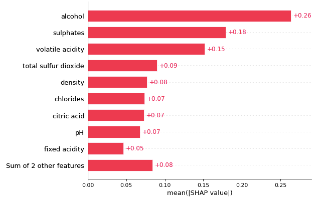
(1) Global Interpretability (1.1) Bar plot for feature importance
If you have too many predictors, the bar plot for the variable importance becomes long and ugly. It does not resonate with your audience and loses its persuasive power. Should you cut off the tail of the chart? But the audience will not know the collective contributions of those less important variables — what if their collective importance is larger than the top variables? The SHAP bar plot lets you specify how many predictors to display and sum up the contributions of the less important variables. This is a nice touch because you can inform the audience of the collective contributions of the rest variables.
(1.2) Cohort plot
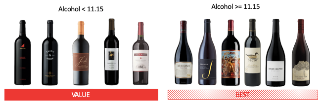
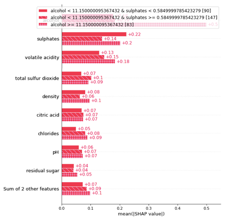
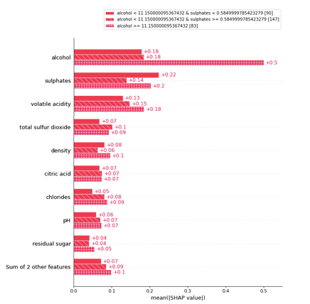
A population can be divided into two or more groups according to a variable. This gives more insights into the heterogeneity of the population. Figure (B.2) shows my population can be divided into two cohorts: in those samples, the alcohol levels are less than 11.15, and in those that the alcohol levels are more than 11.15. In Figure (1.1) we know the variable “alcohol” is the most important. Figure (1.2) tells us that the variable “alcohol” is even more important in the second cohort.
This is done by using .cohorts(N) to divide the population into N cohorts. It runs sklearn DecisionTreeRegressor for the partition. My population has 320 samples. It is automatically partitioned into 237 samples for one cohort and 83 samples for the second cohort.
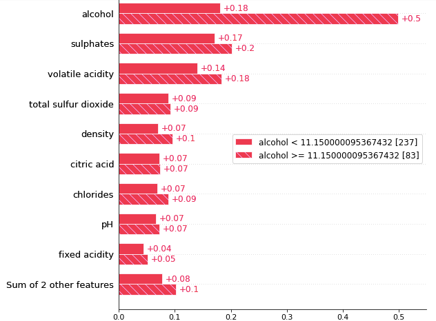
The threshold of this optimal division is alcohol = 11.15. The bar plot tells us that the reason that a wine sample belongs to the cohort of alcohol≥11.15 is because of high alcohol content (SHAP = 0.5), high sulphates (SHAP = 0.2), and high volatile acidity (SHAP = 0.18), etc. This may inspire a market segmentation strategy that the first cohort can be labeled as the “best” selection of wines, and the other cohort as the “value” wine selection.
(1.3) Heatmap plot
Let me arbitrarily choose 100 wine samples and run the following code to create a heatmap. The outcome is in Figure (1.3).
This heatmap contains much information. First, the importance of the variables is labeled on the left side. The horizontal bars on the right side rank the variables from the most important to the least important. The model variable importance represents global interpretability. It means this XGBoost model considers “alcohol” as the most important attribute to the wine quality, followed by “sulphates” and so on.
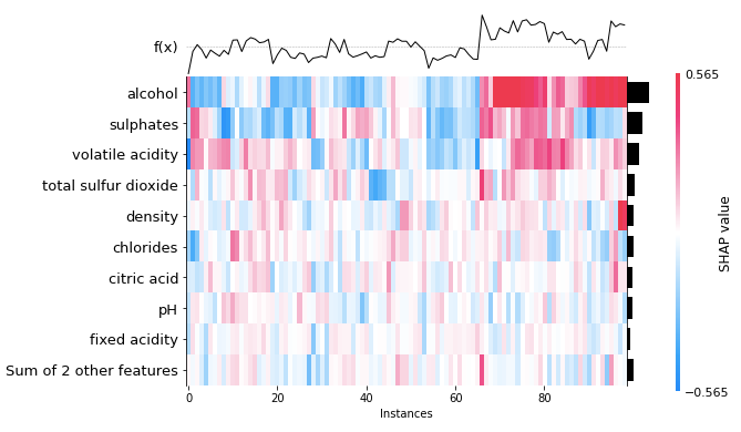
Second, this heatmap is based on wine samples from 1 to 100. So the X-axis is the instance from 1 to 100. The colors show the magnitude of the SHAP values. Look at Wine sample 100 on the right of the heatmap, it has a red color for alcohol, which means “alcohol” has contributed the most to the quality of that wine sample.
Third, the f(x) curve on the top of Figure (1.3) is the model predictions of the instances. Wine sample 100 has a high prediction. It means the quality of the wine sample 100 is high, and “alcohol” contributes greatly to the quality of that wine sample.
Fourth, you may have noticed the observations have been arranged such that the colors clustered together. This is because the SHAP heatmap class runs a hierarchical clustering on the instances, then orders these 1 to 100 wine samples on the X-axis (usingshap.order.hclust).
Fifth, the center of the 2D heatmap is the base_value (using .base_value), which is the mean prediction for all instances. The heatmap shows high predictions (high values in f(x) to the right) are associated with high alcohol content and high sulphates (in red color).
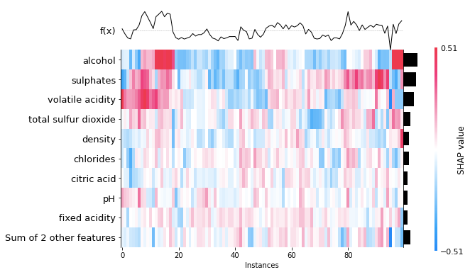
I mentioned that I “arbitrarily” choose 100 data samples to produce the heatmap in Figure (1.3). If I choose another set of data samples, will the interpretation be very different? In Figure (1.4) I choose another set of observations to show you that the interpretation stays the same. The high predictions (high values in f(x) in the left) are associated with high alcohol content and high sulphates (in red color).
(2) Local Interpretability
There are many ways to explain an individual prediction. In this section, I will demonstrate four types of plots: the waterfall plot, the bar plot, the force plot, and the decision plot. I will repeatedly use two examples (Observation 1 and 2) for each type of plot. This lets you compare how they look.
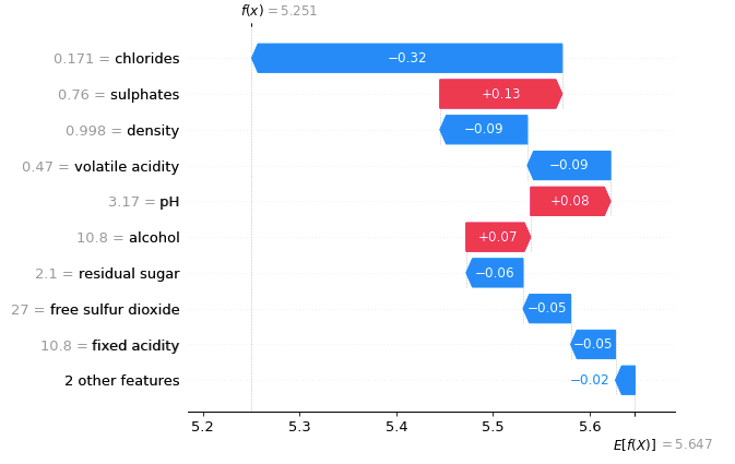
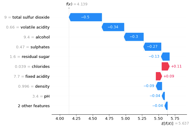
(2.1.1) The waterfall plot for Observation 1
A waterfall plot powerfully shows why a case receives its prediction given its variable values. You start with the bottom of a waterfall plot and add (red) or subtract (blue) the values to get to the final prediction. The graph below shows the prediction for the first observation in X_test. It starts with the base value of 5.637 at the bottom, which is the average of all observations. The model prediction for Observation 1 is 4.139, as shown on the top. Why is it 4.139? It is because 5.637–0.04–0.04–0.09+0.09+0.11–0.13–0.27–0.3–0.34–0.5 = 4.139 (notice there is a small rounding error).
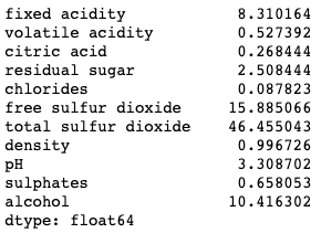
There are values next to the variable names. Those are the values of the variables. For example, the value of “alcohol” for the first observation is 9.4. Is 9.4 good, if compared with all other wines? Remember the SHAP model is built on the training data set. The means of the variables can be obtained by X_train.mean(). The average “alcohol” of all wines is 10.41. Observation 1 is only 9.4. Because a high “alcohol” level contributes positively to the quality rating, but the alcohol of Observation 1 is lower than the average, the “alcohol” rating of this wine contributes negatively to its quality prediction by -0.3 as shown in Figure (2.1.1).
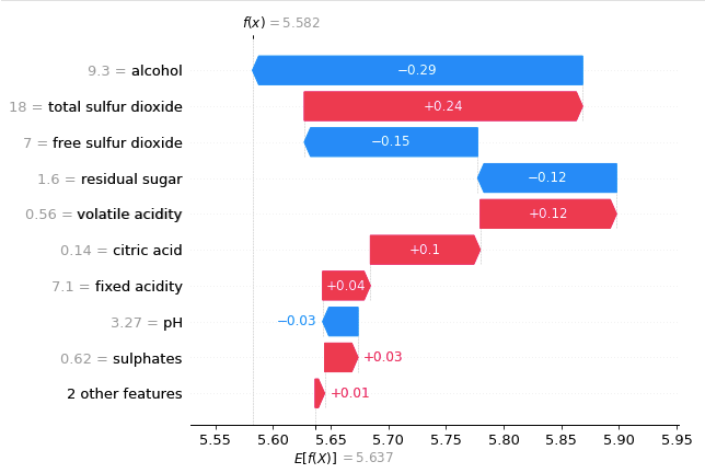
(2.1.2) The waterfall plot for Observation 2
Below I show the prediction for the second observation in X_test. The reason that the final prediction is 5.582 is that 5.637+0.01+0.03–0.03+0.04+0.1+0.12–0.12–0.15+0.24–0.29 = 5.582.
If you are creating a waterfall plot, see “Creating Waterfall Plots for the SHAP Values for All Models”.
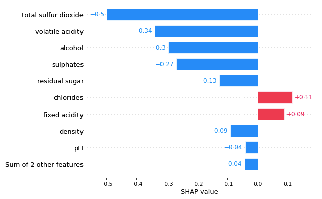
(2.2.1) The bar plot for Observation 1
Compared with the waterfall plot, the bar plot centers at zero to show the contributions of variables. See Figure (2.2.1).
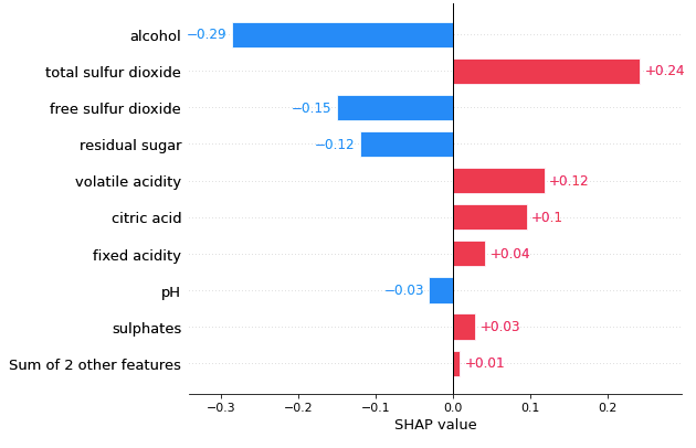
(2.2.2) The bar plot for Observation 2
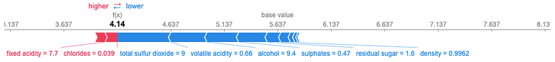
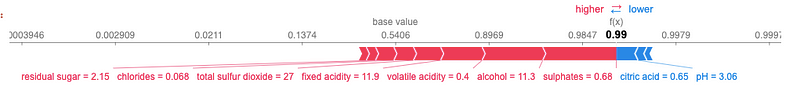
(2.3.1) The force plot for Observation 1
I have explained a force plot with great detail in the previous article “Explain Your Model with the SHAP Values”. For Observation 1, our XGBoost model predicts it to be 4.14. Why does the model predict it to be 4.14? The force plot starts with a base value of 5.647. Those blue factors push the prediction to the left, and the red factors push the prediction to the right. Thus it settles at 4.14.
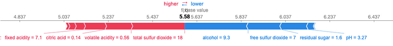
(2.3.2) The force plot for Observation 2
The prediction for Observation 2 is 5.58. The force plot in Figure (C.3.2) explains the key factors.
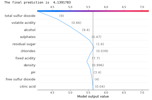
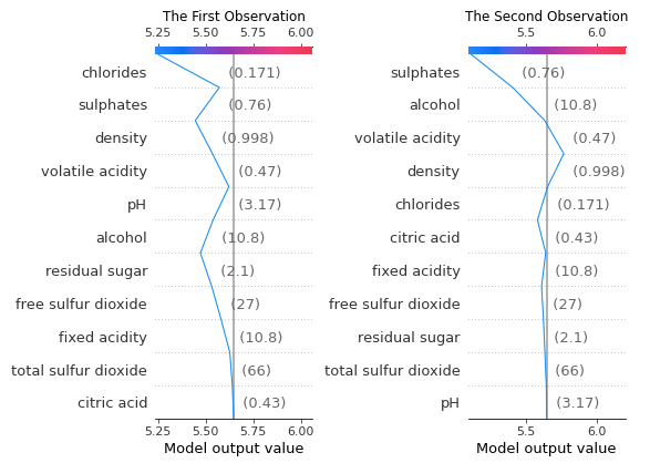
(2.4.1) The decision plot for Observation 1
If there are many predictors, the force plot becomes busy and does not present them well. A decision plot will be a good choice. Figure (2.4.1) shows the decision plot for Observation 1. It states that the final prediction is 4.139 (~4.14). The vertical line in the center is the base value. The numbers in parenthesis are the values of the variables. For example, the value of “alcohol” for Observation 1 is 9.4. We know the level of alcohol content positively contributes to the quality of the wine. Is 9.4 good, if compared with all other wines? We have explained in Section (2.1.1) that the means of the variables can be obtained by X_train.mean(). The average “alcohol” of all wines is 10.41 and Observation 1 is only 9.4. Because the alcohol of Observation 1 is lower than the average, the “alcohol” rating of this wine contributes negatively to its quality prediction, as shown in Figure (2.4.1).
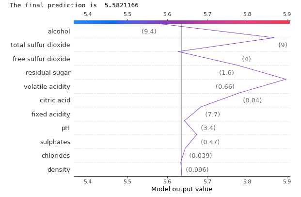
(2.4.2) The decision plot for Observation 2
Let’s produce the decision plot for Observation 2. The XGBoost model predicts its quality to be 5.58.
(3) Binary Target
A binary model can be easily done by specifying reg:logistic in xgb.XGBRegressor(). The prediction shall be a probability between 0 and 1. However, in the waterfall plot, XGBoost presents the log odds rather than the predicted probability. There have been long discussions on the need to present the waterfall plot in terms of the predicted probability in this GitHub issue, and Mr. Lundberg has made further revisions since then. In this section, I want to detail the waterfall plot in the log odds, and how it can be presented in terms of predicted probability. I will first show you the force plot so you can compare it with the waterfall plot.
(3.1) Force plot
I create a binary target variable y = np.where(df[‘quality’]>5,1,0) and specify reg:logistic to build a binary model.
(3.2) XGBoost with Waterfall plot
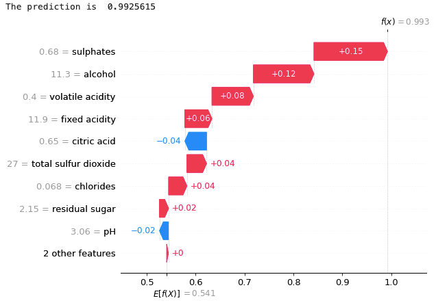
Below is the waterfall plot. The final prediction in the plot is f(x) = 4.894. We expect the output of this binary model to be a probability between 0 and 1. Why is it larger than 1.0? It is because the units on the x-axis in the waterfall plot are log-odds units rather than probability. The XGBoost classifier produces the margin output before the logistic link function (as explained in its documentation).
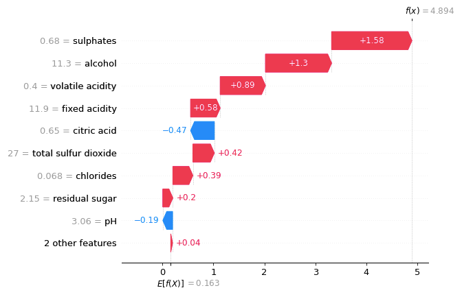
You can convert the log-odd to a probability of [0,1] by using the logistic sigmoid function, which is expit(x) = 1/(1+exp(-x)), the inverse of the logit function. In other words, 1(1+exp(-4.894) ) = 0.992, which is the predicted probability in the above (3.1) force plot. I joined the discussion in this Github issue and shared the following utility function that does the conversion from the log odds to probabilities.
So let’s apply the conversion and then do the waterfall plot for one observation:
Now the waterfall plot is shown as the predicted probabilities. For more details, see the Jupyter notebook which is available via this Github link.
In my post “Creating Waterfall Plots for the SHAP Values for All Models” I have open-sourced my waterfall plot code that does not need the above transformation. It lets you draw a static waterfall or an interactive waterfall chart.
(4) How to Customize SHAP plots
As said before, many SHAP plots can work with Matplotlib for customization. Remember to turn off the plotting parameter of a SHAP function by show=False. Below I show an example that the legend masks the graph so we want to move it to a better location. This example divides the population into three cohorts, see Section (1.2) cohort plot for how to do a cohort plot.
(4.1) Legend, font size, etc.
The location of the legend can be specified by the keyword argument bbox_to_anchor, which gives a great degree of control for manual legend placement. See the Legend guide of the Matplotlib.
(4.2) Show SHAP plots in subplots
You may want to present multiple SHAP plots aligning horizontally or vertically. This can be done easily by using the subplot function of Matplotlib.
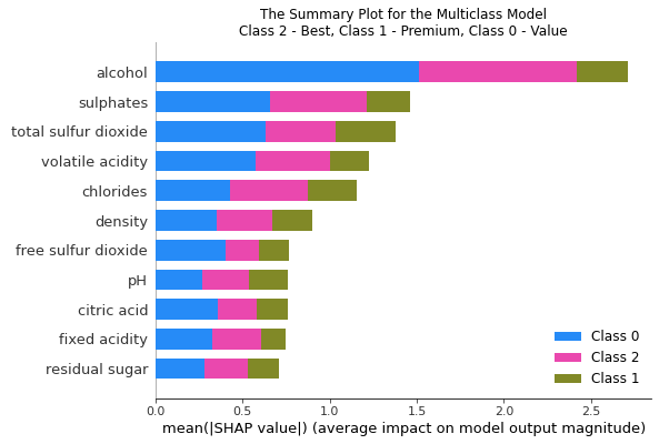
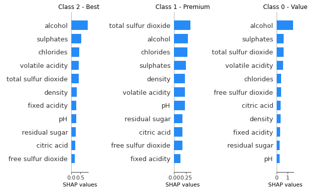
(5) The SHAP Plots for a Multi-class Model
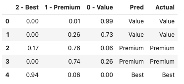
You may have built a multi-class model that classifies instances into several classes. How does the SHAP help to demonstrate a multi-class model? Below I create a new target variable ‘Multiclass’ for three classes: ‘Best’, ‘Premium’, and ‘Value’. The model is done by specifying multi:softprob for the parameter of XGBClassifier.
The output of a multi-class model is a matrix of probabilities for the classes. We have three classes, so the outputs are the probabilities for the three classes, summing up to 1.0. In scikit-learn, the function .predict_proba() renders the probabilities, as shown in Columns “2-Best”, “1-Premium” and “0- Value”. The function .predict() renders the predicted classification, as shown in Column “Pred” below.
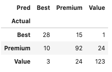
We can show a confusion matrix like this:
You can use the summary plot to show the variable importance by class. Below are two ways to show the results.
Conclusion
In this chapter, we have learned various ways of presenting model predictions. They are all good options for you to deliver a stylized presentation. This effort pays off when your audience understands your predictions better and is ready to adopt your model. Remember to download the Jupyter notebook via this Github link. For those of you who are interested in model explainability, the following sequence will be helpful:
Part I: Explain Your Model with the SHAP Values
Part II: The SHAP with More Elegant Charts
Part III: How Is the Partial Dependent Plot Calculated?
Part VI: An Explanation for eXplainable AI
Part V: Explain Any Models with the SHAP Values — Use the KernelExplainer
Part VI: The SHAP Values with H2O Models
Part VII: Explain Your Model with LIME
Part VIII: Explain Your Model with Microsoft’s InterpretML
Readers are recommended to purchase books by Chris Kuo:

- The explainable AI: https://a.co/d/cNL8Hu4
- Transfer learning for image classification: https://a.co/d/hLdCkMH
- Modern time series anomaly detection: https://a.co/d/ieIbAxM
- Handbook of Anomaly Detection: https://a.co/d/5sKS8bI


