
The Art Critic’s Response
The Designers For The Writer’s Challenge Contest Tell Us How Medium Really Feels About Us
If you still believe they value your work, look no further than this logo
Who could have known that deconstructing Medium’s visual messages could become a full time job?
As the s̶e̶l̶f̶-̶p̶r̶o̶c̶l̶a̶i̶m̶e̶d̶ u̶n̶i̶v̶e̶r̶s̶a̶l̶l̶y̶ ̶p̶r̶a̶i̶s̶e̶d̶ resident graphic design professional in these parts, I have taken my role as a̶r̶t̶ ̶s̶n̶o̶b̶ a̶n̶g̶r̶y̶ ̶c̶r̶a̶n̶k̶ arbiter of good taste in corporate communications seriously.
2017
I shined a light on Medium’s technique of using snooty wine descriptions in order to convince you that their sausage made from unidentifiable animal parts (that might be considered a delicacy in Korea) is actually a finely aged Black Angus steak.
This was not even the case of dressing up a pig and putting lipstick on it. At the very least we would have known the final “product” was pork!
2020
I tried to warn and protect you fine writers about the dark underbelly of this online word mill organized around the principle of the infinite monkey theorem.
In addition, I provided you the tools to analyze typography, so you can decide for yourself.
2021
But now, your corporate overlords have created their pièce de résistance in gas lighting every good writer unable to find any correlation between high quality writing and the judges’ selection process for the Writer’s Challenge.
How is it possible, to paraphrase the great George Carlin, that their shit turns to gold, and our gold turns to shit?
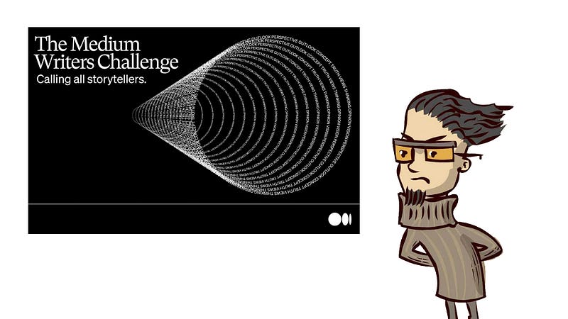
Look no further for the true message behind the Writer’s Challenge than their contest logo.
There are three components of design theory we can see in the contest logo: use of negative space; choice of color, and; looking at something from different angles.
#1. Negative space: all that space around the rings of type pull the eye toward the rings of type, but there is negative space between the rings of type, so our eye is drawn into the hollow center the illustration. It feels like we are entering this object and headed toward the very back of the image. Something rings hollow here, doesn’t it?
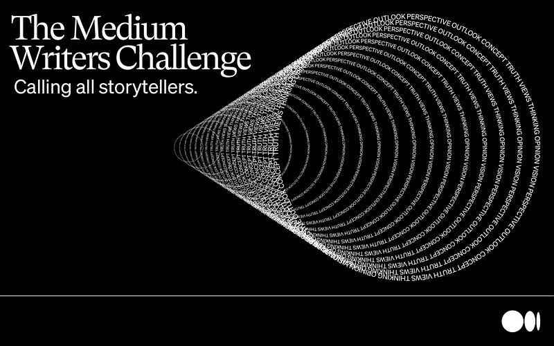
#2. Color choice: even if you don’t mind a monochromatic vision of the creative world, what does it say when the dominant color is black? Cultures aside (in Japan, white is the color of death), reversing type out of black overwhelms the positive space (the logo) with negative space. This is the opposite of 99.999999999% of the books or magazines you will read. Check out the inverse of the image below and I think you will get a completely different message.
When the image is positive, the eye is drawn to the front of the rings. The direction of the art is going out toward the reader. This reads like a telescope, with a feeling of hope that our vision will continue moving forward, outward and expand.
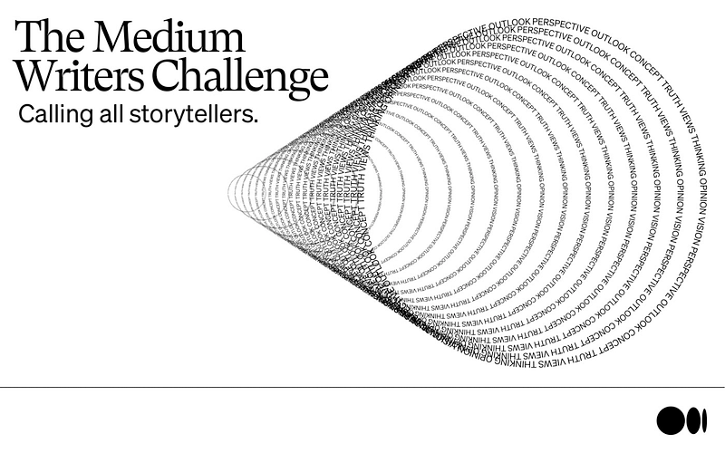
#3. Change the Viewing Angle: if we rotate the image 180°, the rings travel from right to left, which goes against the way our eyes flow naturally (from top left to bottom right). There is conflict between the type and the image, so we can throw out this mixed message.
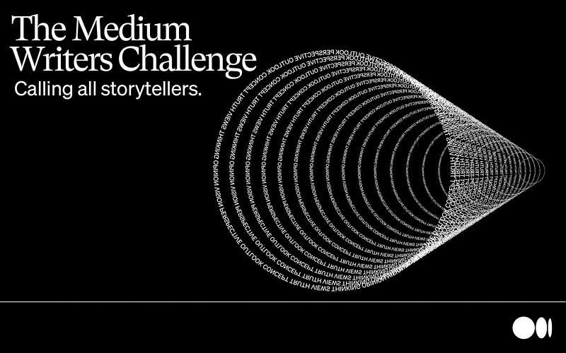
However, if we rotate the image 90° counterclockwise, the true message from Medium becomes clear.
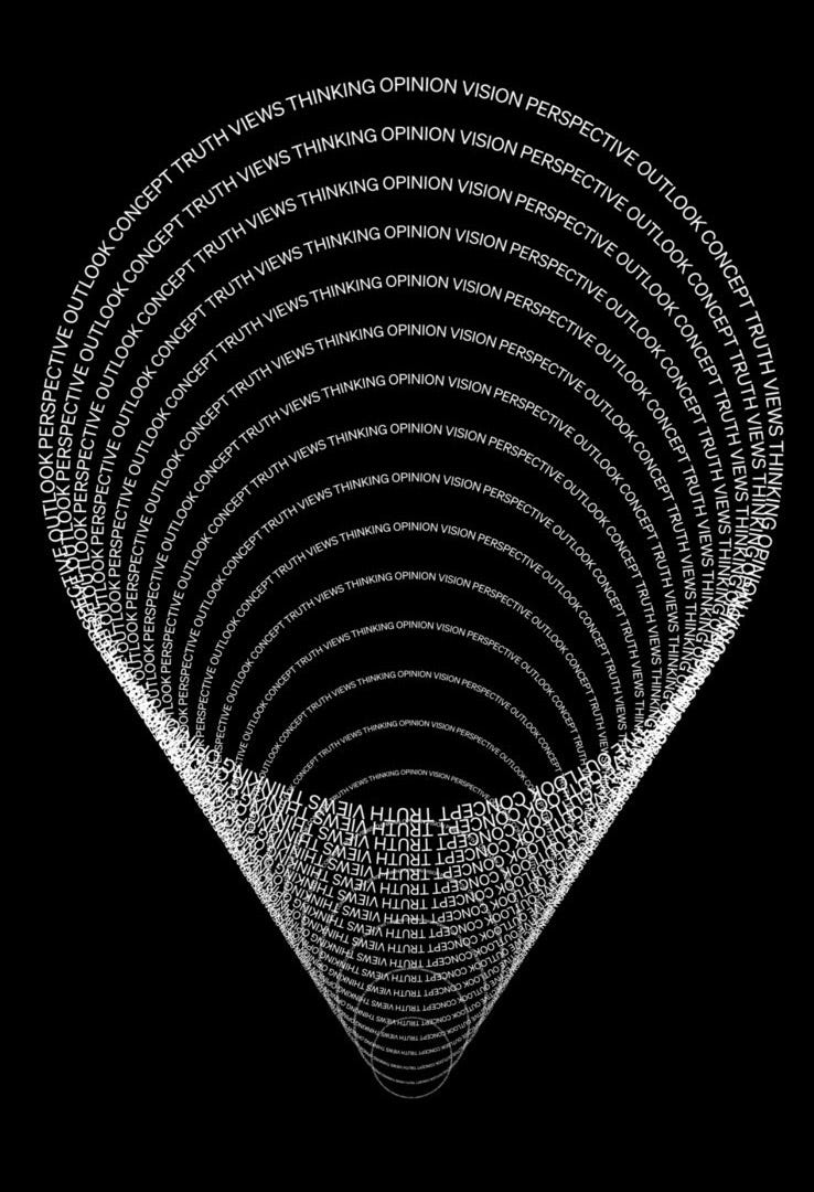
Tell me your eye doesn’t enter the rings and head downward to the bottom and center of those tiny rings.
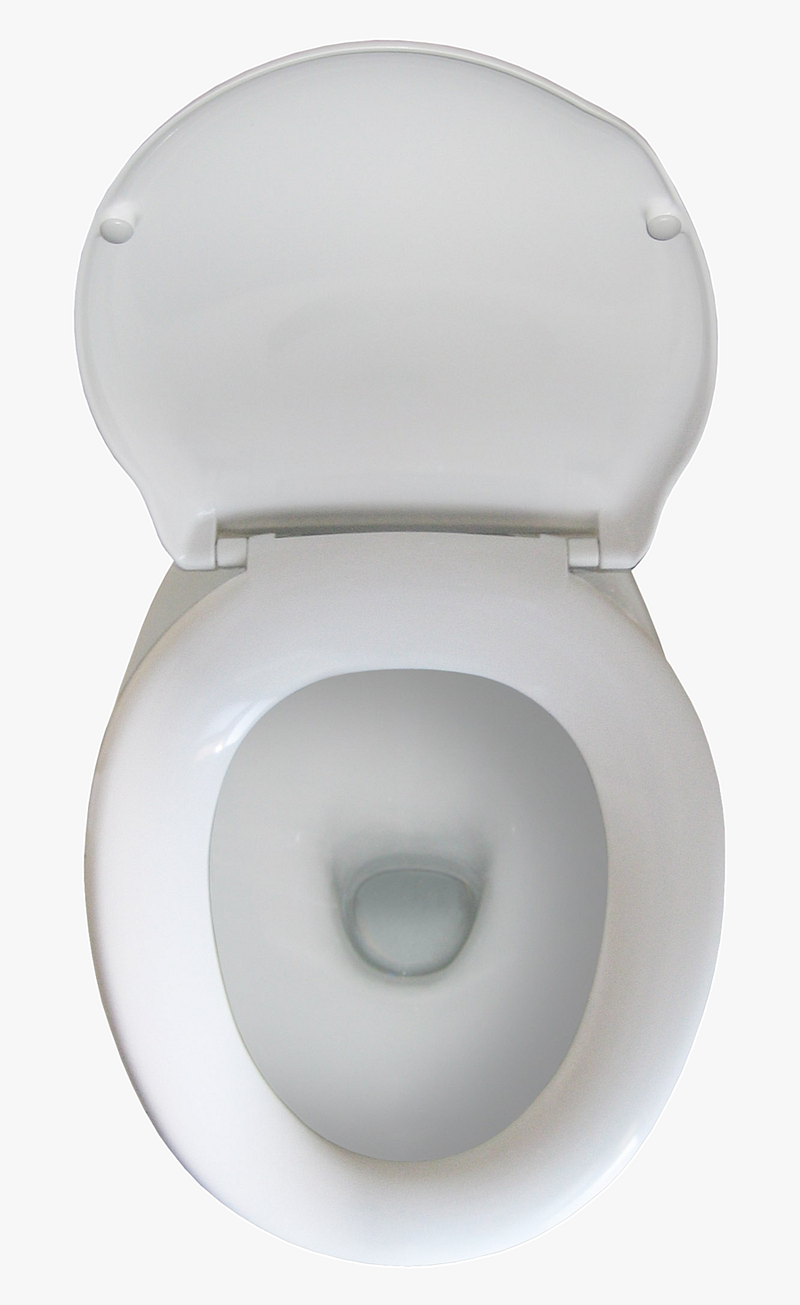
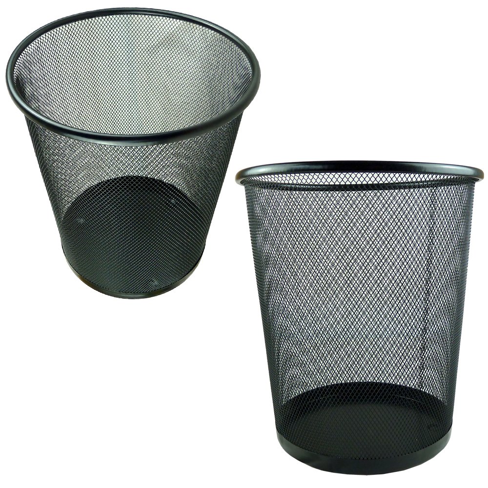
Guess what other objects display this form in the real world?

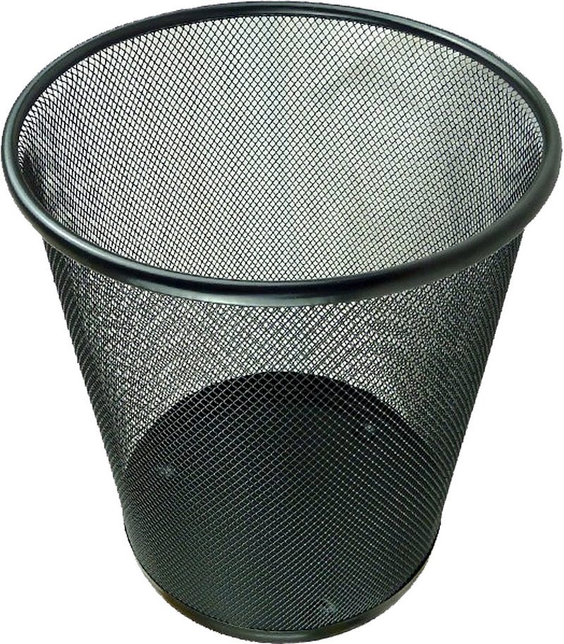
And symbolically, the final destination for all of the blood, sweat, and tears you spill on your keyboard…
Happy Monday, everyone!
As long as you remember this absurd and arbitrary system has been designed to keep you literally spinning your creative wheels like a hamster, you won’t be disappointed.
Don’t feel bad. It was easy to hook you.
Thanks for reading! If you enjoyed this article, you might like this music parody.

Lon Shapiro is a recovering online writer who finds true joy in interacting with his fan (not a typo — you know who you are). If you fall into that tiny group of people who find my stuff funny, subscribe here before this article gets buried under 10,000 stories of sex confessionals, self-help gruel, and tech-bro boasting.


