The Story Behind Medium and the Terrible, Horrible, No Good, Very Bad Logo
It’s not too late to design a good logo — call me, Ev

Don’t you just hate it when some snooty wine connoisseur describes the fruity insouciance and je ne sais quoi of a wine that seems very similar to Two-Buck Chuck?
That’s how I felt when I read an article by some content marketer about Medium’s new logo.
Believe it or not: these are actual quotes by what I think is a normal human being.
These glorious, empty, , are so glorious, so inspired that I have to put them in the largest type available.
“The brand deities be praised; Medium is new. But it’s different. Subtly.”
“It’s less blocky. More heterogenous. As if the attitude and youth of Katniss Everdeen merged with the ancient English lore of Geoffrey Chaucer.”
“It’s medieval modernity. And evokes a paladin-like aura of ‘classical edginess.’”
“It brings back the simple strength of Medium, a place where ideas are expressed and writing is honored. It’s time to think big thoughts.”
“Oddity is replaced with universality. Ambiguity with clarity. Zaniness with simplicity.”
Dude, I’m sorry but this is a black box with a white “M” inside.
If you want to read an e-book and set your tablet to night reading, I get it. But putting down words to paper, computer or mobile device? Are you kidding me?
“Medium’s new logo is punctilious.”
Seriously? Where exactly is the attention to detail?
I’m not saying the new logo is verifiably horrendous, but it’s just a fucking font.
Here is the 2017 unveiling of Medium’s new logo that you can still download from their branding guidelines page.

I found the found and show it below.
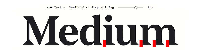
So they cut off exactly four serifs and squeezed the letters together.
Bravo.
Now I will admit the logo does give the feeling of being more like a magazine. I can see that. And maybe they’re trying to emphasize the value of their premium content (translation: how do we monetize this thing?). So a serious literary magazine makes sense. But who is the site really for? Who makes the site live?
It’s you, the writers.
Without your content, there is no Medium. So if the vast majority of you are going to slave away over a keyboard and receive no compensation, shouldn’t the site say “this is a cool, comfortable place to write my stuff?”
As a graphic designer, I can definitely say the following:
- Design is so subjective, you will always have people who will hate a logo or love it.
- However, it is possible to do something that is so terrible and contrary to a brand that the popular response forces the company to go back to its original logo. (See the disastrous and outrageously expensive attempts by Pepsi and Tropicana)
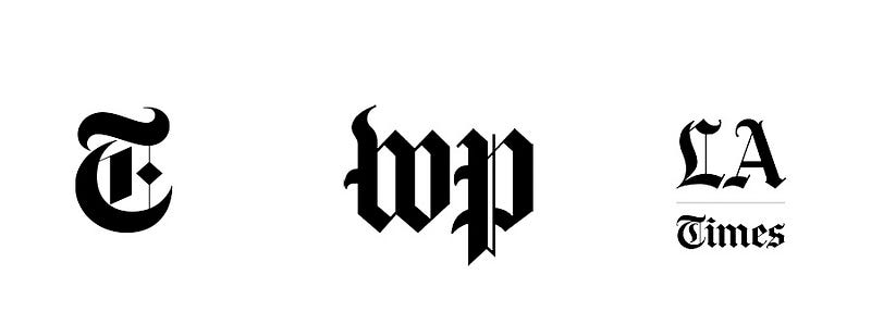
- The more people wax rhapsodic about the symbolism of a logo (“punctilious,” really?) that is basically a font, the more you know there is nothing intrinsically unique or creative about said logo. (Here are a few logos connected with the news and the printed word— you’ll notice the first set is black on a white background, because that is how we perceive the written word. (See appendix below.)
- When a logo (or a tagline, for that matter) can apply to any company within any industry, you have not created any real brand equity. (Every professional designer will look at books of award winning logos to make sure they don’t copy existing work, as well as find inspiration. Here are tons of examples where the M could contain additional subtleties.)
- When you replace something that was even average, but was easily recognizable, you have killed any brand equity. (People have come to know and welcome that green icon, and the green typography used throughout the site; the black icon now stands in stark contrast to the green used on the follow buttons, causing confusion. The changes to the website interface have done nothing to improve my desktop experience — maybe it’s better for mobile users.)
- If you are going to represent a digital company that exists solely on the internet, it would be cool to leverage the difference between the static and finite world of print, and the interactive world online.
What if a website for writers employed the graphic device that the entire universe understands to be a cursor?
Here’s a simple way to communicate that Medium is a digital site all about writing, using the new font and color.
Or, they could leverage the current brand equity and use the green color like this:
Who knows, maybe they already thought of this idea. Maybe it got shot down because they were afraid people would try to start typing at the end of the logo, instead of on the story page. Or maybe a gif uses extra memory, or not all mobile devices would display the image correctly.
All I know is, I came up with this idea in about five minutes, then put it together in another fifteen or twenty.
P.S.: Ev, if you ever want to spend a few thousand dollars developing a logo that says something about what this site does, you know where to find me.
Thanks for reading.
APPENDIX
- Here are a few familiar logo symbols for newspapers. Who could possibly guess they’re trying to show credibility and a connection with a tradition of writing that goes back to the Gutenberg press?
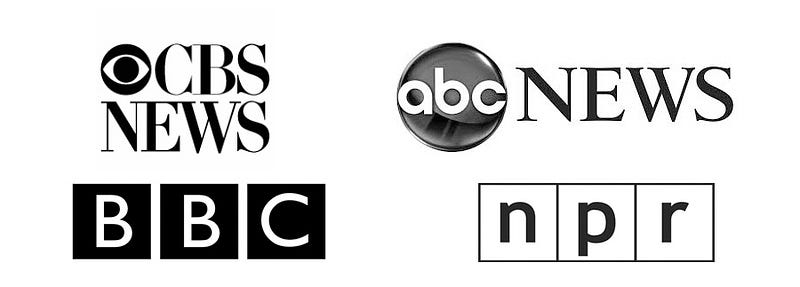
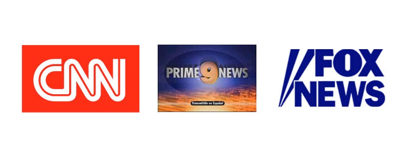
- Here are logo symbols for TV news sources. They’re call letters, but they still are trying to appear as serious and credible news sources. (Note for type aficionados, the BBC uses Gil Sans, a font designed by the great English typographer Eric Gill in 1928, based on the signage used in London’s Underground.)
- And here are logos of companies who think the news needs to stimulate people rather than inform them. CNN’s red neon and Fox News’ spotlights scream for your attention like a hooker in the red light district. Meanwhile, KCAL Channel 9 in Los Angeles is my go-to station when I want to watch a half-hour of car chases, man bites dog stories, porn stars in Vegas, and bikini models.
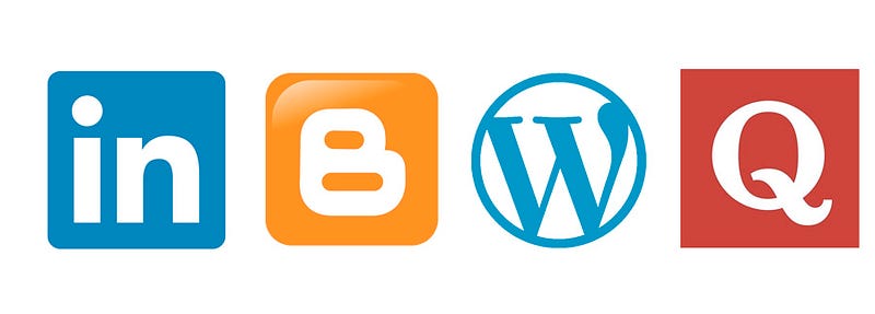
- Now, we come to blogging sites. Looks like everyone figured out it would be a good idea if the company icon looks like a button you would click on a website — brilliant, right? How about a site where you write down you Words? And guess which site allows you to ask a question?