Medium’s New Logo May Not Be Everything They Hoped For
While I respect their honesty, is this the message they want to communicate?
If you’re on a mobile device, you haven’t seen Medium’s new logo icon, so let this be a warning to you — their message is clear.
No, the message is not “Good afternoon.”
Medium introduced a new logo today on my home page, but I didn’t really understand its meaning until I saw my drafts page.
Here is a screenshot of the story as I am typing. My notes are in red.
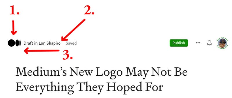
As graphic design professional who has worked on projects for Disney, Six Flags, Subway, Taco Bell, and Universal Studios, I think I am qualified to analyze what we are seeing here. (Please refer to the diagram above.)
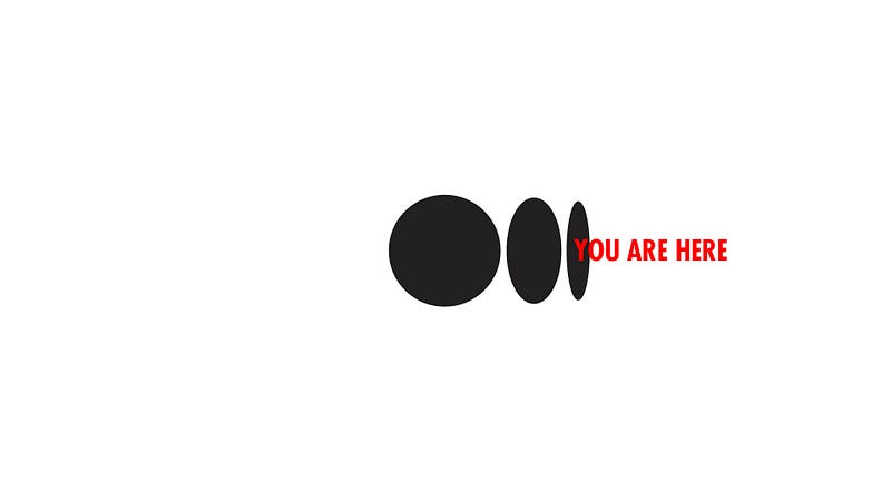
(1.) This section is Medium’s new logo icon. It looks like an endless series of black holes disappearing at the horizon. Or are the holes following a curved surface that represents part of a cylindrical shape, like a waste paper bin?
(2.) This section indicates the status of the story and the user name. I have to ask why is it worded “Draft in Lon Shapiro” instead of “Your draft?” Is Medium implying there is a hole in me? Is the algorithm mocking the emptiness in my soul as I continue to slave away at writing jokes that will fall on deaf ears?
(3.) Notice how the eye is drawn in the direction of the new icon? My draft looks like it is hurtling toward a black hole. Coincidence? I think not.
If this new logo makes you question your purpose as a writer, you’re not alone.
Oh wait, am I the only one who feels that way?
If you enjoyed my insights on graphic design, you can learn all about typography in this open letter to a review of Medium’s new logo.
If you can’t stand snooty wine connoisseurs who make meaningless pronouncements over junk that doesn’t pass a simple taste test, you will love this take from 2017, when Medium introduced their black type logo.