
Plot Points on a Graph with Python
In this article we will look at how you can plot points on a graph with Python.
To plot a point on a graph you need to specify 2 values, 1 for the horizontal axis (X), and one for the vertical axis (Y)
In Python all of this can easily be done with the matplotlib package. And in this article I will explain how, so that you can make plots like this:
Installing and import matplotlib
To be able to use the matplotlib package you have to install it, which can be done with the command: pip install matplotlib.
To learn more about Python packages and installing them you can read this article of mine.
After installing matplotlib you can import the matplotlib collection of functions called pyplot as follows: import matplotlib.pyplot as plt.
Plotting 2 values as 1 point
Plotting 1 point can be done with the plot function, you can specify the X-axis value, the Y-axis value and a marker. A marker is like a symbol that appears at the XY coordinate. When you pass the argument marker='x' an x will appear on the chart.
Here is an example, plt.show() is to make the graph appear on screen:
import matplotlib.pyplot as plt

plt.plot(2,10,marker='x')

plt.show()
This is the graph that the code makes:

Markers and colors
The x symbol is of course not the only marker that you can choose, here are some other markers:
- A point with
'.' - A circle with
'o' - A triangle with
'^' - A square with
's' - An upside-down triangle with
'v' - A start with
'*' - A diamond with
'D'
And you can also specify the color of your marker with the color argument. You can use colornames like 'red' and color hex-codes like '#57c975' as the value.
Here is code to plot some points with various markers and colors:
import matplotlib.pyplot as plt

plt.plot(1,1,marker='.',color='red')
plt.plot(2,1,marker='o',color='green')
plt.plot(2,2,marker='^',color='black')
plt.plot(3,1,marker='s',color='purple')
plt.plot(3,2,marker='v',color='#57c975')
plt.plot(3,3,marker='*',color='#db73f5')
plt.plot(4,1,marker='D',color='#769491')

plt.show()
And here is the result:

Starting a graph at the origin (0,0)
You might have noticed that the graphs above didn’t start at the origin with coordinates (0,0). To make a matplotlib graph start at the origin you can apply:
plt.ylim(bottom=0)
plt.xlim(left=0)
Here is a full example:
import matplotlib.pyplot as plt

plt.plot(1,1,marker='.',color='red')
plt.plot(2,1,marker='o',color='green')
plt.plot(2,2,marker='^',color='black')
plt.plot(3,1,marker='s',color='purple')
plt.plot(3,2,marker='v',color='#57c975')
plt.plot(3,3,marker='*',color='#db73f5')
plt.plot(4,1,marker='D',color='#769491')

plt.ylim(bottom=0)
plt.xlim(left=0)

plt.show()
Plotting multiple points
In this section we will look at how you can plot multiple points in a graph. You could of course use the plot function multiple times like we did in the examples above, but there is another way.
With the scatter function we can pass one list of values for the x-axis and one list of values for the y-axis.
Data in 2 collections of values If your data is already in 2 separate lists you can easily pass them to the scatter function:
import matplotlib.pyplot as plt

distances = [0, 1.6, 4, 6.8, 8, 9.2, 10.4, 12, 13.8, 14.8, 17.8]
times = [0, 1, 2, 3, 4, 5, 6, 7, 8, 9, 10]

plt.scatter(times,distances)

plt.show()
Data in a dictionary If your data is stored in a dictionary with one feature as keys and one feature as values you can use the keys and values methods to extract the data as lists.
As an example, here is a dictionary that holds the same data as the distances and times lists. And we will use the keys and values methods on that dictionary:
distances_after_times = {0:0, 1: 1.6, 2: 4, 3: 6.8, 4: 8, 5: 9.2,
                        6: 10.4, 7: 12, 8: 13.8, 9: 14.8, 10: 17.8}
print(distances_after_times.keys())
print(distances_after_times.values())
Here is what the code prints:
dict_keys([0, 1, 2, 3, 4, 5, 6, 7, 8, 9, 10])
dict_values([0, 1.6, 4, 6.8, 8, 9.2, 10.4, 12, 13.8, 14.8, 17.8])
So to plot the data points in the dictionary we can use the scatter function like this:
import matplotlib.pyplot as plt

distances_after_times = {0:0, 1:1.6, 2:4, 3:6.8, 4:8, 5:9.2,
                        6:10.4, 7:12, 8:13.8, 9:14.8, 10:17.8}

plt.scatter(distances_after_times.keys(),distances_after_times.values())

plt.show()
Data in tuples of 2 As a final example for plotting multiple points we will look at a scenario where the data is stored in X-value & Y-value pairs like this:
times_and_distances = [(0, 0), (1, 1.6), (2, 4), (3, 6.8),
                       (4, 8), (5, 9.2), (6, 10.4), (7, 12),
                       (8, 13.8), (9, 14.8), (10, 17.8)]
In this case we just have to make 2 separate lists out of this data. One list for the times and one for the distances. This can be done by looping over the tuples in the list, unpacking the values and appending them to lists:
times = []
distances = []
for time_dist in times_and_distances:
    time, dist = time_dist
    times.append(time)
    distances.append(dist)


print(times)
print(distances)
The output shows that we have successfully created 2 lists with the data:
[0, 1, 2, 3, 4, 5, 6, 7, 8, 9, 10]
[0, 1.6, 4, 6.8, 8, 9.2, 10.4, 12, 13.8, 14.8, 17.8]
And we can pass these lists like before as X-values and Y-values:
times_and_distances = [[0, 0], (1, 1.6), (2, 4), (3, 6.8),
                       (4, 8), (5, 9.2), (6, 10.4), (7, 12),
                       (8, 13.8), (9, 14.8), (10, 17.8)]

times = []
distances = []
for time_dist in times_and_distances:
    time, dist = time_dist
    times.append(time)
    distances.append(dist)

plt.scatter(times,distances)

plt.show()
All 3 examples of getting to our scatter function call from different data structures lead to the same chart:

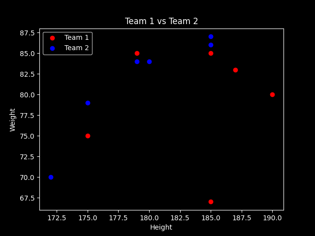
Plotting multiple sets of points in one graph
It is also possible to plot multiple sets of points in one graph. By giving them different collors it will be easy to separate the different groups when analysing the chart.
To plot multiple sets, just call the scatter function multiple times like in this example:
import matplotlib.pyplot as plt


plt.scatter([190,185,185,175,187,179],[80,85,67,75,83,85],
             color='red')
plt.scatter([172,185,180,175,185,179],[70,87,84,79,86,84],
             color='blue')

plt.show()
The code above produces this chart:

Making a graph better looking and more understandable
If you want to learn how to make a simple graph more understandable and better looking by:
- adding a title
- adding labels
- setting ticks at specific values and displaying specific tick labels
- changing background color
- changing the limits of the X- and Y-axis
and more, consider reading this article of mine:
Thank you for reading!
You can get full access to all my posts by joining Medium. Your membership fee directly supports me and other writers you read. You’ll also get full access to every story on Medium:
More charts and graphs in Python:


