
8 Matplotlib Tips for Clear & Pretty Charts
Matplotlib is a popular package to make charts and visualize data. If you have ever tried matplotlib you might know that making charts with it is quite easy. But the default settings don’t always look that good.
In this article we will look at 8 tips for making clear & better looking charts.
1 Add a title and labels to your chart
Adding a title above your chart and a label to each axis is an easy way to make the chart more understandable. Descriptive titles and labels make it clear what data is visualized.
To add a title and axis labels you can use the title function. And to add a label to an axis you can use the xlabel or ylabel function:
import matplotlib.pyplot as plt

seasons = range(2000,2023)
wins = [10,9,15,8,15,1,9,9,8,1,5,1,3,2,0,3,0,5,6,3,0,0,4]
plt.bar(seasons,wins,color='red')

plt.title('Ferrari F1 Wins 2000-2022')
plt.ylabel('Number of Wins')
plt.xlabel('Seasons')

plt.show()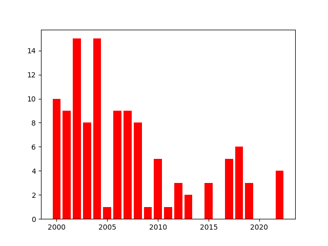

And if you use fig, ax = plt.subplots, you would use the set_title, set_xlabel and set_ylabel methods like this:
import matplotlib.pyplot as plt

fig, ax = plt.subplots()

seasons = range(2000,2023)
wins = [10,9,15,8,15,1,9,9,8,1,5,1,3,2,0,3,0,5,6,3,0,0,4]
ax.bar(seasons,wins,color='red')

ax.set_title('Ferrari F1 Wins 2000-2022')
ax.set_ylabel('Number of Wins')
ax.set_xlabel('Seasons')

plt.show()
You can also make style changes to the title and axis labels, like setting the fontsize with the fontsize argument:
plt.title('Ferrari F1 Wins 2000-2022',fontsize=24)
plt.ylabel('Number of Wins',fontsize=16)
plt.xlabel('Seasons',fontsize=16)
2 Prevent parts of your chart from being cut off
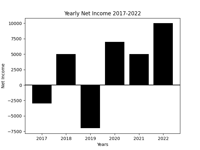
Sometimes the labels of your chart or other parts get cut off from the image. To prevent that, you can call the tight_layout function. I believe you have to call it just before using the show or save function to make sure it works.
net_income = {2018: [9000, 9000, 12000, 15000],
              2019: [-20000, 20000, 15000, 25000],
              2020: [7000, -3000, -9000, -10000],
              2021: [7000, 15000, 15000, 30000],
              2022: [15000, 15000, 25000, 40000]}

for year, data in net_income.items():
    x_coordinates = [year + 0.2 * q for q in [1,2,3,4]]
    plt.bar(x_coordinates,data,width=0.2,edgecolor='black')

years = net_income.keys()
plt.xticks([year+0.5 for year in years], years)

plt.title('Net Income per Quarter')
plt.ylabel('Net Income')
plt.xlabel('Years')

plt.axhline(y=0, color='black', linewidth=0.5)

plt.tight_layout()

plt.show()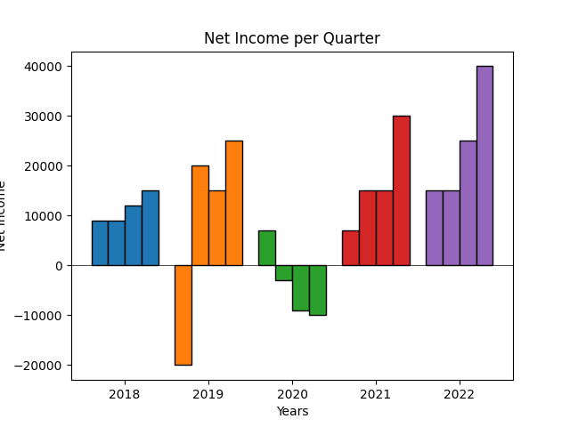
The plt.tight_layout() function call also works if you use fig, ax = plt.subplots().
Learn to graph quarterly data like in the bar chart above with this article of mine:
3 Let the x and y ranges start at the origin (0,0)
When you plot lines or points on a graph, the ranges don’t start at 0 by default. Even when your data includes a point at (0,0).
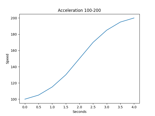
But this can be achieved with the xlim and ylim functions.
To start the y range at 0 you use plt.ylim(bottom=0) and to start the x range at 0 you use plt.xlim(left=0). These have to be used after plotting the data for it to work.
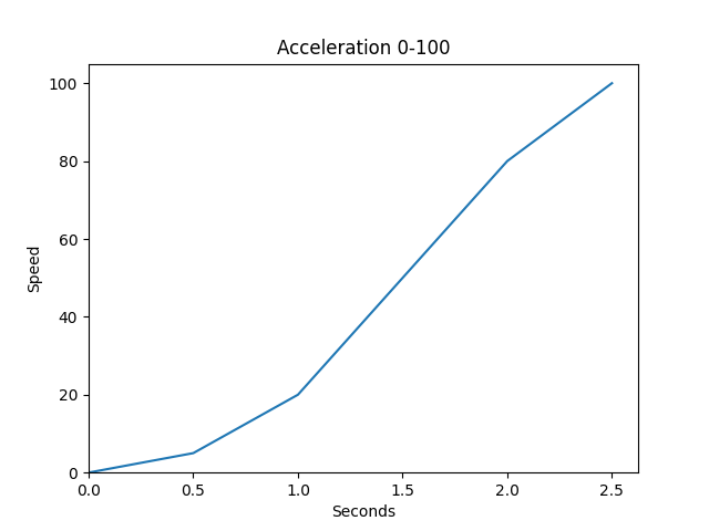
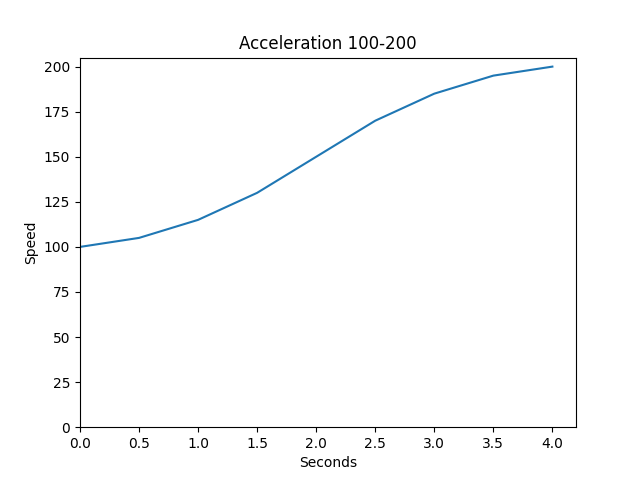
If you use fig, ax = plt.subplots, you would use the set_xlim and set_ylim methods like this:
ax.set_xlim(left=0)
ax.set_ylim(bottom=0)
4 Set the outer limits of the x and y ranges
With the same xlim and ylim functions you can also define the outer limit of an axis’ range.
To set the outer limit of the x range to 150 you can use xlim(right=150). And to set the outer limit of the y range to 150 you can use ylim(top=150).
And of course you can start a range at other values than 0 as well:
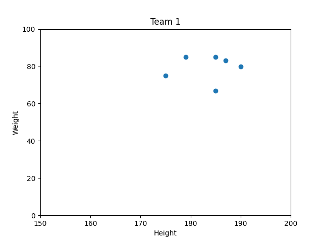
plt.title('Team 1')
plt.xlabel('Height')
plt.ylabel('Weight')

plt.scatter([190,185,185,175,187,179],[80,85,67,75,83,85])

plt.xlim(left=150, right=200)
plt.ylim(bottom=0, top=100)

plt.show()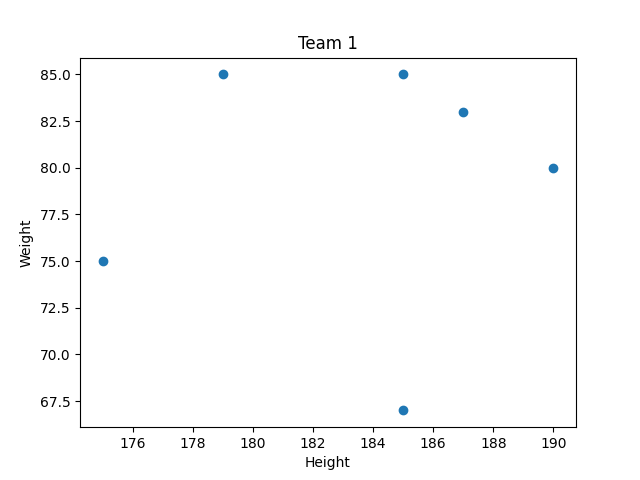
5 Add horizontal or vertical lines to charts
Sometimes a horizontal or vertical line can help make a clear distinction.
Think about when you have a bar chart with both negative and positive values. By adding a horizontal line at y=0 you get a clear distinction between the negative and positive values and it looks better in my opinion.
A horizontal line can be made with the axhline function by passing it a y value, you can also pick a color: plt.axhline(y=0, color=’black’)
Vertical lines can be made with axvline in a similar way: plt.axvline(x=2019, color=’black’)

If you use fig, ax = plt.subplots, you would use the axhline and axvline methods like this:
ax.axhline(y=0)
ax.axvline(x=0)
6 Customize the values along the X or Y axis
In matplotlib charts, ticks are the labels that specify values at the X or Y axis. You can completely customize the ticks that you want to show along an axis.
Let’s look at some example code to make a bar chart that shows yearly revenue data:
import matplotlib.pyplot as plt

years = range(2013,2023)
revenues = [55000, 105000, 300000, 927000, 1405000,
            4905000, 4723000, 7000000, 12000000, 15000000]
plt.bar(years,revenues,color='green')

plt.title('Yearly Revenue 2013-2022')
plt.ylabel('Revenue $')
plt.xlabel('Year')

plt.tight_layout()
plt.show()
The code produces this bar chart:
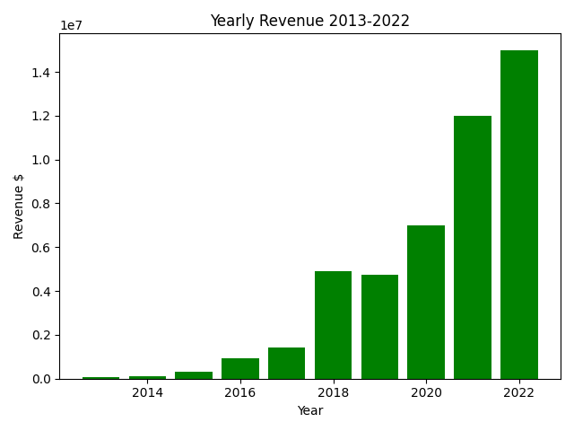
As you can see not every year has gotten a tick on the x axis. And on the y axis we can see scientific notation numbers at intervals of 2 million dollars.
To specify at which values you want a tick to appear you can use the xticks and yticks functions to which you pass a collection of values like a list or range.
To show each year we use the range years, by default ranges have a stepsize of 1. This means that every year will get a tick on the x-axis.
And to show a y-axis tick at each interval of $1 million, we make a new range y_tick_values. The range goes from 0 to 16 million with a stepsize of 1 million: y_tick_values = range(0,16000000,1000000)
Here is the same bar chart making code after the xticks and yticks update:
import matplotlib.pyplot as plt

years = range(2013,2023)
revenues = [55000, 105000, 300000, 927000, 1405000,
            4905000, 4723000, 7000000, 12000000, 15000000]
plt.bar(years,revenues,color='green')

plt.xticks(years)

y_tick_values = range(0,16000000,1000000)
plt.yticks(y_tick_values)

plt.title('Yearly Revenue 2013-2022')
plt.ylabel('Revenue $')
plt.xlabel('Year')

plt.tight_layout()
plt.show()
And here is the new bar chart:

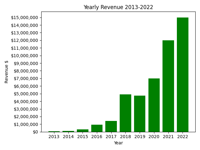
Okay, so now we have ticks at the desired places, but how can we change what is displayed at these ticks? I don’t like the scientific notations along the y axis.
Changing the displayed labels at ticks can easily be done by specifying the desired labels as a second argument in the xticks or yticks function call.
Here is an example:
y_tick_values = range(0,16000000,1000000)
y_tick_labels = ['${:,}'.format(value) for value in y_tick_values]
plt.yticks(y_tick_values,y_tick_labels)
In the code above we make a list y_tick_labels that takes the elements from the y_tick_values range and transforms them.
With '${:,}'.format(value) a value gets transformed into a string that starts with $ and :, is to place commas as thousand separators. So that, for example, 12000000 will be $12,000,000.
Here is the new bar chart code:
import matplotlib.pyplot as plt

years = range(2013,2023)
revenues = [55000, 105000, 300000, 927000, 1405000,
            4905000, 4723000, 7000000, 12000000, 15000000]
plt.bar(years,revenues,color='green')

plt.xticks(years)

y_tick_values = range(0,16000000,1000000)
y_tick_labels = ['${:,}'.format(value) for value in y_tick_values]
plt.yticks(y_tick_values,y_tick_labels)

plt.title('Yearly Revenue 2013-2022')
plt.ylabel('Revenue $')
plt.xlabel('Year')

plt.tight_layout()
plt.show()
Now our bar chart looks like this:
If you use fig, ax = plt.subplots() than you can use the set_xticks and set_yticks methods like this:
ax.set_xticks(years)
ax.set_yticks(y_tick_values,y_tick_labels)
7 Add a legend to your chart
When you plot multiple series in a chart, adding a legend can help clarify what points belong to what entity.
A legend can be made with the legend function.
When you add the color and label argument to your series, for instance in a scatter plot, the legend function will map the serie’s colors to the labels automatically.
Here is an example:
plt.title('Team 1 vs Team 2')
plt.xlabel('Height')
plt.ylabel('Weight')

plt.scatter([190,185,185,175,187,179],[80,85,67,75,83,85],
             color='red', label='Team 1')
plt.scatter([172,185,180,175,185,179],[70,87,84,79,86,84],
             color='blue', label='Team 2')

plt.legend(loc='upper left')
plt.show()
And here is the chart:
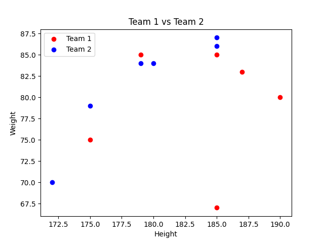
If you use fig, ax = plt.subplots() than you can use the legend method like this:
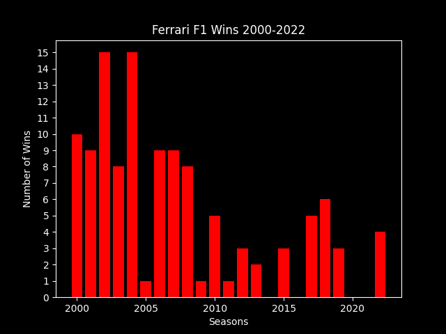
ax.legend(loc='upper left')8 Make charts in dark mode
An easy way to change the background of your chart to black is by using the dark backhtound style. This way the things that were black like texts and lines automatically become white so that they stay visible.
This is how you can select the dark background style:
plt.style.use('dark_background')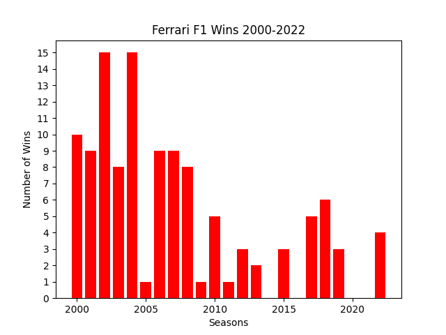
Thank you for reading!
You can get full access to all my posts by joining Medium. Your membership fee directly supports me and other writers you read. You’ll also get full access to every story on Medium:
More charts and graphs in Python: