
Beautiful Pie Charts with Python
Making pie charts in Python is fairly simple as you will soon see. It can be done with the matplotlib package which is commonly used to make data visualizations.
But we’ll go the extra mile to make sure the pie charts we create look good.
Example data: an investment portfolio
To be able to make a pie chart we of course need some data. So here is some example data of an investment portfolio:
portfolio = {'Cash':90000,'Real Estate':700000,'Stocks':375000,
             'Watches':55000,'Baseball Cards':230000}
As you can see the dictionary portfolio has 5 items. The keys are the investment categories and the values are the amounts of money that the categories are worth.
1. A basic Pie Chart with matplotlib
To be able to use the matplotlib package we first have to install it, which can be done with the command: pip install matplotlib.
If we now make a Python file we can import the matplotlib collection of functions called pyplot as follows: import matplotlib.pyplot as plt.
The function that we want to use is the pie function. As the first argument it takes a list of data points. We will send the values of our portfolio dictionary as the first argument in our function call.
We will also send the keys of portfolio as the named argument labels when calling the pie function.
Here is a full code example of creating a real basic pie chart with matplotlib:
import matplotlib.pyplot as plt
portfolio = {'Cash':90000,'Real Estate':700000,'Stocks':375000,
'Watches':55000,'Baseball Cards':230000}
labels = portfolio.keys()
data = portfolio.values()
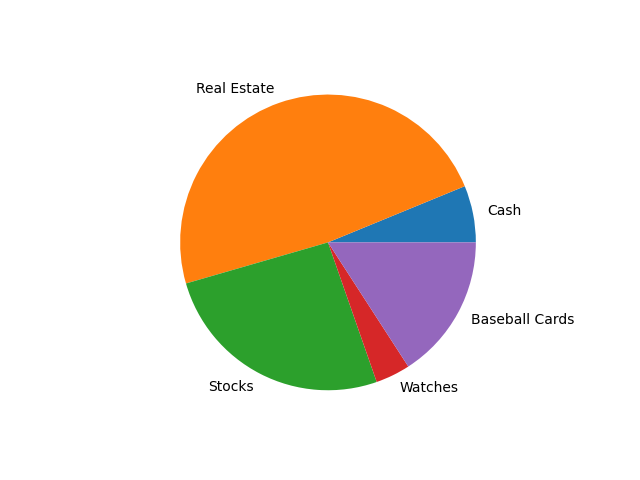
plt.pie(data,labels=labels)
plt.show()The line plt.show() makes a screen appear with our pie chart in it, the pie chart looks like this:
2. Starting our Pie Chart at 12 o’clock with wedges in clockwise direction from big to small
I believe the default way that a pie chart is graphed is by starting at 3 o’clock and adding the wedges counter-clockwise.
I want to begin with 3 changes to make our chart look better:
- Start at 12 o’clock.
- Add the wedges in the clockwise direction.
- Add the wedges in descending order of size.
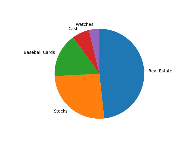
To put our first wedge at 12 o’clock we have to pass the startangle argument to the function call and give it the value 90.
To add the wedges in the clockwise direction we add the counterclock argument with value False to the pie function call.
And to add the wedges in descending order all we have to do is sort the data and labels lists from big to small.
We will first sort the portfolio dictionary on its values with the sorted function:
sorted_portfolio = sorted(portfolio.items(),
                          key= lambda key_value: key_value[1],
                          reverse=True)
We pass 3 arguments to the function:
portfolio.items()By using the items method, the result will contain key-value tuples instead of just the keys or the values we sort on. An example key-value tuple would be:('Cash',90000).- The
keyargument is used to define a lambda function that specifies how to sort. We want to sort on the value at index 1 ofkey_value. For example tuple('Cash',90000),key_value[1]evaluates to90000. - By adding
reverse=Truethe key-value tuples are sorted in descending order.
Here is what sorted_portfolio looks like in our example: [('Real Estate', 700000), ('Stocks', 375000), ('Baseball Cards', 230000), ('Cash', 90000), ('Watches', 55000)]
We can now make the labels and data lists with 2 list comprehensions:
labels = [key_value_tuple[0] for key_value_tuple in sorted_portfolio]
data = [key_value_tuple[1] for key_value_tuple in sorted_portfolio]
The lists are now in descending order: ['Real Estate', 'Stocks', 'Baseball Cards', 'Cash', 'Watches'] and [700000, 375000, 230000, 90000, 55000].
To learn more about list comprehensions you can read this short article of mine:
The code that includes the 3 improvements now looks like this:
import matplotlib.pyplot as plt

portfolio = {'Cash':90000,'Real Estate':700000,'Stocks':375000,
             'Watches':55000,'Baseball Cards':230000}

sorted_portfolio = sorted(portfolio.items(),
                          key= lambda key_value: key_value[1],
                          reverse=True)

labels = [key_value_tuple[0] for key_value_tuple in sorted_portfolio]
data = [key_value_tuple[1] for key_value_tuple in sorted_portfolio]

plt.pie(data,labels=labels,startangle=90,counterclock=False)
plt.show()
The pie chart that the code generates now looks like this:
3. Changing the colors of our pie chart
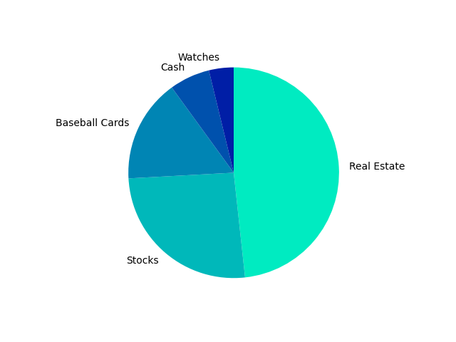
I think that other colors would make our pie chart look. So I make a list colors in which I put the hex color-codes of 5 colors: colors = ["#00ebc1", "#00b8ba", "#0085b4", "#0051ad", "#001ea6"]
And then I pass this list to the colors argument in the pie function call:
plt.pie(data,labels=labels,startangle=90,counterclock=False,colors=colors)Here is how it makes the pie chart look like:
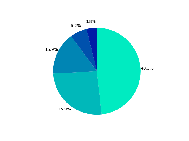
4. Showing percentages as Pie Chart wedge labels
Instead of showing the current labels I will replace them with percentages. The percentages are calculated by dividing the value of a category by the sum of all categories.
Here is how to calculate the sum off all values in data: total = sum(data).
Then we make a list called percentages with a list comprehension. percentages = ["{0:.1%}".format(value / total) for value in data]. The part {0:.1%} changes a float value like 0.33333 to a string like 33.3%.
The percentages list will look like this: ['48.3%', '25.9%', '15.9%', '6.2%', '3.8%'].
Instead of passing the old list labels to the labels argument we will now pass percentages to it:
plt.pie(data,labels=percentages,startangle=90,counterclock=False,colors=colors)This is the result:

You might notice that the 6.2% and 3.8% labels aren’t nicely centered. We can easily fix that by using the named argument textprops. The corresponding value will be a dictionary with "ha" as a key (horizontal alignment) and "center" as the value.
We also add labeldistance=1.15 to prevent the labels from overlapping our pie chart.
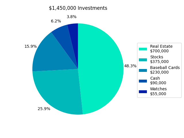
plt.pie(data,labels=percentages,startangle=90,counterclock=False,
    colors=colors,textprops={"ha":"center"},labeldistance=1.15)
Here is the new pie chart:
5. Adding a legend to our Pie Chart
You might think, without the names of the categories the chart isn’t very informative. And you are right. That is why I will now add a legend to the pie chart.
A legend can be added with the legend function. By default it takes the labels used in the pie function. But we will have to overwrite those labels.
We could just use the orignal labels list, but I will also add the investment value of each category to the labels. Here is the new labels list:
labels = ['{}\n${:,.0f}'.format(label,value)
          for label, value in zip(labels,data)]
The \n character is a newline character which puts an ‘enter’ in the text. The part {:,.0f} puts a comma as thousand separator in a number like 375000 to make it 375,000.
By default, the legend was overlapping my pie chart. But by using the loc argument in the legend function you can specify its location. I use loc=(1.02,0.25). 1.02 is to place the legend on the right and 0.25 positions the legend at a nice height.
I also had to add the function call tight_layout(pad=3) to make sure the legend doesn’t get cut off from the chart.
Finally, we will add a title to our pie chart with the title function:
plt.title(‘${:,.0f} Investments’.format(total)).
Again we used {:,.0f} to place a comma as a thousand separator in the total investment value.
Here is the full code:
import matplotlib.pyplot as plt

portfolio = {'Cash':90000,'Real Estate':700000,'Stocks':375000,
             'Watches':55000,'Baseball Cards':230000}

sorted_portfolio = sorted(portfolio.items(),
                          key= lambda key_value: key_value[1],
                          reverse=True)

colors = ["#00ebc1", "#00b8ba", "#0085b4", "#0051ad", "#001ea6"]

labels = [key_value_tuple[0] for key_value_tuple in sorted_portfolio]
data = [key_value_tuple[1] for key_value_tuple in sorted_portfolio]
labels = ['{}\n${:,.0f}'.format(label,value)
          for label, value in zip(labels,data)]

total = sum(data)
percentages = ["{0:.1%}".format(value / total) for value in data]

plt.pie(data,labels=percentages,startangle=90,counterclock=False,
    colors=colors,textprops={"ha":"center"},labeldistance=1.15)
plt.legend(labels=labels,loc=(1.02,0.25))
plt.tight_layout(pad=3)
plt.title('${:,.0f} Investments'.format(total))

plt.show()
This produces the following pie chart:
Thank you for reading!
You can get full access to all my posts by joining Medium. Your membership fee directly supports me and other writers you read. You’ll also get full access to every story on Medium:
More charts and graphs in Python:


