
Graph Quarterly Data with Python
A company’s number of sales per quarter or quarterly income statements are just 2 examples of quarterly data.
In this article I will show you how to visualize quarterly data by making graphs in Python. I will start with a simple example and work up to more complex situations. All so that you can learn how to tackle the difficulties you may encounter when making quarterly data graphs.
1. Installing the data visualization package matplotlib
One of the most well known Python packages to make data visualizations is the matplotlib package. In this article I will also use that package. It can be installed with the following command: pip install matplotlib.
To learn more about packages and how to install them you can read this short article I wrote:
2. Graphing quarterly data of one year
Suppose we have a list of the number of sales for each of the 4 quarters of 2022: sales_2022 = [7,46,93,63].
We can easily make a bar chart to visualize this sales data with 4 lines of code:
import matplotlib.pyplot as plt

sales_2022 = [7,46,93,63]

plt.bar([1,2,3,4],sales_2022)
plt.show()
On the first line we import pyplot from the matplotlib package and store it with the name plt. pyplot is a collection of functions, and we use the bar function to make a bar chart.
We pass 2 arguments to it.
- The first argument contains the x-coordinates of our bars. Our x-coordinates are
[1,2,3,4]so that we get 1 bar for each quarter. - The second argument contains the height of our bars. In our case that should be the quarterly sales data stored in
sales_2022.
With plt.show() we open up a screen in which the chart is shown.
If we run the code we get this bar chart:
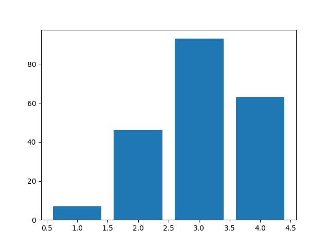
It is good to know, that the default width of a bar is 0.8 and the specified x-coordinate is by default in the middle of the bar.
Okay, so now we have a bar chart that visualizes the quarterly data, but let’s make it a little better looking.
3. Adding a title, axis labels and bar labels
Let’s begin with adding a title above our chart. This can be done with the title function to which we pass our desired title: plt.title('2022 Sales').
Then we will put labels on the y and x axis of our chart with the ylabel and xlabel functions: plt.ylabel('Sales') and plt.xlabel('Quarters').
Finally we will replace the ticks on the x axis with the numbers 1, 2, 3 and 4. This will make it look like the bars have labels. It can be done with the xticks function: plt.xticks([1,2,3,4])
After all updates our code now looks like this:
import matplotlib.pyplot as plt

sales_2022 = [7,46,93,63]

plt.bar([1,2,3,4],sales_2022)

plt.title('2022 Sales')
plt.ylabel('Sales')
plt.xlabel('Quarters')
plt.xticks([1,2,3,4])

plt.show()
Which makes our chart look like this:

4. Graphing quarterly data of multiple years
If we want to make one chart with data of multiple years we will need to come up with another method.
Here is some example data that we will visualize:
sales = {2015: [36, 53, 40, 63],
         2016: [46, 93, 99, 70],
         2017: [52, 102, 100, 63],
         2018: [52, 90, 80, 73],
         2019: [75, 120, 150, 120],
         2020: [102, 153, 198, 163],
         2021: [105, 130, 140, 133],
         2022: [120, 202, 180, 153]}
So we have 8 years and 32 quarters in total that we will have to graph.
In the previous examples we used the bar function to plot number of sales at x-coordinates 1 to 4.
But what do the x-coordinates have to be when we plot multiple years?
I choose to make x-coordinate-lists like [2015.2, 2015.4, 2015.6, 2015.8] and [2022.2, 2022.4, 2022.6, 2022.8]. So basically for each year we make a list with 4 x-coordinates that use the formula year + 0.2 * quarter.
Okay, so 4 coordinates for 4 quarters, that makes sense. But why 0.2?
This way we can plot the 2015 data between the coordinates 2015 and 2016.
I hope you remember that the coordinate will be in the center of the bar. This means that if we make our bars 0.2 wide they will range from:
2015
2015.1to2015.32015.3to2015.52015.5to2015.72015.7to2015.9
2015.9 to 2016.1 will be blank, this provides a clear distinction between the years.
2016
2016.1to2016.32016.3to2016.52016.5to2016.72016.7to2016.9
We can loop over the years and sales data in sales with:
for year, data in sales.items():
As an example, in the first iteration year will be 2015 and data will be [36, 53, 40, 63].
For each year we determine the x-coordinates with a list comprehension: x_coordinates = [year + 0.2 * q for q in [1,2,3,4]].
To learn more about list comprehensions you can read this short article of mine:
With x_coordinates done we are ready to plot the bars by using the bar function and passing x_coordinates and data to it, we will also pass width=0.2 to it.
Here is the full code example:
import matplotlib.pyplot as plt

sales = {2015: [36, 53, 40, 63],
         2016: [46, 93, 99, 70],
         2017: [52, 102, 100, 63],
         2018: [52, 90, 80, 73],
         2019: [75, 120, 150, 120],
         2020: [102, 153, 198, 163],
         2021: [105, 130, 140, 133],
         2022: [120, 202, 180, 153]}

for year, data in sales.items():
    x_coordinates = [year + 0.2 * q for q in [1,2,3,4]]
    plt.bar(x_coordinates,data,width=0.2)

plt.show()
The code displays this visualization:
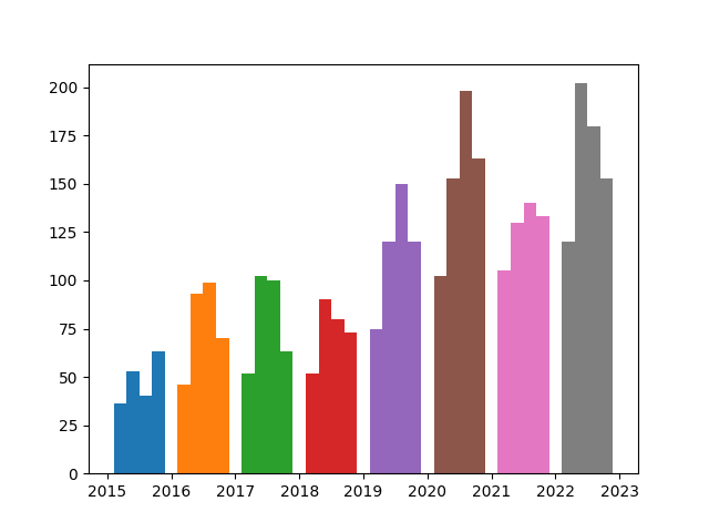
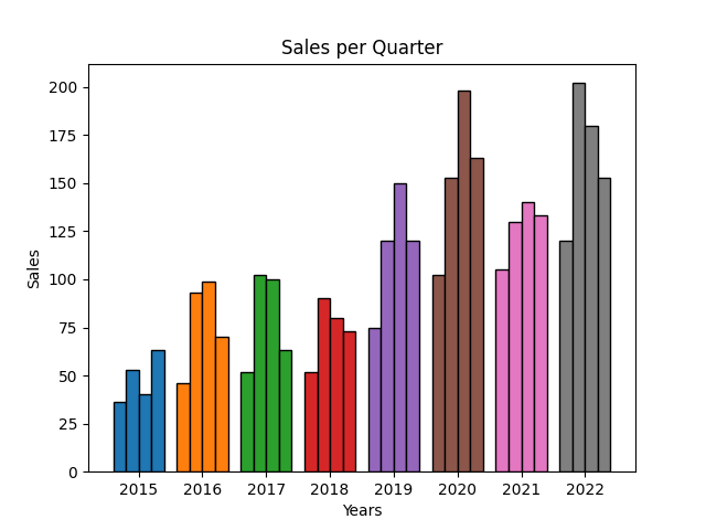
Okay, looks like it could use some improvements.
Let’s make the bars more distinguishable by giving them borders. This can easily be done by specifying an edgecolor to the bar function, for example edgecolor='black'.
And it would look better if the year labels were in the middle of each year. This can be done by using the xticks function. We have to pass 2 lists to it. The first list contains the x-coordinates at which we want to put the tick and center the label. And the second list contains the labels.
In our case we want to put the ticks at year+0.5 and the labels themselves should be the years.
Finally, we will also add a title and axis labels.
import matplotlib.pyplot as plt

sales = {2015: [36, 53, 40, 63],
         2016: [46, 93, 99, 70],
         2017: [52, 102, 100, 63],
         2018: [52, 90, 80, 73],
         2019: [75, 120, 150, 120],
         2020: [102, 153, 198, 163],
         2021: [105, 130, 140, 133],
         2022: [120, 202, 180, 153]}

for year, data in sales.items():
    x_coordinates = [year + 0.2 * q for q in [1,2,3,4]]
    plt.bar(x_coordinates,data,width=0.2,edgecolor='black')

years = sales.keys()
plt.xticks([year+0.5 for year in years], years)

plt.title('Sales per Quarter')
plt.ylabel('Sales')
plt.xlabel('Years')

plt.show()
Now it looks a lot better:
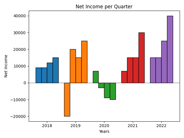
5. Graphing quarterly data with negative values
A company probably doesn’t make negative sales, but unfortunately they could have a negative income in certain quarters.
The code we just created can deal with negative values, but to make the visualization extra clear I would put a a horizontal line at y=0. That way you can easily see what quarter has a postive value, and what quarter has a negative value.
The horizontal line can easily be made with the axhline function: plt.axhline(y=0, color='black', linewidth=0.5)
This is unrelated to negative values, but sometimes the labels on the left get cut off from the image, so I also called the tight_layout function to prevent that: plt.tight_layout().
net_income = {2018: [9000, 9000, 12000, 15000],
              2019: [-20000, 20000, 15000, 25000],
              2020: [7000, -3000, -9000, -10000],
              2021: [7000, 15000, 15000, 30000],
              2022: [15000, 15000, 25000, 40000]}

for year, data in net_income.items():
    x_coordinates = [year + 0.2 * q for q in [1,2,3,4]]
    plt.bar(x_coordinates,data,width=0.2,edgecolor='black')

years = net_income.keys()
plt.xticks([year+0.5 for year in years], years)

plt.title('Net Income per Quarter')
plt.ylabel('Net Income')
plt.xlabel('Years')

plt.axhline(y=0, color='black', linewidth=0.5)
plt.tight_layout()

plt.show()
After running the code, this visualization pops up:
6. Graphing unsorted quarterly data with missing values
When you are halfway through a year you probably don’t have data for quarters 3 and 4. And when the data you are looking at only starts at quarter 3 of a certain year, quarters 1 and 2 will be missing.
In that case the above code won’t work. Because we assume we have input data in lists of 4 values. And we also assume that the quarterly data is in chronological order.
We will now transform the code so that it can deal with unsorted quarterly data with missing values like this:
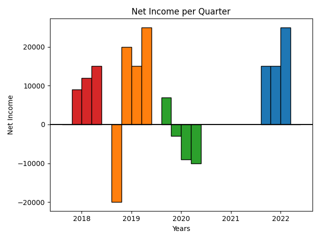
net_income = {2022: {1:15000, 2:15000, 3:25000},
              2019: {4:25000, 2:20000, 3:15000, 1:-20000},
              2020: {4:-10000, 3:-9000, 2:-3000, 1:7000},
              2018: {4:15000, 2:9000, 3:12000}}
As you can see, the years and quarters aren’t sorted, year 2021 is missing, year 2022 doesn’t have Q4 data and 2018 doesn’t have Q1 data.
We have to change the data variable that we pass to the bar function as the second argument.
By using the get method on the original data dictionary we can specify a value to use in case a key can’t be found. If we cant find a quarter because it is missing we will take value 0 so that no bar will be made for that missing quarter:
data = [data.get(q,0) for q in [1,2,3,4]]
This line of code can transform a dictionary like this: {4:15000, 2:9000, 3:12000} to a sorted list with 4 values like this: [0, 9000, 12000, 15000].
To also put a label on our chart for missing years, we make our list of years like this:
years = [y for y in range(min(net_income),max(net_income)+1)].
This way years that are not in the net_income dictionary but are between the lowest and highest years are also included.
Here is the final code:
net_income = {2022: {1:15000, 2:15000, 3:25000},
              2019: {4:25000, 2:20000, 3:15000, 1:-20000},
              2020: {4:-10000, 3:-9000, 2:-3000, 1:7000},
              2018: {4:15000, 2:9000, 3:12000}}


for year, data in net_income.items():
    x_coordinates = [year + 0.2 * q for q in [1,2,3,4]]
    data = [data.get(q,0) for q in [1,2,3,4]]
    plt.bar(x_coordinates,data,width=0.2,edgecolor='black')


years = [y for y in range(min(net_income),max(net_income)+1)]
plt.xticks([year+0.5 for year in years], years)

plt.title('Net Income per Quarter')
plt.ylabel('Net Income')
plt.xlabel('Years')

plt.axhline(y=0, color='black')
Which makes the following Bar chart:
Thank you for reading!
You can get full access to all my posts by joining Medium. Your membership fee directly supports me and other writers you read. You’ll also get full access to every story on Medium:
More charts and graphs in Python:


