
Plot Lines and Functions with Python
The Python package matplotlib is great for visualizing data. A common task is plotting a line on a graph, that is what we are going to look at in this article.
By the end of this article you should be able to plot lines on graphs like this:
Installing and import matplotlib
To be able to use the matplotlib package you have to install it, which can be done with the command: pip install matplotlib.
To learn more about Python packages and installing them you can read this article of mine.
After installing you can import the matplotlib collection of functions called pyplot as follows: import matplotlib.pyplot as plt.
How lines are plotted
A line is a connection between 2 points. If you define 2 points, a line can be drawn by coloring in the pixels between them.
The plot function
The function that we will use is the plot function that comes with the pyplot collection of functions.
The plot function can be used to plot single points on a graph, but today we are going to plot lines by specifying at least 2 points.
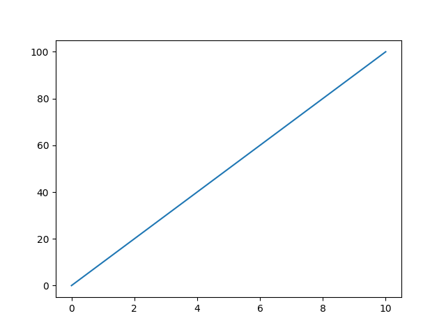
A line between 2 points
Suppose we have 2 points:
- Point 1 has X-axis (horizontal) coordinate 0 and Y-axis (vertical) coordinate 0. The coordinate would be (0,0).
- Point 2 has X-axis coordinate 10 and Y-axis coordinate 100. The coordinate would be (10,100).
We can put this data in Python like this:
point_1_x = 0
point_1_y = 0

point_2_x = 10
point_2_y = 100
And then we can draw a line between these points by passing a list with x-coordinates and a list with y-coordinates to the plot function like this:
import matplotlib.pyplot as plt

point_1_x = 0
point_1_y = 0

point_2_x = 10
point_2_y = 100

plt.plot([point_1_x,point_2_x],[point_1_y,point_2_y])

plt.show()
This is the graph with the line that the code makes:
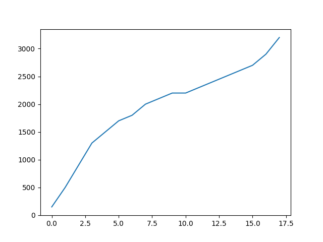
A line that connects multiple points
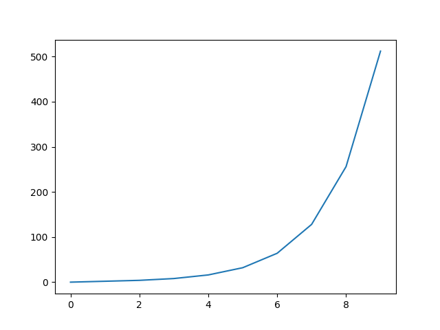
We just passed 2 lists with a length of 2 to the plot function, but these lists can also be longer.
If we use lists with 10 items in them we are basically connecting 10 points with a line.
import matplotlib.pyplot as plt

x_coordinates = [0, 1, 2, 3, 4, 5, 6, 7, 8, 9]
y_coordinates = [0, 2, 4, 8, 16, 32, 64, 128, 256, 512]

plt.plot(x_coordinates,y_coordinates)

plt.show()
The above code makes this graph:
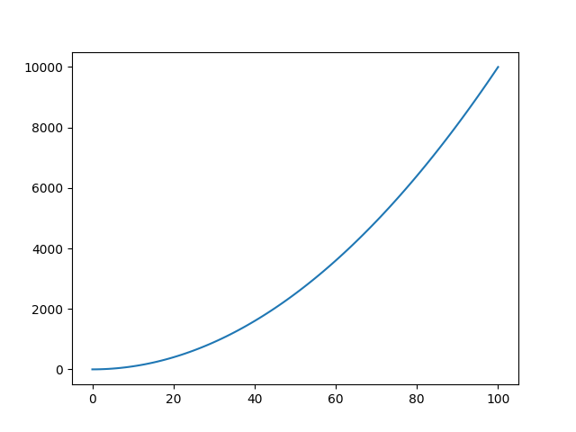
Graphing a line based on a function in Python
If we have a mathematical function like y = x², we can also easily plot that with the plot function.
First we define along which range of x values we want to plot the function. We can use a range object for that, to which we pass 2 values. The start value and the stop value. The stepsize is by default 1. But you can overwrite that by specifying a different stepsize as the third argument.
When working with ranges, if you take stop value 100 for instance, it stops 1 step before that, not at 100 itself.
So if we want to plot a function from x=0 to x=100, we can specify the range of x values as follows: x_range = range(0,101). That will generate 101 values from 0 to 100.
We can then calculate the y value corresponding to each x value in a list comprehension: y_values = [x**2 for x in x_range].
x**2 is the Python way to note x². To learn more about list comprehensions you can read this short article of mine:
The list y_values will hold 101 y values. To get an idea, here are the first 10: [0, 1, 4, 9, 16, 25, 36, 49, 64, 81].
We can pass x_range and y_values to the plot function, like we have been doing in the examples before, to plot the mathematical function:
import matplotlib.pyplot as plt

x_range = range(0,101)
y_values = [x**2 for x in x_range]

plt.plot(x_range,y_values)

plt.show()
The above code makes this graph:
Extra options for plotting lines with the plot function
The plot function allows you to customize the lines that it plots by adding arguments to the function call.
Here are 3 of those options.
- Colors, with the
colorargument you can pass a color name like'red'or a hex color code like'#FF0000'to give the line a color. - Markers, with the
markerargument you can make markers appear at the points that your line connects. Some examples are:'o'for circles,'s'for squares and'*'for stars. - Linestyle, with the
linestyleargument you can make dotted (':') or dashed('--')lines among other styles, instead of the default solid line.
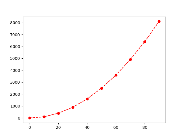
Here is an example of applying the 3 options to a plotted line:
import matplotlib.pyplot as plt

x_range = range(0,100,10)
y_values = [x**2 for x in x_range]

plt.plot(x_range, y_values, color='red', marker='o', linestyle='--')
plt.show()
The code makes the following graph:
Plotting multiple lines
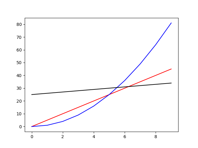
Plotting multiple lines can be easily done by just calling the plot function multiple times. Here is an example:
import matplotlib.pyplot as plt

x_range = range(0,10,1)

plt.plot(x_range, [5*x for x in x_range], color='red')
plt.plot(x_range, [x**2 for x in x_range], color='blue')
plt.plot(x_range, [x+25 for x in x_range], color='black')

plt.show()
The graph that the code makes:
Making a graph better looking and more understandable
If you want to learn how to make a simple graph more understandable and better looking by:
- adding a title
- adding labels
- setting ticks at specific values and displaying specific tick labels
- changing background color
- changing the limits of the X- and Y-axis
and more, consider reading this article of mine:
Thank you for reading!
You can get full access to all my posts by joining Medium. Your membership fee directly supports me and other writers you read. You’ll also get full access to every story on Medium:
More charts and graphs in Python: