
Op or Pop?
The art of Bridget Riley plays with perceptions and makes the viewer see things that aren’t really there……
Op Art is often presented as a ‘sub-plot’ in the development of Pop Art. As well as the similar sounding labels, this alignment arose mainly because both styles caught the public imagination around the mid-twentieth-century and entered the wider cultural arena together. Also, both offer a non-elitist primary experience to the viewer, who need not have much of a critical and contextual understanding of art to get an immediate ‘pay-off’. What you see is what you get!
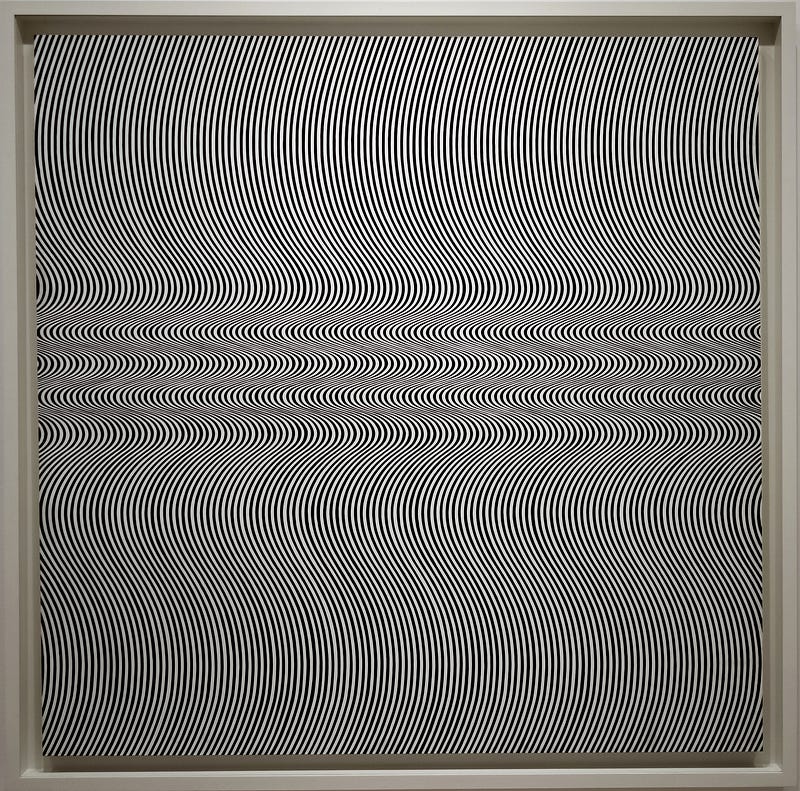
Typical of Bridget Riley’s early work, her 1964 painting Current, would be instrumental in defining the Op Art movement. After training at London’s Royal Academy, she began her career in commercial illustration often applying the Pointillist technique to build an image using distinct dots of pure colour that ‘mix in the eye’ to create subtler hues. This approach lent itself to clearly defined colour separation, well-suited to the analogue printing processes which required a different plate for each ink.
Seeing the work of Jackson Pollock, at his 1958 exhibition at London’s influential Whitechapel Gallery, piqued her interest in purely abstract painting. She also saw an extensive retrospective of the Futurists, at the 1960 Venice Biennale, and was interested in their notions of ‘dynamism’ and their pioneering spirit of experimentation.
Suddenly, her own art changed from representational Impressionism to the kind of purely abstract works she’s now known for. Current comprised lots of wavy, vertical lines of alternating black and white. The width of these lines vary subtly in relation to their curves. This creates an optical illusion of movement.
This precise, ‘zebra striped’ piece was used as the catalogue cover for The Responsive Eye, a highly influential and well-publicised exhibition at New York’s Museum of Modern Art in 1965, where works by Bridget Riley hung alongside others by Josef Albers and Victor Vasarely, fellow pioneers of the style.
Op Art is most simply summed-up as art that creates an optical illusion. This is dependant on the position of the viewer and how their eyes move and focus on the surface. The interaction of pattern and perception causes an interference effect that disrupts the integrity of that surface and will often imply actual movement and allude to three-dimensional distance and depth.
Obviously, the effect of seeing Current ‘for real’, on a gallery wall, will be different to seeing the digital representation above. Now, though, we can enjoy how the pattern, intended to work via an analogue medium, interacts and disrupts the digital experience — just have a scroll up and down to see what I mean!
This also raises interesting ideas about retinal resolution, governed by cell density of our eye biology, and the parallel with the pixels of a screen. It brings to mind Marshall McLuhan’s media theories concerning how human perception interacts with various technologies. It was also in the 1960s that he postulated that all media are the extensions of organic human faculties. For example, screen, stage, page, and picture are all effectively extensions of sight.
Why should an illusion of three-dimensionality fascinate us when the world we already inhabit is actually three-dimensional? Probably, because it highlights that what we perceive is only an internal ‘model’ of the real world, dependant on our decoding of information received via our analogue senses.
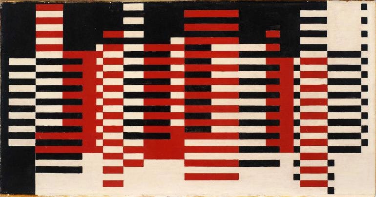
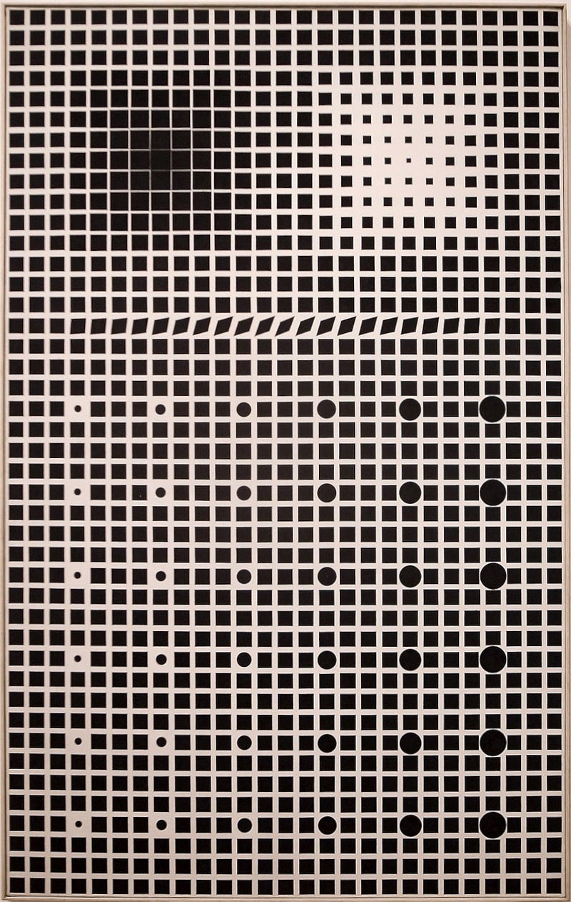
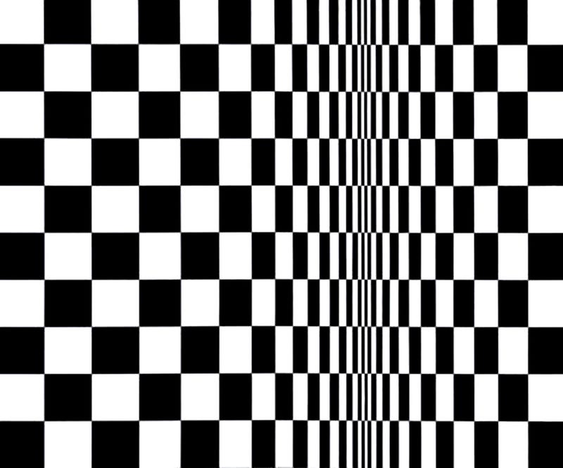
Op Art is concerned with perceptual effects rather than any explicit meanings. The shimmering and ‘strobing’ of Riley’s swirled, spotted, chequered, and striped canvasses reminds us that experiences, in general, and of art in particular, are results of physical processes. Stimulus and response: the light hits the surface of a work and this physical interaction alters the way that light is reflected, the reflected light hits our retina and this physical interaction stimulates biochemical and then neurological responses that we interpret in our very personal, internal way. These processes, even when seeing a fairly simple black and white pattern, can cause us to ‘see’ shapes, patterns and effects that are not really there, existing only as a result of looking.
Op Art is experiential. The viewer does, as Marcel Duchamp put it, complete the art. Although engagement is immediate, some knowledge of the conceptual antecedents will, I believe, enhance enjoyment by offering additional and alternative approaches to engage with the works. Riley’s Op Art owes much to the works of Georges-Pierre Seurat, whose Pointillist style she had emulated shortly before moving into optical abstractions and his work continued to be a major influence as she began introducing colour effects in the second half of the 1960s.
The optical theories of Josef Albers, which he expounded whilst teaching at the Bauhaus in the 1920s, were also a huge influence as were those of Paul Klee, his fellow teacher at the immensely influential German Design School. Similarities with some of Francis Picabia’s striped paintings are also apparent, but the most obvious predecessors are Marcel Duchamp’s Precision Optics (1920) and Rotoreliefs (1935), which used the viewer’s visual perception to create the core elements in the works that could only exist when viewed in a way prescribed by the artist.
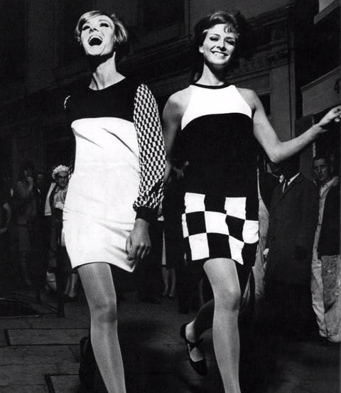
Riley’s own influence was felt strongly in the décor and fashion of the period, such as the famous black and white ‘London look’ fashions developed by Mary Quant.
* All images are used with permission or presented here for educational purposes under fair usage policy.


_(38932493384).jpg)
_by_Victor_Vasarely.jpg)