
Make the cutest charts in Python
visualize your data with hand-drawn charts
In this tutorial, I would like to introduce a very cool Python hand-painted style visualization package: cutecharts.
Different from the common charts such as Matplotlib and seaborn, this package can be used to generate the following kinds of charts that look like hand drawn, and the effect may be better in some scenarios. Cute charts are also interactive and dynamic. Whenever the mouse is hovering on the chart, the numbers show up.
To create this chart, you just need a few lines of Python codes.
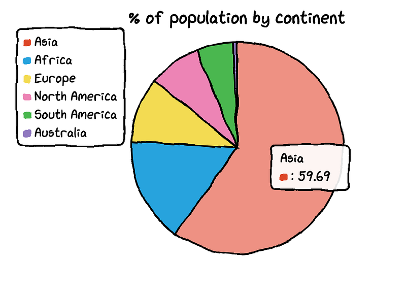
For now, this library supports five kinds of charts — Bar, Line, Pie, Radar and Scatter. It also supports combination of charts. Let us explore them one by one.
Before we start to draw cute charts, we need to install the cutechart library.
$ pip install cutechartsLet us use dataset of Toronto temperature to draw bar and line charts.
#import library and dataimport cutecharts.charts as ctc
df=pd.DataFrame({
‘x’:[‘Sun.’,’Mon.’,’Tue.’,’Wed.’,’Thu.’,’Fri.’,’Sat.’],
‘y’:[14,15,17,20,22.3,23.7,24.8],
‘z’:[16,16.4,23.6,24.5,19.9,13.6,13.4]})- Bar Chart
chart = ctc.Bar(‘Toronto Temperature’,width=’500px’,height=’400px’)
chart.set_options(
 labels=list(df[‘x’]),
 x_label='Days',
 y_label='Temperature (Celsius)' ,
 colors=[‘#1EAFAE’ for i in range(len(df))]
 )
chart.add_series('This week',list(df[‘y’]))
chart.render_notebook()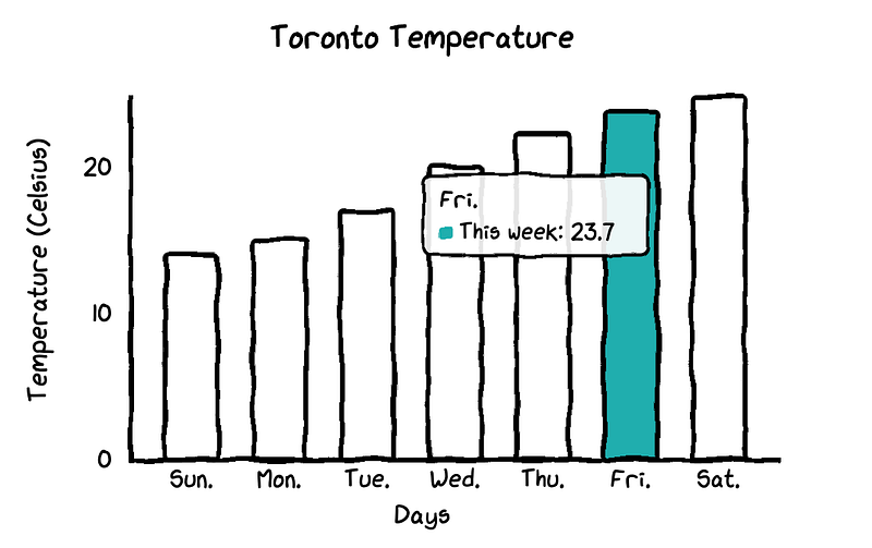
In this bar chart, all bars have the same color. If you would like to customize the colors for each bar, you just need to change one line in the codes.
chart = ctc.Bar(‘title’,width=’500px’,height=’400px’)
chart.set_options(
 labels=list(df[‘x’]),
 x_label=”Days”,
 y_label=”Temperature (Celsius)” ,
 colors=[‘#FFF1C9’,’#F7B7A3',’#EA5F89',’#9B3192',’#57167E’,’#47B39C’,’#00529B’]
 )
chart.add_series(“This week”,list(df[‘y’]))
chart.render_notebook()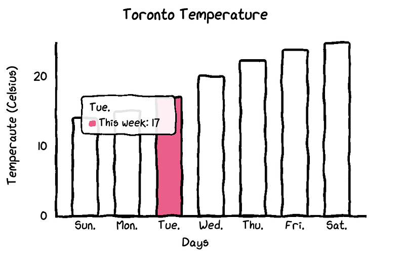
2. Line Chart
It makes more sense to draw the line chart for our dataset so that we can see the differences between temperatures of last week and this week.
chart = ctc.Line(“Toronto Temperature”,width=’500px’,height=’400px’)
chart.set_options(
 labels=list(df[‘x’]),
 x_label=”Days”,
 y_label=”Temperature (Celsius)” )
chart.add_series(“This Week”, list(df[‘y’]))
chart.add_series(“Last Week”, list(df[‘z’]))
chart.render_notebook()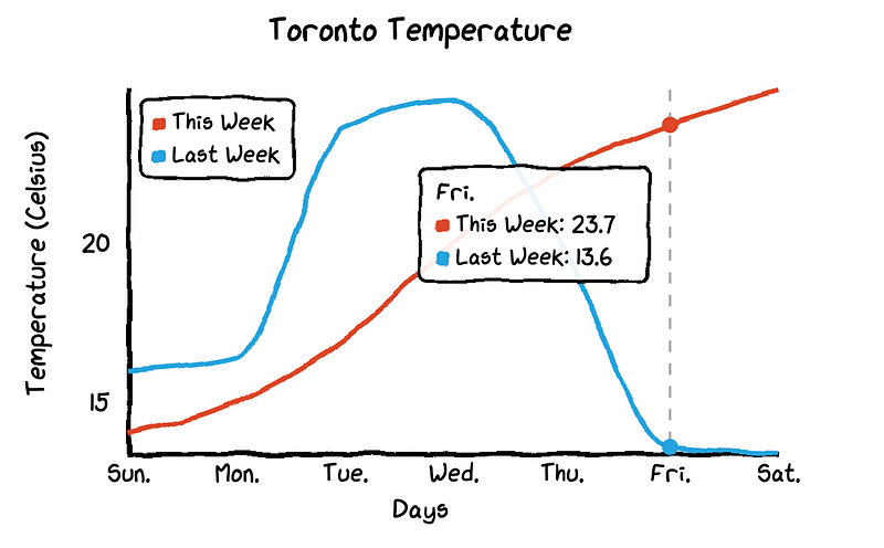
When you hover the mouse on the chart, the chart will automatically show labels with numbers and it also draws a dashed line so that the differences of temperatures between this week and last week become more visualized.
3. Radar Chart
To change the line chart to a radar chart, you just need to change the chart type to ctc.Radar.
chart = ctc.Radar(‘Toronto Temperature’,width=’700px’,height=’600px’)
chart.set_options(
 labels=list(df[‘x’]),
 is_show_legend=True, #by default, it is true. You can turn it off.
 legend_pos=’upRight’  #location of the legend
 )
chart.add_series(‘This week’,list(df[‘y’]))
chart.add_series(“Last week”,list(df[‘z’]))
chart.render_notebook()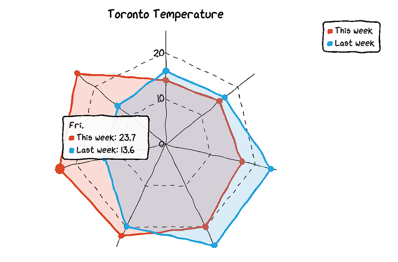
4. Pie Chart
We need another dataset to make pie and donut charts.
df=pd.DataFrame({‘x’:[‘Asia’, ‘Africa’, ‘Europe’, ‘North America’, ‘South America’, ‘Australia’],
 ‘y’:[59.69, 16, 9.94, 7.79, 5.68, 0.54]})
The datasets contains names of continents and their percentages of population.
chart = ctc.Pie(‘% of population by continent’,width=’500px’,height=’400px’)
chart.set_options(
 labels=list(df[‘x’]),
 inner_radius=0
 )
chart.add_series(list(df[‘y’]))
chart.render_notebook()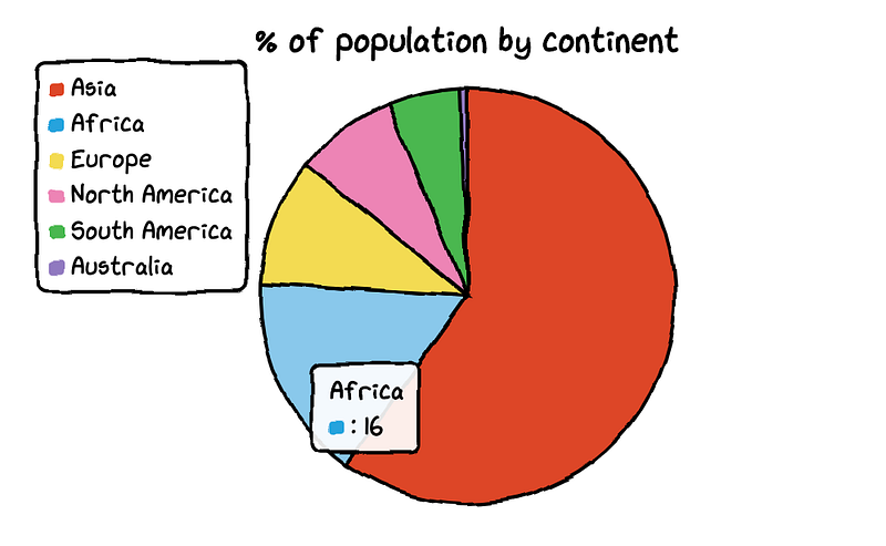
You can change the colors of each part in the pie chart.
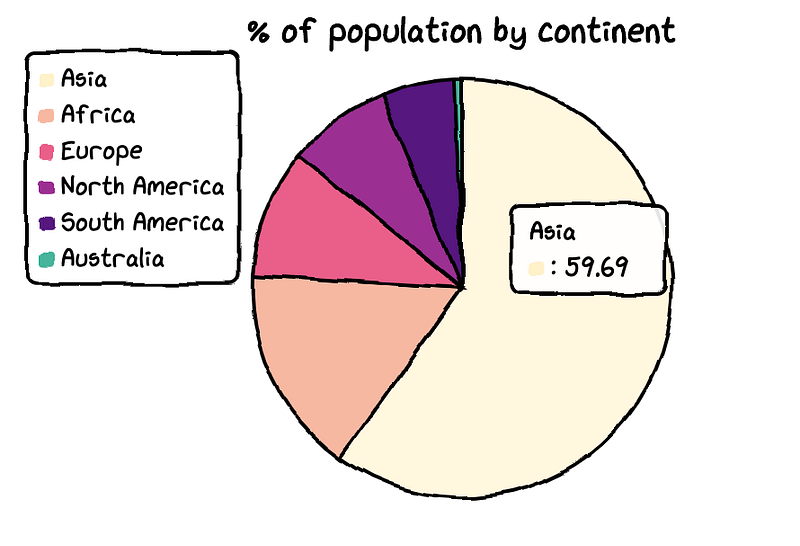
And it is also very easy to turn a pie chart in to a donut chart. You just need to change the parameter of inner_radius.
df=pd.DataFrame({‘x’:[‘Asia’, ‘Africa’, ‘Europe’, ‘North America’, ‘South America’, ‘Australia’],
 ‘y’:[59.69, 16, 9.94, 7.79, 5.68, 0.54]})
chart = ctc.Pie(‘% of population by continent’,width=’500px’,height=’400px’)
chart.set_options(
labels=list(df[‘x’]),
inner_radius=0.6
)
chart.add_series(list(df[‘y’]))
chart.render_notebook()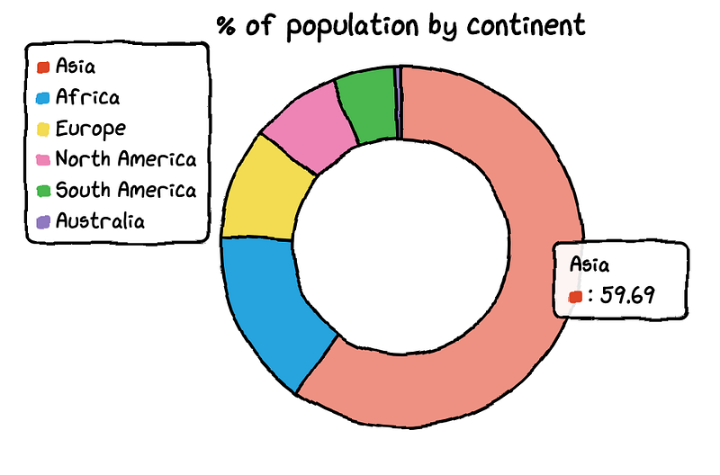
5. Scatter Plot
To plot the scatter plot, I will create a new dataset to map out the relationship between temperature and ice cream sales.
Temperature = [14.2,16.4,11.9,15.2,18.5,22.1,19.4,25.1,23.4,18.1,22.6,17.2]
Sales = [215,325,185,332,406,522,412,614,544,421,445,408]
Then, we can create the scatter plot.
chart = ctc.Scatter(‘Ice Cream Sales vs Temperature’,width=’500px’,height=’600px’)
chart.set_options(
 x_label=”Temperature (Celcius)”,
 y_label=”Icecream Sales” ,
 colors=[‘#1EAFAE’],
 is_show_line = False,
 dot_size=1)
chart.add_series(“Temperature”, [(z[0], z[1]) for z in zip(Temperature, Sales)])
chart.render_notebook()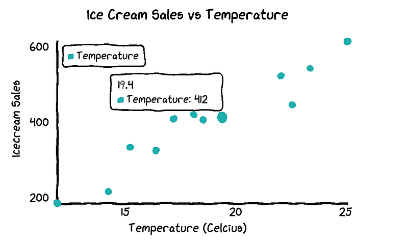
We can easily see that that warmer weather leads to more sales.
6. Combined Charts
You are also able to combine multiple charts together.
chart1 = ctc.Line(“Toronto Temperature”,width=’500px’,height=’400px’)
chart1.set_options(
 labels=list(df[‘x’]),
 x_label=”Days”,
 y_label=”Temperature (Celsius)” )
chart1.add_series(“This Week”, list(df[‘y’]))
chart1.add_series(“Last Week”, list(df[‘z’]))
chart2 = ctc.Bar(‘Toronto Temperature’,width=’500px’,height=’400px’)
chart2.set_options(
labels=list(df[‘x’]),
x_label=”Days”,
y_label=”Temperature (Celsius)” ,
colors=[‘#1EAFAE’ for i in range(len(df))]
)
chart2.add_series(“This week”,list(df[‘y’]))
chart2.add_series(“Last week”,list(df[‘z’]))page = Page()
page.add(chart1, chart2)
page.render_notebook()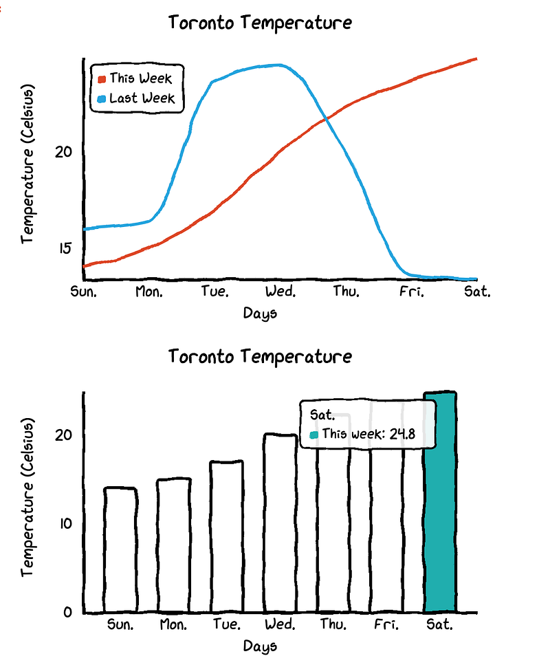
As you can see, the cutechart package can really provide impressively cute charts. The limit of this package is that it can only generate five different kinds charts.
If you are interested in making other types of beautiful charts, you may want to check out my other posts.
- Make beautiful Nightinggale rose chart in python-visualize covid19 death rate
- Make a beautiful water polo chart in a few lines in Python
- Make a beautiful bar chart in just few lines in Python
- Make a beautiful scatterplot in a few lines in Python to make your report outstanding
- Make an impressive animated bubble chart with Plotly in Python — inspired by professor Hans Rosling
- Draw a unique barplot using Matplotlib in Python


