Make a Beautiful Nightingale Rose Chart in Python
Visualize Covid-19 Death Rate
Nightingale’s Rose chart, also referred to as “polar area chart” or “coxcomb chart”, is a circular graph that combines elements of a radar chart and a column graph. This special chart is named after a nurse, statistician, and reformer Florence Nightingale. She invented a color statistical graphic entitled “Diagram of the Causes of Mortality in the Army of the East” to dramatize the extent of needless deaths in British military hospitals during the Cirmean War (1954–56). The chart showed that epidemic disease was responsible for more British deaths in the course of the war than battlefield wounds.
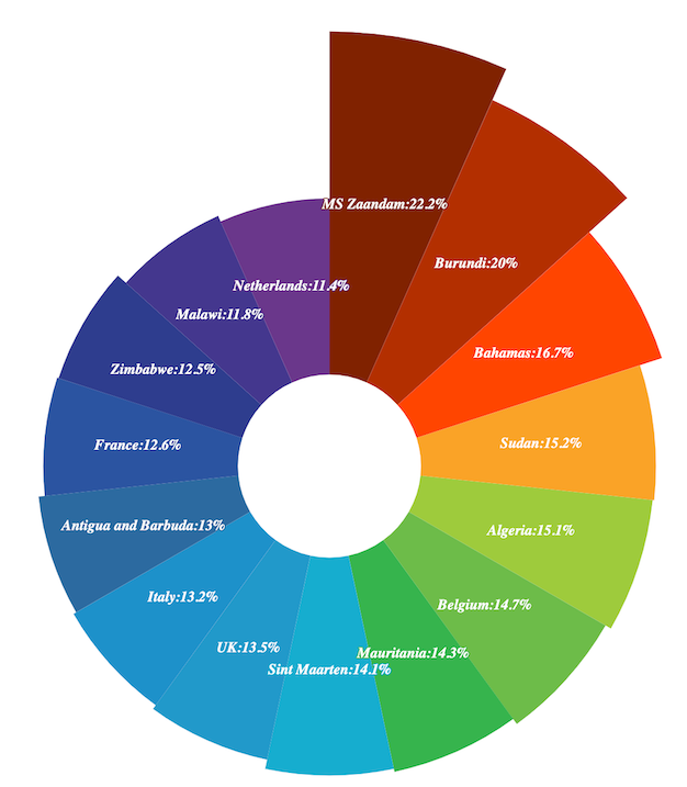
This tutorial, we will create a Nightingale rose chart in Python using the Pyechart library. We don’t even need to import data! It only takes few steps, and you will have a rose chart like this!
Step 1: import libraries
import numpy as np
import pandas as pd
from pyecharts.charts import Pie
from pyecharts import options as opts
Step 2: open the website and get data by clipboard function
import webbrowser
website = ‘https://www.worldometers.info/coronavirus/'
webbrowser.open(website)
Worldmeters refreshes covid-19 information daily with a good format, so data for this tutorial is from this website. read_clipboard() in Pandas can read, copy, paste tabular data and parse it into a Data Frame. It is a very useful function if you want to practice on small dataset. One of the limitation is that it cannot handle merged cells.
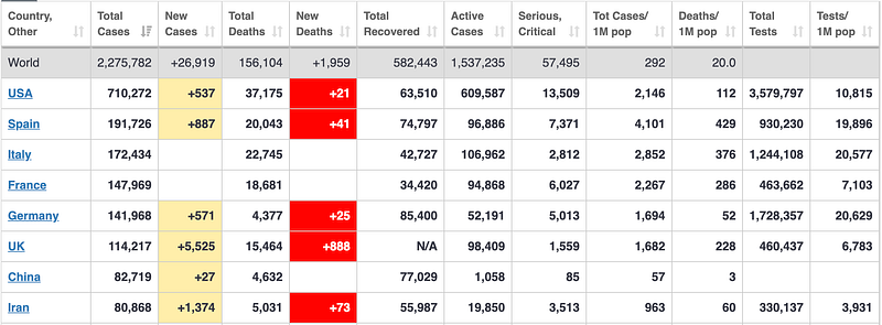
When you copy the table from Worldmeters, please do not include the first row, which has column names. Each cell in the first row is merged cell and clipboard() cannot process it. It will return error.
After you copy the whole table except the first row, execute below codes
data = pd.read_clipboard()
data
You will get a table like this
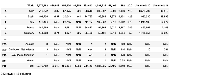
Step3: the first row will be replaced by proper column names
data.columns = [‘Country’,’TotalCases’,’NewCases’,’TotalDeaths’,’NewDeaths’,’TotalRecovered’,’ActiveCases’,’CriticalCondition’,‘TotCasesPerMillion’,’DeathsPerMillion’,’TotalTests’,’TestsPerMillion’]
data
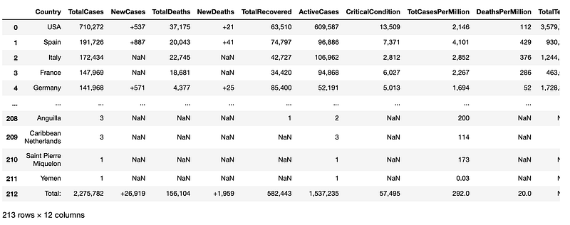
Then, the dataframe looks much better.
Step 4: data manipulation
# remove "," from the dataset
for x in range(1,len(data.columns)):
 data[data.columns[x]] = data[data.columns[x]].str.replace(‘,’,’’)
#replace NaNs with zeros
data = data.fillna(0)#change the datatype from object to integer
for i in range (1,len(data.columns)):
data[data.columns[i]] = data[data.columns[i]].astype(float).astype(int)#create a column 'Death Rate'
data['DeathRate'] = data['TotalDeaths']/data['TotalCases']#sort the data frame by 'Death Rate' in descending order
data.sort_values(by=['DeathRate'], inplace=True, ascending=False)Step 5: Select the top 15 countries which have the highest death rate
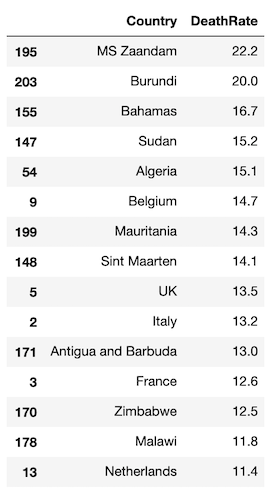
df=data[[‘Country’,’DeathRate’]].head(15) #select two columns and top 15 rowsdf[‘DeathRate’] = (df[‘DeathRate’]*100).round(1)
dfThe data frame for further visualization is ready.
Step 6: visualize the data
c = df[‘Country’].values.tolist()
d = df[‘DeathRate’].values.tolist()#create the color_series for the rosechart
color_series = [‘#802200’,’#B33000',’#FF4500',’#FAA327',’#9ECB3C’,
‘#6DBC49’,’#37B44E’,’#14ADCF’,’#209AC9',’#1E91CA’,
‘#2C6BA0’,’#2B55A1',’#2D3D8E’,’#44388E’,’#6A368B’,
‘#D02C2A’,’#D44C2D’,’#F57A34',’#FA8F2F’,’#D99D21']rosechart = Pie(init_opts=opts.InitOpts(width='1350px', height='750px'))
# set the color
rosechart.set_colors(color_series)
# add the data to the rosechart
rosechart.add("", [list(z) for z in zip(c, d)],
radius=["20%", "95%"], # 20% inside radius,95% ourside radius
center=["30%", "60%"], # center of the chart
rosetype="area")# set the global options for the chart
rosechart.set_global_opts(title_opts=opts.TitleOpts(title='Nightingale Rose Chart',subtitle="Covid-19 Death Rate"),
legend_opts=opts.LegendOpts(is_show=False),
toolbox_opts=opts.ToolboxOpts())# set the series options
rosechart.set_series_opts(label_opts=opts.LabelOpts(is_show=True, position="inside", font_size=12,formatter="{b}:{c}%", font_style="italic",font_weight="bold", font_family="Century"),)
rosechart.render_notebook()Finally, the beautiful Nightingale rose chart is generated!
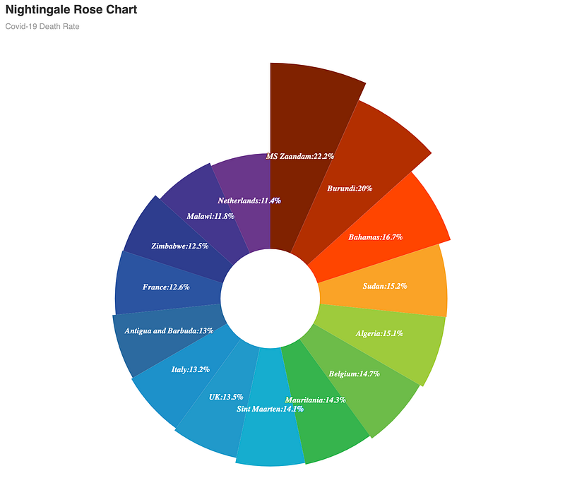
From the chart, it is easy to see that the MS Zaandam, which is a cruise ship, has the highest death rate. Next to it are Burundi, Bahamas and Sudan. And the death rates of the top 15 countries all exceeded 10%, considerably higher than the death rate of normal seasonal flu, which is typically around 0.1% in the U.S., according to The New York Times.
So, stay at home and enjoy learning data visualization!
If you are interested in making other types of beautiful charts, you may want to check out my other posts.
- Make a beautiful water polo chart in a few lines in Python
- Make a beautiful bar chart in just few lines in Python
- Make a beautiful scatterplot in a few lines in Python to make your report outstanding
- Make an impressive animated bubble chart with Plotly in Python — inspired by professor Hans Rosling
- Make the cutest chart in Python — visualize your data with hand-drawn charts