
Make a beautiful water polo chart in a few lines in Python
If you are tired of the charts you’ve seen a lot, you might be interested in placing a water polo chart in your report. The chart looks like this:
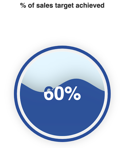
It is a dynamic chart and the water is flowing in the chart. It is very eye-catching.
To create this chart, you just need a few lines of Python codes.
Before you write these few lines of codes, you need to install the visualization package called Pyechart. It is a Python echarts plotting library. It provides more than 30 kinds of charts. The latest version is 1.7.1 and it was released on March 12th 2020. You can pip install it.
pip install pyecharts==1.7.1After the library is installed, we can start to build the beautiful chart:
#import librariesfrom pyecharts import options as opts
from pyecharts.charts import Liquid
from pyecharts.globals import SymbolTypeCode to generate the water polo chart:
c = (
    Liquid()
    .add("Completion", [0.6])
    .set_global_opts(title_opts=opts.TitleOpts(title="% of sales target achieved",pos_left="center"))
)
c.render_notebook()
You can generate the file in html format as well.
c = (
 Liquid()
 .add(“Completion”, [0.6])
 .set_global_opts(title_opts=opts.TitleOpts(title=”% of sales target achieved”,pos_left=”center”))
 #Render the water polo map as html by the render() method
 . render(“round water polo. html”)
)
You can further beautify your chart by changing some parameters.
Remove the outline of the chart
Turn the is_outline_show into False, you will remove the outline of the chart.
c = (
 Liquid()
 .add(“Completion”, [0.6], is_outline_show=False)
 .set_global_opts(title_opts=opts.TitleOpts(title=”% of sales target achieved”,pos_left=”center”))
)
c.render_notebook()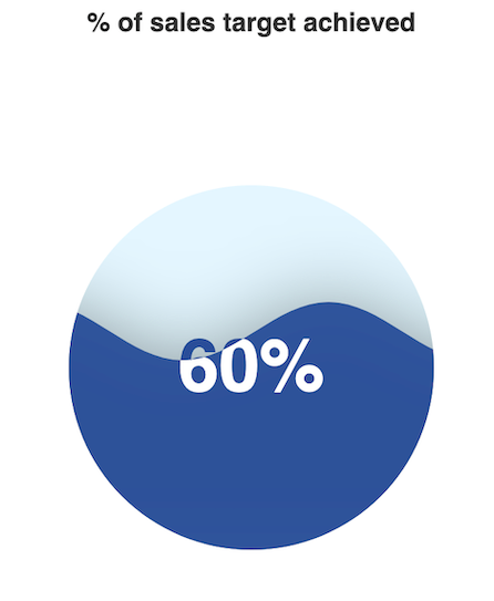
Customize the color of the water polo
add the color parameter and put the hex color code.
c = (
 Liquid()
 .add(“Completion”, [0.6], is_outline_show=False,color=[‘#7733FF’])
 .set_global_opts(title_opts=opts.TitleOpts(title=”% of sales target achieved”,pos_left=”center”))
)
c.render_notebook()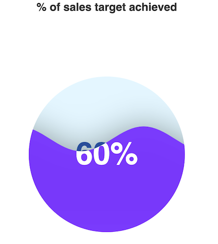
Customize the shape of the water polo chart — round rectangular
The library provides many shapes for the water polo chart. For example, Rectangular, arrow, diamond, triangle, etc. I am going to draw a round rectangular chart.
c = (
    Liquid()
    .add("Completion", [0.6], is_outline_show=False, color=['#7733FF'],shape = SymbolType.ROUND_RECT)
    .set_global_opts(title_opts=opts.TitleOpts(title="% of sales target achieved",pos_left="center"))
    )
c.render_notebook()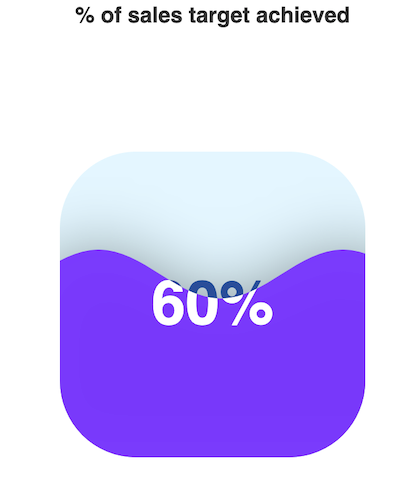
Customize the shape of the water polo chart — diamond
c = (
    Liquid()
    .add("Completion", [0.6], is_outline_show=False, color=['#7733FF'],shape = 'diamond')
    .set_global_opts(title_opts=opts.TitleOpts(title="% of sales target achieved",pos_left="center"))
    )
c.render_notebook()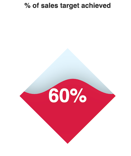
Customize the shape of the water polo chart — using SVG path method
#custom a SVG path looks like a whale
shape = ("path://M367.855,428.202c-3.674-1.385-7.452-1.966-11.146-1"
         ".794c0.659-2.922,0.844-5.85,0.58-8.719 c-0.937-10.407-7."
         "663-19.864-18.063-23.834c-10.697-4.043-22.298-1.168-29.9"
         "02,6.403c3.015,0.026,6.074,0.594,9.035,1.728 c13.626,5."
         "151,20.465,20.379,15.32,34.004c-1.905,5.02-5.177,9.115-9"
         ".22,12.05c-6.951,4.992-16.19,6.536-24.777,3.271 c-13.625"
         "-5.137-20.471-20.371-15.32-34.004c0.673-1.768,1.523-3.423"
         ",2.526-4.992h-0.014c0,0,0,0,0,0.014 c4.386-6.853,8.145-14"
         ".279,11.146-22.187c23.294-61.505-7.689-130.278-69.215-153"
         ".579c-61.532-23.293-130.279,7.69-153.579,69.202 c-6.371,"
         "16.785-8.679,34.097-7.426,50.901c0.026,0.554,0.079,1.121,"
         "0.132,1.688c4.973,57.107,41.767,109.148,98.945,130.793 c58."
         "162,22.008,121.303,6.529,162.839-34.465c7.103-6.893,17.826"
         "-9.444,27.679-5.719c11.858,4.491,18.565,16.6,16.719,28.643 "
         "c4.438-3.126,8.033-7.564,10.117-13.045C389.751,449.992,"
         "382.411,433.709,367.855,428.202z")
c = (
Liquid()
.add("Completion", [0.6, 0.5, 0.4, 0.3], is_outline_show=False, shape = shape)
.set_global_opts(title_opts=opts.TitleOpts(title="% of sales target achieved",pos_left="center"))
)
c.render_notebook()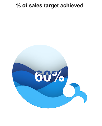
With just few lines of Python codes, you can get this beautiful water polo chart. You can customize the shape and color to make the chart even more amazing.
If you are interested in making other types of beautiful charts, you may want to check out my other posts.
- Make beautiful Nightinggale rose chart in python-visualize covid19 death rate
- Make a beautiful bar chart in just few lines in Python
- Make a beautiful scatterplot in a few lines in Python to make your report outstanding
- Animated bubble chart with Plotly in Python — inspired by professor Hans Rosling
- Make the cutest chart in Python — visualize your data with hand-drawn charts
- Draw a unique barplot using Matplotlib in Python


