
Draw a unique barplot using Matplotlib in Python
Matplotlib is the most basic and powerful library for data visualization in Python. It is a 2D plotting library that allows you to create publication-quality figures easily. Another complimentary package that is based on this data visualization library is Seaborn. It can provide a high-level interface to draw statistical graphics.
If you are tired of the bar plot generated by seaborn by default and interested in improving the quality and beauty of your bar chart, this tutorial is made for you.
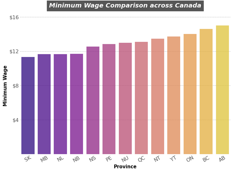
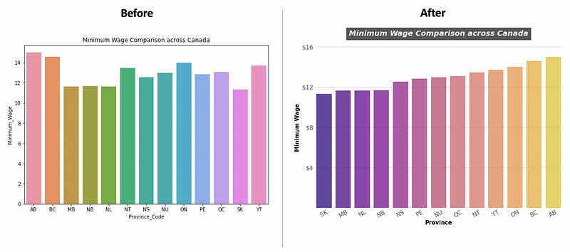
In this tutorial, we are going to build a customized bar plot using Matplotlib and seaborn. The finished bar chart will look like this.
1. Import libraries
import numpy as np
import pandas as pd
import matplotlib.pyplot as plt
import seaborn as sns
%matplotlib inline
2. Create a dataframe for data visualization
Mydict={
 ‘Province’:[‘Alberta’,’British Columbia’,’Manitoba’,’New Brunswick’,’Newfoundland & Labrador’,
 ‘Northwest Territories’,’Nova Scotia’,’Nunavut’,’Ontario’,’Prince Edward Island’,
 ‘Quebec’,’Saskatchewan’,’Yukon’],
 ‘Province_Code’:[‘AB’,’BC’,’MB’,’NB’,’NL’,’NT’,’NS’,’NU’,’ON’,’PE’,’QC’,’SK’,’YT’],
 ‘Minimum_Wage’:[‘15.00’,’14.60',’11.65',’11.70',’11.65',’13.46',’12.55',’13.00',’14.00',’12.85',’13.10',’11.32',’13.71']
}df=pd.DataFrame(Mydict)#change the datatype of minimum wage from object to float
df['Minimum_Wage'] = df['Minimum_Wage'].astype(str).astype(float)
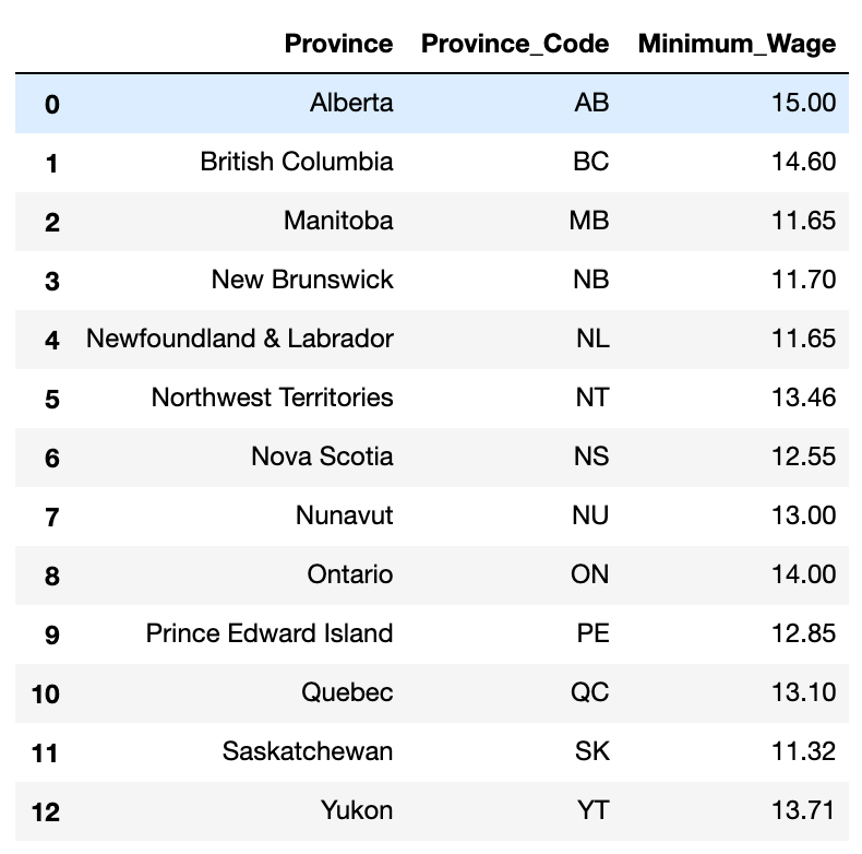
print(df.dtypes)The dataset is very simple. It contains the minimum salaries across all provinces in Canada.
3. Draw a basic bar plot
fig,ax = plt.subplots(figsize=(9,6))
sns.barplot(x=’Province_Code’,y=’Minimum_Wage’,data=df,ci=95,ax=ax)
ax.set_title(‘Minimum Wage Comparison across Canada’)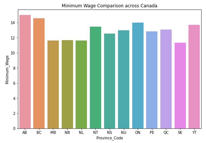
It can be clearly seen that the font of the axis labels on the horizontal and vertical coordinates is a little bit small, It is hard to read. And the scale line is not very helpful in pinpointing the real number for each bar. The first step is to enlarge the font of the axis labels and remove the scale line.
3.1 Remove the tick line
fig,ax = plt.subplots(figsize=(9,6))
sns.barplot(x=’Province_Code’,y=’Minimum_Wage’,data=df,ci=95,ax=ax)
ax.set_title(‘Minimum Wage Comparison across Canada’)

# set the font size of labels into 16 and remove the tick line
ax.tick_params(labelsize=16,length=0)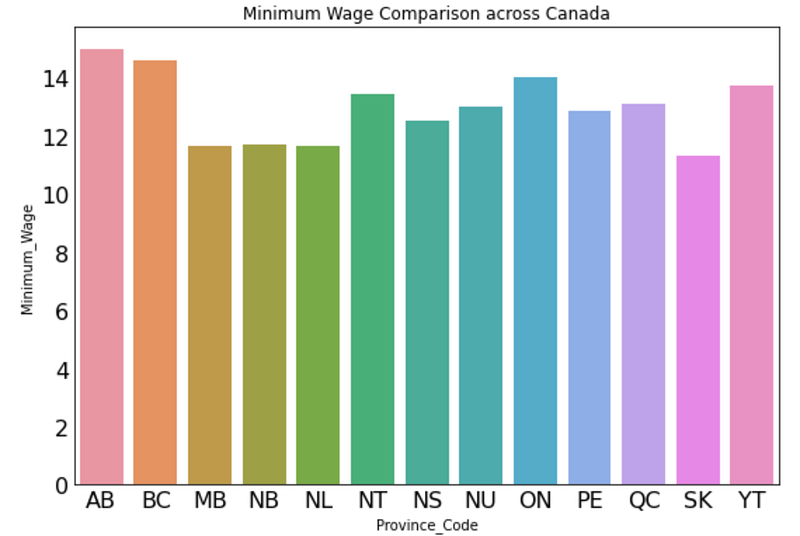
3.2 Remove the borders of the bar chart
# method 1
ax.spines[‘left’].set_visible(False)
ax.spines[‘top’].set_visible(False)
ax.spines[‘right’].set_visible(False)
ax.spines[‘bottom’].set_visible(False)#method 2
plt.box(False)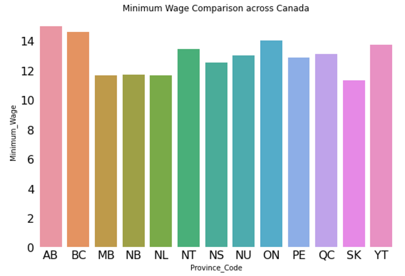
The chart is getting better already by increase fonts and removing the border lines.
3.3 Reorder the sequence of bars in the chart
fig,ax = plt.subplots(figsize=(9,6))
sns.barplot(x=’Province_Code’,y=’Minimum_Wage’,data=df,ci=95,ax=ax,
order = df.sort_values(‘Minimum_Wage’).Province_Code, #reorder bars ) #change the color of barsax.set_title(‘Minimum Wage Comparison across Canada’)
# set the font size of labels into 16 and remove the tick line
ax.tick_params(labelsize=16,length=0)
plt.box(False) #removing border lines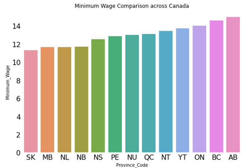
3.4 Change the color of bars
Matplotlib provides very comprehensive choices for you to choose colors. I am going to use plasma. You can try different color palette such as ‘viridis’, ‘plasma’, ‘inferno’, ‘magma’, ‘cividis’. If you would like to use one color with different shades, you can pass ‘Greys’, ‘Purples’, ‘Blues’, ‘Greens’, ‘Oranges’, ‘Reds’ to palette parameter.
fig,ax = plt.subplots(figsize=(9,6))
sns.barplot(x=’Province_Code’,y=’Minimum_Wage’,data=df,ci=95,ax=ax,
 order = df.sort_values(‘Minimum_Wage’).Province_Code, palette = ‘plasma’)
ax.set_title(‘Minimum Wage Comparison across Canada’)
ax.tick_params(labelsize=16,length=0)
plt.box(False)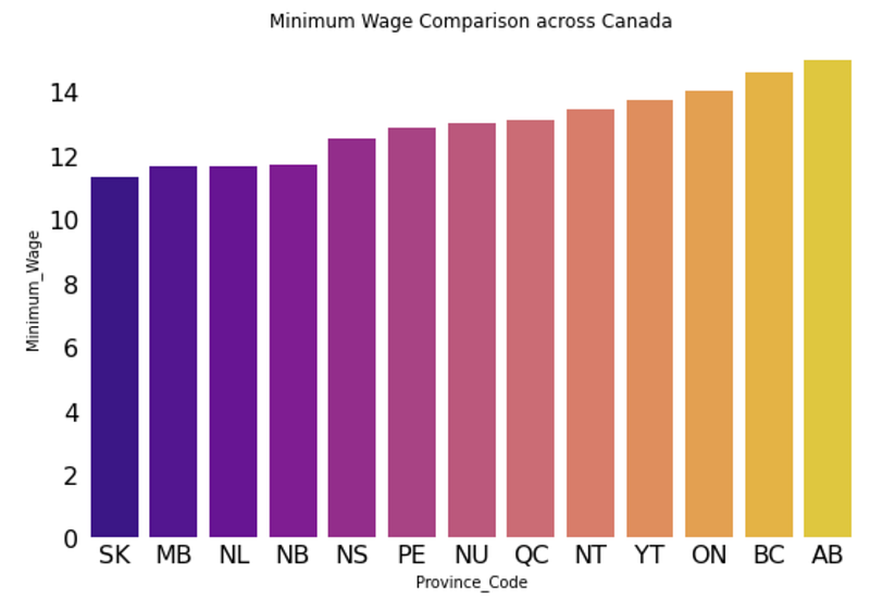
3.5 Add grid lines
Adding grid lines will help audience to pinpoint the height of each bar and have a better understanding of the numbers.
fig,ax = plt.subplots(figsize=(9,6))
sns.barplot(x=’Province_Code’,y=’Minimum_Wage’,data=df,ci=95,ax=ax,
 order = df.sort_values(‘Minimum_Wage’).Province_Code, palette = ‘plasma’)
ax.set_title(‘Minimum Wage Comparison across Canada’)ax.tick_params(labelsize=16,length=0)
plt.box(False)
# add grid lines for y axis
ax.yaxis.grid(linewidth=0.5,color=’black’)
# put the grid lines below bars
ax.set_axisbelow(True)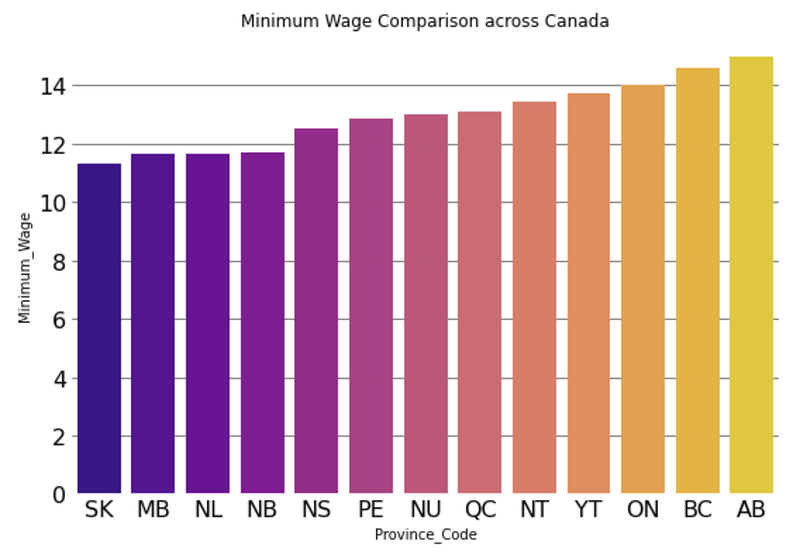
By default, the gridlines are solid lines. It can also be changed by pass variables to the parameter linestyle. You can check out more choices at the matplotlib page.
3.6 Beautify title, labels and ticks
In this step, I am going to beautify the title by giving it a background color and changing the font size and font color. Also, I am going to change the ticks and axis labels.
fig,ax = plt.subplots(figsize=(12,8))
sns.barplot(x=’Province_Code’,y=’Minimum_Wage’,data=df,ci=95,ax=ax,
 order = df.sort_values(‘Minimum_Wage’).Province_Code, palette = ‘plasma’,alpha=0.8)
ax.set_title(‘Minimum Wage Comparison across Canada’,backgroundcolor=’#565656',
 fontsize=20, weight=’bold’,color=’white’,style=’italic’,loc=’center’,pad=30)

ax.tick_params(labelsize=16,length=0)
plt.box(False)
ax.yaxis.grid(linewidth=0.5,color=’grey’,linestyle=’-.’)
ax.set_axisbelow(True)
ax.set_xlabel(‘Province’,weight=’bold’,size=15)
ax.set_ylabel(‘Minimum Wage’,weight=’bold’,size=15)plt.yticks(np.arange(0, 18, 4)) #yticks starts from 0 and ends at 18, step is 4
ax.set_yticklabels([“ “,”$4",”$8",’$12',’$16'],color=’#565656')
plt.xticks(rotation=30,color=’#565656')
plt.show()Now, you get a much more beautify bar chart.
At the very end, let us take a final look at the Before and After charts. The beautified chart is much more clear and and can help audience to read it more easily. Bars are in an ascending order. Labels and title are also informative. Grid lines is helpful in pinpointing the actual numbers of each bars.
If you are interested in making other types of beautiful charts, you may want to check out my other posts.
- Make beautiful Nightinggale rose chart in python-visualize covid19 death rate
- Make a beautiful water polo chart in a few lines in Python
- Make a beautiful bar chart in just few lines in Python
- Make a beautiful scatterplot in a few lines in Python to make your report outstanding
- Make an impressive animated bubble chart with Plotly in Python — inspired by professor Hans Rosling
- Make the cutest chart in Python — visualize your data with hand-drawn charts


