
Make an impressive animated bubble chart with Plotly in Python — inspired by professor Hans Rosling
This tutorial is inspired by professor Hans Rosling, who was a Swedish physician, academic, and public speaker. He provided many amazing TED talks regarding population, poverty, life expectancy, etc. All the animated charts in his talks are very attractive and powerful to convey the ideas.
The animated chart I am going to generate here is GDP per Capita vs Life Expectancy. And I am going to use Ploy.Express library to create the chart and it only requires a few lines. Then you will get the animated bubble chart like this,
Part 1: Data preparation
In this part, I am going to show how I prepare data in detailed steps. If you want to skip this part, you can directly go to the Part 2. Data Animation.
#import librariesimport numpy as np
import pandas as pd
import matplotlib.pyplot as plt
%matplotlib inline
import plotly.express as pxI get the data from the website called Our World in Data. You can download the data in csv format the then import the data.
#import data
df = pd.read_csv(‘life-expectancy-vs-gdp-per-capita.csv’)
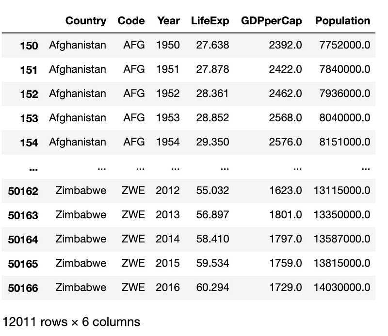
The dataset has 50170 rows and 6 columns.
# rename some columns and drop any rows with missing valuesdf.rename(columns={‘Entity’: ‘Country’, ‘Life expectancy at birth (years)’: ‘LifeExp’,
‘GDP per capita ($)’:’GDPperCap’},inplace=True)df=df.dropna(how='any')
dfThe dataset looks like this,
Then I am going to convert the data type of Year from object to datetime.
#convert data type and sort the data by Yeardf[‘Year’]=pd.to_datetime(df[‘Year’])
df[‘Year’]=df[‘Year’].dt.year
df=df.sort_values(by=['Year'])Lots of data are missing before year 1950, so I will only pick data since 1950.
df=df[df[‘Year’]>1949]The dataset doesn’t have continent information. I need this information for the chart. So I will add this information to the dataset.
#import CountryCodeCountryCode=pd.read_csv(‘https://pkgstore.datahub.io/JohnSnowLabs/country-and-continent-codes-list/country-and-continent-codes-list-csv_csv/data/b7876b7f496677669644f3d1069d3121/country-and-continent-codes-list-csv_csv.csv',sep=',')
CountryCode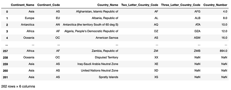
I only need two columns — Continent_Name and Three_Letter_Country_Code
CountryCode=CountryCode[[‘Continent_Name’,’Three_Letter_Country_Code’]]Merge dataset and remove the last column -Three_Letter_Country_Code.
df_final=pd.merge(df,CountryCode,left_on=’Code’,right_on=’Three_Letter_Country_Code’,how=’left’)
df_final = df_final.iloc[:, :-1] #remove last column
df_final
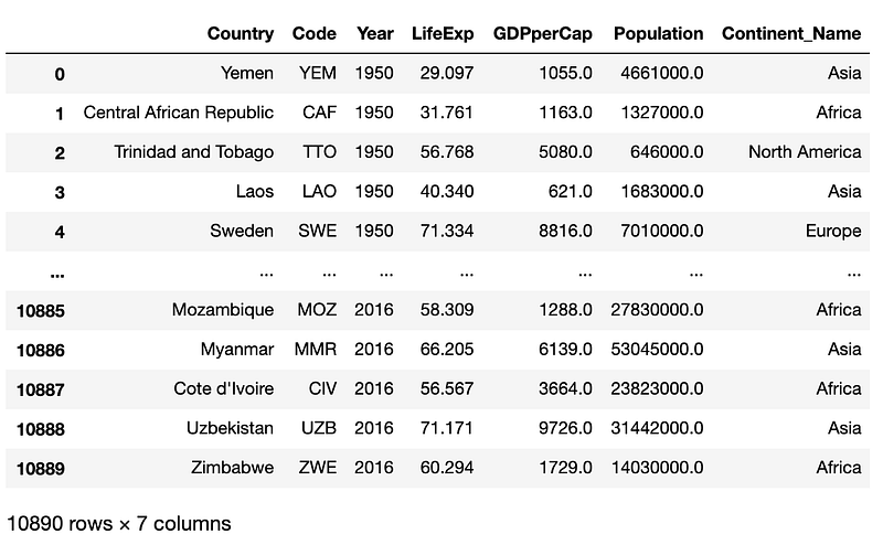
Now, we get the final dataset which includes the continent information.
The final step of data preparation is dropping missing values and sort the dataset with Year.
df_final=df_final.dropna(how=’any’)
df_final=df_final.sort_values(by=[‘Year’])
df_final
Now our dataset is ready to be used for creating the animated chart.
Part 2: Data Animation
fig = px.scatter(df_final,x=”GDPperCap”, y=”LifeExp”,animation_frame=”Year”,
 animation_group=”Country”,size=”Population”,
 color=”Continent_Name”,
 hover_name=”Country”, log_x=True,
 size_max=45,range_x=[200,150000], range_y=[10,100]
 )
fig.layout.updatemenus[0].buttons[0].args[1][“frame”][“duration”] = 700
fig.show()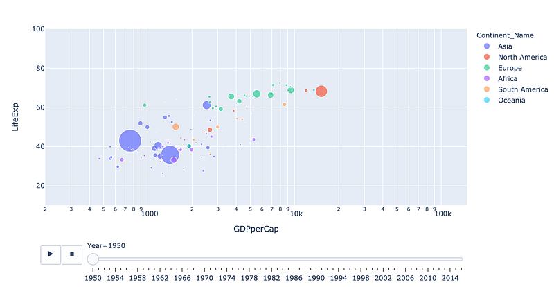
You can further beautiful the chart by adding proper titles, x and y axis labels, background colors.
fig = px.scatter(df_final,x=”GDPperCap”, y=”LifeExp”,animation_frame=”Year”,
 animation_group=”Country”,size=”Population”,
 color=”Continent_Name”,
 hover_name=”Country”, log_x=True,
 size_max=45,range_x=[200,150000], range_y=[10,100]
 )
# Tune marker appearance and layout
fig.update_traces(mode=’markers’, marker=dict(sizemode=’area’,
))fig.update_layout(
title=’Life Expectancy v. Per Capita GDP, 1950~2016',
xaxis=dict(
title=’GDP per Capita’,
gridcolor=’white’,
type=’log’,
gridwidth=2,
),
yaxis=dict(
title=’Life Expectancy (Years)’,
gridcolor=’white’,
gridwidth=2,
),
paper_bgcolor=’rgb(243, 243, 243)’,
plot_bgcolor=’rgb(243, 243, 243)’,
)
fig.layout.updatemenus[0].buttons[0].args[1][“frame”][“duration”] = 600
fig.show()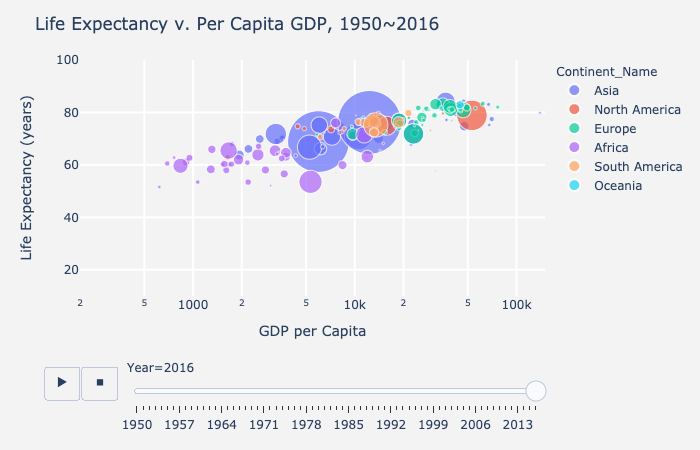
You can also draw the charts in different facets.
import plotly.express as px
df = px.data.gapminder()
fig = px.scatter(df_final, x=”GDPperCap”, y=”LifeExp”,animation_frame=”Year”, animation_group=”Country”,
 size=”Population”, color=”Continent_Name”, hover_name=”Country”, facet_col=”Continent_Name”,
 log_x=True, size_max=45, range_x=[100,100000], range_y=[25,90])
fig.update_layout(
 title=’Life Expectancy v. Per Capita GDP, 1950~2016',
 yaxis=dict(
 title=’Life Expectancy (Years)’,
 gridcolor=’white’,
 gridwidth=2,
 ))
fig.for_each_annotation(lambda a: a.update(text=a.text.split(“=”)[-1]))
for i in range(1,7):
 fig.update_xaxes(title_text=”GDP/Capita”, row=1, col=i)
fig.show()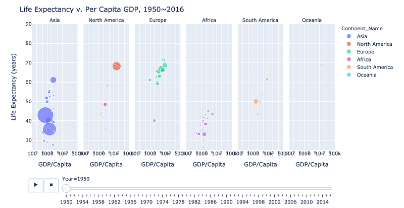
If you are interested in making other types of beautiful charts, you may want to check out my other posts.
- Make beautiful Nightinggale rose chart in python-visualize covid19 death rate
- Make a beautiful water polo chart in a few lines in Python
- Make a beautiful bar chart in just few lines in Python
- Make a beautiful scatterplot in a few lines in Python to make your report outstanding
- Make the cutest chart in Python — visualize your data with hand-drawn charts
- Draw a unique barplot using Matplotlib in Python


