How CSS Is Reducing The Need For Images— Part 2, Eye Candy
In part one I went over how I found someone making a realistic looking styled calculator on Twitter, and how I took my own stab at it without planning. I then started doing it a second time with proper planning and folowing my usual build process.
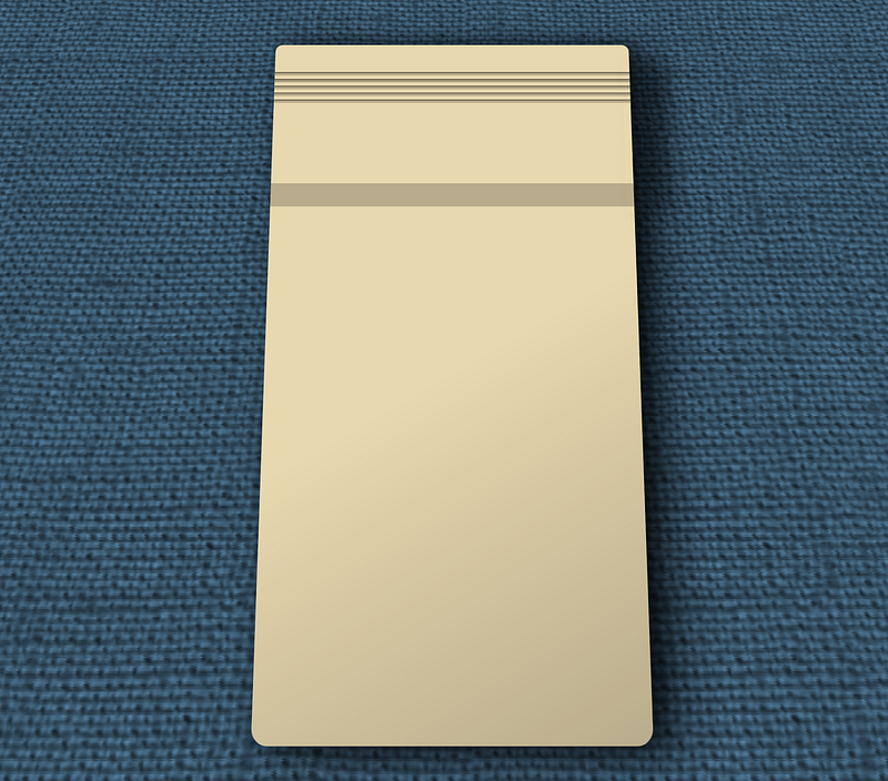
We got so far as the layout, now it’s time to start making it pretty. The initial result of which can be seen here:
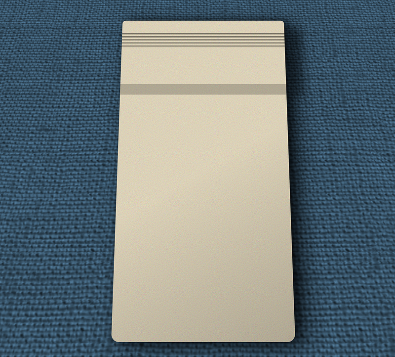
Though that’s as far as I can take it on codepen. The need for specific fonts and codepen never playing nice with my hosting means I need to move it to my own server to show you the finished product.
As with all my examples the directory: https://cutcodedown.com/for_others/medium_articles/htmlCSSCalc/
Is wide open for easy access to the gooey bits and pieces… and I tossed a .rar of the whole shebang in there too.
Stylistic Differences
Note, for those of you who don’t want to hear me rant about late ‘70’s and early ‘80’s technology and why I choose the style I did, skip down to the “coding” section.
Again the reasons for this different take was threefold.
- To see if I can do better on the implementation by thinking first instead of coding first
- To help educate others on what I consider the “best approach” of content, then markup, then layout, then and only then eye candy.
- Making it “my own” instead of trying to mimic the original picture.
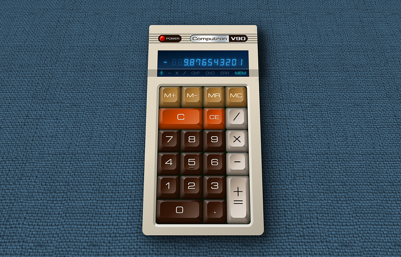
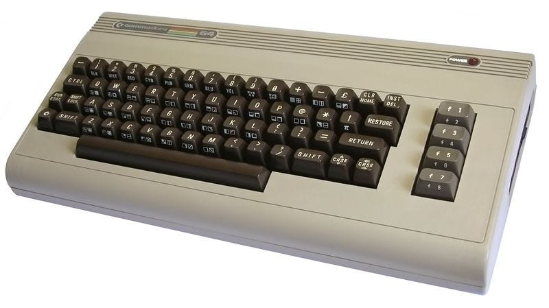
Laugh is, I didn’t even make it my own. Some of the older and more keen eyed of you might recognize my “inspiration”
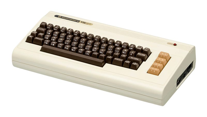
The vents across the top of the original and moving the badge up to the top instantly reminded me of it, so I just went for it. I also borrowed the greyish hue from the function keys on the C64 for the operator keys.
Even then I did make some changes. I liked the metallic of the badge showing, so I made the text that and the model number the inverted. I then made the power badge match that inverted and moved the LED to the other side.
The amber display used by most people doesn’t fit the time period as that was more of a “plasma” thing unless you went with a CRT. Whilst LED’s were starting to come into their own, calculators that used them were typically using very tiny segments… even as larger segmented displays became available, likely due to size restrictions.
So I went different. I made it look like a VFD. Vaccuum Flourescent Display.
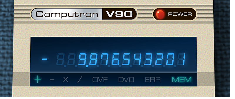
VFD’s have been around since the ‘50’s, appeared in calculators in the late ‘70’s, and were commonplace on many devices in the ‘80’s. They were in fact more common than LED displays in calculators until the price of LCD’s came way, way down. Also really good panels actually had “12 digit 8 segment plus sign”, so that’s what I implemented. A blue plastic or glass was often used not to colour them, but to filter out UV since they are in fact a close relative to how a cathode ray tube works, exciting phosphor with electrons which can emit in additon to visible light, harmful lighting as well. Such filtering became less necessary by the end of the ‘80’s which is when more “white” VFD’s started showing up in home hifi.
The flags section — where I also added indicators for the currently active operator — on many calculators of the time were far simpler. As the VFD was an off the shelf part calculator specific items were more easily implemented with a small incandescent bulb or LCD backlighting a stencil. Much akin to how indicators for things like the “check engine’ or directional signals are implemented in a car.
Not that I’ve ever driven 20k+ miles on a car with the “check engine light” on the entire time.
Because tt ends up behind the UV filter the sickly yellow of the lower power 3mm incandescent (usually 6v bulb being fed under 3v) ends up more green than the VFD. And no joke I actually had a calculator that did this. Ended up replacing the old school “burner bulb” indicators with green LED’s which were brighter and extended the battery life.
The keypad:
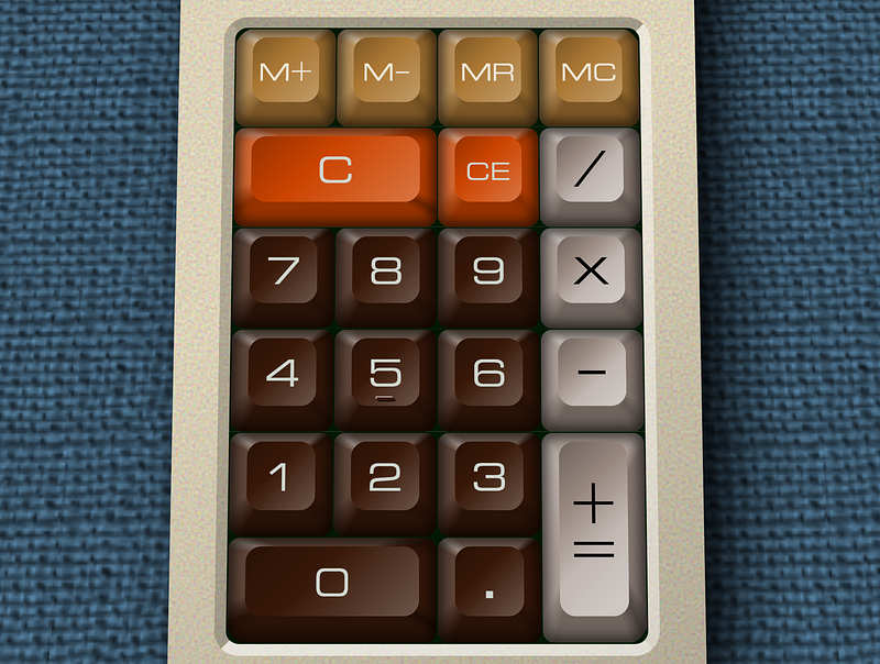
Is a lot more muted than other attempts on the lighting,l and is consistent with “low profile” cherry caps. Like those oft used with cherry “speed silver” switches. Or the keycaps from a late model Coco 1 / early Coco 2 that people called the “melted keyboard”. So not quite as shallow as laptop keyboards.
Basically, I tried to draw inspiration from real world hardware from around ’77 to ’85. Which is actually the last time I found the hardware side of things “fun”.
Let’s Talk Colours
I greatly muted everything, including what’s visually “white” because pure white when it isn’t light is a rarity in the real world. Specular highlights — referring to where a light source is reflected as if on a mirror — are one of the few places you might approach that maximum #FFF white, which is why I only used that as a base for blending, and in making the badge look metallic. Normal non-light emitting objects can only reflect what they recieve, and for things like the “white’ letters printed on a key, what you get back is usually pretty far from it.
It’s akin to that “controversial” picture of a dress where nobody could agree on what color it was (white and gold people) as some folks brains (or lack therein) when looking at a picture on a screen don’t process the natural lighting ques surrounding it.
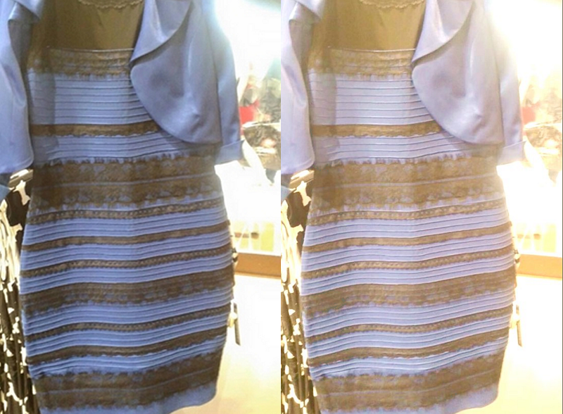
It is too this end I “muddied the colours” but stayed ‘true to hue’. Its’ when hue from ambient lighting gets involved that people short-circuit and that increases the unseased caused by the “uncanny valley” effect. Which I’m already dancing the razor’s edge on.
Thus my base list of custom properties for colours has become:
 --caseBgColor:#E8D8B0;
 --powerLampColor:#F32;
 --h1BgColor:#E8F4FF;
 --h1TextColor:#210;
 --outputBgColor:#024;
 --outputTextColor:#3AF;
 --flagsBgColor:#012;
 --flagsTextColor:#298;
 --flagsTextShadow:#089;
 --flagsOffColor:#456;
 --pcbColor:#001804;
 --buttonBgColor:#381808;
 --buttonTextColor:#D0D8D0;
 --memoryBgColor:#A73;
 --memoryTextColor:#F0E8D8;
 --clearBgColor:#C40;
 --clearTextColor:#D0D8D0;
 --operatorBgColor:#988880;
 --operatorTextColor:#000;
From there we can layer black and white translucent gradients over them to create our lighting and shaping effects.
I used hex colours becuase that’s what I’m the most comfortable with. I’ve been programming for 45 years, started out hand assembling my own RCA 1802 machine language, programmed video hardware on nearly every 8 bit platform that was out there. I think in hex. Part of why I say decimal and things based on decimal — like metric — are dumbass. You want proof metric is dumbass? They say opposites are 100 degrees of temperature from each-other, not 50. If you were ACTUALLY using metric degrees, wouldn’t there be 100 of them in a circle not 200? Shocking how many people don’t realize that 32F and 212F are 180 degrees apart.
Understanding colourspace is tricky, not very well taught, and I’m often aghast at how many of the “artists under the delusion they’re designers” are utterly devoid of the most basic knowledge of it.
Anyhow, it’s time to move on to:
More HTML And CSS, Let’s Make It Purty!
CSS is only as good as the markup it is applied to. I was pretty good at guesstimating the HTML in the prior article. There are only two major changes.
<section class="calc">

 <div class="power">POWER</div>
 <h1>Computron<span>V90</span></h1>
I gave the power LED its own DIV so that if we wanted we could manipulate it more easily from JavaScript.
<ul class="flags">
<li class="smallGlyph" data-text="+">+</li>
<li class="smallGlyph" data-text="-"></li>
<li data-text="X"></li>
<li class="smallGlyph" data-text="÷"></li>
<li title="overflow" data-text="OVF"></li>
<li title="divide by zero" data-text="DV0"></li>
<li title="error" data-text="ERR"></li>
<li title="memory" data-text="MEM">MEM</li>
</ul>The operator flags/indicators got added, with a class “smallGlyph” to indicate that in most fonts the default character is smaller than other ones. This seems a common “feature” in a lot of fonts and it’s a pain in the arse when implementing something like this.
Now, in the CSS one of the first things I did was set up perpective. As I want a background skewed separate from the body, I’ll apply that as html:before meaning we need perspective on both HTML and BODY. Perspective does not inherit.
html, body {
 perspective:30rem;
 height:100%;
}

html {
 overflow:hidden;
 background:#8CF;
}

html:before {
 content:"";
 position:absolute;
 top:-100vw;
 left:-100vw;
 right:-100vw;
 bottom:0;
 transform:rotateX(15deg) translateZ(-30em) scale(1.5);
 background:url(images/canvas_1.png) center center repeat;
}
The overflow:hidden stops the x rotated element from creating scrollbars. Then the generated content gets positioned larger than the screen everywhere but bottom. If you go below bottom the space for a horizontal scrollbar will be made even when it’s not shown. Yeah, it’s weird.
The canvas background image is actually semi-transparent black. Basically it’s a greyscale solid black with the image stored in the alpha channel. This lets our background-color show through so we can recolor the whole thing without other changes. This masking technique is handy for so many things.
*** EDIT *** a Z translation and upscale of the background had to be added because the steaming ****-show of incompetence that is Safari completely ignores HTML depth sorting rules if you apply a rotation/perspective. There’s a reason Safari is basically “the new IE”. If you were getting the “bag over your head” look from the code, well… that’s Apple’s overpriced garbage for you.
Boom, we have that desktop stretching away from us.
For the body:
body {
 overflow:auto;
 display:flex;
 align-items:center;
 justify-content:center;
 font-family:edgar,arial,helvetica,sans-serif;
}
Normally page scrolling is handled by the documentElement / HTML tag, but since we set that to overflow:hidden we can just set it on BODY instead. The flex alignment is retained from the original layout, and we add our webfont.
I went with “OPTI Edgar Condensed” as it’s free and looks very close to a classic font used on all sorts of tech products: Microgramma. See the Wikipedia article on said font for how it basically defined the look of tech products, documentation, and articles for nearly 30 years.
For our section.calc in addition to the colours, we rotate the whole thing and move it up.
 font-size:clamp(9px, min(3.75vw, 2.1vh), 1rem);

 position:relative;
 rotate:x 5deg;
 top:-1.5em;
Sliding it up is requried because the rotation makes it look like it moved down. The center without moving it is actually still center screen, but thanks to perspective the bottom is bigger than the top; The actual math worked out to 1.4983something so 1.5 is close enough. Nobody but the most annoying of pedants is going to notice 0.017em!
Hoping I don’t need to explain how to make rounded corners and box-shadows. That’s old-hat in CSS now. One tweak “tweak” is to add an extra element on the right top side to create a “fake shadow” making that secttion look taller.
.calc:before {
 content:"";
 position:absolute;
 top:1.5em;
 right:-0.75em;
 width:1.25em;
 height:10.5em;
 box-shadow:1.5em 0 1.5em #0008;
}
Box-shadow won’t work if the element doesn’t have a width, and the shadow only gets drawn off to the side so it doesn’t interfere with our content. Sliding it right makes section.calc’s shadow and this one overlap in a nuetralizing manner, making it look relatively uniform. Any “sins” in the shadow actually get hidden by the texture of our “tablecloth”.
The background of the calculator body (section.calc) is where we can start to have some real fun.
 background-color:var(--caseBgColor);
 background-image:
  linear-gradient(
   to bottom,

   transparent 2em,
   #000A 2em,
   #0003 2.125em 2.25em,
   transparent 2.25em 2.5em,

   #000A 2.5em,
   #0004 2.625em 2.75em,
   transparent 2.75em 3em,

   #000A 3em,
   #0003 3.125em 3.25em,
   transparent 3.25em 3.5em,

   #000A 3.5em,
   #0003 3.625em 3.75em,
   transparent 3.75em 4em,

   #000A 4em,
   #0003 4.125em 4.25em,
   transparent 4.25em 10em,

   #0003 10em 11.625em,
   transparent 11.625em
  ),
  linear-gradient(
   150deg,
   transparent 50%,
   #0003
  ),
  url("data:image/svg+xml,%3Csvg xmlns='http://www.w3.org/2000/svg' width='500' height='500'%3E%3Cfilter id='noise' x='0' y='0'%3E%3CfeTurbulence type='fractalNoise' baseFrequency='0.75' numOctaves='3' stitchTiles='stitch'/%3E%3CfeBlend mode='screen'/%3E%3C/filter%3E%3Crect width='500' height='500' filter='url(%23noise)' opacity='0.5'/%3E%3C/svg%3E");
Something a lot of people don’t realize… you can layer multiple background-images over each-other. Just beware that in the “painters algo” used to put things together, the one you declare last is the one that ends up on the bottom.
I am often shocked how when making things like striped backgrounds people will still resort to “DIV and SPAN” for nothing. Look at something simple like a hamburger icon where clowns like those working with bootcrap will do something like:
<div class="hamburger" onclick="toggleMenu()">
  <span class="hamburger_stripe></span>
  <span class="hamburger_stripe></span>
  <span class="hamburger_stripe></span>
</div>
Setting aside that DIV is the wrong tag and thus non alternative navigable (should be an anchor or button) and onevent attributes are incompetent trahs… those span are basically there to do what linear gradient could in the CSS requiring ZERO extra markup!
Some of you will notice I’m using 4 digit hex for colours. Both it and 8 digit hex colours are a semi-new feature in CSS and is unsupported in browsers older than 2017. Again, I think in hex for colour so for me this is well worth telling people still using XP or other lame excuses for not using a browser made in the last five years to suck it. I’ve spent 25 years catering to people who still want IE 6 support. ENOUGH!
If you really care, it’s not a big deal to switch back to RGBA, since:
#00F4 == rgba(0,0,255,0.26667) #FF000080 == rgba(255,0,0,0.5019)
I separated those bits of the declaration for a reason, let’s break them down. First we repeat this pattern five times to create the “vent lines”
   #000A 2em,
   #0003 2.125em 2.25em,
   transparent 2.25em 2.5em,
We started out transparent right up to the top of this, then we go with a dark transparency for an eighth of an EM fading into a much lighter transparency. Boom, it looks like a panel line with a slight shadow.
After doing that five times we can draw the darkened section that looks like where the top is larger and slants down into the keypad area. We do this by ending the last indentation as transparent and continuing that transparency right to the top of the “slanted” area.
   #000A 4em,
   #0003 4.125em 4.25em,
   transparent 4.25em 10em, /* end last vent */

   #0003 10em 11.625em, /* slanted area */
   transparent 11.625em /* transparent from end of slant to the bottom */
Which so far gets us this:
Instead of me going on and on explaining how linear-gradient works, just go read MDN’s page they do a far better job explaining it than I could.
To further improve the appearance another gradient can be applied as a shadow at an angle after the first one.
  linear-gradient(
   150deg,
   transparent 50%,
   #0003
  ),
Looks minor, but it gives it a lot more depth.
Finally for this part let’s texture it. When I said “no SVG” in the previous article I meant in the markup. Nothing wrong with using SVG as a background image, and in particular the various ways you can make “filters” — particularly noise — can help make things realistic. I went with such a rich “aged” plastic colour — that would send any experienced vintage computer collector diving for 92% pure hydrogen peroxide and UV lights — for a reason. Layering a texture over it can both lighten and desaturate the result.
This bit of “magic background”:
url("data:image/svg+xml,%3Csvg xmlns='http://www.w3.org/2000/svg' width='500' height='500'%3E%3Cfilter id='noise' x='0' y='0'%3E%3CfeTurbulence type='fractalNoise' baseFrequency='0.75' numOctaves='3' stitchTiles='stitch'/%3E%3CfeBlend mode='screen'/%3E%3C/filter%3E%3Crect width='500' height='500' filter='url(%23noise)' opacity='0.5'/%3E%3C/svg%3E");Giving us this:
The texturing kind-of blurs out unless you get close, but on a subconscious level it does all sorts of things to make your brain think it might not be a drawing. 3D computer graphics guys have known for ages that textures can hide a multitude of sins like low poly counts. Some of you at this point might even think that where the dark stripe for the “slanted part” is actually at a different angle than the rest, and that’s 100% optical illusion.
I only just learned this trick this week, so I’m happy to have something to test it on. Given I usually use a 20 to 60k alpha transparent PNG file for this, gutting things down to 355 bytes of SVG encoded into the CSS is more than welcome. Ooh I lovededit!
Next up we have the logo. It and the power indicator share some code, but let’s focus on the H1 for now.
.calc h1 {
 display:inline-block;
 overflow:hidden;
 padding-left:0.5em;
 margin-bottom:1.875em;
 font-size:0.875em;
 line-height:1.5;
 color:var(--h1TextColor);
 background:
  var(--h1BgColor)
  linear-gradient(
   280deg,
   #FFFE 30%,
   #0004 40% 50%,
   #FFFE 65% 79%,
   #0004 100%
  );
 border-radius:1em;
 border:0.1em solid;
 border-color:#000 #0006 #0004 #000B;
 box-shadow:
  0 0 0 0.15em var(--caseBgColor);
 text-shadow:
  0.0625em 0.0625em 0 #FFF;
}

.calc h1 span,
.calc .power {
 display:inline-block;
 position:relative;
 vertical-align:top;
 color:var(--h1BgColor);
 background:var(--h1TextColor);
}

.calc h1 span {
 padding:0 0.5em;
 margin-left:0.5em;
 font-weight:bold;
 letter-spacing:0.125em;
 text-shadow:
  0.125em 0 0 #FFF;
}
I made it inline-block so that it shrunk to the content size. For the most part this shouldn’t be too hard for anyone qualified to work with CSS to decipher, the only big standout is the linear-gradient which with nothing more than overlapping alternating white and black translucent gradients, gives us the appearance of metal. Again the closer you get to white, the more it will feel like a reflection or light source, ideal for things like metal textures or glass effects.
The power button gets floated right.
.calc .power {
 float:right;
 padding:0 1em 0 3.5em;
 font-size:0.5em;
 line-height:2.975;
 border-radius:1.7em;
 box-shadow:
  0 0 0 0.2625em var(--caseBgColor);
}
The large side padding making room for the power LED. I have to redeclare all the top/bottom sizing because the font-size is different. We wouldn’t have to do that if we used REM, but then we lose the ability to change the size of the entire calculator separate from the rest of the page. Thankfully since I work in 1/16th of a EM on primary elements, siblings of different font-sizes aren’t too hard to do the math on. It’s all just basic multiplication and division.
The power LED is built using generated content.
.calc .power:after {
 content:"";
 position:absolute;
 left:0.75em;
 top:0.5em;
 width:1.75em;
 height:2em;
 border-radius:1em;
 background-color:var(--powerLampColor);
 background-image:
  radial-gradient(
   at 25% 20%,
   #FFFC 0.25em,
   transparent 0.3em
  ),
  linear-gradient(
   -30deg,
   #0006,
   transparent
  );
 box-shadow:
  inset 0.0625em 0.125em 0.125em var(--powerLampColor),
  inset 0.25em 0.25em 0.25em #FC48,
  0 0 0.5em 0.125em var(--powerLampColor);
}
Multiple linear gradients and inset box shadows giving us a relatively simple way to fake what looks like a bulb. By making it a hair taller than it is wide, it further enhances the feel we’re looking at things from an angle, nor from straight down. An outer box-shadow of the same color as the lamp adds a hint of “glow”. That inner #FC48 transparency is the inside reflection of the area surrounding the bulb, this is more yellow based on the case colour. This gets blended into the LED and gives it a hint more realism.
The output was a lot easier than it looks.
.calc output {
 clear:both;
 position:relative;
 display:block;
 padding:0.5em 0.5em 0;
 font-size:2.125em;
 font-family:lcd,monospace;
 letter-spacing:0.125em;
 text-align:right;
 color:var(--outputTextColor);
 background-color:var(--outputBgColor);
 background-image:
  linear-gradient(
   170deg,
   #0007,
   transparent 50%
  ),
  linear-gradient(
   to bottom,
   transparent,
   #FFF1 92.5%,
   #FFF4 100%
  );
 text-shadow:
  0 0 0.25em var(--outputTextColor);
}
Layout-wise apart from padding and font size differences our original code holds up. The big additions are colours and the use of linear gradient to fake the appearance of “depth” and reflection. It’s actually shocking how a black fade to transparent halfway across at an angle can make something look like you’re viewing through clear plastic if the contents are offset from the top. I could have used an inset box-shadow for the reflection, but since I was there working with linear gradients I figured what the hell, why not use that instead. Finally the text-shadow in the same colour as the text makes it look like the letters are glowing.
I used a variable tag to isolate the sign indicator so we didn’t need classes. It is a variable in that it’s a separate state from the rest of the number, so I consider that acceptable. To put it left, I float it.
.calc output var {
 float:left;
}
Now one detail of VFD’s, LED’s, and other “segmented” displays is that you can usually see the element even when it’s not lit. That means all our digits, periods, and the minus sign have to be drawn again. To do this quick and easy I just left the text-color alone and reduced the opacity.
.calc output:after,
.calc output:before,
.calc output var:before {
 opacity:0.2;
 text-shadow:none;
}
Killing off the text-shadow whilst at it. All of these are created using generated content.
.calc output:before,
.calc output var:before {
 display:block;
 margin-bottom:-1.5em;
}

.calc output:after {
 content:"...........";
 position:absolute;
 bottom:0;
 right:1em;
}

.calc output:before {
 content:"888888888888";
}

.calc output var:before {
 content:"-";
}
For the 8’s and minus sign we can just make them display:block and then use a negative margin equal to the line-height to slide the line after it (the actual content) up over it. Only the row of periods / decimal places needs any fancy positioning, and even that’s a simple matter of bottom and right alignment.
Now the period inside the number got a span for a reason, it needs to sit between the decimal places, not act as one as that’s not how LCD’s work. I could have tweaked this in the font, but for better versatility simply making the element zero width in flow using negative margins:
.calc output span {
 display:inline-block;
 width:1em;
 margin:0 -0.3125em 0 -0.6875em;
 text-align:center;
}
gets the job done. All we needed to do was make it inline-block so we can declare a width, then shrink the sides. The amount of margin adjustment I manually tweaked until it was where I wanted it. So long as your negative margins total the same as the width, and you align the text center, you should be good.
The flags list:
.flags {
 display:flex;
 align-items:stretch;
 margin-bottom:1.5em;
 text-align:center;
 background-color:var(--flagsBgColor);
 background-image:
  linear-gradient(
   transparent,
   var(--outputBgColor)
  );
}

.flags li {
 list-style:none;
 flex-grow:1;
 text-align:center;
 font-size:0.75em;
 line-height:2.125;
 color:var(--flagsTextColor);
 text-shadow:
   -0.125em 0 0.25em var(--flagsTextShadow),
   0.125em 0 0.25em var(--flagsTextShadow);
 transform:scaleX(0.8);
}
gets flex to space them evenly, font size, colouration, again kind of a yawn. The gradient fade of the outputBgColor over the darker flagsBgColor completes the effect of the container itself. The only real trick here is I used a scaling transform to dodge the fact that the smaller font needed might go below browser minimums on smaller screens. (like my old 7" tablet with the 480x800 display).
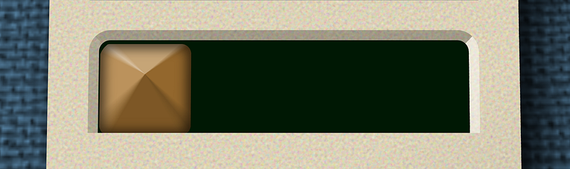
As with the output area, we want the text to be slightly visible even when not “lit”. Because I put the text of each LI in data- attributes, we can access them to plug them in using the attr() command thus:
.flags li:before {
 content:attr(data-text);
 display:block;
 margin-bottom:-2.125em;
 text-shadow:none;
 color:var(--flagsOffColor);
}
Using the same negative bottom margin trick to make them underlap the actual content.
From there I just tweak the appearances ever so slightly.
.flags li.smallGlyph {
 font-size:1em;
 font-weight:bold;
 line-height:1.59375;
}

.flags li.smallGlyph:before {
  margin-bottom:-1.59375em;
}

.flags li[data-text="X"] {
 font-weight:bold;
}
Bumping the small glyphs and making the “X as multiply” consistent in size with the other operators. Note, using CSS variables / custom properties here could clean up the code… though it could also make it harder to understand.
For the fieldset we want a shadow/hightlight around the keys. Normally a box shadow would get it done, but that would involve an extra element in the markup. If we try to apply it to each of the fieldsets there’s overlaps making where the fieldset “meet” eachother have visual imperfections. If only there was a CSS property for applying colours on the sides of an object, that obeyed border radius, that only effects the side you tell it to.
Oh wait, there is. BORDER.
.calc fieldset {
 overflow:hidden;
 width:19.3125em;
 padding-right:0.0625em;
 background:var(--pcbColor);
 -webkit-background-clip:padding-box;
 background-clip:padding-box;
 border-style:solid;
 border-width:0 0.5em;
 border-color:#0004 #FFF7 #FFF9 #0003;
}

.calc fieldset:first-of-type {
 border-radius:1.0625em 1.0625em 0 0;
 border-top-width:0.5em;
}

.calc fieldset:last-of-type {
 padding-bottom:0.0625em;
 border-radius:0 0 1.0625em 1.0625em;
 border-bottom-width:0.5em;
}
The problem is our “Printed circuit board” colour would show through as normally the background of an element goes UNDER its border. Solution? change the background-clipping behavior. Simply saying “padding-box” makes the background not bleed under the border. We can then use first or last of type to round the top and bottom corners at our first and last fieldset, turning on/off the top/bottom borders as appropriate.
Bringing us finally to the thing people keep asking me about: “How the devil are you doing those keys with just a BUTTON and SPAN… and if I weren’t obsessed with scaling I wouldn’t even need the span.
The “savior” here is conic-gradient.
.calc button {
 position:relative;
 overflow:hidden;
 float:left;
 width:4.5em;
 height:4.5em;
 margin:0.0625em 0 0 0.0625em;
 padding-bottom:0.875em;
 border:0;
 border-radius:0.5em;
 color:var(--buttonTextColor);
 box-shadow:inset 0 0 0.5em 0.25em #0009;
 --transitionTime:0.3s;
 transition:
  top var(--transitionTime),
  transform var(--transitionTime),
  box-shadow var(--transitionTime);
 background:
  var(--buttonBgColor)
  conic-gradient(
   at 50% 1.5em,
   #FFF5 49deg,
   #0002 58deg 130deg,
   #0005 140deg,
   #0004 150deg 210deg,
   #FFF3 230deg 296deg,
   #FFF8 306deg,
   #FFF5 316deg
  );
}
Which by itself gives us:
As the center is offset this time around I went in and manually tweaked the corner angles. This has to be done again for the wide and tall buttons.
.calc button.tall {
 float:right;
 height:9.0625em;
 margin-left:-0.25em;
 background-image:
  conic-gradient(
   at 50% 3.75em,
   #FFF3 27deg,
   #0002 37deg 150deg,
   #0007 158deg,
   #0004 165deg 197deg,
   #FFF3 207deg 225deg,
   #FFF5 330deg,
   #FFF3 335deg
  );
}

.calc button.wide {
 width:9.0625em;
 background-image:
  conic-gradient(
   at 50% 1.25em,
   #FFF3 65deg,
   #0002 75deg 115deg,
   #0007 120deg,
   #0004 125deg 240deg,
   #FFF3 252deg 280deg,
   #FFF7 285deg,
   #FFF3 290deg
  );
}
But apart from that they are the same code as in the last article.
The ability to draw a graident in a circle from one colour to the next is really powerful. Again, see MDN’s documentation to learn more.
Again notice how I’m using nothing but differing opacities of white and black here to create shadow and light, letting the underlying background-color show through.
I also have this little tweak:
.calc button:last-of-type {
 margin-right:-0.25em;
}
Firefox is an idiot at calculating perfect widths with floats, often adding an extra pixel. Since I declared a fixed elastic width for wrapping and other behaviors, a negative margin on the last element of each fieldset avoids any of FF’s goofy “why is this dropping down to the next line” rubbish.
A problem that as a large font user (1 rem by default is not 16px) I encountered a lot, another of the many reasons I don’t use FF as my daily driver — even if it is my #1 browser for testing and debugging.
Ok, next we use generated content to create the “face” of the button.
.calc button:before {
 content:"";
 position:absolute;
 top:0.375em;
 bottom:1.125em;
 left:0.75em;
 right:0.75em;
 border-radius:0.6875em;
 background:
  var(--buttonBgColor)
  linear-gradient(
   135deg,
   #0004,
   transparent 40%,
   #FFF4 100%
  );
}
The simple angled linear gradient creating the “feel” that the surface is concave. Which looks like this:
Hey, that’s a keycap. Add the text back in, and all the other buttons and fieldsets, and boom. Job done. The way the highlight top-left gets cut off also helps it look like a blurred specular — aka reflective /mirror-like— highlight instead of just shading. I’d be tempted to use a radial-gradient there as a second layer atop it to create a “fullbright” spot, but that might be taking things too far.
And because we used transparent layers of gradients and shadows, the code for the different colours, font-sizes, and so forth already exist. All I had to do was tweak their values for the final font!
One last trick up my sleeve is the hover states. See above how the button has:
--transitionTime:0.3s;
transition:
  top var(--transitionTime),
  transform var(--transitionTime),
  box-shadow var(--transitionTime);
I don’t say all because that can trigger animation when it loads, and adds rendering overhead. But with that simple bit of code all had to do for keydown on focus/hover is:
.calc button:focus,
.calc button:hover {
 top:0.125em;
 transform:scale(0.97);
 box-shadow:inset 0 0 0.5em 0.5em #0007;
 --transitionTime:0.1s;
}
Slide it down a bit, shrink it, and increase the shaodw size. I also decrease the variable “transitionTime” so that pushing the key down takes 1/10th of a second, while it coming back up is slower. Another reason native custom properties (aka “CSS variables”) are way more powerful and useful native than they ever were via preprocessors. And why until we had them native, I never entirely saw their usefulness.
As a final tweak, let’s add an indexing “nib” to the 5 key by using class=”index” and this CSS:
.calc button.index:after {
 content:"";
 position:absolute;
 top:3em;
 left:50%;
 width:0.75em;
 height:0.125em;
 transform:translateX(-50%);
 background:var(--buttonBgColor);
 box-shadow:
   0.0625em 0.0625em 0 #000C,
   -0.0625em -0.0625em 0 #FFF8;
}
I could have used a minus sign and text shadow for this, but I wanted it consistent irregardless of which font was in use.
And that’s basically all the changes I made since the initial layout. Again:
- Content
- Semantic Markup
- Layout for each media target
- Eye Candy / Paintover (adjusting layout as needed)
- Part III of this series?
Conclusion
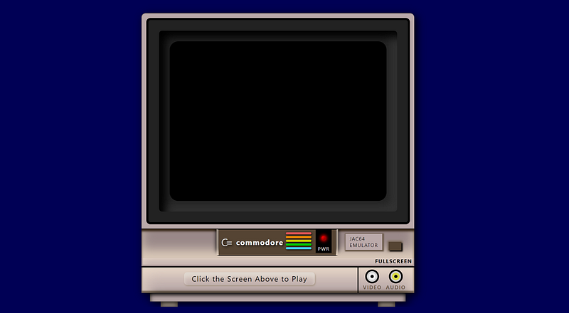
I have to say I impressed myself with these results. I mean, it’s not like I’ve not been doing drawings in CSS for well over a decade and a half. I mean for example this page on my retrocomputing/hobby site:
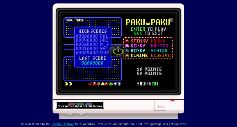
The monitor around the JavaScript DOS emulator? One of the first things I did when we got box-shadow, linear-gradient, and border-radius well over a decade ago. Which led to this follow-up for the Commodore 64 version of my little Pac Man for 1982–1984 computers:
But even so those are clearly computer drawn and pretty far off from realistic looking.
And yes, I’m THAT “Jason M. Knight” who didn’t get the memo people don’t write games for DOS anymore. Which is why I’m also in the planning stages of writing a new one right now… with lower minimums specs than Paku Paku had.
One thing about building stuff with HTML and CSS like this is it reminds me of programming graphics using BASIC ROM routines on devices like the Apple ][, TRS-80 Coco, and so forth back in the late ‘70’s and early ‘80’s. Those computers came with graphcis primitive routines for drawing polygons, circles, and rectangles, and had built in floodfill routines much akin to what paint programs had. A number of “picture at the top, text adventure at the bottom” games used this method.
One of my favories was “Black Sanctum” on the Coco.
Some didn’t bother backbuffering and were hobbled by the CPU and graphical limitations, to the point you could see it being drawn on screen during scene transitions. This was very common amongst games written in Basic, or those that were just really early on their respective platforms. “Mystery House” for the Apple II comes to mind.
Laugh is before I came across this calculator idea I’ve had a side project going where eventually I’m going to have some vintage basic games and text adventures ported to JavaScript that I wanted to replicate the screen of a TRS-80 Model 1… and maybe the wall of my bedroom circa 1978 behind it.
This is how far I’ve gotten so far with that:
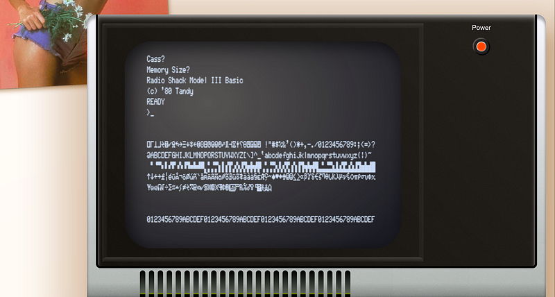
The laugh is the display scanlines are actually embedded into the font. Since as some of you know I do fontography as well. That font is actually my handiwork containing both the model 1 and model 3 extended characters.
So I am by no means unfamiliar with the techniques involved, but the idea of something simple like a calculator was a great place to start from, so I really have to thank Kass on Twitter for being my muse. Young lady lit a fire under this old dog’s arse.
Her own library of HTML/CSS designs is quite impressive, and just makes me want to play with this stuff more now that I actually have the time.
Really wanted to give her a shoutout. Whist her HTML could use some cleaning up and a bit more leveraging of generated content and layering, she’s head and shoulders above the competition in terms of taking CSS to that next level. Those of you who follow me regularly know I do NOT hand out praise freely.
If you made it this far, thank you for staying with me through this beast of an article. The next article will come some real magic: Making this all actually do something!
… and I will do so using nothing but vanilla JavaScript.
Article Index
Part 1, Markup and Layout Part 2, Eye Candy Part 3, Make it work with JS Part 4, Explaining the calculator JS Part 5, Explaining the Help Modals


