avatarJason Knight

Free AI web copilot to create summaries, insights and extended knowledge, download it at here

15371

Abstract

an> <span class="hljs-attr">data-text</span>=<span class="hljs-string">"MEM"</span>></span>MEM<span class="hljs-tag"></<span class="hljs-name">li</span>></span> <span class="hljs-tag"></<span class="hljs-name">ul</span>></span>

<span class="hljs-tag"><<span class="hljs-name">fieldset</span> <span class="hljs-attr">class</span>=<span class="hljs-string">"memory"</span>></span> <span class="hljs-tag"><<span class="hljs-name">button</span>></span><span class="hljs-tag"><<span class="hljs-name">span</span>></span>M+<span class="hljs-tag"></<span class="hljs-name">span</span>></span><span class="hljs-tag"></<span class="hljs-name">button</span>></span> <span class="hljs-tag"><<span class="hljs-name">button</span>></span><span class="hljs-tag"><<span class="hljs-name">span</span>></span>M-<span class="hljs-tag"></<span class="hljs-name">span</span>></span><span class="hljs-tag"></<span class="hljs-name">button</span>></span> <span class="hljs-tag"><<span class="hljs-name">button</span>></span><span class="hljs-tag"><<span class="hljs-name">span</span>></span>MR<span class="hljs-tag"></<span class="hljs-name">span</span>></span><span class="hljs-tag"></<span class="hljs-name">button</span>></span> <span class="hljs-tag"><<span class="hljs-name">button</span>></span><span class="hljs-tag"><<span class="hljs-name">span</span>></span>MC<span class="hljs-tag"></<span class="hljs-name">span</span>></span><span class="hljs-tag"></<span class="hljs-name">button</span>></span> <span class="hljs-comment"><!-- .memory --></span><span class="hljs-tag"></<span class="hljs-name">fieldset</span>></span>

<span class="hljs-tag"><<span class="hljs-name">fieldset</span>></span> <span class="hljs-tag"><<span class="hljs-name">button</span> <span class="hljs-attr">class</span>=<span class="hljs-string">"clear wide"</span>></span><span class="hljs-tag"><<span class="hljs-name">span</span>></span>C<span class="hljs-tag"></<span class="hljs-name">span</span>></span><span class="hljs-tag"></<span class="hljs-name">button</span>></span> <span class="hljs-tag"><<span class="hljs-name">button</span> <span class="hljs-attr">class</span>=<span class="hljs-string">"clear doubleDigit"</span>></span><span class="hljs-tag"><<span class="hljs-name">span</span>></span>CE<span class="hljs-tag"></<span class="hljs-name">span</span>></span><span class="hljs-tag"></<span class="hljs-name">button</span>></span> <span class="hljs-tag"><<span class="hljs-name">button</span> <span class="hljs-attr">class</span>=<span class="hljs-string">"operator"</span>></span><span class="hljs-tag"><<span class="hljs-name">span</span>></span><span class="hljs-symbol">&divide;</span><span class="hljs-tag"></<span class="hljs-name">span</span>></span><span class="hljs-tag"></<span class="hljs-name">button</span>></span> <span class="hljs-tag"></<span class="hljs-name">fieldset</span>></span>

<span class="hljs-tag"><<span class="hljs-name">fieldset</span>></span> <span class="hljs-tag"><<span class="hljs-name">button</span>></span><span class="hljs-tag"><<span class="hljs-name">span</span>></span>7<span class="hljs-tag"></<span class="hljs-name">span</span>></span><span class="hljs-tag"></<span class="hljs-name">button</span>></span> <span class="hljs-tag"><<span class="hljs-name">button</span>></span><span class="hljs-tag"><<span class="hljs-name">span</span>></span>8<span class="hljs-tag"></<span class="hljs-name">span</span>></span><span class="hljs-tag"></<span class="hljs-name">button</span>></span> <span class="hljs-tag"><<span class="hljs-name">button</span>></span><span class="hljs-tag"><<span class="hljs-name">span</span>></span>9<span class="hljs-tag"></<span class="hljs-name">span</span>></span><span class="hljs-tag"></<span class="hljs-name">button</span>></span> <span class="hljs-tag"><<span class="hljs-name">button</span> <span class="hljs-attr">class</span>=<span class="hljs-string">"operator char"</span>></span><span class="hljs-tag"><<span class="hljs-name">span</span>></span>X<span class="hljs-tag"></<span class="hljs-name">span</span>></span><span class="hljs-tag"></<span class="hljs-name">button</span>></span> <span class="hljs-tag"></<span class="hljs-name">fieldset</span>></span>

<span class="hljs-tag"><<span class="hljs-name">fieldset</span>></span> <span class="hljs-tag"><<span class="hljs-name">button</span>></span><span class="hljs-tag"><<span class="hljs-name">span</span>></span>4<span class="hljs-tag"></<span class="hljs-name">span</span>></span><span class="hljs-tag"></<span class="hljs-name">button</span>></span> <span class="hljs-tag"><<span class="hljs-name">button</span>></span><span class="hljs-tag"><<span class="hljs-name">span</span>></span>5<span class="hljs-tag"></<span class="hljs-name">span</span>></span><span class="hljs-tag"></<span class="hljs-name">button</span>></span> <span class="hljs-tag"><<span class="hljs-name">button</span>></span><span class="hljs-tag"><<span class="hljs-name">span</span>></span>6<span class="hljs-tag"></<span class="hljs-name">span</span>></span><span class="hljs-tag"></<span class="hljs-name">button</span>></span> <span class="hljs-tag"><<span class="hljs-name">button</span> <span class="hljs-attr">class</span>=<span class="hljs-string">"operator"</span>></span><span class="hljs-tag"><<span class="hljs-name">span</span>></span>-<span class="hljs-tag"></<span class="hljs-name">span</span>></span><span class="hljs-tag"></<span class="hljs-name">button</span>></span> <span class="hljs-tag"></<span class="hljs-name">fieldset</span>></span>

<span class="hljs-tag"><<span class="hljs-name">fieldset</span>></span> <span class="hljs-tag"><<span class="hljs-name">button</span>></span><span class="hljs-tag"><<span class="hljs-name">span</span>></span>1<span class="hljs-tag"></<span class="hljs-name">span</span>></span><span class="hljs-tag"></<span class="hljs-name">button</span>></span> <span class="hljs-tag"><<span class="hljs-name">button</span>></span><span class="hljs-tag"><<span class="hljs-name">span</span>></span>2<span class="hljs-tag"></<span class="hljs-name">span</span>></span><span class="hljs-tag"></<span class="hljs-name">button</span>></span> <span class="hljs-tag"><<span class="hljs-name">button</span>></span><span class="hljs-tag"><<span class="hljs-name">span</span>></span>3<span class="hljs-tag"></<span class="hljs-name">span</span>></span><span class="hljs-tag"></<span class="hljs-name">button</span>></span> <span class="hljs-tag"><<span class="hljs-name">button</span> <span class="hljs-attr">class</span>=<span class="hljs-string">"operator tall"</span>></span><span class="hljs-tag"><<span class="hljs-name">span</span>></span>+<span class="hljs-tag"><<span class="hljs-name">br</span>></span>=<span class="hljs-tag"></<span class="hljs-name">span</span>></span><span class="hljs-tag"></<span class="hljs-name">button</span>></span> <span class="hljs-tag"><<span class="hljs-name">button</span> <span class="hljs-attr">class</span>=<span class="hljs-string">"wide"</span>></span><span class="hljs-tag"><<span class="hljs-name">span</span>></span>0<span class="hljs-tag"></<span class="hljs-name">span</span>></span><span class="hljs-tag"></<span class="hljs-name">button</span>></span> <span class="hljs-tag"><<span class="hljs-name">button</span>></span><span class="hljs-tag"><<span class="hljs-name">span</span>></span>.<span class="hljs-tag"></<span class="hljs-name">span</span>></span><span class="hljs-tag"></<span class="hljs-name">button</span>></span> <span class="hljs-tag"></<span class="hljs-name">fieldset</span>></span>

<span class="hljs-comment"><!-- .calc --></span><span class="hljs-tag"></<span class="hljs-name">section</span>></span></pre></div><p id="cf4b">When I talk about writing your content first then marking it up semantically, that’s what I mean. From experience I was able to take some educated guesses on where/what classes would be needed to say why something is different, and because of that it is unlikely that the markup would change significantly irregardless of how I’m going to style it.</p><p id="e08f">This might not be compatible with the layout of that “original” but that’s not my intent. Starting out with what things look like is utterly bass ackwards, and can result in “painting yourself into a corner” in terms of accessibility, semantics, and just plain simplicity. I’ve said it thousands of times the past two decades:</p><p id="c02e" type="7">Content should dictate markup, content + markup + device and user limitations should dictate layout. Only then do you worry about colour and texture. Starting out with appearance is putting the hart before the corse.</p><p id="b519">The outer section is our calculator body, the H1 is our badge since it’s the heading for this entire document/section. <i>(drop that to the appropriate heading depth if this is embedded in another page)</i>. The output tag will contain our display values, whilst the list of flags reveals the state of the calculator. Such as when overflow (result too large for the hardware), divide by zero, and so forth are set. <i>A feature an old Radio Shack calcualtor had that I loved.</i></p><p id="f8a4">I used data- attributes there so that scripting can use them as hooks to add/remove the values as appropriate, and so that we can leverage them from CSS for certain… effects I’m planning.</p><p id="214e">Then there are the fieldset. Each of them is used to group like buttons where appropriate, though the placement of “operators” does mess with that on the “clearing” set. Using wide buttons in appropriate spots also makes it more “intuitive” for people used to keyboard interfaces and results in a square keypad — easier to style.</p><p id="7d9c">I also combined plus and equals to a single large key since that’s how “professional” calculators usually handle that. Normally I’d never say “wide” or “tall” since that’s presentation, but we’re not saying HOW wide or HOW tall, so I let that slide.</p><p id="ea29"><i>Every good rule and concept needs exceptions.</i></p><h1 id="efa6">Layout</h1><p id="ca1b">Let’s toss this in a pen and work on arranging things. Again, fancy stuff like button styling, gradients, shadows and so forth really shouldn’t be applied until AFTER you have a working layout. At most we’ll apply the base colours just to see what we’re working with.</p> <figure id="afcf"> <div> <div> <img class="ratio" src="http://placehold.it/16x9"> <iframe class="" src="https://cdn.embedly.com/widgets/media.html?src=https%3A%2F%2Fcodepen.io%2Fjason-knight%2Fembed%2Fpreview%2FBaPLEBq%3Fdefault-tabs%3Dcss%252Cresult%26height%3D600%26host%3Dhttps%253A%252F%252Fcodepen.io%26slug-hash%3DBaPLEBq&amp;display_name=CodePen&amp;url=https%3A%2F%2Fcodepen.io%2Fjason-knight%2Fpen%2FBaPLEBq&amp;image=https%3A%2F%2Fshots.codepen.io%2Fjason-knight%2Fpen%2FBaPLEBq-512.jpg%3Fversion%3D1672894295&amp;key=a19fcc184b9711e1b4764040d3dc5c07&amp;type=text%2Fhtml&amp;schema=codepen" allowfullscreen="" frameborder="0" height="600" width="800"> </div> </div> </figure></iframe></div></div></figure><p id="51b9">Some of the padding/margins might get redone as we work, but let’s go over this base CSS.</p><p id="a97f">I start out with a reset:</p><div id="6ddf"><pre><span class="hljs-comment">/* START RESET */</span>

<span class="hljs-selector-tag">html</span>, <span class="hljs-selector-tag">body</span>, <span class="hljs-selector-tag">div</span>, <span class="hljs-selector-tag">ul</span>, <span class="hljs-selector-tag">li</span>, <span class="hljs-selector-tag">fieldset</span> { <span class="hljs-attribute">margin</span>:<span class="hljs-number">0</span>; <span class="hljs-attribute">padding</span>:<span class="hljs-number">0</span>; }

*, *<span class="hljs-selector-pseudo">:before</span>, *<span class="hljs-selector-pseudo">:after</span> { <span class="hljs-attribute">box-sizing</span>:border-box; }

<span class="hljs-selector-tag">img</span>, <span class="hljs-selector-tag">fieldset</span> { <span class="hljs-attribute">border</span>:<span class="hljs-number">0</span>; }

<span class="hljs-selector-tag">html</span>, <span class="hljs-selector-tag">body</span> { <span class="hljs-attribute">height</span>:<span class="hljs-number">100%</span>; }

<span class="hljs-selector-tag">body</span>, output, <span class="hljs-selector-tag">button</span> { <span class="hljs-attribute">font-family</span>:inherit; <span class="hljs-attribute">font-size</span>:<span class="hljs-number">1em</span>; <span class="hljs-attribute">line-height</span>:<span class="hljs-number">1.5</span>;

}

<span class="hljs-comment">/* END RESET */</span></pre></div><p id="1ea8">This is a subset of my larger one cut down so we’re not wasting time on things that don’t impact our layout.</p><p id="adf7">Next I set up the page, this really isn’t part of the “calculator” though the flex parent managing to auto-shrink our container to its content saves us some headaches.</p><div id="0b3b"><pre><span class="hljs-selector-tag">body</span> { <span class="hljs-attribute">display</span>:flex; <span class="hljs-attribute">align-items</span>:center; <span class="hljs-attribute">justify-content</span>:center; <span class="hljs-attribute">font-family</span>:arial,helvetica,sans-serif; <span class="hljs-attribute">padding</span>:<span class="hljs-number">1rem</span>; <span class="hljs-attribute">background</span>:<span class="hljs-number">#8CF</span>; }</pre></div><p id="8670">If I have to explain that, I’m surprised you made it this far into the article.</p><p id="b37f">Now for the outer <code>section.calc</code></p><div id="1ca8"><pre><span class="hljs-selector-class">.calc</span> {

<span class="hljs-attr">--caseBgColor</span>:<span class="hljs-number">#D0D0C0</span>; <span class="hljs-attr">--h1BgColor</span>:<span class="hljs-number">#F0F8FF</span>; <span class="hljs-attr">--outputBgColor</span>:<span class="hljs-number">#420</span>; <span class="hljs-attr">--outputTextColor</span>:<span class="hljs-number">#F80</span>; <span class="hljs-attr">--flagsBgColor</span>:<span class="hljs-number">#210</span>; <span class="hljs-attr">--flagsTextColor</span>:<span class="hljs-number">#F00</span>; <span class="hljs-attr">--pcbColor</span>:<span class="hljs-number">#002D04</span>; <span class="hljs-attr">--buttonBgColor</span>:<span class="hljs-number">#807870</span>; <span class="hljs-attr">--buttonTextColor</span>:<span class="hljs-number">#FFF</span>; <span class="hljs-attr">--memoryBgColor</span>:<span class=

Options

"hljs-number">#F80</span>; <span class="hljs-attr">--memoryTextColor</span>:<span class="hljs-number">#FFF</span>; <span class="hljs-attr">--clearBgColor</span>:<span class="hljs-number">#F00</span>; <span class="hljs-attr">--clearTextColor</span>:<span class="hljs-number">#FFF</span>; <span class="hljs-attr">--operatorBgColor</span>:<span class="hljs-number">#E8E4E0</span>; <span class="hljs-attr">--operatorTextColor</span>:<span class="hljs-number">#000</span>;

<span class="hljs-attribute">text-align</span><span class="hljs-selector-pseudo">:right</span>; <span class="hljs-attribute">margin</span>:auto; <span class="hljs-attribute">padding</span>:<span class="hljs-number">1em</span> <span class="hljs-number">2em</span> <span class="hljs-number">1.5em</span>; <span class="hljs-attribute">font-size</span>:<span class="hljs-built_in">clamp</span>(<span class="hljs-number">9px</span>, <span class="hljs-built_in">min</span>(<span class="hljs-number">3.75vw</span>, <span class="hljs-number">2.2vh</span>), <span class="hljs-number">3rem</span>); <span class="hljs-attribute">background-color</span>:<span class="hljs-built_in">var</span>(--caseBgColor);

}</pre></div><p id="29db">I start out declaring all the colours. I added extra blank lines to make the code clearer on the colour vs. layout section. The “BgColor” ones are backgrounds, “textColor” are text. I shouldnt’ have to explain that, but here we are. Most of those should be self explanatory other than “PCB” — printed circuit board. That’s used as the border between keys since IRL you’d actually see a sliver of the underlying board showing through.</p><p id="a38b">We know what we have to color, so it shouldn’t have been rocket science to plan those colours.</p><p id="f7da">The rest of it is layout tweaks. Don’t forget with flex that if you forget to “margin:auto” it will cut things off instead of providing a scrollbar if the window is too small.</p><p id="3c75">My font-size approach probably needs some explanation. Clamp is a very powerful function and in this case I’m using it to help make it so that if the screen gets too small we shrink everything. Normally I rail against this type of layout because on a website we have scrolling for a reason… but this is more of an application where different rules apply. Scrolling up and down to reach the keys kind of sucks.</p><p id="0562">The syntax of clamp is:</p><p id="48ac">clamp(min, amount, max)</p><p id="6599"><b>min</b> being the smallest it’s allowed to get, <b>max</b> being the largest. 9px is ridiculously tiny and the minimum size many browsers will even let you declare. Most of our content will be over 1em, but who knows, someone might want to use this on a ancient handheld with a 256x384 or so display.</p><p id="6464">I also use CSS’ “min” calculation which returns whichever value is smaller. The numbers I chose based on viewport width and height should for most displays prevent scrolling and provide scaling up to our maximum.</p><p id="fbee">We may want to play with that 3em max… that’s honking huge, so I’d say that depends on your needs. Good enough for now in testing.</p><p id="21fe">Planning my layout, I already know the sides of the case will be 2em, thus the padding of same. Since I’m going for four normal button-widths across with a button-width of 4.5em and a gap of 0.0625em around them, we can add that up, add some extra space, determine the needed font-size, and poof come up with a number. Then do the same for height.</p><p id="96af"><b>OR</b> you could just experiment with resizing the window after the layout is done to get working values. <i>Which is what I actually did.</i></p><p id="4e56">The text-align:left moves the heading:</p><div id="325d"><pre><span class="hljs-selector-class">.calc</span> <span class="hljs-selector-tag">h1</span> { <span class="hljs-attribute">float</span><span class="hljs-selector-pseudo">:right</span>; <span class="hljs-attribute">padding</span>:<span class="hljs-number">0.25em</span> <span class="hljs-number">0.75em</span>; <span class="hljs-attribute">margin-bottom</span>:<span class="hljs-number">1.5rem</span>; <span class="hljs-attribute">background</span>:<span class="hljs-built_in">var</span>(--h1BgColor); }</pre></div><p id="887e">I know a lot of moro… uhm, I mean people object to “floats” now that we have flex and grid, but honestly this is so flipping simple a section there is no reason to bother with that stuff for it. I want the heading on the right. Poof, it is. Job done.</p><p id="a411">For the output section:</p><div id="1251"><pre><span class="hljs-selector-class">.calc</span> output { <span class="hljs-attribute">clear</span>:both; <span class="hljs-attribute">display</span>:block; <span class="hljs-attribute">padding</span>:<span class="hljs-number">0.5em</span> <span class="hljs-number">0.5em</span> <span class="hljs-number">0</span>; <span class="hljs-attribute">font-size</span>:<span class="hljs-number">2em</span>; <span class="hljs-attribute">background</span>:<span class="hljs-built_in">var</span>(--outputBgColor); <span class="hljs-attribute">color</span>:<span class="hljs-built_in">var</span>(--outputTextColor); <span class="hljs-attribute">text-align</span><span class="hljs-selector-pseudo">:right</span>; }</pre></div><p id="31ac">Output is normally inline, we want it block to fill width with no alignment headaches. Clear the float, bump the font, colour it, move the alignment to the right.</p><p id="ff87">The <var> inside it is for our sign, as it is first this too can be solved far easier with float than more “modern” techniques. Just because there’s a new way doesn’t mean throw the old one out when it’s cleaner, easier, and simpler.</var></p><div id="50a1"><pre><span class="hljs-selector-class">.calc</span> output <span class="hljs-selector-tag">var</span> { <span class="hljs-attribute">float</span><span class="hljs-selector-pseudo">:left</span>; }</pre></div><p id="ef2a">The span will be used with some “trickery” to space the periods properly for an LCD. We’ll skip styling this any further for now and move on.</p><p id="8996">The processor flags section:</p><div id="b0d0"><pre><span class="hljs-selector-class">.calc</span> <span class="hljs-selector-class">.flags</span> { <span class="hljs-attribute">display</span>:flex; <span class="hljs-attribute">align-items</span>:stretch; <span class="hljs-attribute">margin-bottom</span>:<span class="hljs-number">1.5em</span>; <span class="hljs-attribute">text-align</span>:center; <span class="hljs-attribute">background</span>:<span class="hljs-built_in">var</span>(--flagsBgColor); <span class="hljs-attribute">color</span>:<span class="hljs-built_in">var</span>(--flagsTextColor); }

<span class="hljs-selector-class">.calc</span> <span class="hljs-selector-class">.flags</span> <span class="hljs-selector-tag">li</span> { <span class="hljs-attribute">list-style</span>:none; <span class="hljs-attribute">flex-grow</span>:<span class="hljs-number">1</span>; <span class="hljs-attribute">width</span>:<span class="hljs-number">21%</span>; <span class="hljs-attribute">text-align</span>:center; }</pre></div><p id="d624">makes more sense with flex auto-sizing to fill. I use the 21% trick for four across, since 25% can occasionally miscalculate in firefox resulting in them all NOT fitting on the same line.</p><p id="5fdb">Cute trick, don’t know how many of you know it. When you want “X” number of flex columns, it’s easier to say the next size down plus 1% (or round up to the next nearest) than it is the exact amount if you turn flex-grow on. Thus if you want two across, you say 34%. You want three across, 26%. Four == 21%, Five = 17%, and so forth.</p><p id="d4c2"><i>This is particularly true if you’re using margins instead of gap because… well… I dunno now.</i></p><p id="9386">The fieldsets:</p><div id="c127"><pre><span class="hljs-selector-class">.calc</span> <span class="hljs-selector-tag">fieldset</span> { <span class="hljs-attribute">width</span>:<span class="hljs-number">18.3125em</span>; <span class="hljs-attribute">background</span>:<span class="hljs-built_in">var</span>(--pcbColor); <span class="hljs-attribute">padding-right</span>:<span class="hljs-number">0.0625em</span>; }

<span class="hljs-selector-class">.calc</span> <span class="hljs-selector-tag">fieldset</span><span class="hljs-selector-pseudo">:last-of-type</span> { <span class="hljs-attribute">padding-bottom</span>:<span class="hljs-number">0.0625em</span>; }</pre></div><p id="3667">All get right padding to show some of the “PCB” through the gaps, with the last one getting a bottom gap. I do this because I’m going to use float not flex for the buttons, and floats stack margins. Thus we’ll margin the left and top of the buttons, and boom, even gaps.</p><p id="00db"><b>Why floats?</b> Because “display:grid” masonry support is experimental in FF and existant nowhere else, micromanaging grid or flex for each and every blasted element would inhale in the proverbial equine of short stature. Floats stack. With our only tall button being on the right, it’s easy enough to float that one right, and everything else left, and boom. LAYOUT!</p><p id="436b">That width is calculated based on the 4.5em of each button, 4 buttons across, with five 0.0625em gaps between them.</p><p id="3d91">So lets float these buttons:</p><div id="37f8"><pre><span class="hljs-selector-class">.calc</span> <span class="hljs-selector-tag">button</span> { <span class="hljs-attribute">float</span><span class="hljs-selector-pseudo">:left</span>; <span class="hljs-attribute">width</span>:<span class="hljs-number">4.5em</span>; <span class="hljs-attribute">height</span>:<span class="hljs-number">4.5em</span>; <span class="hljs-attribute">margin</span>:<span class="hljs-number">0.0625em</span> <span class="hljs-number">0</span> <span class="hljs-number">0</span> <span class="hljs-number">0.0625em</span>; <span class="hljs-attribute">border</span>:<span class="hljs-number">0</span>; <span class="hljs-attribute">background</span>:<span class="hljs-built_in">var</span>(--buttonBgColor); <span class="hljs-attribute">color</span>:<span class="hljs-built_in">var</span>(--buttonTextColor); }</pre></div><p id="fb8d">Pretty damned simple, no? Now we just adjust the width and height of the tall and wide ones.</p><div id="7d09"><pre><span class="hljs-selector-class">.calc</span> <span class="hljs-selector-tag">button</span><span class="hljs-selector-class">.tall</span> { <span class="hljs-attribute">float</span><span class="hljs-selector-pseudo">:right</span>; <span class="hljs-attribute">height</span>:<span class="hljs-number">9.0625em</span>; }

<span class="hljs-selector-class">.calc</span> <span class="hljs-selector-tag">button</span><span class="hljs-selector-class">.wide</span> { <span class="hljs-attribute">width</span>:<span class="hljs-number">9.0625em</span>; }</pre></div><p id="b479">That extra bit being to make up for the gap between the buttons (duh)</p><p id="92f8">Those various span get the font-sizes on them, which avoids EM going whacky on the button themselves. I had actually forgotten this, but button’s default display state actually vertically aligns its content for you, so we don’t need to “dick around” much here.</p><div id="5c0e"><pre><span class="hljs-selector-class">.calc</span> <span class="hljs-selector-tag">button</span> <span class="hljs-selector-tag">span</span> { <span class="hljs-attribute">font-size</span>:<span class="hljs-number">1.5em</span>; }

<span class="hljs-selector-class">.calc</span> <span class="hljs-selector-class">.memory</span> <span class="hljs-selector-tag">button</span> <span class="hljs-selector-tag">span</span>, <span class="hljs-selector-class">.calc</span> <span class="hljs-selector-class">.doubleDigit</span> <span class="hljs-selector-tag">span</span> { <span class="hljs-attribute">font-size</span>:<span class="hljs-number">1em</span>; }

<span class="hljs-selector-class">.calc</span> <span class="hljs-selector-class">.operator</span><span class="hljs-selector-pseudo">:not</span>(<span class="hljs-selector-class">.char</span>) <span class="hljs-selector-tag">span</span> { <span class="hljs-attribute">font-size</span>:<span class="hljs-number">2.25em</span>; }</pre></div><p id="3116">Just set the sizes. We’ll probably have to play more with these when we make the buttons look like actual keys, but for now good placeholders.</p><p id="92f5">Then we apply our unique colours.</p><div id="0df0"><pre><span class="hljs-selector-class">.calc</span> <span class="hljs-selector-class">.memory</span> <span class="hljs-selector-tag">button</span> { <span class="hljs-attr">--buttonBgColor</span>:<span class="hljs-built_in">var</span>(--memoryBgColor); <span class="hljs-attribute">color</span>:<span class="hljs-built_in">var</span>(--memoryTextColor); }

<span class="hljs-selector-class">.calc</span> <span class="hljs-selector-tag">button</span><span class="hljs-selector-class">.clear</span> { <span class="hljs-attr">--buttonBgColor</span>:<span class="hljs-built_in">var</span>(--clearBgColor); <span class="hljs-attribute">color</span>:<span class="hljs-built_in">var</span>(--clearTextColor); }

<span class="hljs-selector-class">.calc</span> <span class="hljs-selector-tag">button</span><span class="hljs-selector-class">.operator</span> { <span class="hljs-attr">--buttonBgColor</span>:<span class="hljs-built_in">var</span>(--operatorBgColor); <span class="hljs-attribute">color</span>:<span class="hljs-built_in">var</span>(--operatorTextColor); }</pre></div><p id="4727">First the entire “memory” row so we don’t have to piss classes on all of them, then the ones that share rows with “normal’ keys.</p><h1 id="201b">Conclusion</h1><p id="0425">I’m going to close out part one here, and start work on part 2 where I’ll be adding shadows, gradients, rounded corners, and other such eye candy.</p><p id="2e0e">So far though this layout is far less fragile than my previous attempt. A lot of that is changing the design, more of that is just doing this in that proper order I’m always ranting about.</p><ol><li>Content</li><li>Markup</li><li>Layout</li><li>Eye Candy</li><li>Scripted behaviors (if any)</li></ol><p id="801f">It is the fastest, easiest way to build sane, rational, and accessible templates.</p><p id="3e98"><a href="https://deathshadow.medium.com/how-css-is-reducing-the-need-for-images-part-2-eye-candy-bd5ee628e849">Please read on with Part II — Eye Candy</a>.</p><h1 id="b676">Article Index</h1><p id="6c2c"><a href="https://readmedium.com/how-css-is-reducing-the-need-for-images-lets-style-a-calculator-ccf9332e56e">Part 1, Markup and Layout</a> <a href="https://readmedium.com/how-css-is-reducing-the-need-for-images-part-2-eye-candy-bd5ee628e849">Part 2, Eye Candy</a> <a href="https://readmedium.com/css-reduces-the-need-for-images-part-3-lets-script-it-5a466ae5930a">Part 3, Make it work with JS</a> <a href="https://readmedium.com/css-reduces-the-need-for-images-part-4-the-actual-application-script-127f3eeb492a">Part 4, Explaining the calculator JS</a> <a href="https://deathshadow.medium.com/css-reduces-the-need-for-images-part-5-modal-driven-help-1ed7b41b580e">Part 5, Explaining the Help Modals</a></p></article></body>

How CSS Is Reducing The Need For Images — Let’s Style A Calculator

Part 1 of 5

This was my first attempt, can I do better?

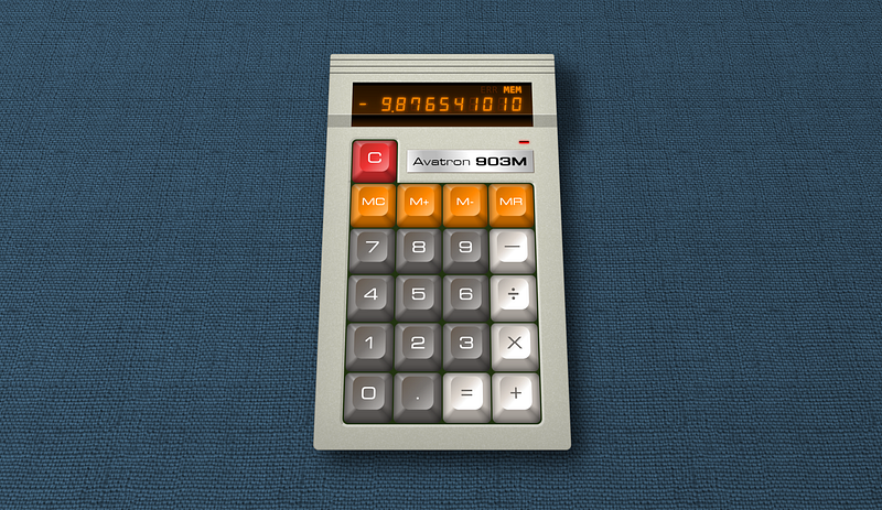
Recently I came across this tweet about making a retro looking calculator using just HTML and CSS. It’s a decent implementation though I disliked all the excess “DIV for nothing” and classes. Those of you who regularly read my writings are likely not shocked by that at all.

I took my own initial stab at it, but was thinking “I can do better” and that it would be an excellent topic for an article. I’d also like to do this in a way that’s uniquely “mine”.

The original “Kass” posted on Muskie’s dumpster fire (twitter):

Doesn’t look/feel like real keys to me, because the lighting angle is both non-standard, and unrealistic. This stands to reason though as the art they were working from kind-of looks the same.

Bottom-lighting always looks a bit wrong or off.. to me at least. It’s why it’s used in theatre and stage for villains or to make someone look evil. I mean take Marko from Nightwish during “Romanticide”.

Underlighting with a palor reducing hue

It is accepted practice that on computers “artificial” shadowing is done as if the light is top-left. This is actually the result of usability studies that were joint performed between IBM, Apple, and Microsoft in the late ‘80’s which influenced not just Windows and OS/2, but Microsoft Office on all platforms and many things Apple would later implement. Though early on Apple disliked shadowing because their video hardware couldn’t do it efficiently.

It’s also a bit of a wonk they have the “specular” or “occidental” highlight on all four sides. The “off” sides would not have specular at all, there would be no specular on straight “below lit” lighting. The counter side would have an oriental dark spot, not an occidental.

Side note, before anyone gets their panties in a knot over my use of the word “oriental” it just means east or in lighting terms opposite of the primary light source. It was not nor ever had a racist meaning. Particularly when Ukrainians, Georgians, Indians, Mongols, Chinese, Koreans, and even Australians would all technically be at one point or another in history “Oriental”. Next you’ll be telling me not to use the word “retarded”

I made my own implementation here: https://cutcodedown.com/for_others/calc/calcTemplate.html

Which is a lot fancier, but I did so without proper planning as more of a drive-by that took me maybe 20 minutes of real work and then hours of me dicking around with things like perspective. It was a good learning example, but I have a process for building layouts and I flat out did not follow it.

And if I do it the way I’d really have done it from scratch, maybe you folks can follow along and learn how I do it.

Planning

First off there are “requirements” a “fixed” layout like this would have for me:

  1. Each of the buttons should be a button tag so it is navigable and easier to hook when/if you make an app out of this.
  2. The layout should dynamically scale to the user font-size preference, and this means EM. At the same time it should scale to viewport, which means we need to micromanage EM. It should also be able to co-exist with other page elements scaling independent of them, ruling out REM.
  3. As with isolating EM for scaling, no ID’s should be used so that if you want to run multiple instances on a page you can… for whatever reason. To that end the outer class should be included in all declarations to help with isolation.
  4. The display should be an tag since what it shows is the result from JavaScript.
  5. The badge describing it would/should be our H1 tag, though if you merge it into another page it might drop to H2.
  6. Whilst the idea is to avoid using images for “finished” elements, using them to provide ‘texture” is not off the table.
  7. Apart from texture images, this should be an HTML and CSS only implementation. That means no SVG, canvas, or JavaScript.
  8. I went overboard in mine avoiding classes. For “unique” keys lets go ahead and use classes to describe what they are, but let’s not do that for “normal” keys. Only put classes on what’s DIFFERENT or to group like elements.
  9. Let’s deviate from the style of the original and make something a hair fancier with buttons of different widths and so-forth.
  10. Colours of the calculator should be applied using custom properties (aka “CSS variables”) to make reskinning easier for the end user.
  11. It would be nice if in addition to easily colouring the buttons, if the case plastic itself were easily changed from a single place.

I am going to break this into multiple articles as things could get a bit long, for this part of the series let’s focus on our general outer container and layout.

The Markup

Her original used markup like this:

        <div class="button-container">
            <div class="logo-container">
                <div class="logo">
                    <span class="name">Avatron</span> <strong>903M</strong>
                </div>
            </div>
            <div class="button-container-top">
                <div class="button-top-row">
                    <div class="button button--orange button-first">
                        <div class="shading"></div>
                        <div class="button-inner">
                            <div class="button-text">C</div>
                        </div>
                    </div>
                </div>
            </div>
            <div class="button-container-bottom">
                <div class="button-row top-row">
                    <div class="button button--orange button-first">
                        <div class="shading"></div>
                        <div class="button-inner">
                            <div class="button-text">MC</div>
                        </div>
                    </div>

And that’s what I call DIV and class soup. Due to the final styling i don’t entirely mind the row DIV — something I normally rail against — but the rest of those DIV are “problematic”. Worse, theres no

I would write the same section as:

 <h1>Addatron <span>909</span></h1>
 <div>
   <button><span>C</span></button>
 </div><div>
   <button><span>MC</span></button>
 </div>

It is unlikely anything else there would require DIV so we can just skip naming them and use nth-of-child instead… or if need be H1 ~ div:nth-child. Lots of ways to do it without throwing classes at everything. Almost all our shading can be handled by generated content, meaning the only extra element we need is a span since the font is different sizes in the various buttons based on type and text width (big numbers vs. small multicharacter text), and we need to work in EM. More so though is that it’s hard to position generated content under sibling text nodes. You can do it, but one span to make it easier isn’t going to kill us.

Especially compared to the endless pointless DIV people throw at problems like this.

For now though, let’s just make a simple test box containing what a full fledged calculator should have. As I’m not mimicking the original design I’m going to switch the label to being above the display. Instead of DIV let’s use FIELDSET to indicate that these are user interactable for on-page input, and not form controls like SUBMIT or RESET. Aka what a fieldset MEANS!

<!--
  This is part one of making a HTML/CSS styled calculator template
-->

<section class="calc">

  <h1>Addatron <span>909</span></h1>
  
  <output><var>-</var>9<span>.</span>876543201</output>
  
  <ul class="flags">
    <li title="overflow" data-text="OVF"></li>
    <li title="divide by zero" data-text="DV0"></li>
    <li title="error" data-text="ERR"></li>
    <li title="memory" data-text="MEM">MEM</li>
  </ul>

  <fieldset class="memory">
    <button><span>M+</span></button>
    <button><span>M-</span></button>
    <button><span>MR</span></button>
    <button><span>MC</span></button>
  <!-- .memory --></fieldset>
  
  <fieldset>
    <button class="clear wide"><span>C</span></button>
    <button class="clear doubleDigit"><span>CE</span></button>
    <button class="operator"><span>&divide;</span></button>
  </fieldset>

  <fieldset>
    <button><span>7</span></button>
    <button><span>8</span></button>
    <button><span>9</span></button>
    <button class="operator char"><span>X</span></button>
  </fieldset>

  <fieldset>
    <button><span>4</span></button>
    <button><span>5</span></button>
    <button><span>6</span></button>
    <button class="operator"><span>-</span></button>
  </fieldset>
   
  <fieldset>
    <button><span>1</span></button>
    <button><span>2</span></button>
    <button><span>3</span></button>
    <button class="operator tall"><span>+<br>=</span></button> 
    <button class="wide"><span>0</span></button>
    <button><span>.</span></button>
  </fieldset>
    
<!-- .calc --></section>

When I talk about writing your content first then marking it up semantically, that’s what I mean. From experience I was able to take some educated guesses on where/what classes would be needed to say why something is different, and because of that it is unlikely that the markup would change significantly irregardless of how I’m going to style it.

This might not be compatible with the layout of that “original” but that’s not my intent. Starting out with what things look like is utterly bass ackwards, and can result in “painting yourself into a corner” in terms of accessibility, semantics, and just plain simplicity. I’ve said it thousands of times the past two decades:

Content should dictate markup, content + markup + device and user limitations should dictate layout. Only then do you worry about colour and texture. Starting out with appearance is putting the hart before the corse.

The outer section is our calculator body, the H1 is our badge since it’s the heading for this entire document/section. (drop that to the appropriate heading depth if this is embedded in another page). The output tag will contain our display values, whilst the list of flags reveals the state of the calculator. Such as when overflow (result too large for the hardware), divide by zero, and so forth are set. A feature an old Radio Shack calcualtor had that I loved.

I used data- attributes there so that scripting can use them as hooks to add/remove the values as appropriate, and so that we can leverage them from CSS for certain… effects I’m planning.

Then there are the fieldset. Each of them is used to group like buttons where appropriate, though the placement of “operators” does mess with that on the “clearing” set. Using wide buttons in appropriate spots also makes it more “intuitive” for people used to keyboard interfaces and results in a square keypad — easier to style.

I also combined plus and equals to a single large key since that’s how “professional” calculators usually handle that. Normally I’d never say “wide” or “tall” since that’s presentation, but we’re not saying HOW wide or HOW tall, so I let that slide.

Every good rule and concept needs exceptions.

Layout

Let’s toss this in a pen and work on arranging things. Again, fancy stuff like button styling, gradients, shadows and so forth really shouldn’t be applied until AFTER you have a working layout. At most we’ll apply the base colours just to see what we’re working with.

Some of the padding/margins might get redone as we work, but let’s go over this base CSS.

I start out with a reset:

/* START RESET */

html, body, div, ul, li, fieldset {
  margin:0;
  padding:0;
}

*, *:before, *:after {
  box-sizing:border-box;
}

img, fieldset {
  border:0;
}

html, body {
  height:100%;
}

body, output, button {
  font-family:inherit;
  font-size:1em;
  line-height:1.5;
  
}

/* END RESET */

This is a subset of my larger one cut down so we’re not wasting time on things that don’t impact our layout.

Next I set up the page, this really isn’t part of the “calculator” though the flex parent managing to auto-shrink our container to its content saves us some headaches.

body {
  display:flex;
  align-items:center;
  justify-content:center;
  font-family:arial,helvetica,sans-serif;
  padding:1rem;
  background:#8CF;
}

If I have to explain that, I’m surprised you made it this far into the article.

Now for the outer section.calc

.calc {

  --caseBgColor:#D0D0C0;
  --h1BgColor:#F0F8FF;
  --outputBgColor:#420;
  --outputTextColor:#F80;
  --flagsBgColor:#210;
  --flagsTextColor:#F00;
   --pcbColor:#002D04;
  --buttonBgColor:#807870;
  --buttonTextColor:#FFF;
  --memoryBgColor:#F80;
  --memoryTextColor:#FFF;
  --clearBgColor:#F00;
  --clearTextColor:#FFF;
  --operatorBgColor:#E8E4E0;
  --operatorTextColor:#000;

  text-align:right;
  margin:auto;
  padding:1em 2em 1.5em;
  font-size:clamp(9px, min(3.75vw, 2.2vh), 3rem);
  background-color:var(--caseBgColor);
  
}

I start out declaring all the colours. I added extra blank lines to make the code clearer on the colour vs. layout section. The “BgColor” ones are backgrounds, “textColor” are text. I shouldnt’ have to explain that, but here we are. Most of those should be self explanatory other than “PCB” — printed circuit board. That’s used as the border between keys since IRL you’d actually see a sliver of the underlying board showing through.

We know what we have to color, so it shouldn’t have been rocket science to plan those colours.

The rest of it is layout tweaks. Don’t forget with flex that if you forget to “margin:auto” it will cut things off instead of providing a scrollbar if the window is too small.

My font-size approach probably needs some explanation. Clamp is a very powerful function and in this case I’m using it to help make it so that if the screen gets too small we shrink everything. Normally I rail against this type of layout because on a website we have scrolling for a reason… but this is more of an application where different rules apply. Scrolling up and down to reach the keys kind of sucks.

The syntax of clamp is:

clamp(min, amount, max)

min being the smallest it’s allowed to get, max being the largest. 9px is ridiculously tiny and the minimum size many browsers will even let you declare. Most of our content will be over 1em, but who knows, someone might want to use this on a ancient handheld with a 256x384 or so display.

I also use CSS’ “min” calculation which returns whichever value is smaller. The numbers I chose based on viewport width and height should for most displays prevent scrolling and provide scaling up to our maximum.

We may want to play with that 3em max… that’s honking huge, so I’d say that depends on your needs. Good enough for now in testing.

Planning my layout, I already know the sides of the case will be 2em, thus the padding of same. Since I’m going for four normal button-widths across with a button-width of 4.5em and a gap of 0.0625em around them, we can add that up, add some extra space, determine the needed font-size, and poof come up with a number. Then do the same for height.

OR you could just experiment with resizing the window after the layout is done to get working values. Which is what I actually did.

The text-align:left moves the heading:

.calc h1 {
  float:right;
  padding:0.25em 0.75em;
  margin-bottom:1.5rem;
  background:var(--h1BgColor);
}

I know a lot of moro… uhm, I mean people object to “floats” now that we have flex and grid, but honestly this is so flipping simple a section there is no reason to bother with that stuff for it. I want the heading on the right. Poof, it is. Job done.

For the output section:

.calc output {
  clear:both;
  display:block;
  padding:0.5em 0.5em 0;
  font-size:2em;
  background:var(--outputBgColor);
  color:var(--outputTextColor);
  text-align:right;
}

Output is normally inline, we want it block to fill width with no alignment headaches. Clear the float, bump the font, colour it, move the alignment to the right.

The inside it is for our sign, as it is first this too can be solved far easier with float than more “modern” techniques. Just because there’s a new way doesn’t mean throw the old one out when it’s cleaner, easier, and simpler.

.calc output var {
  float:left;
}

The span will be used with some “trickery” to space the periods properly for an LCD. We’ll skip styling this any further for now and move on.

The processor flags section:

.calc .flags {
  display:flex;
  align-items:stretch;
  margin-bottom:1.5em;
  text-align:center;
  background:var(--flagsBgColor);
  color:var(--flagsTextColor);
}

.calc .flags li {
  list-style:none;
  flex-grow:1;
  width:21%;
  text-align:center;
}

makes more sense with flex auto-sizing to fill. I use the 21% trick for four across, since 25% can occasionally miscalculate in firefox resulting in them all NOT fitting on the same line.

Cute trick, don’t know how many of you know it. When you want “X” number of flex columns, it’s easier to say the next size down plus 1% (or round up to the next nearest) than it is the exact amount if you turn flex-grow on. Thus if you want two across, you say 34%. You want three across, 26%. Four == 21%, Five = 17%, and so forth.

This is particularly true if you’re using margins instead of gap because… well… I dunno now.

The fieldsets:

.calc fieldset {
  width:18.3125em;
  background:var(--pcbColor);
  padding-right:0.0625em;
}

.calc fieldset:last-of-type {
  padding-bottom:0.0625em;
}

All get right padding to show some of the “PCB” through the gaps, with the last one getting a bottom gap. I do this because I’m going to use float not flex for the buttons, and floats stack margins. Thus we’ll margin the left and top of the buttons, and boom, even gaps.

Why floats? Because “display:grid” masonry support is experimental in FF and existant nowhere else, micromanaging grid or flex for each and every blasted element would inhale in the proverbial equine of short stature. Floats stack. With our only tall button being on the right, it’s easy enough to float that one right, and everything else left, and boom. LAYOUT!

That width is calculated based on the 4.5em of each button, 4 buttons across, with five 0.0625em gaps between them.

So lets float these buttons:

.calc button {
  float:left;
  width:4.5em;
  height:4.5em;
  margin:0.0625em 0 0 0.0625em;
  border:0;
  background:var(--buttonBgColor);
  color:var(--buttonTextColor);
}

Pretty damned simple, no? Now we just adjust the width and height of the tall and wide ones.

.calc button.tall {
  float:right;
  height:9.0625em;
}

.calc button.wide {
  width:9.0625em;
}

That extra bit being to make up for the gap between the buttons (duh)

Those various span get the font-sizes on them, which avoids EM going whacky on the button themselves. I had actually forgotten this, but button’s default display state actually vertically aligns its content for you, so we don’t need to “dick around” much here.

.calc button span {
  font-size:1.5em;
}

.calc .memory button span,
.calc .doubleDigit span {
  font-size:1em;
}

.calc .operator:not(.char) span {
  font-size:2.25em;
}

Just set the sizes. We’ll probably have to play more with these when we make the buttons look like actual keys, but for now good placeholders.

Then we apply our unique colours.

.calc .memory button {
  --buttonBgColor:var(--memoryBgColor);
  color:var(--memoryTextColor);
}

.calc button.clear {
  --buttonBgColor:var(--clearBgColor);
  color:var(--clearTextColor);
}

.calc button.operator {
  --buttonBgColor:var(--operatorBgColor);
  color:var(--operatorTextColor);
}

First the entire “memory” row so we don’t have to piss classes on all of them, then the ones that share rows with “normal’ keys.

Conclusion

I’m going to close out part one here, and start work on part 2 where I’ll be adding shadows, gradients, rounded corners, and other such eye candy.

So far though this layout is far less fragile than my previous attempt. A lot of that is changing the design, more of that is just doing this in that proper order I’m always ranting about.

  1. Content
  2. Markup
  3. Layout
  4. Eye Candy
  5. Scripted behaviors (if any)

It is the fastest, easiest way to build sane, rational, and accessible templates.

Please read on with Part II — Eye Candy.

Article Index

Part 1, Markup and Layout Part 2, Eye Candy Part 3, Make it work with JS Part 4, Explaining the calculator JS Part 5, Explaining the Help Modals

HTML
CSS
Web Design
Web Development
Template
Recommended from ReadMedium