
Doing the 2021 #30DayMapChallenge with Stata
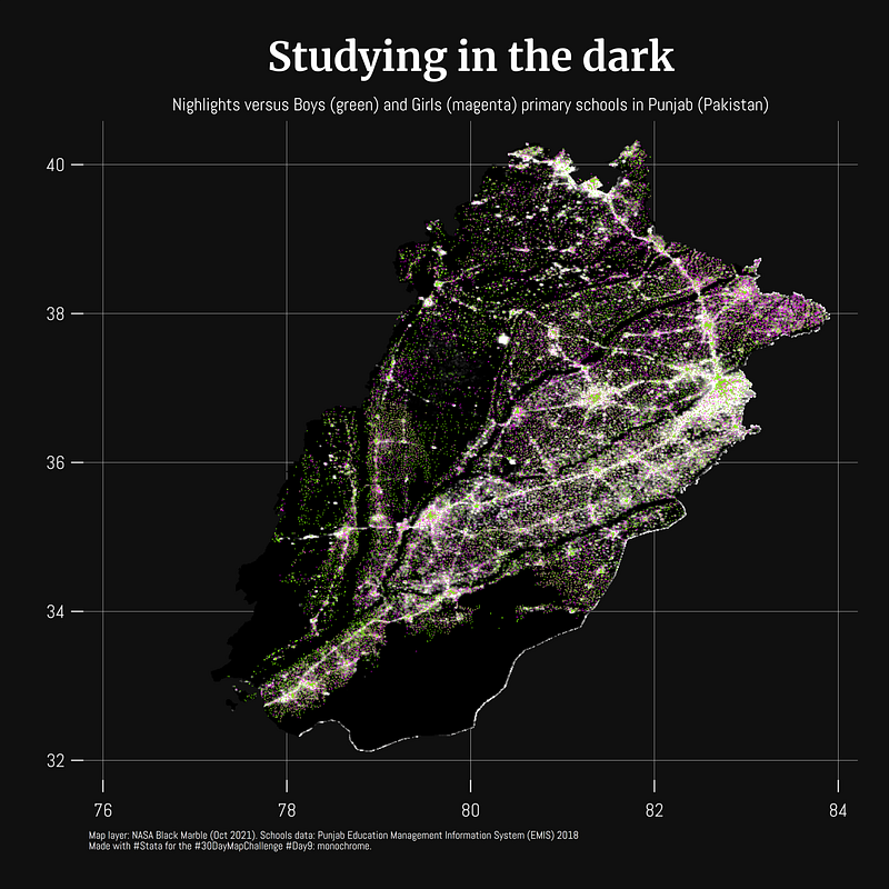
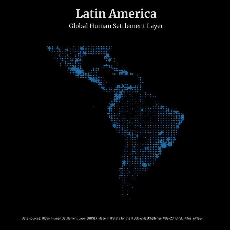
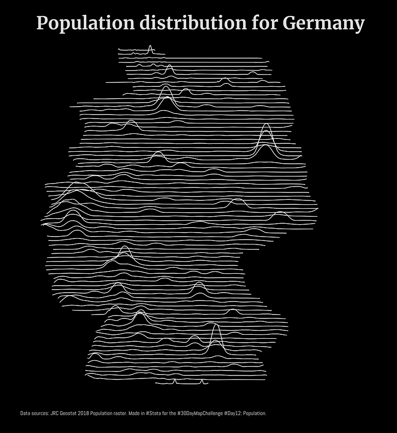
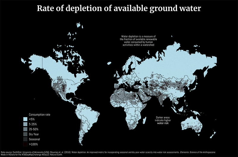
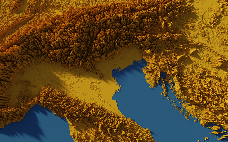
I participated in the 2021 #30DayMapChallenge and posted a map daily on Twitter. 20 out of 29 maps were produced in Stata and here are some of my favorites:
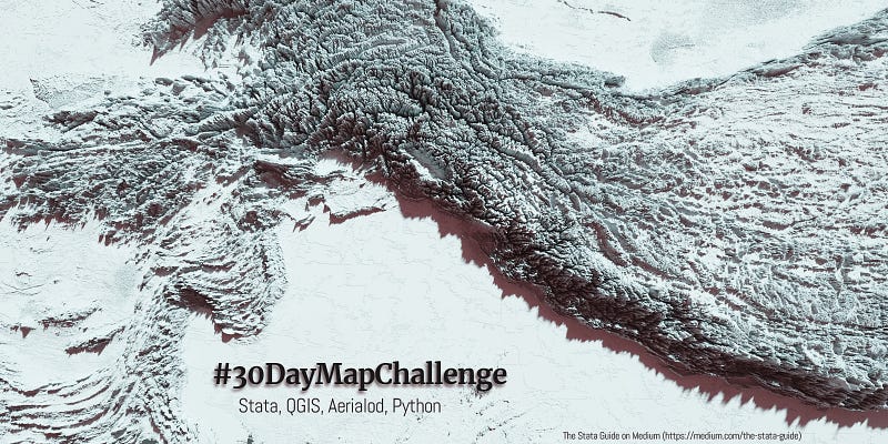
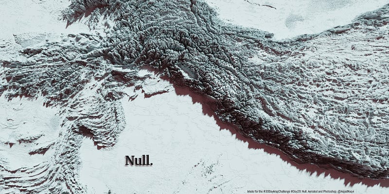
Some maps were also made in other softwares including Aerialod and QGIS. Here are the ones from Aerialod:
All the maps produced for the challenge can be viewed here:
The task of the 30th day was to summarize the results, which is basically the above GitHub repository.
The challenge had some amazing entries and tons of inspirational work from established dataviz experts and organizations. Most of these can be viewed in the link below:
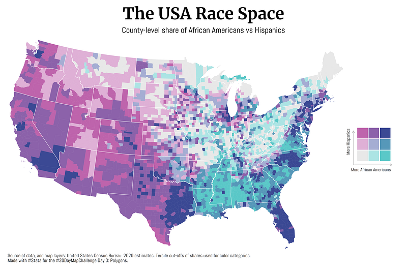
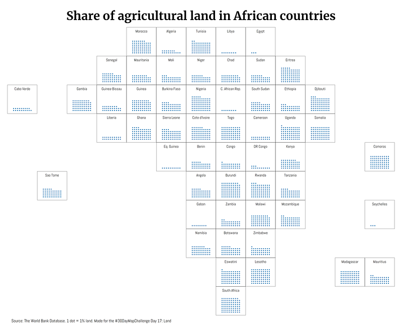
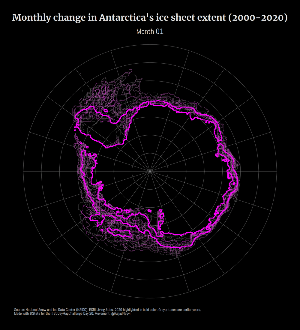
Three of my maps made it into the Top 10. These were for Day 3 (bi-variate map), Day 17 (Africa’s tilemap), and Day 20 (Antarctica ice sheet animation).
I learned a lot about Rayshader in R, and Blender, both of which can produce really amazing high-quality 3-D visuals. I will definitely explore these further in the future.
Why did I do the challenge?
So why did I do it? First, the time cost for most of the maps was low for me. I already had a bunch of data and map templates from my past work. These were recycled and reworked and here most of the effort went into the design and the storytelling elements. It would not have been possible to do all of this from scratch.
There are also two other reasons besides putting out random maps for a month straight. First, my aim was to push my Stata skills as far as possible and become more comfortable with spatial data. I also wanted to program a couple of new map templates, bi-variate maps and tilemaps, which have been on my to-do list for a long time. Challenges like these provide the right impetus to push these side projects through.
Second, my goal was to familiarize myself with different data sources. We see maps online all the time that show data like emissions, nightlights, or other satellite imagery, and think “wow it would be cool to have this data for my own research work”. While maps are great for visuals, the data itself is extremely rich. Since my own research focuses on the intersection of climate change and economics, high-frequency spatial-temporal information like temperatures, rainfall, droughts, water consumption, etc. are very useful. Even static indicators like elevation, density and distance indicators, infrastructure build-up, etc. can be extracted from spatial layers.
Dealing with spatial data requires us to overcome two major challenges: (a) where do we find the datasets that we require, and (b) how do we extract the information from it. Both of these I wanted to deal with during the challenge month. Let’s briefly talk about them:
Where do I find the datasets?
A lot more spatial data is presently available in a structured format as opposed to a few years ago. Big-name providers like NASA’s Earthdata, USGS’s EarthExplorer, EU JRC’s data catalog now allow us to access and download datasets. They are also actively working on making this information more accessible. Even two or three years ago, when these services were in their nascency, options for accessing spatial layers were limited.
Since these databases are evolving, and the datasets are massive, these websites are not easy to navigate. For example, NASA’s Blackmarble layer is actually referred to as VNP46A2 in the database. There is a logic to the name, but there are dozens of other spatial datasets with similar-looking names and it can get confusing very fast. On top of this, these datasets are further split into grids that divide up the world, and each grid for each dataset comes with several different layers. Then there is also the time resolution, which at the highest frequency, is on a daily basis. At the end of the day, the number of files equals grid tiles times layers times data frequency. And very quickly, you end up with a massive folder. Just to give some perspective, for the #30DayMapChallenge, I ended up downloading over 80 gigabytes of raw data. Not all of it was used and data processing itself generates massive amounts of temporary files. Additionally, processing this data requires fairly decent computing power. I crashed my home computer a few times. Some reality checks also made me lower my ambitions. For example, it is amazing that we can now download a 30 meter resolution imagery, but playing with it means that you need to have access to top-of-the-line processing power, or the ability to access some of the cloud-based services to remotely process the spatial data. For day-to-day work, especially for making and publishing maps online, a 250 meter, or even a 1 kilometer resolution image is more than enough. It is also sufficient for economic analysis unless you have some really amazing micro geo-referenced dataset.
I will write up a guide on how to access some of these datasets.
How do we process all this data?
As economists, we are used to running regressions on (relatively small) datasets. Datasets with a few thousand data points are usually considered decent enough to test our identification strategies. In contrast, spatial data is in another league. This is big data with millions of data points (that is if we convert them to points!). This is the type of data that is large enough to run some Machine Learning (ML) algorithms, which might even be necessary to figure out what is going on in the data.
Usually, when we use spatial data as economists, it is aggregated to some administrative boundaries that we are using for research. But the true power lies in harnessing the depth of information that is now available and too few economists are using this information in their research work. For example, we can use this type of datasets to explore how the pandemic affected economic activity at a city or region level. We can also combine this information with other high-frequency datasets (e.g. Twitter or social media feeds) to really explore questions that would not have been possible to answer even a few years back.
As casual users, most of the time we just drag and drop the spatial files we have in softwares like QGIS or ArcGIS. These softwares have scripts running in the background that does the pre-processing for us to display data on the screen or extract some information. But if we are serious about using these datasets, learning about their structure and how to deal with them is essential for moving forward.
The return on investment in getting to know these databases is high, especially if you want them for your own research work. But why is the data itself so complicated? Datasets based on satellite imagery are massive and contain tons of information, therefore also need to have unconventional data structures to optimally store the information. More advanced users use cloud services like the Google Earth Engine to handle large data quantities that would be almost impossible to process on local computers.
Since Stata cannot read pixels or geotiffs (one of my goals is to make it do so!), we are invariably bound by other softwares to help give us the data in a format that we can use. A natural choice for such things is R or Python, where one can build a whole data pipeline and analysis workflow, but it requires really massive sunk costs. And here you really have to know exactly what you are doing. Spatial datasets contain several data points for each pixel. They also come in different projection units. Therefore, scripting through them is not trivial. As beginners, it is highly advisable to visualizing the data as it is processed. And once we become comfortable with it, we can dive into bulk data processing through some automated workflow scripts.
As a start, a good option is to use softwares like QGIS (free), ArcGIS (not free!), or others. These software can handle and visualize the complex data layers structures. They also provide us with toolboxes and GUIs that are user-friendly enough to allow us to extract the information in a format that we can import in Stata or other statistical softwares. Most of the time, the data we need is usually in the form x-coordinate, y-coordinate, plus some values.
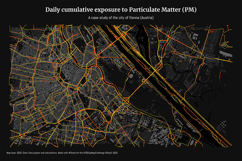
GIS softwares usually rely on GDAL, an open-source set of C++ and Python libraries, to process the spatial layers for visualization, or extract information from them. One can also directly install GDAL and work with it directly (note that it is not easy to do so), but for generic data processing and extraction, we can use existing toolboxes within standard GIS software. On top of this, one can slowly start building some Python scripts to give us more flexibility in processing or extracting the data we need. For example, QGIS has an interface that allows batch processing of multiple layers from dropdown menus within toolboxes. If the number of layers we need to process is very large, we can utilize the Python interface in QGIS to run scripts. Let’s say you want information on how nightlights evolved on a daily basis for the duration of the pandemic, for example, for the city of Vienna. Getting this data would definitely require the ability to script the whole process from start-to-finish to minimize manually dealing with each layer independently.
I will write more on this in later guides. Stay tuned!
About the author
I am an economist by profession and I have been using Stata since 2003. I am currently based in Vienna, Austria where I work at the Vienna University of Economics and Business (WU) and at the International Institute for Applied Systems Analysis (IIASA). You can see my profile, research, and projects on GitHub or on my personal website. You can connect with me via Medium, Twitter, LinkedIn, or simply via email: [email protected]. If you have questions regarding the Guide or Stata in general post them in The Code Block Discord server. If don’t have time to make all these visuals in Stata, contact me on UpWork and we can figure (no pun intended!) something out.
The Stata Guide, releases awesome new content regularly. Subscribe, Clap, and/or Follow the guide if you like the content!


