
Exploring Parallel Coordinates Highcharts in React
A step-by-step guide on parallel coordinates chart
Introduction
Highcharts is an enterprise-grade JavaScript charting library based on SVG. It comes with excellent documentation and innumerable examples. The only drawback is that the license is proprietary. It is free for personal/non-commercial uses, but you must pay for commercial applications.
In a previous article, we have introduced Highcharts and the working environment to explore Highcharts using Create React App. We continue to use this environment to try out parallel coordinates chart.
As we have explained in the previous article, it is recommended to include the following imports for every chart:
import Highcharts from 'highcharts';
import HighchartsReact from 'highcharts-react-official';
import HighchartsExporting from 'highcharts/modules/exporting';
import HighchartsAccessibility from 'highcharts/modules/accessibility';highcharts: It is the JavaScript charting library.highcharts-react-official: It is the official Highcharts-supported wrapper for React.highcharts/modules/exporting: It is the Highcharts exporting module that provides a menu with export-related menu items toView in full screen,Print chart,Download PNG image,Download JPEG image,Download PDF document, andDownload SVG vector image.highcharts/modules/accessibility: It is the Highcharts accessibility module that provides accessibility for the generated chart HTML.
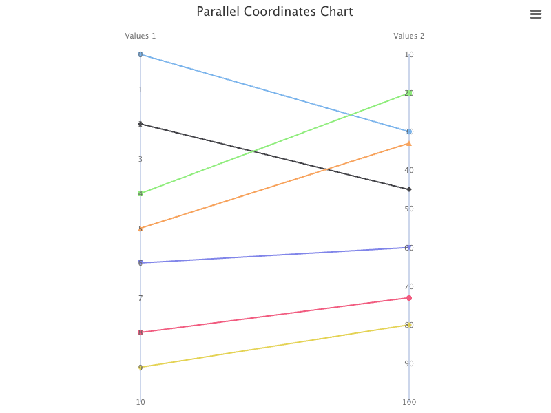
Parallel Coordinates Chart With Two Linear Axes
A parallel coordinates chart is a common way of visualizing and analyzing high-dimensional datasets. The nature of parallel coordinates requires at least two axes, which can be the same type or different types.
Highcharts supported axis types are linear, logarithmic, datetime, category and treegrid. Besides treegrid that is used for Gantt charts, all other axis types are available for a parallel coordinates chart. The default axis type is linear, which uses the linear scale.
The following src/App.js is an example that shows a parallel coordinates chart with two linear axes:
- At lines 5 and 8,
highcharts/modules/parallel-coordinatesis loaded, which is required for parallel coordinates chart. - At lines 10–18,
datais created with 7 lines, where each line is composed of two coordinates. - At lines 21–29, the chart’s setting is defined.
– At line 22,
typeis defined as'linear'. – At lines 23–24,widthandheightare defined. – At line 25,parallelCoordinatesis set to true. – At lines 26–28, all parallel axes are configured withlineWidthof 2 (default is 1). - At lines 30–32, the chart title is set to
'Parallel Coordinates Chart'. - At lines 33–36, two
xAxisare defined, withoffsetto be 10. - At lines 37–52, two
yAxisare defined. – At lines 38–44, the firstyAxisislinear.minis 0, andmaxis 10. SincestartOnTickis set to false,minandmaxvalues are strictly enforced.reversedis set to true, such that the origin is at the top. – At lines 45–51, the secondyAxisis alsolinear, with the similar setting. - At lines 53–56,
seriesare calculated fromdata(line 10). - At lines 57–59, the default credits have been turned off.
- At line 62, a parallel coordinates chart is created.
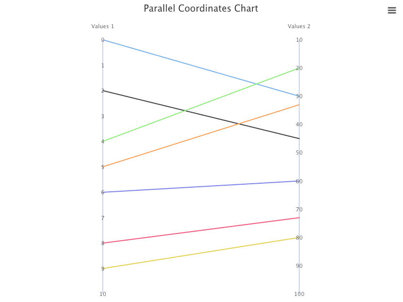
Execute yarn start, and we see a parallel coordinates chart with two linear axes.
Hover on the left side of the line, it shows the coordinate of the first axis.
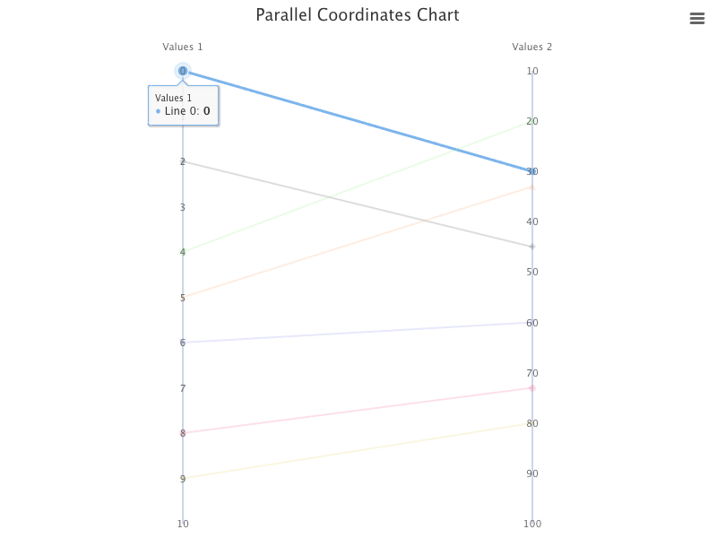
Hover on the right side of the line, it shows the coordinate of the second axis.
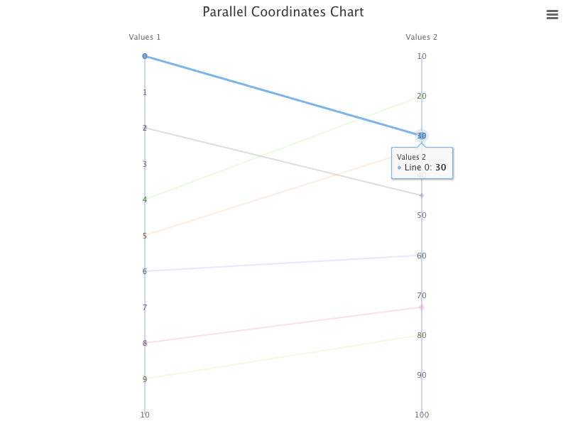
For each line, there are markers at two ends, and we can turn them off.
plotOptions: {
  series: {
    marker: {
      enabled: false,
      states: {
        hover: {
          enabled: false,
        },
      },
    },
  },
}
Execute yarn start, and we see the chart does not have markers on axes.
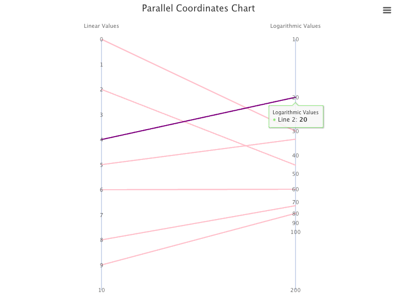
Parallel Coordinates Chart With One Linear Axis and One Logarithmic Axis
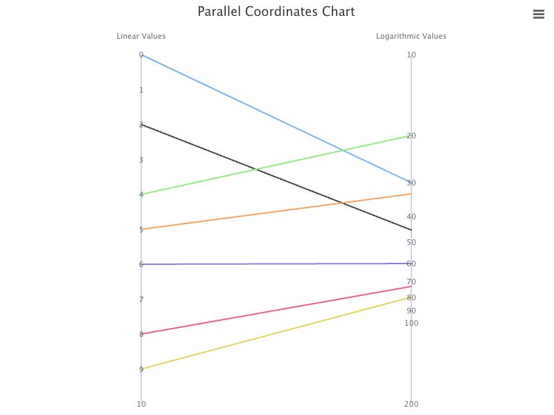
We change the second yAxis to logarithmic, which displays numerical data over a very wide range of values in a compact way. startOnTick is removed, as min and max values are not enforced anyway.
{
  type: 'logarithmic',
  min: 10,
  max: 100,
  s̶t̶a̶r̶t̶O̶n̶T̶i̶c̶k̶:̶ ̶f̶a̶l̶s̶e̶,̶
  startOnTick: false,
  reversed: true,
}
Rename xAxis categories:
xAxis: {
  categories: ['Linear Values', 'Logarithmic Values'],
  offset: 10,
}
Execute yarn start, and we see a parallel coordinates chart with one linear axis and one logarithmic axis.
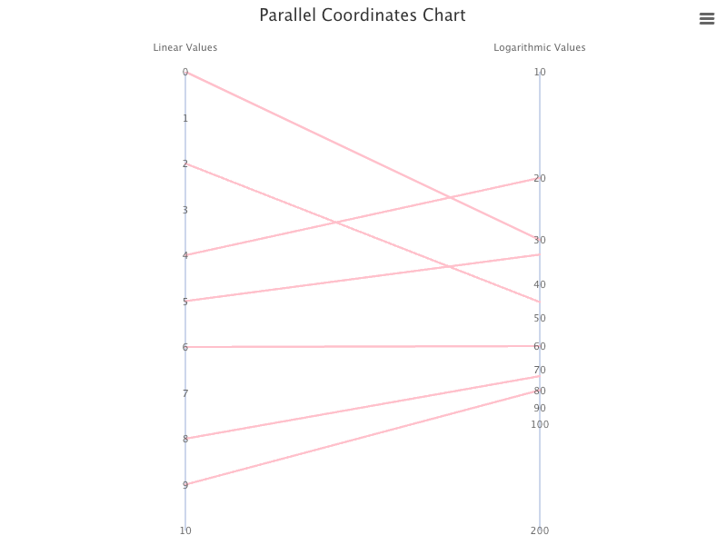
We can also set all lines to pink, and hovered lines to purple in src/App.css:
.highcharts-series path {
  stroke: pink;
  stroke-width: 2px;
}
.highcharts-series-hover path {
  stroke: purple;
}
Import ./App.css at line 1 in src/App.js:
Execute yarn start, and we see a parallel coordinates chart with pink lines.
And the hovered line is purple.
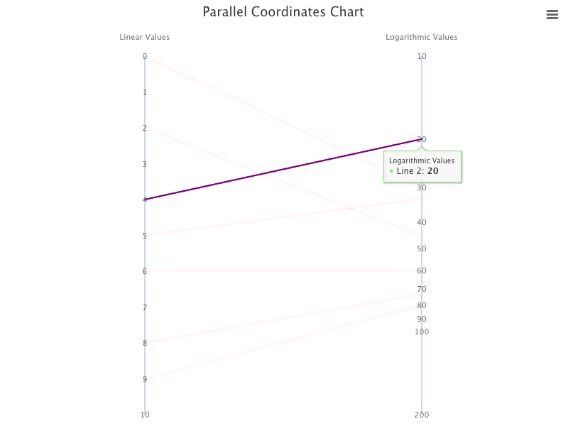
When a line is hovered, the un-hovered lines become faded (inactive). The effect is achieved by Highchats setting opacity to 0.2. It can be turned off by setting opacity to 1 in src/App.css:
.highcharts-series-inactive {
  opacity: 1;
}
Execute yarn start, and we see a parallel coordinates chart that inactive lines are not faded.
The opacity rule is for illustration only, we do not use it for the rest of the examples.
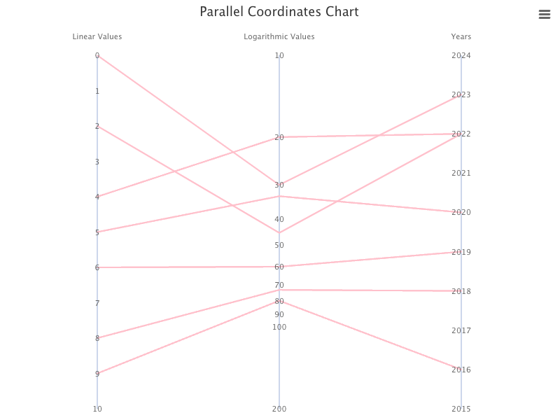
Parallel Coordinates Chart With Three Axes
We create the third yAxis to be datetime, which uses date time scale and displays the date time values as axis labels in the specified format. Date.UTC(year, month, day, hours, minutes, seconds, milliseconds) can get time in milliseconds for UTC (Universal Time Coordinated), the global standard time defined by the World Time Standard — historically known as Greenwich Mean Time.
Here is the type/range of Date.UTC parameters:
year: integermonth: 0–11day: 1–31hours: 0–23minutes: 0–59seconds: 0–59milliseconds: 0–999
We expand data with the third coordinates of datetime, with years apart:
const data = [
  [0, 30, Date.UTC(2023)],
  [2, 45, Date.UTC(2022)],
  [4, 20, Date.UTC(2022)],
  [5, 33, Date.UTC(2020)],
  [6, 60, Date.UTC(2019)],
  [8, 73, Date.UTC(2018)],
  [9, 80, Date.UTC(2016)],
];
Add the third xAxis:
xAxis: {
  categories: ['Linear Values', 'Logarithmic Values', 'Years'],
  offset: 10,
}
Add the third yAxis:
{
type: 'datetime',
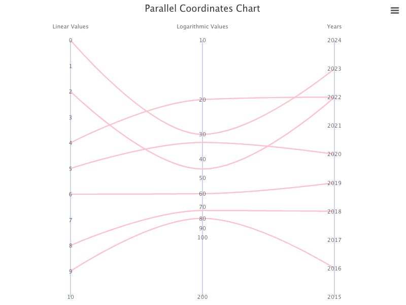
}Execute yarn start, and we see a parallel coordinates chart with one linear axis, one logarithmic axis, and one datetime axis for Years.
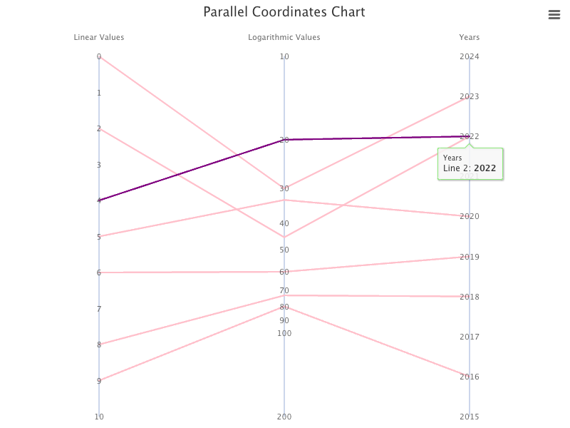
The chart looks good until we hover on a line near the third axis. It shows the date time value in milliseconds, instead of the year.
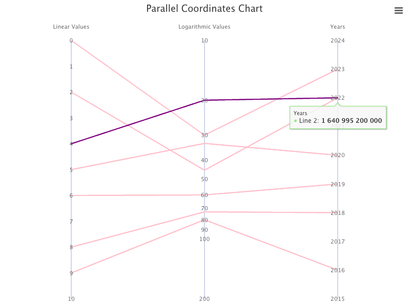
We can configure tooltip to use formattedValue, instead of the raw value:
tooltip: {
  pointFormat: '{series.name}: <b>{point.formattedValue}</b><br/>',
}
Now, the tooltip shows the year value as a year.
A parallel coordinates chart can support types of line or spline. Here is the modified src/App.js, which sets the chart type to spline (line 23):
Execute yarn start, and we see a parallel coordinates chart with curved lines (spline).
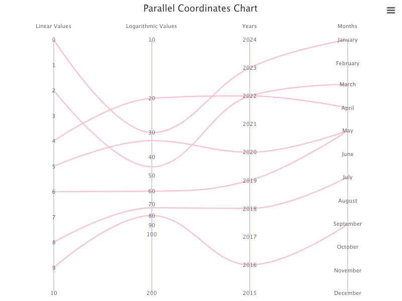
Parallel Coordinates Chart With Four Axes
We create the fourth yAxis to be datetime too, but make it to show months. In order to show month labels in a meaningful way, the distance between values should be months apart.
We expand data with the fourth coordinates of datetime:
const data = [
  [0, 30, Date.UTC(2023), Date.UTC(2023, 0)],
  [2, 45, Date.UTC(2022), Date.UTC(2023, 2)],
  [4, 20, Date.UTC(2022), Date.UTC(2023, 3)],
  [5, 33, Date.UTC(2020), Date.UTC(2023, 4)],
  [6, 60, Date.UTC(2019), Date.UTC(2023, 4)],
  [8, 73, Date.UTC(2018), Date.UTC(2023, 6)],
  [9, 80, Date.UTC(2016), Date.UTC(2023, 8)],
];
Add the fourth xAxis:
xAxis: {
  categories: ['Linear Values', 'Logarithmic Values', 'Years', 'Months'],
  offset: 10,
}
Add the fourth yAxis:
{
  type: 'datetime',
  min: Date.UTC(2023, 0), // January
  max: Date.UTC(2023, 11), // December
  tickInterval: 24 * 3600 * 1000 * 30, // A month
  reversed: true,
  labels: {
    format: '{value:%B}', // long month format, like January
  },
}
In the code snippet above, we set the value format to be %B, which is the format of long month, like January. Here is a list for Highcharts supported datetime formats:
%a: Short weekday, likeMon%A: Long weekday, likeMonday%d: Two digit day of the month, 01 to 31%e: Day of the month, 1 through 31%w: Day of the week, 0 through 6%b: Short month, likeJan%B: Long month, likeJanuary%m: Two digit month number, 01 through 12%y: Two digits year, like 09 for 2009%Y: Four digits year, like 2009%H: Two digits hours in 24h format, 00 through 23%k: Hours in 24h format, 0 through 23%I: Two digits hours in 12h format, 00 through 11%l: Hours in 12h format, 1 through 12%M: Two digits minutes, 00 through 59%p: Upper case AM or PM%P: Lower case AM or PM%S: Two digits seconds, 00 through 59%L: Milliseconds
Here is the modified src/App.js, with four axes:
Execute yarn start, and we see a parallel coordinates chart with one linear axis, one logarithmic axis, one datetime axis for Years, and one datetime axis for Months.
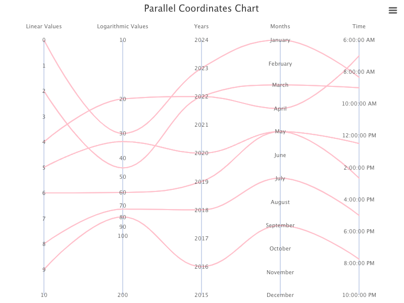
Parallel Coordinates Chart With Five Axes
We create the fifth yAxis to be datetime too, but make it to show time. In order to show time labels in a meaningful way, the distance between values should be hours apart.
We expand data with the fifth coordinates of datetime:
const data = [
  [0, 30, Date.UTC(2023), Date.UTC(2023, 0), Date.UTC(2023, 0, 1, 8, 20, 30)],
  [2, 45, Date.UTC(2022), Date.UTC(2023, 2), Date.UTC(2023, 0, 1, 9, 0, 0)],
  [4, 20, Date.UTC(2022), Date.UTC(2023, 3), Date.UTC(2023, 0, 1, 7, 0, 0)],
  [5, 33, Date.UTC(2020), Date.UTC(2023, 4), Date.UTC(2023, 0, 1, 12, 30, 0)],
  [6, 60, Date.UTC(2019), Date.UTC(2023, 4), Date.UTC(2023, 0, 1, 14, 40, 10)],
  [8, 73, Date.UTC(2018), Date.UTC(2023, 6), Date.UTC(2023, 0, 1, 17, 0, 30)],
  [9, 80, Date.UTC(2016), Date.UTC(2023, 8), Date.UTC(2023, 0, 1, 19, 45, 15)],
];
Add the fifth xAxis:
xAxis: {
  categories: ['Linear Values', 'Logarithmic Values', 'Years', 'Months', 'Time'],
  offset: 10,
}
Add the fifth yAxis:
{
  type: 'datetime',
  reversed: true,
  labels: {
    format: '{value:%l:%M:%S %p}', // time format, like 8:30:00 AM
  },
}
Here is the modified src/App.js, with five axes:
Execute yarn start, and we see a parallel coordinates chart with one linear axis, one logarithmic axis, one datetime axis for Years, one datetime axis for Months, and one datetime axis for Time.
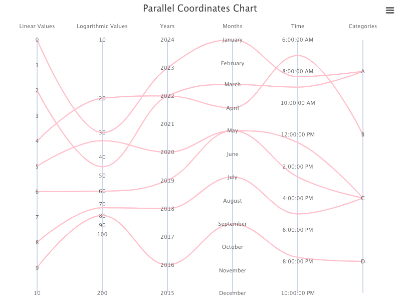
Parallel Coordinates Chart With Six Axes
We create the sixth yAxis to be category, with 4 groups (0–3).
Expand data with the sixth coordinates of category:
const data = [
  [0, 30, Date.UTC(2023), Date.UTC(2023, 0), Date.UTC(2023, 0, 1, 8, 20, 30), 0],
  [2, 45, Date.UTC(2022), Date.UTC(2023, 2), Date.UTC(2023, 0, 1, 9, 0, 0), 0],
  [4, 20, Date.UTC(2022), Date.UTC(2023, 3), Date.UTC(2023, 0, 1, 7, 0, 0), 1],
  [5, 33, Date.UTC(2020), Date.UTC(2023, 4), Date.UTC(2023, 0, 1, 12, 30, 0), 2],
  [6, 60, Date.UTC(2019), Date.UTC(2023, 4), Date.UTC(2023, 0, 1, 14, 40, 10), 2],
  [8, 73, Date.UTC(2018), Date.UTC(2023, 6), Date.UTC(2023, 0, 1, 17, 0, 30), 2],
  [9, 80, Date.UTC(2016), Date.UTC(2023, 8), Date.UTC(2023, 0, 1, 19, 45, 15), 3],
];
Add the sixth xAxis:
xAxis: {
  categories: ['Linear Values', 'Logarithmic Values', 'Years', 'Months', 'Time', 'Categories'],
  offset: 10,
}
Add the sixth yAxis:
{
  type: 'category',
  reversed: true,
  categories: ['A', 'B', 'C', 'D'],
}
Here is the modified src/App.js, with six axes:
Execute yarn start, and we see a parallel coordinates chart with one linear axis, one logarithmic axis, one datetime axis for Years, one datetime axis for Months, one datetime axis for Time, and one category axis for 4 groups.
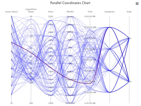
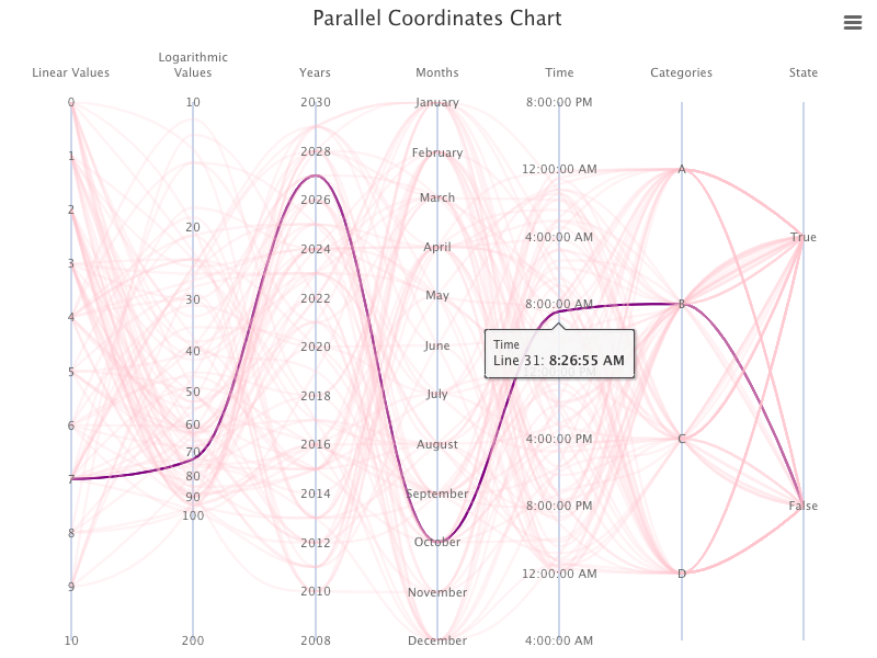
Parallel Coordinates Chart With Seventh Axes
We create the seventh yAxis to be category too, with 2 groups (0–1).
Expand data with the seventh coordinates of category:
const data = [
  [0, 30, Date.UTC(2023), Date.UTC(2023, 0), Date.UTC(2023, 0, 1, 8, 20, 30), 0, 1],
  [2, 45, Date.UTC(2022), Date.UTC(2023, 2), Date.UTC(2023, 0, 1, 9, 0, 0), 0, 0],
  [4, 20, Date.UTC(2022), Date.UTC(2023, 3), Date.UTC(2023, 0, 1, 7, 0, 0), 1, 0],
  [5, 33, Date.UTC(2020), Date.UTC(2023, 4), Date.UTC(2023, 0, 1, 12, 30, 0), 2, 1],
  [6, 60, Date.UTC(2019), Date.UTC(2023, 4), Date.UTC(2023, 0, 1, 14, 40, 10), 2, 1],
  [8, 73, Date.UTC(2018), Date.UTC(2023, 6), Date.UTC(2023, 0, 1, 17, 0, 30), 2, 1],
  [9, 80, Date.UTC(2016), Date.UTC(2023, 8), Date.UTC(2023, 0, 1, 19, 45, 15), 3, 1],
];
Add the seventh xAxis:
xAxis: {
  categories: ['Linear Values', 'Logarithmic Values', 'Years', 'Months', 'Time', 'Categories', 'State'],
  offset: 10,
}
Add the seventh yAxis:
{
  type: 'category',
  categories: ['False', 'True'],
}
Here is the modified src/App.js, with seven axes:
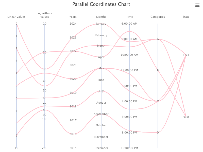
Execute yarn start, and we see a parallel coordinates chart with one linear axis, one logarithmic axis, one datetime axis for Years, one datetime axis for Months, one datetime axis for Time, one category axis for 4 groups, and one category axis for 2 groups.
Parallel Coordinates Chart With More or Less Data
We have shown a parallel coordinates chart with various data. What if data is incomplete, i.e. some values are null?
const data = [
  [null, 30, Date.UTC(2023), Date.UTC(2023, 0), Date.UTC(2023, 0, 1, 8, 20, 30), 0, 1],
  [2, null, Date.UTC(2022), Date.UTC(2023, 2), Date.UTC(2023, 0, 1, 9, 0, 0), 0, 0],
  [4, 20, null, Date.UTC(2023, 3), Date.UTC(2023, 0, 1, 7, 0, 0), 1, 0],
  [5, 33, Date.UTC(2020), null, Date.UTC(2023, 0, 1, 12, 30, 0), 2, 1],
  [6, 60, Date.UTC(2019), Date.UTC(2023, 4), null, 2, 1],
  [8, 73, Date.UTC(2018), Date.UTC(2023, 6), Date.UTC(2023, 0, 1, 17, 0, 30), null, 1],
  [9, 80, Date.UTC(2016), Date.UTC(2023, 8), Date.UTC(2023, 0, 1, 19, 45, 15), 3, null],
];
It shows broken lines:
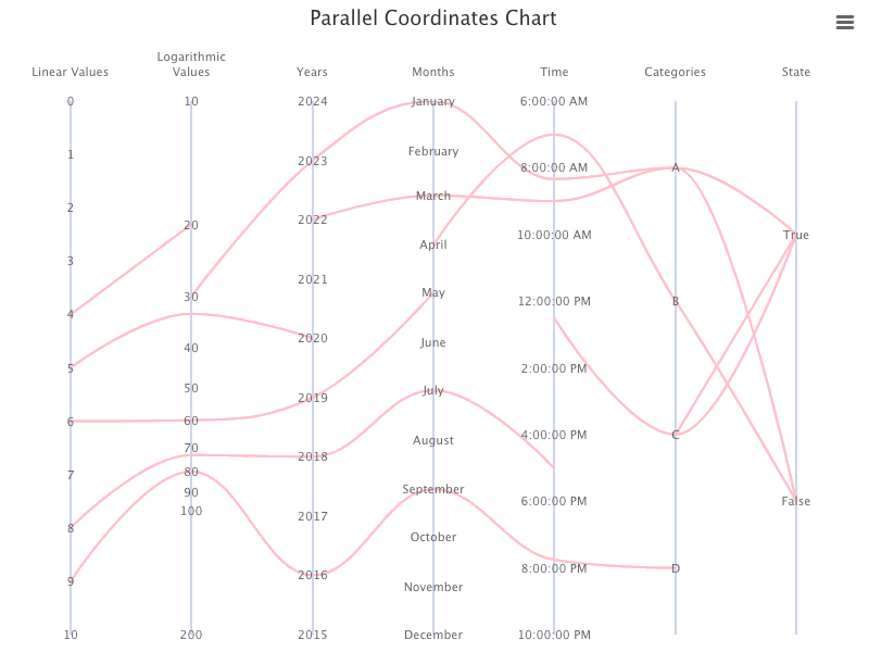
Hovering on a broken line still highlights all pieces:
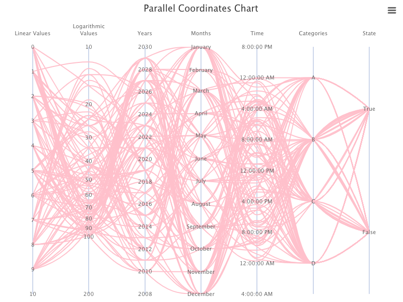
A parallel coordinates chart helps analyze large datasets to find patterns and correlations. Instead of hardcoded 7 lines in previous examples, the following modified src/App.js generates 100 random lines:
- At line 11,
TOTAL_LINE_COUNTis configured with 100 lines. - At lines 13–24,
datais generated dynamically based on some random calculation.
Execute yarn start, and we see a parallel coordinates chart with a large dataset (100).
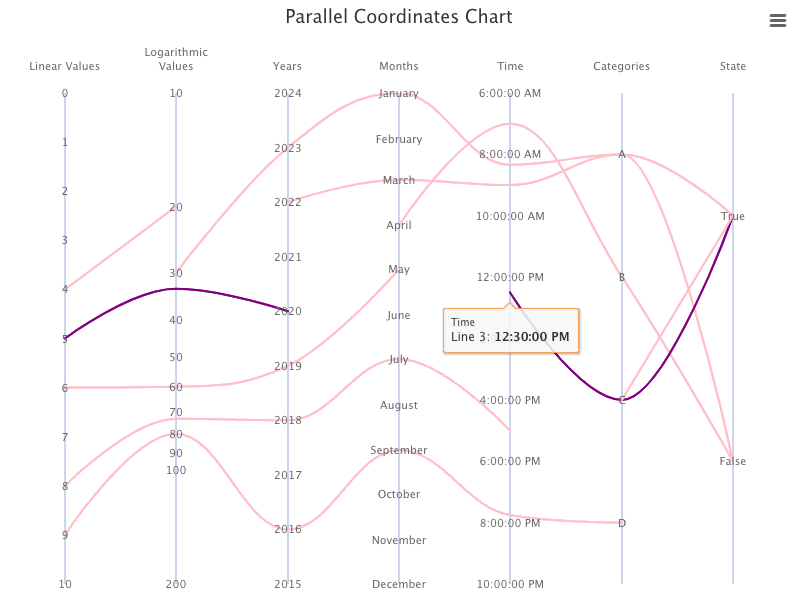
Here is the plot with a hovered line.
Parallel Coordinates Chart That Is Programmably Hovered On
We have explored parallel coordinates chart in details. Let’s have some fun effect to programmably hover on a line every second.
We install a hook that provides a declarative setInterval called useInterval.
% yarn add @use-it/interval
After the installation, @use-it/interval becomes part of dependencies in package.json, along with highcharts and highcharts-react-official.
"dependencies": {
  "@use-it/interval": "^1.0.0",
  "highcharts": "^10.3.2",
  "highcharts-react-official": "^3.1.0"
}
Modify src/App.js to the following:
- At line 51,
enableMouseTrackingis disabled as we perform programmable hovering. - At line 124,
chartComponentRefis generated fromuseRef, wherechartComponentRef.currentpoints to the chart object by configuring it at line 135. - At lines 126–133,
useIntervalis invoked every second (1000 ms). It selects a random line (line 128). At line 130, the selected line is set tohover, and other lines are set toinactive.
For a change, we make the chart line color to be blue with 0.2 opacity, same as inactive line color (blue). The hovered line remains purple, but thicker (5px).
Here is the modified src/App.css:
.highcharts-series path {
  stroke: rgb(0, 0, 255, 0.2);
  stroke-width: 2px;
}
.highcharts-series-hover path {
  stroke: purple;
  stroke-width: 5px;
}
.highcharts-series-inactive path {
  stroke: blue;
}
Execute yarn start, and we see a parallel coordinates chart that programmably hovers on a line every second.
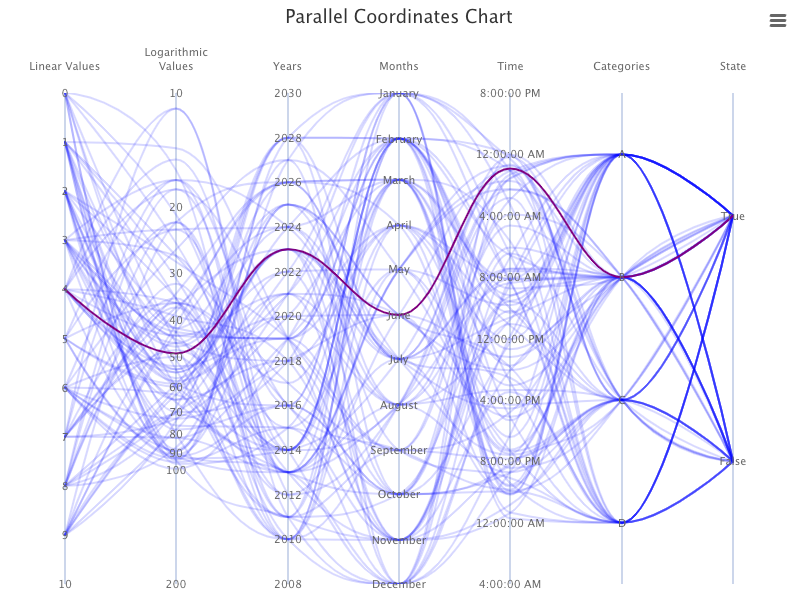
The following video captures the dynamics.
The complete code repository is located here.
Parallel Coordinates Chart That Got the Edge Lines Cut Off
Go back to have a simple parallel coordinates chart with two axes in src/App.js, where the series lineWidth is set to 10 (line 50):
Execute yarn start, and we see the parallel coordinates chart.
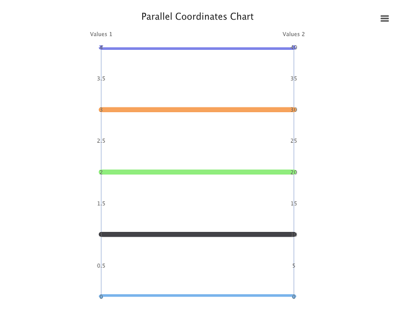
Have you noticed that the first and last lines are thinner than the middle lines?
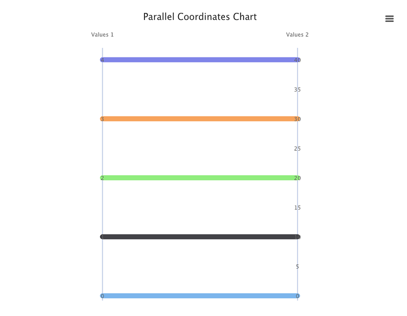
It is a well-known issue in Highcharts that edge lines are cut off. There are many forums that have discussed similar problems, such as this one. We can adopt the solution from the linked article to set minPadding, along with turn off startOnTick and endOnTick.
{
  minPadding: 0.02,
  startOnTick: false,
  endOnTick: false,
}
Here is the modified src/App.js:
Execute yarn start, and we see the parallel coordinates chart in which all lines have the same width.
Conclusion
Highcharts is an enterprise-grade JavaScript charting library based on SVG. It comes with excellent documentation and innumerable examples.
In this article, we have provided step-by-step guide on parallel coordinates chart.
We have also written articles on other Highcharts types:
- In this article:
line,spline,area,areaspline,column,bar,pie,scatter,scatter3d,heatmap,treemap, andgauge. - In this article:
bubble,packedbubble,streamgraph, andcylinder. - In this article:
sankeydiagram,arcdiagram,dependencywheel, andnetworkgraph. - In this article: Drawing Capabilities.
- In this article:
timeline.
Highcharts is free for personal/non-commercial uses, but you must pay for commercial applications. If your budget allows, Highcharts is highly recommended.
Thanks for reading.
Want to Connect?

If you are interested, check out my directory of web development articles.


