
More Highcharts Examples in React: Sankey Diagram, Arc Diagram, Dependency Wheel, and Network Graph
Explore chart types for enterprise-grade applications
Introduction
Highcharts is an enterprise-grade JavaScript charting library based on SVG. It comes with excellent documentation and innumerable examples. The only drawback is that the license is proprietary. It is free for personal/non-commercial uses, but you must pay for commercial applications.
In a previous article, we introduced Highcharts and 12 chart types of line, spline, area, areaspline, column, bar, pie, scatter, scatter3d, heatmap, treemap, and gauge.
In that article, we have built a working environment to explore Highcharts using Create React App. We continue to use the environment to try out more chart types of sankeydiagram, arcdiagram, dependencywheel, and networkgraph.
As we have explained in that article, it is recommended to include the following imports for every chart:
import Highcharts from 'highcharts';
import HighchartsReact from 'highcharts-react-official';
import _ from 'lodash';
import HighchartsExporting from 'highcharts/modules/exporting';
import HighchartsAccessibility from 'highcharts/modules/accessibility';highcharts: It is the JavaScript charting library.highcharts-react-official: It is the official Highcharts-supported wrapper for React.lodash: It is a modern JavaScript utility library delivering modularity, performance, and extras. As lodash comes with Create React App, we conveniently use its function,_.startCase, to make each initial letter capitalized.highcharts/modules/exporting: It is the Highcharts exporting module that provides a menu with export-related menu items toView in full screen,Print chart,Download PNG image,Download JPEG image,Download PDF document, andDownload SVG vector image.highcharts/modules/accessibility: It is the Highcharts accessibility module that provides accessibility for the generated chart HTML.
The Sankey Diagram Chart
A Sankey diagram chart is the type of flow diagram, in which the width of the link between two nodes is shown proportional to the flow quantity. A Sankey diagram series is composed of a list of arrays, where each array is defined as [from, to, weight]:
from: The source node that the flow comes from.to: The destination node that the flow goes to.weight: The width of the flow link.
Here is the modified src/App.js:
- At lines 6 and 9,
highcharts/modules/sankeyis loaded, which is required for the Sankey diagram chart. - At lines 12–16, the chart’s
type,width, andheightare defined. - At lines 17–19, the chart title is composed from the type.
- At lines 20–39,
seriesdefines the data series. – At line 22,keysare defined as[from, to, weight]. – At lines 23–27,dataLabelsare defined for the flow label (format) and the node name (nodeFormat). The label color is set toblack, which has white borders. – At lines 28–37, the flow data is defined. The source nodes areA1,A2, andA3, and the destination nodes areB1,B2, andB3. Typically, the flow goes in one direction. In this code snippet, it goes fromAnodes toBnodes. - At lines 40–42, the default credits have been turned off.
- At line 47, the Sankey diagram chart is created.
Execute yarn start, and we see a Sankey diagram chart. Nodes are vertically listed in two columns: the source column and the destination column. Each node’s height is proportional to its total weights, and each flow link’s width is proportional to its weight.

The Sankey diagram flow can go a number of sections. In addition to the section of flow from A nodes B nodes, we add another section of flow from B nodes to C nodes.
data: [
  ['A1', 'B1', 1],
  ['A1', 'B2', 3],
  ['A1', 'B3', 1],
  ['A2', 'B1', 1],
  ['A2', 'B3', 1],
  ['A3', 'B1', 2],
  ['A3', 'B2', 3],
  ['A3', 'B3', 1],
  ['B1', 'C1', 2],
  ['B1', 'C2', 3],
  ['B2', 'C1', 3],
  ['B2', 'C2', 1],
  ['B2', 'C3', 2],
  ['B3', 'C1', 4],
  ['B3', 'C2', 1],
  ['B3', 'C3', 1],
]
Execute yarn start, and we see a Sankey diagram chart with three columns.

If we change keys to [to, from, weight], the Sankey diagram chart changes the flow direction.

The Arc Diagram Chart
An arc diagram chart visualizes relations and their strength between nodes of a data set. It is a type of the Sankey diagram chart, but it displays nodes differently. Instead of showing nodes on columns, the arc diagram lays out nodes from left to right in a row.
Here is the modified src/App.js:
- At lines 6 and 10,
highcharts/modules/sankeyis loaded, which is required for the arc diagram chart. - At lines 7 and 11,
highcharts/modules/arc-diagramis loaded, which is also required for the arc diagram chart. - At lines 14–18, the chart’s
type,width, andheightare defined. - At lines 19–21, the chart title is composed from the type.
- At lines 22–42,
seriesdefines the data series. – At line 24,keysare defined as[from, to, weight]. – At line 25,linkWeightis set to 5. The default value is a lot wider, depending on each link’sweight. – At line 25,centeredLinksis set to true, which anchors both link ends from two nodes’ centers. – At lines 27–31,dataLabelsare defined for the flow link label (format) and the node name (nodeFormat). The label color is set toblack, which has white borders. – At lines 32–40, the link data is defined. Typically, links go one direction, but one link is defined in the reversed direction (line 38). - At lines 43–45, the default credits have been turned off.
- At line 50, the arc diagram chart is created.
Execute yarn start, and we see an arc diagram chart. All nodes are displayed from left to right in a row. Each node’s size is proportional to its total weights, and each link is defined with width of 5.
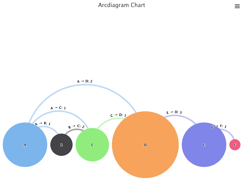
By default, the series is placed such that the biggest node is touching the bottom border of the plot area. We can set offset to lift it up.
keys: ['from', 'to', 'weight'],
offset: '50%',
Here, offset is set to 50%, where the center of nodes is place at the 50% position, i.e. the vertical center, of a chart.

Dependency wheel
A dependency wheel chart is a type of flow diagram, where nodes are laid out in a circle and links are drawn between them. Each link’s width is proportional to the flow quantity, and each node’s size is proportional to its total flow quantity. It is a type of the Sankey diagram chart, but it displays nodes differently. Instead of showing nodes on columns, the arc diagram lays out nodes on the arcs of a circle, indicating that the flow links are multidirectional.
Here is the modified src/App.js:
- At lines 6 and 10,
highcharts/modules/sankeyis loaded, which is required for the dependency wheel chart. - At lines 7 and 11,
highcharts/modules/dependency-wheelis loaded, which is also required for the dependency wheel chart. - At lines 14–18, the chart’s
type,width, andheightare defined. - At lines 19–21, the chart title is composed from the type.
- At lines 22–40,
seriesdefines the data series. – At line 24,keysare defined as[from, to, weight]. – At lines 25–29,dataLabelsare defined for the flow label (format) and the node name (nodeFormat). The label color is set toblack, which has white borders. – At lines 30–38, the link data is defined. The links of the dependency wheel chart are multidirectional. - At lines 41–43, the default credits have been turned off.
- At line 48, the dependency wheel chart is created.
Execute yarn start, and we see a dependency wheel chart.

You may wonder why link labels are not center-aligned to the link. It is a known issue in Highcharts.
As it does not make sense to have these link labels at side, we simply remove them from the dataLabels setting:
dataLabels: {
  nodeFormat: '{point.name}',
  color: 'black',
}
When a link is hovered on, the link label shows.

Links in the dependency wheel chart are curved by default. The curve level is controled by curveFactor. A higher number makes it more curved, and the default value is 0.6.
Let’s try curveFactor of 1.
keys: ['from', 'to', 'weight'],
curveFactor: 1
Does the following dependency wheel look more curved?

We can also set curveFactor to 0 to make the lines straight.

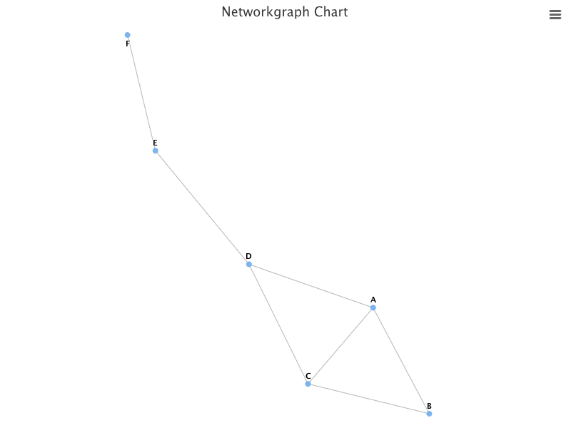
The Network Graph Chart
A network graph chart shows a mathematical structure (graph) of relations between points in an aesthetically-pleasing way. The graph visualizes how subjects are interconnected with each other. Entities are displayed as nodes and the relationship between them are displayed as lines. A network graph is also called the force directed graph, although it shows lines (undirected edges), instead of arrows (directed edges).
Here is the modified src/App.js:
- At lines 6 and 9,
highcharts/modules/networkgraphis loaded, which is required for the network graph chart. - At lines 12–16, the chart’s
type,width, andheightare defined. - At lines 17–19, the chart title is composed from the type.
- At lines 20–37,
seriesdefines the data series. – At line 22,keysare defined as[from, to]. – At lines 23–26,dataLabelsare enabled (line 24). The link labels are turned off (line 25). – At lines 27–35, the link data is defined. Although links define directions, they are displayed as lines (undirected edges). - At lines 38–40, the default credits have been turned off.
- At line 45, the network graph chart is created.
Execute yarn start, and we see a network graph chart.

Well, the graph does not fill the plot area. The default linkLength is calculated as Math.pow(availableWidth * availableHeight / nodesLength, 0.4). We can set it to 80 to make the graph fill the plot area.
plotOptions: {
  networkgraph: {
    layoutAlgorithm: {
      linkLength: 80,
    }
  }
}
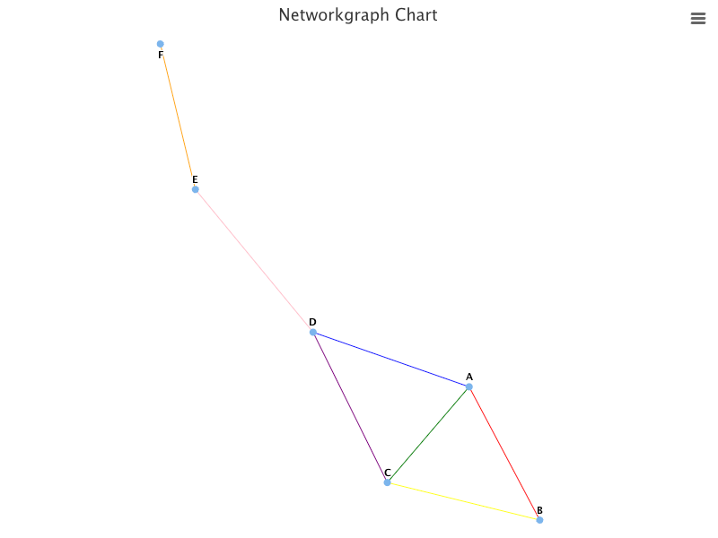
We can also set the global link color to orange:
plotOptions: {
  networkgraph: {
    layoutAlgorithm: {
      linkLength: 80,
    },
    link: {
      color: 'orange',
    },
  },
}
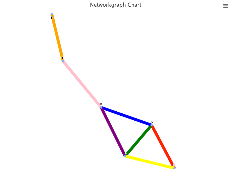
In addition, we can set color for each link to overwrite the global link color, orange.
series: [
  {
    keys: ['from', 'to', 'color'],
    data: [
      ['A', 'B', 'red'],
      ['A', 'C', 'green'],
      ['A', 'D', 'blue'],
      ['B', 'C', 'yellow'],
      ['C', 'D', 'purple'],
      ['E', 'D', 'pink'],
      ['E', 'F'],
    ],
  },
]
We can make links thicker:
series: [
  {
    keys: ['from', 'to', 'color'],
    link: {
      width: 10,
    },
    data: [
      ['A', 'B', 'red'],
      ['A', 'C', 'green'],
      ['A', 'D', 'blue'],
      ['B', 'C', 'yellow'],
      ['C', 'D', 'purple'],
      ['E', 'D', 'pink'],
      ['E', 'F'],
    ],
  },
]
We can enlarge nodes, and color them to brown:
series: [
  {
    keys: ['from', 'to', 'color'],
    link: {
      width: 10,
    },
    marker: {
      lineWidth: 10,
      lineColor: 'brown'
    },
    data: [
      ['A', 'B', 'red'],
      ['A', 'C', 'green'],
      ['A', 'D', 'blue'],
      ['B', 'C', 'yellow'],
      ['C', 'D', 'purple'],
      ['E', 'D', 'pink'],
      ['E', 'F'],
    ],
  },
]
We can enlarge node labels, and color them to white:
dataLabels: {
  enabled: true,
  linkFormat: '',
  style: {
    fontSize: 20,
    color: 'white',
  }
}
Conclusion
Highcharts is an enterprise-grade JavaScript charting library based on SVG. It comes with excellent documentation and innumerable examples.
In this article, we have introduced additional chart types of sankeydiagram, arcdiagram, dependencywheel, and networkgraph.
We have also written articles on other Highcharts types:
- In this article:
line,spline,area,areaspline,column,bar,pie,scatter,scatter3d,heatmap,treemap, andgauge. - In this article:
bubble,packedbubble,streamgraph, andcylinder. - In this article:
parallelCoordinates. - In this article: Drawing Capabilities.
- In this article:
timeline.
Highcharts is free for personal/non-commercial uses, but you must pay for commercial applications. If your budget allows, Highcharts is highly recommended.
Thanks for reading.
Want to Connect?

If you are interested, check out my directory of web development articles.
More content at PlainEnglish.io. Sign up for our free weekly newsletter. Follow us on Twitter, LinkedIn, YouTube, and Discord.
Interested in scaling your software startup? Check out Circuit.


