
More Highcharts Examples in React: Bubble, Packed Bubble, Stream Graph, and Cylinder
Explore chart types for enterprise-grade applications

Introduction
Highcharts is an enterprise-grade JavaScript charting library based on SVG. It comes with excellent documentation and innumerable examples. The only drawback is that the license is proprietary. It is free for personal/non-commercial uses, but you must pay for commercial applications.
In a previous article, we introduced Highcharts and 12 chart types of line, spline, area, areaspline, column, bar, pie, scatter, scatter3d, heatmap, treemap, and gauge.
In that article, we have built a working environment to explore Highcharts using Create React App. We continue to use the environment to try out more chart types of bubble, packedbubble, streamgraph, and cylinder.
As we have explained in that article, it is recommended to include the following imports for every chart:
import Highcharts from 'highcharts';
import HighchartsReact from 'highcharts-react-official';
import _ from 'lodash';
import HighchartsExporting from 'highcharts/modules/exporting';
import HighchartsAccessibility from 'highcharts/modules/accessibility';highcharts: It is the JavaScript charting library.highcharts-react-official: It is the official Highcharts-supported wrapper for React.lodash: It is a modern JavaScript utility library delivering modularity, performance, and extras. As lodash comes with Create React App, we conveniently use its function,_.startCase, to make each initial letter capitalized.highcharts/modules/exporting: It is the Highcharts exporting module that provides a menu with export-related menu items toView in full screen,Print chart,Download PNG image,Download JPEG image,Download PDF document, andDownload SVG vector image.highcharts/modules/accessibility: It is the Highcharts accessibility module that provides accessibility for the generated chart HTML.
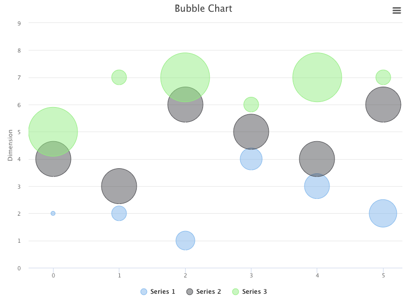
The Bubble Chart
A bubble chart is a type of chart that displays three dimensions of data. Each entity is coded in [x, y, z] format, where [x, y] specifies the location, and z is the size.
Here is the modified src/App.js:
- At lines 6 and 9,
highcharts/highcharts-moreis loaded, which is required for the bubble chart. - At lines 12–16, the chart’s
type,width, andheightare defined. - At lines 17–19, the chart title is composed from the type.
- At lines 20–24,
yAxisis configured with atitle. - At lines 25–35,
seriesdefines three sets of data points (lines 26–28, lines 29–31, and lines 32–34). - At lines 36–38, the default credits have been turned off.
- At line 43, the bubble chart is created.
Execute yarn start, and we see a bubble chart.
The Packed Bubble Chart
A packed bubble chart is a type of bubble chart, with its location, [x, y], being automatically calculated to pack the bubbles in a cluster. Instead of the format, [x, y, z], the packed bubble chart only needs the z value for the size. It uses the size and, optionally, the color to visualize data.
Here is the modified src/App.js:
- At lines 6 and 9,
highcharts/highcharts-moreis loaded, which is required for the packed bubble chart. - At lines 12–16, the chart’s
type,width, andheightare defined. - At lines 17–19, the chart title is composed from the type.
- At lines 20–29, the minimum bubble size is configured to be 30%, and the maximum bubble size is configured to be 100%. The data labels are enabled, and the point’s name formats each label.
- At lines 30–111,
seriesdefines four sets of data points,A(lines 33–50),B(lines 54–75),C(lines 79–92), andD(lines 96–109). - At lines 112–114, the default credits have been turned off.
- At line 119, the packed bubble chart is created.
Execute yarn start, and we see a packed bubble chart.
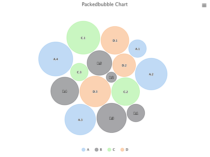
The packed bubble chart has drag and drop capability, allowing a user to move one selected bubble between series to check how their relations change with the move.
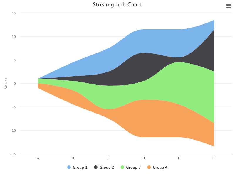
The Stream Graph and Area Charts
A stream graph chart is a stacked area chart displaced around a central axis, resulting in a flowing and organic shape. It is often used for displaying compound volumes across different categories or over time.
Here is the modified src/App.js:
- At lines 6 and 9,
highcharts/modules/streamgraphis loaded, which is required for the stream graph chart. - At lines 12–16, the chart’s
type,width, andheightare defined. - At lines 17–19, the chart title is composed of the type.
- At lines 20–22,
xAxisis defined to be six categories. - At lines 23–40,
seriesdefines four sets of volumes for these categories,Group 1(lines 24–27),Group 2(lines 28–31),Group 3(lines 32–35), andGroup 4(lines 36–39). - At lines 41–43, the default credits have been turned off.
- At line 48, the stream graph chart is created.
Execute yarn start, and we see a stream graph chart.
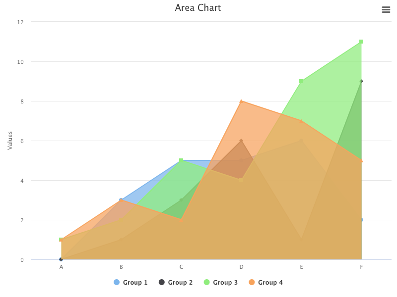
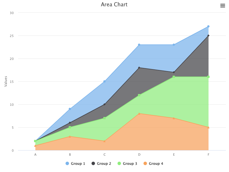
For the same options, change the type to area:
<HighchartsReact highcharts={Highcharts} options={getOptions('area')} />Execute yarn start, and we see an area chart.
Add plotOptions to stack them:
plotOptions: {
  area: {
    stacking: 'normal',
  },
}
Execute yarn start, and we see a stacked area chart.
Change the type to areaspline:
plotOptions: {
  areaspline: {
    stacking: 'normal',
  },
}
...

function App() {
  return (
    <HighchartsReact highcharts={Highcharts} options={getOptions('areaspline')} />
  );
}
Execute yarn start, and we see an areaspline chart.
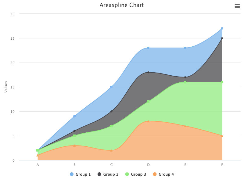
Does it look similar to the stream graph chart?
The stream graph chart displays around a central axis, while the stacked areaspline chart displays along xAxis. Otherwise, they are similar.
The Cylinder and Column Charts
A 3D cylinder chart is a variation of a 3D column chart, and it features cylindrical points.
Here is the modified src/App.js:
- At lines 4 and 8,
highcharts/highcharts-3dis loaded, as the cylinder chart is a 3D chart. - At lines 7 and 11,
highcharts/modules/cylinderis loaded, which is required for the cylinder chart. - At lines 14–18, the chart’s
type,width, andheightare defined. - At lines 19–21, the chart title is composed from the type.
- At lines 22–24,
xAxisis defined to be six categories. - At lines 25–42,
seriesdefines four sets of volumes for these categories,Group 1(lines 26–29),Group 2(lines 30–33),Group 3(lines 34–37), andGroup 4(lines 38–41). - At lines 43–45, the default credits have been turned off.
- At line 50, the cylinder chart is created.
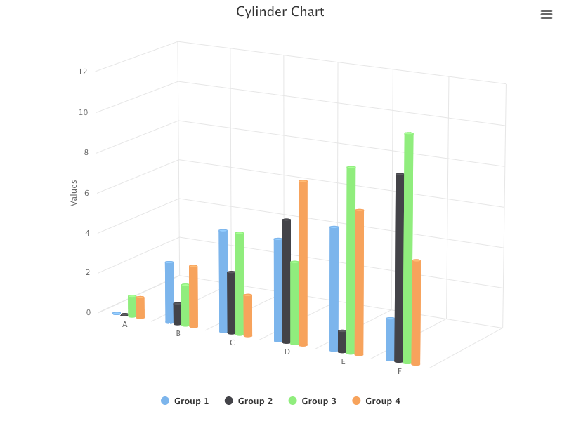
Execute yarn start, and we see a cylinder chart.
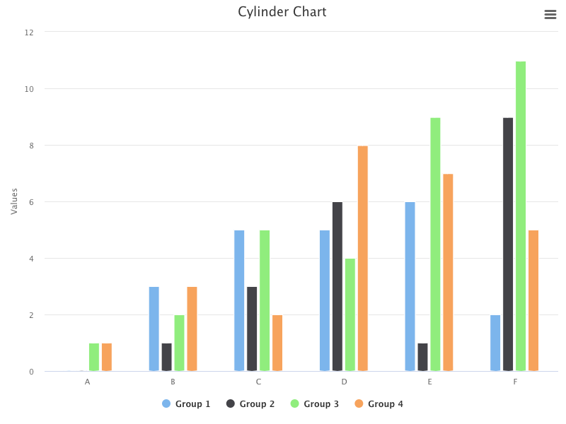
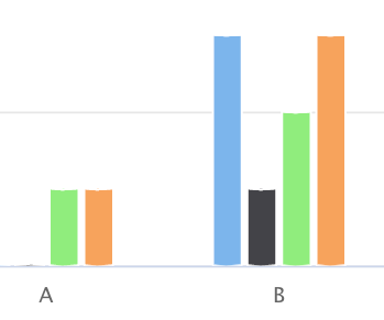
If you observe carefully, both ends of each column look cylindrical. Here is the enlarged view:
Change the type to column:
function App() {
  return (
    <HighchartsReact highcharts={Highcharts} options={getOptions('column')} />
  );
}
Execute yarn start, and we see a column chart where both ends of each column are edged.
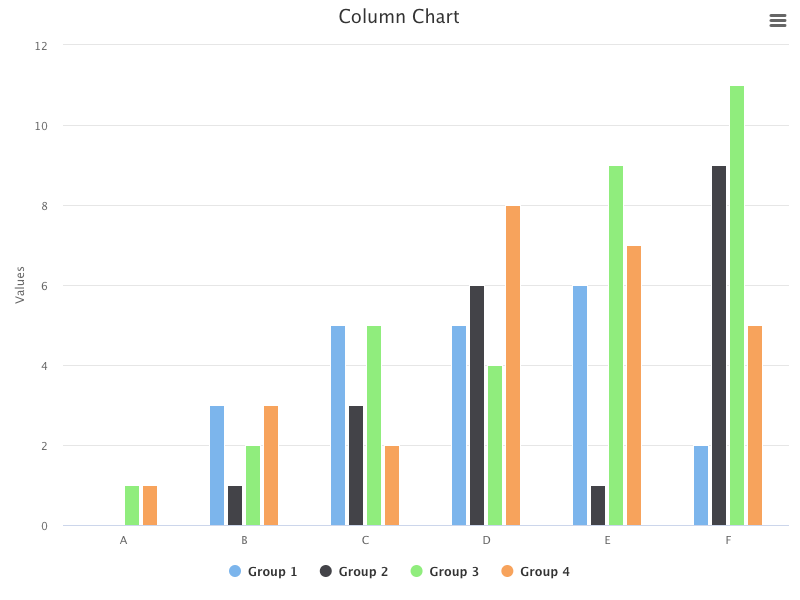
When looking at the 2D view, the differences between the cylinder and column charts are minor.
Add options3d to enable the 3D charts and configure the rotation angles and depth.
chart: {
type,
width: 800,
height: 600,
options3d: {
enabled: true,
alpha: 15,
beta: 30,
depth: 300,
},
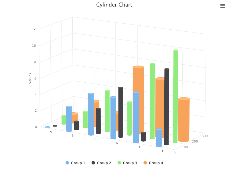
}Here is the cylinder chart in 3D view:
Here is the column chart in 3D view:
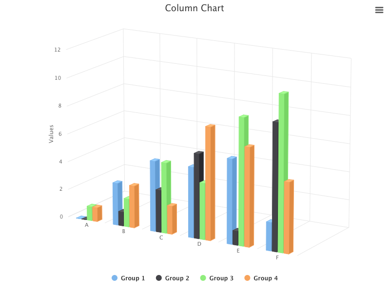
In the 3D view, the differences between the cylinder and column charts are obvious.
The cylinder looks cylindrical, but we want to make it more three-dimensional. We put groups into different depths and set cylinders with different diameters (pointWidth).
Here is the modified src/App.js:
- At lines 31–34,
zAxisis configured withminandmaxvalues. - At lines 36–41,
Group 1setsdepthto be 0, andpointWidthto be 30. - At lines 42–47,
Group 2setsdepthto be 100, andpointWidthto be 20. - At lines 48–53,
Group 3setsdepthto be 200, andpointWidthto be 20. - At lines 54–59,
Group 4setsdepthto be 300, andpointWidthto be 50.
Execute yarn start, and the 3D cylinder chart is very three-dimensional.
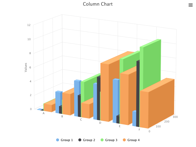
Change the type to column:
function App() {
  return (
    <HighchartsReact highcharts={Highcharts} options={getOptions('column')} />
  );
}
The 3D column chart is also very three-dimensional, and it illustrates the depth clearer.
Conclusion
Highcharts is an enterprise-grade JavaScript charting library based on SVG. It comes with excellent documentation and innumerable examples.
In this article, we have introduced additional chart types of bubble, packedbubble, streamgraph, and cylinder.
We have also written articles on other Highcharts types:
- In this article:
line,spline,area,areaspline,column,bar,pie,scatter,scatter3d,heatmap,treemap, andgauge. - In this article:
sankeydiagram,arcdiagram,dependencywheel, andnetworkgraph. - In this article:
parallelCoordinates. - In this article: Drawing Capabilities.
- In this article:
timeline.
Highcharts is free for personal/non-commercial uses, but you must pay for commercial applications. If your budget allows, Highcharts is highly recommended.
Thanks for reading.
Want to Connect?

If you are interested, check out my directory of web development articles.


