
7 Examples To Master Highcharts in React
The enterprise-grade JavaScript charting library

Highcharts is an enterprise-grade JavaScript charting library based on SVG. It was first released in 2009 by Highsoft in Vik, Norway.
Highcharts supports a long list of different chart types, including line, spline, area, areaspline, column, bar, pie, scatter, scatter3d, heatmap, treemap, gauge, and almost all chart types. It comes with excellent documentation and innumerable examples. It is powerful with a low learning curve. The only drawback is that the license is proprietary. It is free for personal/non-commercial uses, but you have to pay for commercial applications.
Along with D3.js, Highcharts dominates the charting application. Let’s take a look at how it works.
Set Up The Working Environment
We are going to use Create React App to explore Highcharts. The following command creates a React project:
% yarn create react-app react-highcharts
% cd react-highcharts
Install highcharts and highcharts-react-official.
highcharts: It is the JavaScript charting library.highcharts-react-official: It is the official Highcharts-supported wrapper for React.
% yarn add highcharts highcharts-react-officialAfter the installation, these packages become part of dependencies in package.json:
"dependencies": {
  "highcharts": "^10.3.2",
  "highcharts-react-official": "^3.1.0"
}
With the working environment, adding a chart is as simple as adding one line of code:
<HighchartsReact highcharts={Highcharts} options={option} />Example 1: Basic Type Charts
A data series is a row or column plotted numbers on the chart. For our example, create two simple data series, each having six points.
series: [
  {
    data: [1, 2, 1, 4, 3, 6],
  },
  {
    data: [2, 7, 0, 4, 6, 2],
  },
]
Modify src/App.css to have the flex layout.
div {
  display: flex;
  flex-wrap: wrap;
}
Modify src/App.js to plot eight charts of the type line, spline, area, areaspline, column, bar, pie, and scatter.
- At lines 6–28, a chart configuration is created.
– At lines 7–11, the chart’s
type,width, andheightare defined. – At lines 12–14, the chart title is composed from the type. As lodash comes with Create React App,_.startCaseis called to make each initial letter capitalized. – At lines 15–19,yAxis, the Y axis, or value axis, is configured with atitle. – At lines 20–27, two data series are created. - At lines 33–40, each line creates a chart with the specified type:
–
line(line 33): The line chart is represented by a series of data points connected with a straight line. –spline(line 34): The spline chart draws a curved line between the points in a data series. –area(line 35): The area chart functions the same way as a line chart, except that it fills the area between the line and the threshold, which is 0 by default. –areaspline(line 36): The areaspline chart is the same as the area chart, except that the line is a spline instead of a straight line. –column(line 37): The column chart displays data as vertical bars. –bar(line 38): The bar chart is the same as the column chart, except that the X-axis and Y-axis are switched. –pie(line 39): The pie chart is a circular chart divided into sectors, which is proportional to the quantity it represents. –scatter(line 40): The scatter chart draws a dot for each data point without connecting them.
Execute yarn start, and we see eight charts, each being a specific type.

Example 2: Chart Credits and Export Menu
Look at the screenshot above. By default, Highcharts puts a credits label/link in the lower right corner of the chart.
The text and link can be configured. And here is an example:
credits: {
  text: 'My Credits',
  href: 'https://jenniferfubook.medium.com/jennifer-fus-web-development-publications-1a887e4454af',
}
Or it can be turned off with this code:
credits: {
  enabled: false,
}
Highcharts’ exporting module provides a menu with export-related menu items to View in full screen, Print chart, Download PNG image, Download JPEG image, Download PDF document, and Download SVG vector image.

This module can be included in one line of code.
require('highcharts/modules/exporting')(Highcharts);Or two lines:
import HighchartsExporting from 'highcharts/modules/exporting';
HighchartsExporting(Highcharts);
By default, the menu is put in the upper right corner of the chart. The location and content can be customized.
Here is the modified src/App.js:
- At lines 5–6, the exporting module is loaded.
- At lines 30–32, the default credits have been turned off.
Execute yarn start, and we see eight charts. Each chart has an exporting menu, and credits have been turned off.

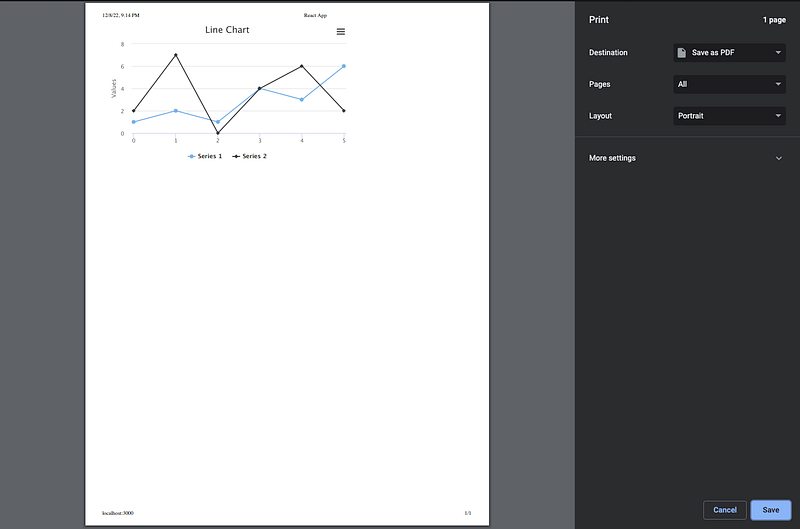
On the line chart, click the Print chart menu item and pops up a modal to print the chart or save it as a PDF file.
On the line chart, click the Download PNG image menu item, and it saves a PNG file to the Downloads folder.

Each chart can be saved in JPEG, PDF, or SVG format.
Example 3: Basic Charts in 3D View
highcharts-3d is a Highcharts module that provides 3D support. It needs to be imported to create 3D charts.
This module can be included in one line of code.
require('highcharts/highcharts-3d')(Highcharts);Or two lines:
import Highcharts3D from 'highcharts/highcharts-3d';
Highcharts3D(Highcharts);
Configuring a 3D chart is similar to configuring a regular chart, except for the following options:
options3dconfigures the 3D option. The flag,enabled, enables a 3D chart.alphaandbetaare the angles to rotate the view of the chart anddepthdefines the total depth with a default value of100. Here is an example:
options3d: {
  enabled: true,
  alpha: 15,
  beta: 30,
  depth: 300,
}plotOptions.[type].depthdefines the depth of each plot.- The chart’s data might be in a different format for each type.
xAxisdefines X axis or category axis. For our 3D examples, threexAxisare defined for plots at different depths, although thesexAxisthemselves are not visible.
Here is the modified src/App.js:
- At lines 6 and 8, Highcharts’ 3D module is loaded.
- At lines 13–18,
options3denables the 3D charts and configure the rotation angles and depth. - At lines 28–38, three
xAxisare set to invisible. - At lines 39–43,
plotOptions.[type].depthis set to 100. - At lines 44–57,
seriesdefines plots forxAxis 0,xAxis 1, andxAxis 2. Each plot has six points.
Execute yarn start, and we see eight charts in 3D view.

Here are some observations from the screenshot above:
line,spline,area,columnandbarcharts are displayed nicely in 3D view.- The
areasplinedoes not rotate the view, as 3D type is not officially supported. - The
piechart works, but three pies stacking on each other is clumsy. Simplifying it to one pie makes it look nicer:
series: [
  {
    data: [2, 2, 1, 4, 3, 2],
  },
]
- The
scatterchart does not show up. The common options that we have used do not work for thescatterchart. The data needs to be coded in[x, y, z]format. Also, it should use the type,scatter3d, instead ofscatter. Here is the fixed configuration:
const getOptions = (type) => ({
  chart: {
    type: 'scatter3d',
    options3d: {
      enabled: true,
      alpha: 15,
      beta: 30,
      depth: 300,
    },
  },
  title: {
    text: _.startCase(`${type} chart`),
  },
  yAxis: {
    title: {
      text: 'Values',
    },
  },
  series: [
    {
      data: [[0, 2, 0], [1, 2, 0], [2, 1, 0], [3, 4, 0], [4, 3, 0], [5, 2, 0]],
    },
    {
      data: [[0, 4, 100], [1, 3, 100], [2, 6, 100], [3, 5, 100], [4, 4, 100], [5, 6, 100]],
    },
    {
      data: [[0, 5, 200], [1, 7, 200], [2, 7, 200], [3, 6, 200], [4, 7, 200], [5, 7, 200]],
    },
  ],
  credits: {
    enabled: false,
  },
});
Then, the 3D scatter chart shows up:

In the screenshot above, the xAxis ending label, 5, is jammed with the zAxis starting label, 0. The two numbers next to each other look like 50. To avoid confusion, we turn off the first label of zAxis, which stands for the Z axis or depth axis for 3D plots.
zAxis: {
  showFirstLabel: false
}
It looks better now.

options3d positions the chart in a good angle. However, it could be more helpful if we can view it from various angles, via 3D rotation. This can be achieved by click and drag of a mouse, or through a touch screen.
Here is the modified src/App.js:
Execute yarn start, and we see the 3D scatter chart that can be rotated:

Example 4: Heatmap Charts
A heatmap is a graphical representation of data where the individual values contained in a matrix are represented as colors.
The heatmap chart requires the heatmap module to be imported. It can be accomplished by one line of code:
require('highcharts/modules/heatmap')(Highcharts);Or two lines:
import HighchartsHeatmap from 'highcharts/modules/heatmap';
HighchartsHeatmap(Highcharts);
xAxis.categories is defined as the following:
xAxis: {
  categories: ['A', 'B', 'C', 'D', 'E', 'F'],
}
yAxis.categories is defined as the following:
yAxis: {
  categories: ['Apple', 'Banana', 'Pear'],
}
Then, data is a matrix of 6 x 3, where [x, y, z] represents the z value at [x, y]:
data: [
  [0, 0, 5], [0, 1, 8], [0, 2, 9],
  [1, 0, 3], [1, 1, 6], [1, 2, 2],
  [2, 0, 7], [2, 1, 1], [2, 2, 9],
  [3, 0, 4], [3, 1, 5], [3, 2, 1],
  [4, 0, 8], [4, 1, 6], [4, 2, 7],
  [5, 0, 7], [5, 1, 3], [5, 2, 4],
]
colorAxis is a color axis for series. Visually, it appears as a gradient or as separate items inside the legend. Here is colorAxis that defines a gradient from '#FF0000' (red) to '#0000FF' (blue)
colorAxis: {
  min: 0,
  minColor: '#FF0000',
  maxColor: '#0000FF',
}
It looks like this:

Here is the modified src/App.js:
- At lines 6 and 8, the heatmap module is loaded.
- At line 13, add
plotBorderWidthto separate the heatmap areas. - At lines 18–20,
xAxisis defined with 6categories. - At lines 21–25,
yAxisis defined with 3categories.titleis turned off (line 23), andcategoriesis displayed in areversedorder. - At lines 26–30,
colorAxisis defined as a gradient color from white (line 28) to the color of the first series (line 29).colorAxisreplaces the default labels for series. - At lines 31–45,
datais defined anddataLablesenables showing the heatmap value at each area. - At line 53, the heatmap chart is created.
Execute yarn start, and we see a heatmap chart.

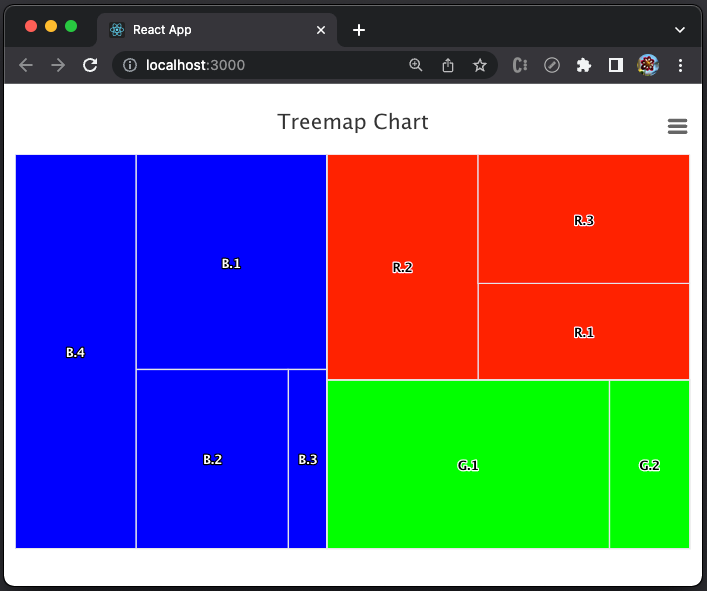
Example 5: Treemap Charts
A treemap is a graphical representation of data where hierarchical data is displayed using nested figures, usually rectangles.
The treemap chart requires the treemap module to be imported. It can be done by one line of code:
require('highcharts/modules/treemap')(Highcharts);Or two lines:
import HighchartsTreemap from 'highcharts/modules/treemap';
HighchartsTreemap(Highcharts);
data defines the hierarchical parent-child relationships, along with values. Here is an example:
data: [
  {
    id: 'parentId',
    name: 'Parent',
    color: '#FF0000',
  },
  {
    name: 'child1',
    parent: 'parentId',
    value: 3,
  },
  {
    name: 'child2',
    parent: 'parentId',
    value: 5,
  },
]
Here is the modified src/App.js:
- At lines 6 and 8, the treemap module is loaded.
- At line 16,
typeis specified inseries, instead ofchart. - At line 17,
layoutAlgorithmis set to'sliceAndDice’, which is the default behavior of dividing the area into smaller parts. - At lines 18–79,
datadefines the hierarchical data, which defines three parents,Red(lines 19–23),Green(lines 24–28), andBlue(lines 29–33).Redhas thee children (lines 34–48),Greenhas two children (lines 49–58), andBluehas four children (lines 59–78). - At line 89, the treemap chart is created.
Execute yarn start, and we see a treemap chart.
Change layoutAlgorithm to 'stripes’, and we see the areas are divided into strips:

Change layoutAlgorithm to 'squarified’ or 'strip’, and we see the areas are divided into the following shapes:

Example 6: Gauge Charts
A gauge chart is also called a speedometer chart or a dial chart. The chart has a needle that points to a certain value over the pivot point. It is an effective visualization to assess performance, track progress, and facilitate decision making.
The gauge chart requires the highcharts-more module to be imported. It can be done by one line of code:
require('highcharts/highcharts-more')(Highcharts);Or two lines:
import HighchartsMore from 'highcharts/highcharts-more';
HighchartsMore(Highcharts);
For a gauge chart, yAxis sets min and max values, and series.data defines a value.
yAxis: {
  min: 0,
  max: 100,
},
series: [
  {
    data: [80],
  },
]
Here is the modified src/App.js:
- At lines 6 and 8,
highcharts-moreis loaded. - At lines 17–23,
yAxissetsminandmaxto 0 and 100.yAxis.title.textis set to'Speed'. - At lines 24–28,
series.datais set to 80. - At line 36, the gauge chart is created.
Execute yarn start, and we see a gauge chart.

A gauge chart can be defined for any arc with pane.startAngle and pane.endAngle. When it is not a full circle, pane.background should be set to null. It is also a good idea to adjust the center to position [x, y].
pane: {
  startAngle: -90,
  endAngle: 89.9,
  background: null,
  center: ['50%', '70%'],
}
Now we see a half gauge:

We can style the gauge bands based on yAxis values.
yAxis: {
    min: 0,
    max: 100,
    title: {
      text: 'Speed',
    },
    plotBands: [
      {
        from: 0,
        to: 25,
        color: '#FF0000',
        thickness: 15,
      },
      {
        from: 25,
        to: 80,
        color: '#00FF00',
        thickness: 15,
      },
      {
        from: 80,
        to: 100,
        color: '#0000FF',
        thickness: 15,
      },
    ],
  }
The above code defines a red band for values 0–25, a green band for values 25–80, and a blue band for values 80–100.

It seems that the pivot point is too close to the number.
We resize the band to 120% size:
pane: {
  startAngle: -90,
  endAngle: 89.9,
  background: null,
  center: ['50%', '70%'],
  size: '120%',
}
This chart looks nicer.

Example 7: Chart Accessibility
Execute chart examples, and we see the following warning in the console.
highcharts.src.js:223Highcharts warning: Consider including the “accessibility.js” module to make your chart more usable for people with disabilities. Set the “accessibility.enabled” option to false to remove this warning. See https://www.highcharts.com/docs/accessibility/accessibility-module.
Inspect chart elements, and we see no accessibility information.

Accessibility makes web applications usable for people whose abilities are limited in some way, such as vision (using a screen reader) and mobility (using the keyboard only). In addition, limitations could come from the device’s capability, such as mobile devices. It is very important to make Enterprise software accessible.
The accessibility module can be imported by one line of code:
require('highcharts/modules/accessibility')(Highcharts);Or two lines:
import HighchartsAccessibility from 'highcharts/modules/accessibility';
HighchartsAccessibility(Highcharts);
Simply importing this module, the chart becomes accessible. In addition, there is accessibility option to configure description and more features, such as announcing new data to screen reader users, configuring special keyboard navigation, etc.
- At lines 7 and 10, the accessibility module is loaded.
- At lines 19–22,
accessibilitydefines adescription.
Execute yarn start, and recheck the chart elements.

There are many of accessibility information in the screenshot above, including the accessibility description that we have specified:
<div aria-hidden="false" style="position: absolute; width: 1px; height: 1px; overflow: hidden; white-space: nowrap; clip: rect(1px, 1px, 1px, 1px); margin-top: -3px; opacity: 0.01;">
  <p>Gauge Chart</p>
  <div>Chart with 1 data point.</div>
  <div>The gauge chart shows the performance speed between 0 and 100.</div>
  <div>The chart has 1 Y axis displaying Speed. Data ranges from 80 to 80.</div>
</div>
If you pay a little attention, you will notice that each chart is an SVG file.

Bonus Example: Draw a Line With Full Width on Axis X
We give this bonus example, as you may encounter this issue in product development. Put this simple line chart in src/App.js, where the series lineWidth is set to 10 (line 21):
Execute yarn start, and we see the line chart.

Have you noticed that the blue line on axis X is thinner?
It is a well-known issue in Highcharts that edge lines are cut off. There are many forums that have discussed similar problems, such as this one. We can adopt the solution from the linked article to set min to a value below 0.
yAxis: {
  title: {
    text: 'Values',
  },
  min: -0.2,
}
Execute yarn start, and we see the line on axis X fully displayed:

Conclusion
We have shown seven examples of Highcharts in React, which include 12 chart types of line, spline, area, areaspline, column, bar, pie, scatter, scatter3d, heatmap, treemap, and gauge.
We have also written articles on other Highcharts types:
- In this article,
bubble,packedbubble,streamgraph, andcylinder. - In this article,
sankeydiagram,arcdiagram,dependencywheel, andnetworkgraph. - In this article:
parallelCoordinates. - In this article: Drawing Capabilities.
- In this article:
timeline.
Out of the box, Highcharts provides enterprise-grade JavaScript charting capabilities. If your budget allows, Highcharts is highly recommended.
Thanks for reading.
Want to Connect?

If you are interested, check out my directory of web development articles.


