
Branding Matters: Why I Chose Red, White and Blue for my Photography Website
When I started my photography blog, I initially struggled to pick out the colours and style for my branding.
PS: I will be mentioning my website a lot throughout this article. If you want to see how I incorporated the colours for yourself, check out my website Photoaspire here
It felt so difficult and I felt overwhelmed by the choices of colour that I could incorporate into my website design.
So, I spent a few hours looking at other photography websites within my niche and I started to get some ideas forming together.
I observed that many of the top sites used blue within their themes and I also discovered that white space was important to ensuring that your content is accessible and easy to read.
After some research on photography sites similar to mine, I decided to conduct a little fact-finding behind why certain brands use certain colours:
It is all about customer behaviour and emotion. If you can use the right colours to invoke the right emotions and feelings within your site visitors and you can pair this with epic content, you are good to go.
Looking back now, I probably took way too much time worrying about the design, UI and colours when instead I should have been writing more blog posts.
But, hindsight is 20/20.
As a result, I have decided to explain to you all why I settled on the colours of red, white and blue for my photography website.
If you read until the end I will also give you some quick pointers on how you can use colours in your branding to improve your website, too.
Red is a passionate colour and it invokes feelings of optimism and happiness
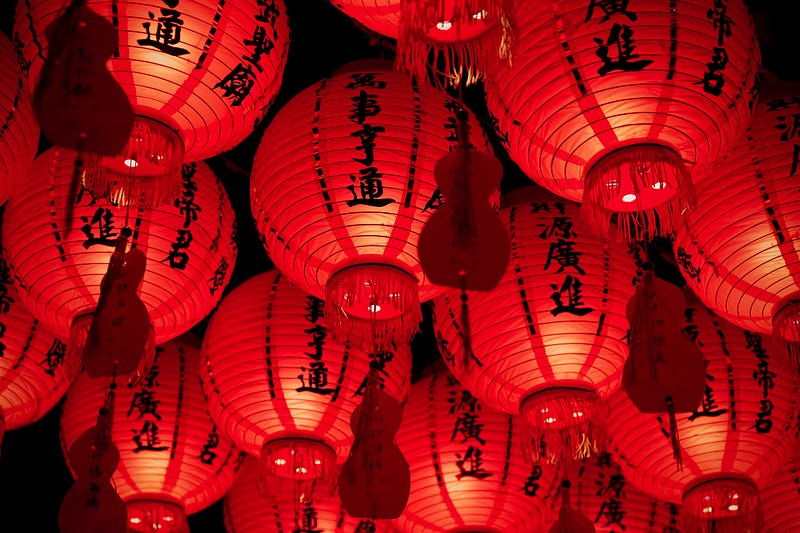
First of all, we have the colour red.
This colour is strong, passionate and it is a very dynamic colour indeed.
It can also be used when companies make a bold statement. In many sectors of the economy, such as finance and road safety, it is often associated with negativity.
For example, red is often used at sop signs and crash signs while it is used to show when the value of a company is going down in the stock market.
As a result, you must be careful not to overuse this colour otherwise the impact it has on your reader may diminish.
For example, you can use it on your call-to-action buttons to get a customer to subscribe to your email list.
This way, it is creating strong emotions within them and they feel passionate and optimistic about signing up for your latest email.
But, you must make sure you avoid using red on most of the rest of the website. Otherwise, your reader will get used to seeing red and they are less likely to take action.
Many top brands use red as a prominent colour. CNN, KFC, Coca-Cola, Lego and so on.
Food companies use it to increase your appetite and Lego uses it to make people and kids feel passionate about their lego playsets and bricks.
I have used it on my website because it is designed to make the reader feel passionate about photography.
It gets them into the creative mindset and this is important when you are a photographer.
Without that sense of motivation or creativity, it can be very hard to be productive to be able to come up with new photography ideas or have the motivation to get anything done.
Setting the mood for your company with colours can bolster your relationship with your readers.
By using red on my website it ensures that my readers feel happy and optimistic about their photography skills and they feel confident in themselves to learn new skills and take their photography to the next level.
Despite this being a powerful colour, I personally use a second colour to pair with this. This is to ensure that the colour scheme is balanced out and it does not overwhelm my readers.
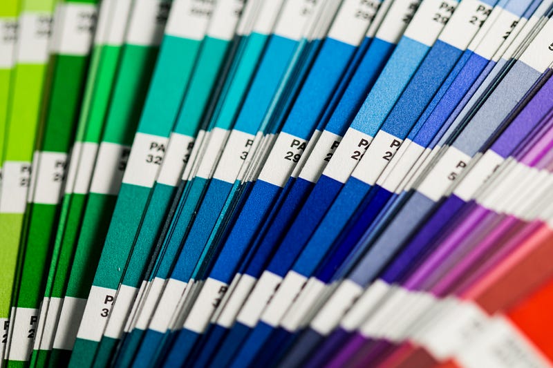
Blue is a colour that builds strength and trust in a company

This is the second colour that is used within my website and personally, I prefer to use it more over the red colour.
There are a few psychological reasons for this and I suggest you give blue a try in your branding if you haven’t already.
Blue is a colour that invokes feelings of trust and stability.
This probably explains why so many banks use it.
They want you to feel calm and put your trust into that bank that they will look after your money.
For example, Paypal uses a blue branding colour scheme and you are greeted by a blue button whenever you checkout using the app.
But, we have to consider that it can also create negative feelings and emotions too. It can cause feelings of depression and bring about a sense of coldness.
But, if you use this colour in the correct way, it can increase the feeling of trustworthiness readers have on your blog.
Many companies like to use blue for their verification buttons. Instagram, Facebook and Twitter all use tick icons coloured in blue. This reassures the viewer that they are viewing a legitimate website or page.
I use it for the same reasons. It makes the reader feel calm and they are willing to place their trust in me that my photography articles contain reliable and factual information.
After all, remaining a credible person in your industry is one of the most important things you can do and if you destroy your credibility, it can be very hard to get it back, if not impossible.
If they are trusting me more, it means they are more likely to take action on what I have written in my articles or they are more likely to spend money with me.
Many large internationally recognised corporations have also decided to use this colour in their marketing, too.
Facebook, Twitter, Barclays and Oral-B all use blue as a prominent colour in their marketing.
The third and final colour I have settled upon for my website is white. You may think that is a strange decision but I will elaborate a little more on why I chose this colour now.
White is an amazing colour for keeping minimalist branding and it invokes calmness and neutrality

Lastly, we have the colour white.
White is a neutral colour and it invokes a sense of freedom and calmness.
I personally do not use it as a prominent colour unlike the other 2 colours, red and blue.
I instead use it for the purpose of creating white space.
White space means that there are large amounts of white surrounding my writing, just like what you are seeing now when reading this article.
It makes things easier for my visitors to read and as such, they will be more likely to take action in a way that increases my revenue.
They will also be more likely to return to my website and become closer fans with my brand.
However, there are also some successful companies that have been able to use this colour as their main colour.
Take Apple for example. Apple is the largest company in the world.
They use the colour white in their apple logo and it gives us a sense of calm and neutrality.
They couple this with the colour blue in their IOS operating system.
These two colours coupled together make for a reliable experience and Apple use the colour blue to boost their trust and credibility.
They want you to feel that they are protecting your data and privacy, and this is one of the main reasons why they use the colour blue.
Summary of this article and how you can use colour branding to boost your brand and reputation

If you haven’t read or taken in much of this article, here are the most important points you need to know.
These will be particularly helpful if you are looking to use colours in a better way for your branding:
- Firstly, make sure your colours are readable and they do not overpower your reader or the overall experience
- Pick a primary colour and use a more powerful accent colour, such as red, to make people take action on something (CTA, Newspaper etc.)
- Try and avoid using white as a primary colour, except for minimalism or for white space between text
- Play around and use certain colours at different types of branding to see what works best for your readers
- Lastly, have fun. This should (hopefully) be a fun exercise for you. It should be a great opportunity to let you unleash your creative side
I hope this article helped you to better understand how colours can have a big impact on your branding and why I used them in this way personally for my photography blog.
If you enjoyed reading this feel free to give me a follow and you will be notified whenever I write a new post. I mainly write about photography and tech.
If you enjoyed this article, please also consider giving me a share on social media so that others can enjoy this article too. Thanks :)