
5 Incredibly Simple Rules to Improve Your Article Images on Medium
How you can start choosing better pictures for your blog articles
I’ve been spending way too much time researching the top-performing articles lately, and one of the significant pieces of the puzzle I found was the images.
An article with a million views has a million dollar picture. —Me
Make this above statement your next rule in writing — and apply it 100% of the time.
If you’re curious, go on any popular publication here (huge list) and look through the articles for ones with a really high amount of claps (5,000+).
Do you notice anything different about them vs the articles with just a few claps?
I bet you might notice the popular article images are remarkable.
As in, there’s something about them that caught your eye — and that equates to a higher chance that someone clicks into the article.
The way I see it, you can classify article header pictures into 3 categories.
Bland, Average, and Remarkable Images
Let’s say you’re writing an article about baseball and need to choose the perfect image to entice readers with your sexy talk of batting averages and grand slams.
Here’s 3 examples you might choose:
- Bland
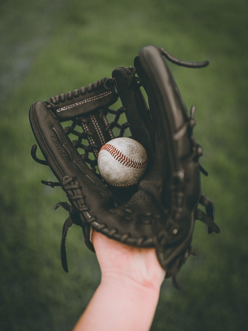
2. Average
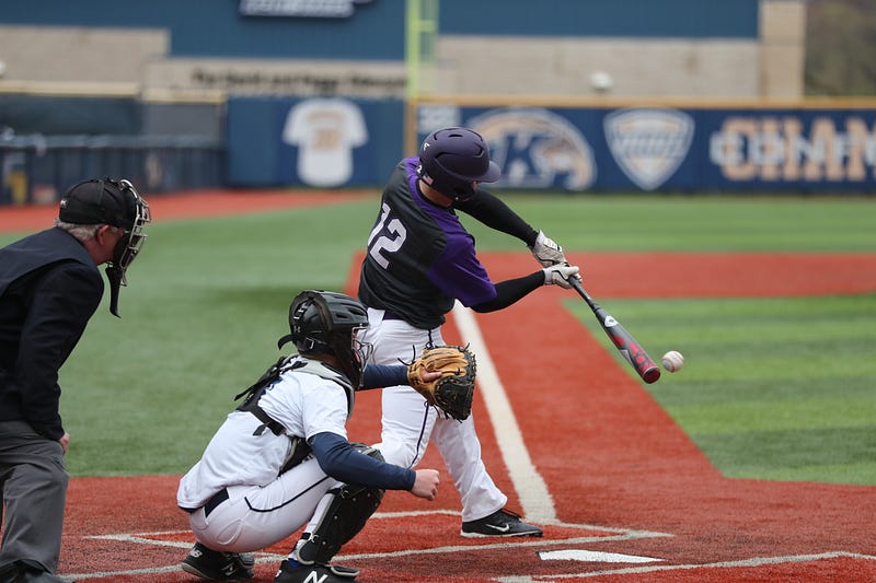
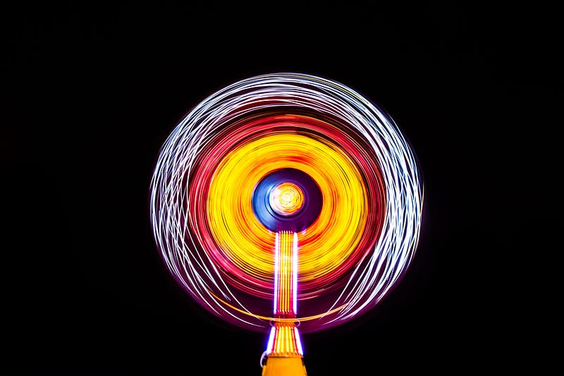
3. Remarkable
Did you notice any differences?
I took each of the above images from the embedded Unsplash search function’s first page.
I’d be willing to bet you that if you wrote a great piece about baseball and used the 3rd image, you’d get at least 94% more views than if you used the 1st picture.
Why?
Because of the data.
In just one example, Skyword found an average of 94% more views from a compelling image versus a bland one. There’s plenty more data where that came from as well, if you dig around Google.
And of my own 250+ blog posts, I can also confirm this pattern.
Remarkable images get more views — period.
How to improve your article images
I recently read about a habit from Tim Denning where he spends an entire day every week just searching for image porn.
No, not the fun kind. He searches for outstanding images that he can use in his next week’s articles.
I’m a bit too disorganized to attempt that (yet), so I focused more on improving my efficiency in article image selections.
To help me with that, I started jotting down rules and tips to help myself improve over time (I have over 100 written down on my post-it wall).
Here’s the rules I follow for images:
Rule #1: Find easy and legal images to use
If you haven’t already, you should make use of these 4 image database sites:
- Unsplash — the embedded image function in Medium — here’s a great article by Casey Botticello on the subject
- Pexels — a great source of easy to copy and free to use pictures
- Pixabay — similar to Pexels, but mostly different images
- WikiMedia Commons — a massive database of fair use images
You can also pay for memberships to other photography websites, there’s many out there but the biggest is probably Photostock.com.
Rule #2: Show credit
It takes work to take great photos, figure out what keywords apply to them, and mass upload them to sites like Pexels and Photostock.
The least we can do as article writers is to help spread the love — and link to their work.
One pet peeve of mine about the official Medium publications is that they often don’t credit their images. This bugs me because their policies require all users to do that — but don’t seem to follow the same rules themselves.
(I’m sure they vet them internally — but still, not cool in my books. ‘Do what we say not what we do’ type thing.)
Rule #3: Pick 3 images for every article
Whenever I end up choosing the image for an article, I will spend about 5–10 minutes searching for 3 different ones.
I put them next to each other in a row, and try to assess which one is the most remarkable and applicable to my topic
Rule #4: Choose an image that is remarkable
Does the image ‘pop-out’ to you when you briefly glance at it? Are its colors bright and eye-catching? Is there contrast in the middle of the picture versus the outside of the image? Is there a person or related object as the focus of the image? Is the image weird and interesting? Do you find yourself looking at it longer than others?
All of these things and more can add up to what I mean by remarkable — but in the end, it is subjective.
I once used an image of a medical dummy that had its leg sawed off — with obviously fake blood and not a real person. I posted it to a Facebook group and immediately got a complaint from someone:
“Ugh, I was just about to eat dinner. Thanks for ruining my night, ass***le!” — a kind internet stranger
While I pointed out it was clearly fake, I still changed the image.
Why?
Because I had to remind myself that points of view are subjective. If one person thought that image was too brutal, then other people would as well.
Rule #5: Colors are everything — be a butterfly.
90% of the time you’ll want to choose images that are bright, colorful, and full of contrast. Occasionally you’ll include something that’s black and white for effect — but it usually won’t get you the results you’re after.
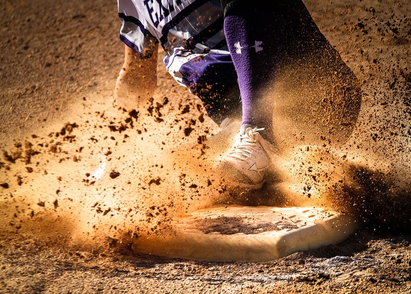
Take these baseball photos for example:
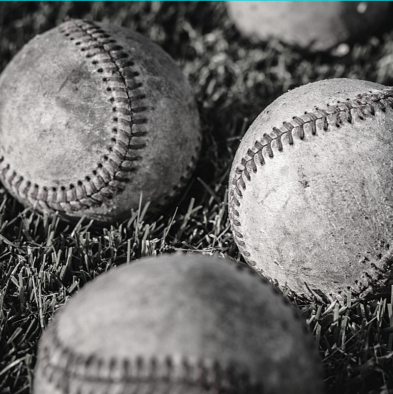
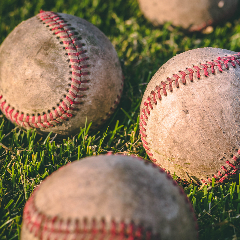
Which one catches your eye more? I’d be more likely to click on the one with colors myself. (Even if I do think the black and white one looks cooler — it doesn’t stand out as much)
Now imagine you’re looking through a stream of articles with header images — the black and white photos lose their prominence even more:
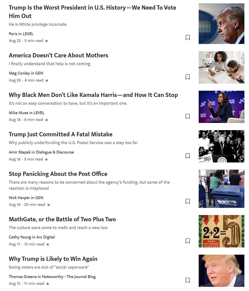
Of the 7 pictures on these articles in the misnamed ‘Popular on Medium’ section, which one is likely clicked the least? (Purely focusing on the image, not the title/topic)
I’d put my money on the black and white photo. Our brains are almost set up to ignore images like this and treat them as text — because it’s the same color.
Tips to up your picture game even more
If you haven’t already, you should familiarise yourself with the basics of SEO — and yes this applies to pictures you use too.
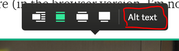
- You can add links to your photos in Medium by pressing ‘CTRL + K’ after clicking on a picture (in the browser version, I’m not sure for the mobile app).
The below random image is linked to my Substack newsletter. You can see that by hovering over the image and not clicking (unless you want to get some really cool emails):
2. You can use the ‘Alt Text’ description to help Google know what the picture is describing. Click the photo you uploaded onto Medium, then press ‘Alt text’ and write in a description for the image.
Users will have a chance at finding your image in Google Image Search after that.
3. Use the caption area to your advantage. You can put short image descriptions, links to your Medium profile or blog, or even jokes to make people laugh. Don’t forget to show your image source here!
4. Use positioning to your advantage. I noticed a trend that a couple of years ago, many of the huge articles on Medium had a massive (and remarkable) image at the very top, even before the Title and Subtitle of the article.
You can play around with this and experiment to see what works better for you.
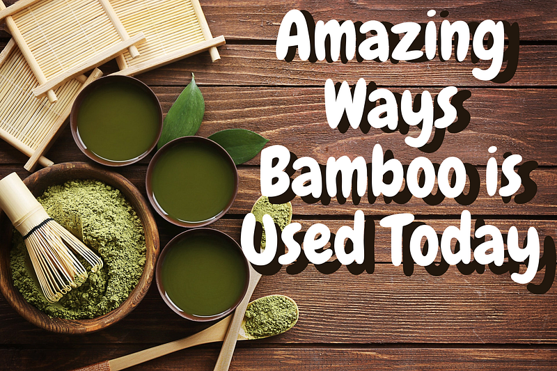
5. Add words to your header image. This is a bit tedious and I don’t do it often — but I’m trying to remember to more often. If you see many popular blogs on Instagram or personal websites, their header images will contain text describing the article.
Here’s one I did yesterday for an article about bamboo:
There are several free tools you can use to make this, from GIMP, to Microsoft Paint (included with Windows), to Canva.
6. Play with the sizing. Medium gives you a few on-site options for image sizing, but it strongly depends on the size of the image you upload. The more pixels in the image, the larger it is. You can choose 1 of 3 sizes for your images:
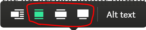
Just like the ‘Alt text’, click the image in the browser, and choose your display size. You can also move the image inline (beside text) if you wish, on the far left button.
7. Up your color game — and use psychology. Everyone has their own color preferences in real life, and this probably affects what they are more likely to click on.
Robert Turner did a great write up on this subject. And I shamelessly borrowed the infographic he used to explain this specific point:
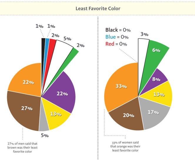
Read through some of those stats and especially Robert’s article. There’s a lot of interesting theory in there that you can apply to your own work.
Some Top Writer Examples
There’s a few particular authors that I noticed have a crazy good image game. Of course, this is subjective — except these authors have hundreds of thousands of views to back up my claim.
Check out Tim Denning, Shannon Ashley, Niklas Göke, Linda Caroll, Stephen Moore, and Tom Kuegler as a start.
Notice how they play with contrast, brightness, the focused object of the image, and when they choose to use black and white photos.
Or for something even more left-field, but very interesting (especially to me, as a hobbyist in digital drawing):
- Some Medium partner publications — like Marker and Slackjaw— often have artists draw amazing cartoon header images
- One of my favorite writers here — Kyrie Gray — combines cartoons and stories in a fantastical manner
Bottom line, there are no set rules (contrary to my entire article’s premise).
You should firstly be writing for yourself and your own enjoyment.
And after that, if you want to up your game, then start picking areas to improve on — like images.
Rules like the ones I stated here aren’t hard and fast, but they will be able to help you choose better and better images over time — and to be able to do that a lot quicker with more results.
A quick recap of the image rules I use myself:
- Find easy and legal images to use
- Show credit
- Pick 3 images for every article
- Choose an image that is remarkable
- Colors are everything — be a butterfly.
Until next time, Mediumites. Thanks for reading!
- If you liked this dive about Medium and images, you’ll probably enjoy my Feedium publication.
- You can also come to join me on my free occasional newsletter.


