
The Psychology Behind Color Choices in UI Design
Colors speak louder than words in design. Whether you’re creating an app interface, a website, or a branding guideline, your choice of colors can determine how users perceive, engage with, and respond to your product. As a UI/UX developer with years of experience, I have always found colors to be more than just a visual element — they’re a psychological trigger. Let me guide you through the psychology of color in UI design and explain how it impacts user experience, trust, and emotions.
Why Color Matters in UI Design
Imagine landing on a website with vibrant, contrasting colors versus a dull, monochromatic palette. Which one catches your attention? That’s the power of color. Colors influence user perception, evoke emotions, and drive actions. They create the first impression and can define whether a user feels welcomed, excited, or overwhelmed.
From my perspective, designing for users isn’t just about aesthetics — it’s about ensuring functionality and emotional connection. Colors are your tool for building that connection.
The Science of Colors and Emotions
Each color triggers specific emotions and behaviors. Here’s a breakdown of popular color choices and their psychological impact:

- Red: Passion, urgency, excitement Red is bold and grabs attention instantly. It’s perfect for creating urgency (think “SALE” buttons). However, too much red can create anxiety.

- Blue: Trust, calmness, stability You’ll see blue in banks and tech brands because it represents trustworthiness. I often recommend blue for apps or websites where building trust is essential.

- Yellow: Optimism, energy, warmth Yellow evokes happiness but should be used sparingly in UI design — it can be overwhelming in large doses.

- Green: Growth, health, balance Green is associated with nature and harmony. It’s an excellent choice for health, wellness, or environmental apps.

- Purple: Creativity, luxury, imagination Purple is widely used in creative industries and products targeting a premium audience.

- Black: Elegance, sophistication, power Black works well for modern, high-end products but can feel intimidating when overused.
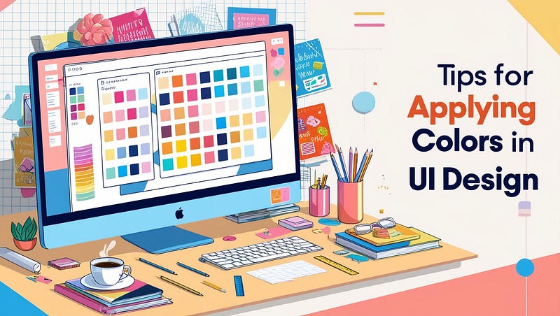
Tips for Applying Colors in UI Design
Let me share some lessons I’ve learned through trial and error:
1. Understand Your Audience
The same color can evoke different emotions depending on cultural and personal contexts. For instance, red may symbolize danger in one culture but prosperity in another. Research your target audience to ensure your color choices resonate with them.
2. Stick to a Color Palette
Avoid overwhelming users with too many colors. Choose a cohesive palette of primary, secondary, and neutral shades. Tools like Adobe Color or Coolors can help you experiment.
3. Leverage Contrast
Color contrast is vital for readability and accessibility. For example, a white button on a light gray background may look subtle but fail usability standards. Use contrast to draw attention to important elements like buttons and headings.
4. Test for Accessibility
Always prioritize accessibility. Color-blind users may not perceive your design the same way. Use tools like the WCAG contrast checker to ensure your design is inclusive.
5. Use Color to Guide User Actions
Colors can act as visual cues. For instance, I’ve often used green for “success” messages and red for “errors” to create a universal understanding for users.
Case Studies of Successful Color Usage
Let me take you through real-life examples of how brands use color psychology effectively:
- Facebook Facebook’s blue represents trust, stability, and dependability. Blue also minimizes eye strain during prolonged usage, aligning perfectly with their goal of keeping users engaged.
- Spotify Spotify’s green emphasizes growth and innovation, resonating with its mission to connect people to music worldwide.
- Coca-Cola Coca-Cola’s iconic red stimulates excitement and energy, mirroring the brand’s vibrant personality.
Common Mistakes to Avoid
While colors are powerful, misusing them can harm the user experience. Here are a few pitfalls I’ve seen (and occasionally made myself):
- Overusing Bright Colors Bright colors are eye-catching but can cause fatigue. Balance them with neutral tones.
- Ignoring Cultural Contexts Never assume a color has the same meaning across cultures. Research is key.
- Lack of Testing Always test your color palette with real users to gather feedback and insights.
A Personal Note on Choosing Colors
When I started my journey in UI design, I often underestimated the role of colors. But over time, I realized that colors are the unsung heroes of good design. They don’t just look good — they communicate, influence, and inspire.
Colors are your voice in design when words fall short. So, the next time you sit down to create, don’t just pick colors that you “like.” Instead, ask yourself: What do I want my users to feel?
Conclusion
The psychology of color in UI design goes beyond aesthetics. It’s about understanding your audience, evoking emotions, and guiding actions. I hope this article has inspired you to experiment with colors thoughtfully and strategically in your projects.
If you found this helpful or have any color-related design experiences to share, let’s chat in the comments. After all, I believe great design is all about sharing knowledge and growing together!
Happy designing! 😊


