
Top 7 CSS Tricks to Make Your Websites Look Stunning
In the fast-evolving world of web design, a visually stunning website can set you apart from the crowd. Whether you’re a frontend developer, a designer, or just someone experimenting with web development, CSS frontend (Cascading Style Sheets) is your ultimate weapon to make your website shine. Beyond functionality, aesthetic appeal ensures user engagement, and CSS offers endless opportunities to achieve this.
But let’s face it—creating a visually appealing website can sometimes feel overwhelming. I’ve been there, struggling with tricky layouts or effects that didn’t quite “wow.” So, to save you some headaches, I’ve compiled seven tried-and-tested CSS tricks that can elevate your website’s design. Let’s dive in!
1. Master the Art of Gradients
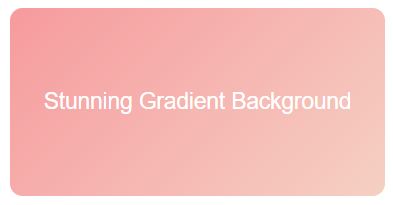
Gone are the days of flat, single-color backgrounds. Gradients can breathe life into your designs. CSS makes it super simple to implement gradients, whether linear, radial, or conic. They’re perfect for backgrounds, buttons, or even text.
Example:
background: linear-gradient(135deg, #ff9a9e, #fad0c4);Pro Tip:
For an extra “pop,” combine gradients with box shadows for 3D effects. Tools like CSS Gradient can help you experiment with combinations. When I first started experimenting with gradients, I was amazed at how they could completely transform the vibe of my website. They instantly made it look more professional, and my users noticed too!
2. Use Glassmorphism for a Modern Feel

Glassmorphism is the new design buzzword. This technique mimics frosted glass with a translucent effect, making your design appear futuristic yet elegant. It works exceptionally well for cards, modals, and navigation menus.
Example:
.backdrop {
  background: rgba(255, 255, 255, 0.1);
  backdrop-filter: blur(10px);
  border-radius: 10px;
  border: 1px solid rgba(255, 255, 255, 0.2);
}
Pro Tip:
Pair glassmorphism with vibrant gradients in the background to make your elements stand out. When I added glassmorphism to my project, a client told me, “This feels like it belongs to 2030!” That’s the power of staying on top of trends.
3. Animate with CSS Transitions and Keyframes
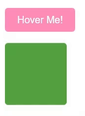
Animations are no longer optional—they're essential for capturing user attention. With CSS transitions and keyframes, you can create hover effects, button animations, or even subtle background changes.
Example (Button Hover Animation):
button {
  background-color: #ff7eb3;
  transition: background-color 0.3s ease-in-out;
}button:hover {
background-color: #ff3c8f;
}Example (Keyframes for a Bouncing Effect):
@keyframes bounce {
  0%, 100% {
    transform: translateY(0);
  }
  50% {
    transform: translateY(-10px);
  }
}
.element {
animation: bounce 2s infinite;
}Pro Tip:
Animations should enhance the user experience, not overwhelm it. Use them sparingly for a polished look. One of my favorite moments as a developer was watching users smile as they hovered over animated buttons for the first time. It’s a small touch that creates joy!
4. Embrace Custom Cursors
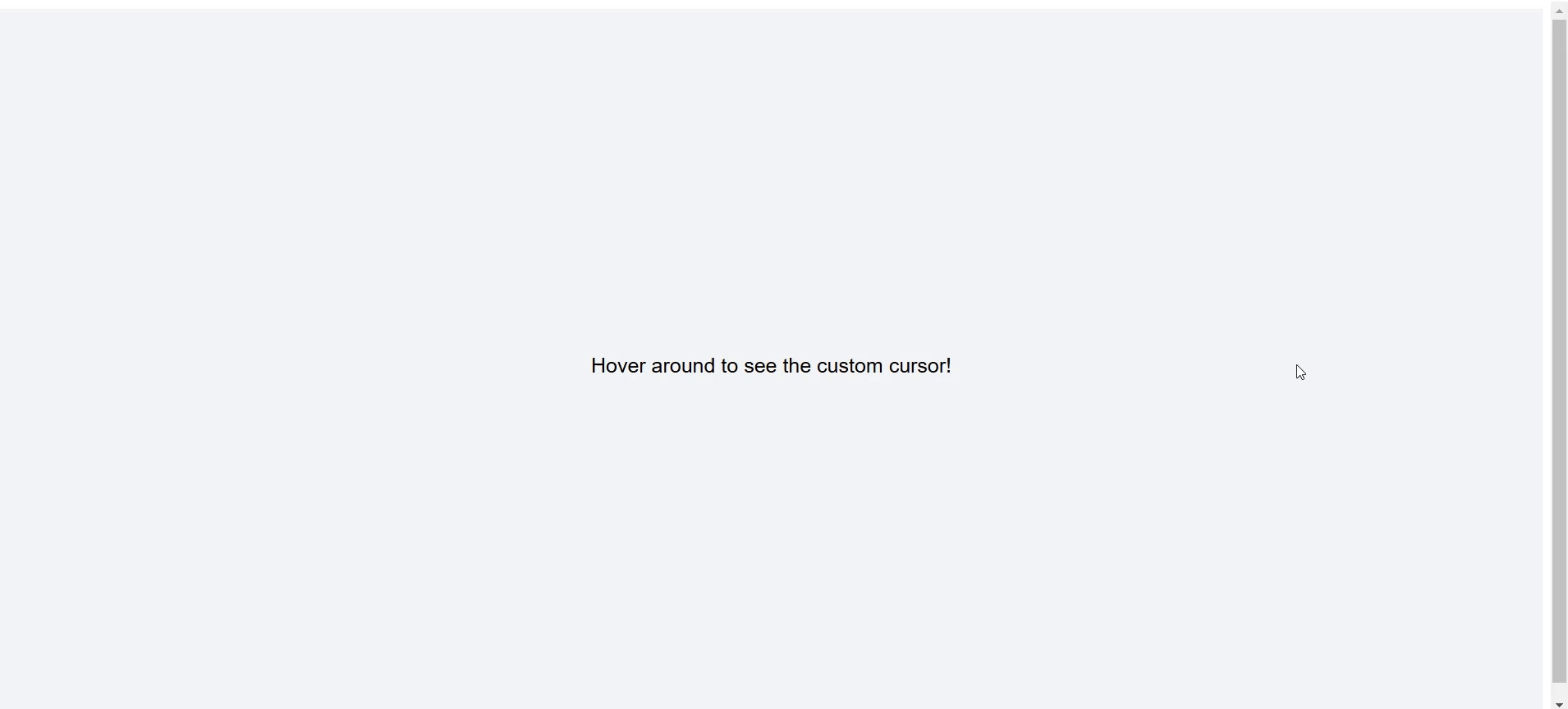
Custom cursors can add a playful or professional touch to your site. Whether you opt for a simple dot or an interactive shape, this small detail can make your website memorable.
Example:
body {
  cursor: url('custom-cursor.png'), auto;
}
Pro Tip:
Ensure your cursor is legible and doesn’t interfere with usability. Websites like Cursor.cc allow you to create custom cursors effortlessly. I once built a website for a creative agency, and the custom cursor turned out to be their favorite feature. They even joked, “We stayed longer just to play with it!”
5. Use CSS Grid for Perfect Layouts
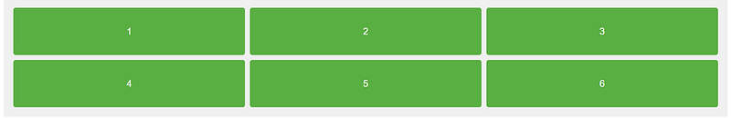
Forget float and flexbox struggles—CSS Grid is here to save the day. Grid makes it easy to create complex layouts with minimal code. Whether it’s a portfolio gallery or a multi-column blog, CSS Grid is your best friend.
Example:
.container {
  display: grid;
  grid-template-columns: repeat(3, 1fr);
  gap: 20px;
}
Pro Tip:
Use media queries to make your grid responsive, ensuring your site looks stunning on any device. I used to dread building layouts until I discovered CSS Grid. It was like finding the cheat code for web design!
6. Add Depth with Shadows and Layering
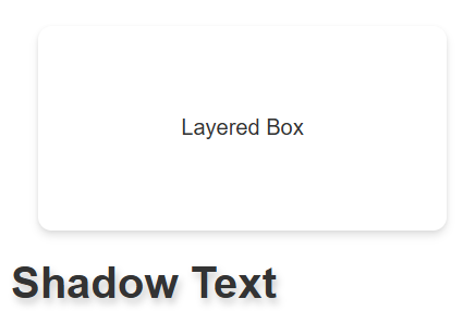
Shadows can make your website feel more tangible and layered. CSS allows you to apply shadows to text, boxes, or even images.
Example (Box Shadow):
.card {
  box-shadow: 0 4px 6px rgba(0, 0, 0, 0.1), 0 1px 3px rgba(0, 0, 0, 0.06);
}
Example (Text Shadow):
h1 {
  text-shadow: 2px 4px 6px rgba(0, 0, 0, 0.2);
}
Pro Tip:
Combine shadows with subtle gradients to create even more depth. I remember when I added shadows to a simple landing page—it went from “meh” to “wow” in seconds. Sometimes, it’s the little things.
7. Play with Typography
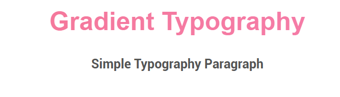
Typography is one of the most overlooked aspects of web design. Pairing fonts creatively and using text effects can drastically improve your website’s readability and appeal.
Example (Gradient Text):
.text-gradient {
  background: linear-gradient(to right, #ff758c, #ff7eb3);
  -webkit-background-clip: text;
  -webkit-text-fill-color: transparent;
}
Pro Tip:
Explore fonts on Google Fonts and experiment with font weights and sizes for emphasis. I once spent hours choosing the perfect font for a website, and the client said, “This makes our brand feel alive!” Fonts are powerful.
Conclusion
Web design is all about attention to detail. With these CSS tricks, you can take your website from good to stunning. Remember, it’s not just about technical implementation but also about connecting with your users emotionally. Whether it’s through a playful animation or a sleek gradient, your design should tell a story.
And here’s the thing: Don’t be afraid to experiment. Web design is an art; every line of code you write is a brushstroke on your digital canvas.
Have fun building—and let me know which CSS trick was your favorite!
Did you like this post? Hit the 💖 and share your thoughts in the comments below!


