
How to Simplify Complex Forms for Better User Experience

Forms are an integral part of the user experience, whether you’re signing up for a service, applying for a job, or completing a checkout process. However, complex forms often intimidate users and lead to higher abandonment rates. As a frontend and UI/UX developer, I’ve tackled this issue many times, and I’d like to share insights on how to simplify complex forms for better user experience — something I’ve learned through hands-on projects and interactions.
Why Simplifying Forms Matters
Before diving into techniques, let’s address why simplicity is key.
- Higher Completion Rates: When forms are easier to fill out, users are more likely to complete them.
- Reduced Cognitive Load: A cluttered form overwhelms users, but a simplified form makes tasks feel manageable.
- Improved Accessibility: A clean and concise form is easier for everyone, including those with disabilities, to navigate.
With this understanding, let me guide you through actionable ways to simplify complex forms.
1. Break Down Forms Into Logical Sections
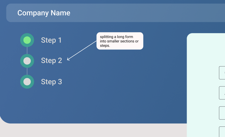
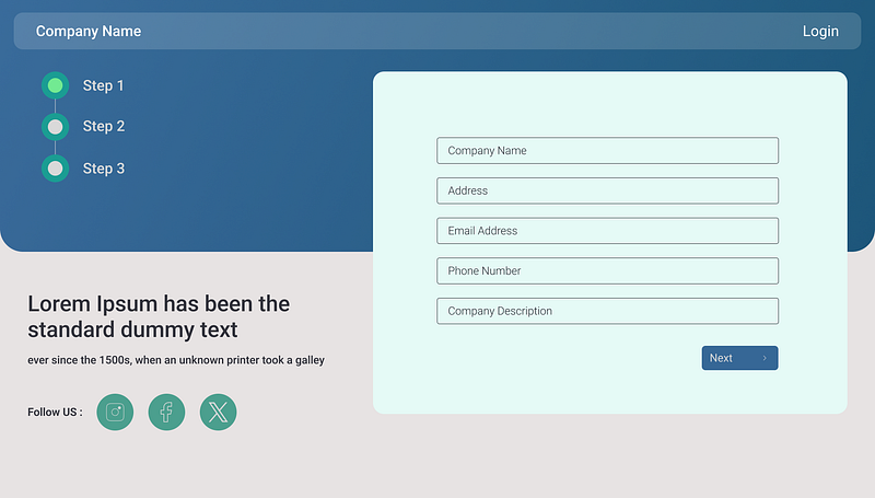
One of the most effective techniques I’ve used is splitting a long form into smaller sections or steps. A multi-step form feels less daunting because users see only one section at a time.
Example:
Instead of displaying 20 input fields on a single screen, divide them into categories like:
- Personal Information (Name, Email, etc.)
- Address Details
- Payment Information
In one of my projects, I used a progress bar at the top of the form to indicate which step the user was on, giving them a sense of progress. This simple visual cue significantly improved user engagement.
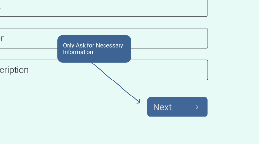
2. Only Ask for Necessary Information
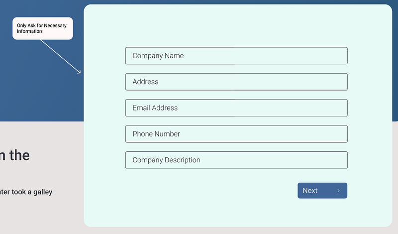
I’ve often seen forms that ask for information that isn’t immediately required. Every additional field you include adds friction.
My Approach:
- Identify the must-have fields.
- If you need optional fields, label them clearly as optional.
- Postpone non-critical information until later.
For example, in a job application form I designed, we initially asked for basic information like name and email. Details like a portfolio link or cover letter were collected after the initial submission.
3. Use Intuitive Input Types

Have you ever filled out a form where entering data felt unnecessarily difficult? That’s often due to poor input design. I always recommend using input fields tailored to the data type.
Examples:
- For dates, use a date picker instead of a text field.
- For addresses, enable autofill suggestions.
- For numeric values like phone numbers, ensure the on-screen keyboard switches to numbers on mobile.
In one of my mobile projects, this small change alone improved user experience significantly because it removed frustration on smaller screens.
4. Provide Real-Time Validation
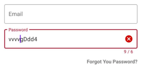
Another powerful technique I use is real-time validation. It’s better to let users know they’ve made a mistake immediately rather than after they’ve submitted the form.
Key Practices:
- Highlight errors near the specific field.
- Use clear error messages, e.g., “Your password must be at least 8 characters long.”
- Include success indicators like a green checkmark when fields are filled out correctly.
Adding real-time validation not only saves users time but also reduces the chances of errors.
5. Prioritize Mobile Responsiveness

With mobile users dominating online traffic, ensuring that your forms work seamlessly on smaller screens is non-negotiable.
What I Do:
- Use a single-column layout for mobile forms to avoid horizontal scrolling.
- Include larger touch targets for buttons and dropdowns.
- Add a visual hierarchy with whitespace to guide the user’s eyes naturally.
In a recent project, I found that tweaking the spacing and button sizes for mobile increased form completion rates by 25%.
6. Add Clear Call-to-Action (CTA) Buttons
Forms often fail because users don’t know what to do next. I’ve found that clear, actionable buttons like “Next Step” or “Submit Form” work wonders compared to vague CTAs like “Continue.”
Best Practices:
- Use contrasting colors to make the button stand out.
- Place CTAs in logical locations, such as at the bottom of each step in a multi-step form.
- Ensure buttons are large enough to tap easily on mobile devices.
7. Test, Analyze, and Optimize

Lastly, never assume your form is perfect. Testing and iterating based on user feedback is crucial. I typically use A/B testing to evaluate which design or layout performs better.
Tools I Recommend:
- Google Analytics to track form drop-off points.
- UserTesting.com to gather real-world feedback.
For example, after analyzing form behavior for an e-commerce site, I realized that adding a “Save for Later” button reduced abandonment rates significantly.
Final Thoughts
Simplifying complex forms isn’t just about making them shorter — it’s about making them smarter and more user-friendly. I’ve shared these strategies from my own experience because I believe that small changes can lead to big results.
Remember, every form tells a story. Make sure your form says, “We value your time and effort.” When users feel this level of care, they’re more likely to engage and complete your forms.
If you’ve implemented any of these techniques or have ideas of your own, I’d love to hear about them in the comments. Let’s make the web a more user-friendly place, one form at a time.


