Free AI web copilot to create summaries, insights and extended knowledge, download it at here
6041
Abstract
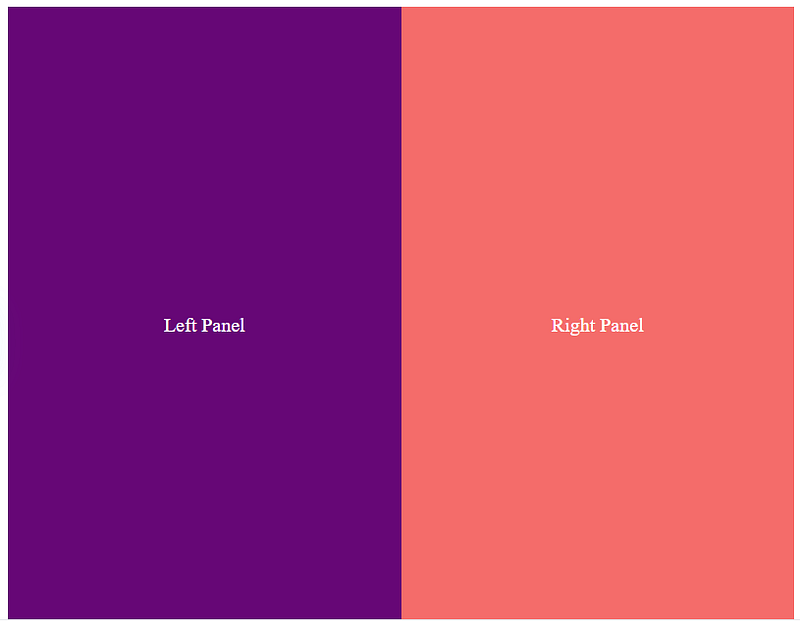
js-attr">class</span>=<span class="hljs-string">"left"</span>></span>Left Panel<span class="hljs-tag"></<span class="hljs-name">div</span>></span>
<span class="hljs-tag"><<span class="hljs-name">div</span> <span class="hljs-attr">class</span>=<span class="hljs-string">"right"</span>></span>Right Panel<span class="hljs-tag"></<span class="hljs-name">div</span>></span>
<span class="hljs-tag"></<span class="hljs-name">div</span>></span></pre></div><div id="7460"><pre><span class="hljs-tag"><<span class="hljs-name">style</span>></span><span class="language-css">
<span class="hljs-selector-class">.split-screen</span> {
<span class="hljs-attribute">display</span>: flex;
<span class="hljs-attribute">height</span>: <span class="hljs-number">100vh</span>;
}
<span class="hljs-selector-class">.left</span> {
<span class="hljs-attribute">flex</span>: <span class="hljs-number">1</span>;
<span class="hljs-attribute">background</span>: <span class="hljs-number">#6a0572</span>;
<span class="hljs-attribute">color</span>: white;
<span class="hljs-attribute">display</span>: flex;
<span class="hljs-attribute">justify-content</span>: center;
<span class="hljs-attribute">align-items</span>: center;
}
<span class="hljs-selector-class">.right</span> {
<span class="hljs-attribute">flex</span>: <span class="hljs-number">1</span>;
<span class="hljs-attribute">background</span>: <span class="hljs-number">#ff6b6b</span>;
<span class="hljs-attribute">color</span>: white;
<span class="hljs-attribute">display</span>: flex;
<span class="hljs-attribute">justify-content</span>: center;
<span class="hljs-attribute">align-items</span>: center;
}
</span><span class="hljs-tag"></<span class="hljs-name">style</span>></span></pre></div><h1 id="a256">4. Border Animation</h1><figure id="4fd2"><img src="https://cdn-images-1.readmedium.com/v2/resize:fit:800/1*Q30g0-NeQ3pRhK5t9SMcGQ.gif"><figcaption>Border Animation</figcaption></figure><h2 id="c22d">How it Works:</h2><ul><li>Uses <code>@keyframes</code> and <code>border</code> properties to create animated borders.</li><li>You can animate the <code>border-width</code>, <code>border-color</code>, or use <code>box-shadow</code> for dynamic effects.</li></ul><h2 id="a630">When to Use:</h2><ul><li>To emphasize buttons, sections, or clickable elements.</li></ul><h2 id="aa91">Code Example:</h2><div id="32b9"><pre><span class="hljs-tag"><<span class="hljs-name">button</span> <span class="hljs-attr">class</span>=<span class="hljs-string">"animated-border"</span>></span>Click Me<span class="hljs-tag"></<span class="hljs-name">button</span>></span></pre></div><div id="9c69"><pre><span class="hljs-tag"><<span class="hljs-name">style</span>></span><span class="language-css">
<span class="hljs-selector-class">.animated-border</span> {
<span class="hljs-attribute">padding</span>: <span class="hljs-number">10px</span> <span class="hljs-number">20px</span>;
<span class="hljs-attribute">font-size</span>: <span class="hljs-number">16px</span>;
<span class="hljs-attribute">background</span>: transparent;
<span class="hljs-attribute">border</span>: <span class="hljs-number">2px</span> solid transparent;
<span class="hljs-attribute">border-image</span>: <span class="hljs-built_in">linear-gradient</span>(to right, <span class="hljs-number">#ff6b6b</span>, <span class="hljs-number">#6a0572</span>);
<span class="hljs-attribute">border-image-slice</span>: <span class="hljs-number">1</span>;
<span class="hljs-attribute">cursor</span>: pointer;
<span class="hljs-attribute">animation</span>: borderAnimation <span class="hljs-number">2s</span> infinite;
}</span></pre></div><div id="bcfe"><pre> <span class="hljs-keyword">@keyframes</span> borderAnimation {
<span class="hljs-number">0%</span> {
<span class="hljs-attribute">border-image</span>: <span class="hljs-built_in">linear-gradient</span>(to right, <span class="hljs-number">#ff6b6b</span>, <span class="hljs-number">#6a0572</span>);
}
<span class="hljs-number">50%</span> {
<span class="hljs-attribute">border-image</span>: <span class="hljs-built_in">linear-gradient</span>(to left, <span class="hljs-number">#6a0572</span>, <span class="hljs-number">#ff6b6b</span>);
}
<span class="hljs-number">100%</span> {
<span class="hljs-attribute">border-image</span>: <span class="hljs-built_in">linear-gradient</span>(to right, <span class="hljs-number">#ff6b6b</span>, <span class="hljs-number">#6a0572</span>);
}
}
</style></pre></div><h1 id="2c44">5. Floating Icons</h1><figure id="6c57"><img src="https://cdn-images-1.readmedium.com/v2/resize:fit:800/1*MEQ0wt8MOeXijznp22vVlg.gif"><figcaption>Floating Icons</figcaption></figure><h2 id="140d">How it Works:</h2><ul><li>Uses <code>@keyframes</code> to create an up-and-down floating motion.</li><li><code>transform: translateY()</code> is animated to simulate floating.</li></ul><h2 id="fab8">When to Use:</h2><ul><li>For playful or decorative icons in headers, footers, or landing pages.</li></ul><h2 id="84e8">Code Example:</h2><div id="d2d5"><pre><span class="hljs-tag"><<span class="hljs-name">div</span> <span class="hljs-attr">class</span>=<span class="hljs-string">"icon"</span>></span>🎈<span class="hljs-tag"></<span class="hljs-name">div</span>></span></pre></div><div id="2c0e"><pre><span class="hljs-tag"><<span class="hljs-name">style</span>></span><span class="language-css">
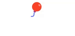
<span class="hljs-selector-class">.icon</span> {
<span class="hljs-attribute">font-size</span>: <span class="hljs-number">3rem</span>;
<span class="hljs-attribute">display</span>: inline-block;
<span class="hljs-attribute">animation</span>: float <span class="hljs-number">3s</span> ease-in-out infinite;
}</span></pre></div><div id="c389"><pre> <span class="hljs-keyword">@keyframes</span> float {
<span class="hljs-number">0%</span>, <span class="h
Options
ljs-number">100%</span> {
<span class="hljs-attribute">transform</span>: <span class="hljs-built_in">translateY</span>(<span class="hljs-number">0</span>);
}
<span class="hljs-number">50%</span> {
<span class="hljs-attribute">transform</span>: <span class="hljs-built_in">translateY</span>(-<span class="hljs-number">20px</span>);
}
}
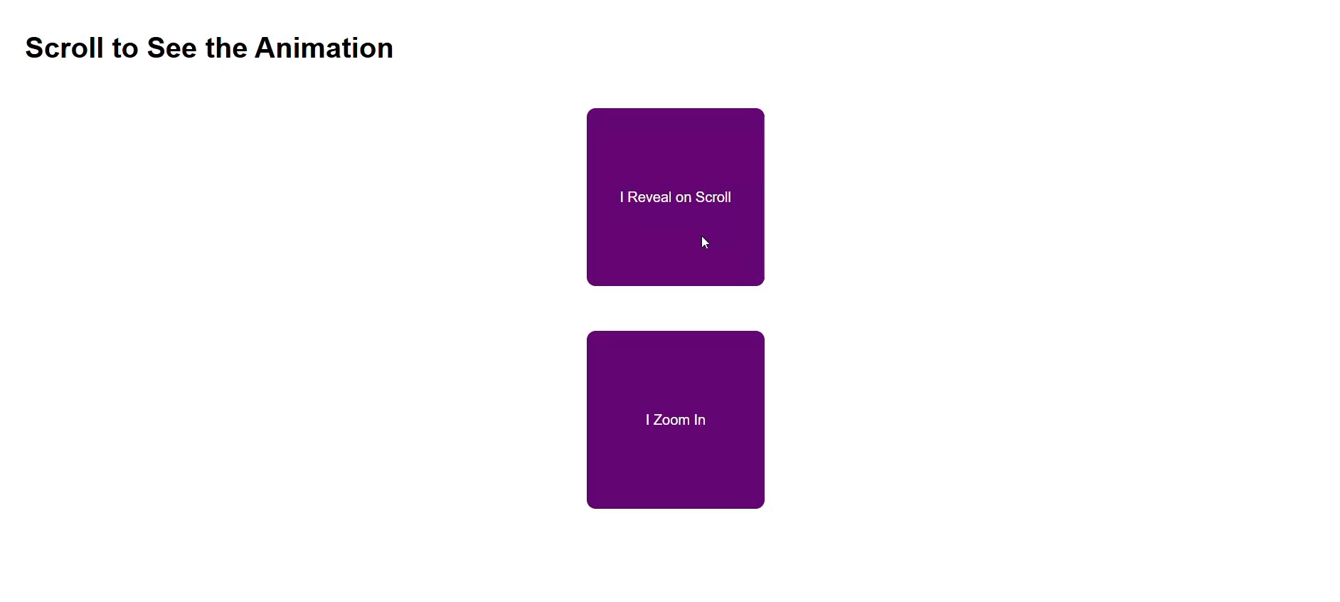
</style></pre></div><h1 id="31c8">6. Scroll Reveal</h1><figure id="5df3"><img src="https://cdn-images-1.readmedium.com/v2/resize:fit:800/1*4BZis-5Zt06u-14PbvslEg.gif"><figcaption>Scroll Reveal</figcaption></figure><h2 id="621f">How it Works:</h2><ul><li>Combines CSS animations with JavaScript libraries like AOS or ScrollReveal.js.</li><li>Reveals elements as they enter the viewport.</li></ul><h2 id="3cf7">When to Use:</h2><ul><li>For storytelling, guiding user focus, or progressive content display.</li></ul><h2 id="855e">Code Example with AOS Library:</h2><div id="43fa"><pre><span class="hljs-tag"><<span class="hljs-name">div</span> <span class="hljs-attr">data-aos</span>=<span class="hljs-string">"fade-up"</span>></span>I Reveal on Scroll<span class="hljs-tag"></<span class="hljs-name">div</span>></span></pre></div><div id="fd26"><pre><span class="hljs-tag"><<span class="hljs-name">link</span> <span class="hljs-attr">href</span>=<span class="hljs-string">"https://cdn.jsdelivr.net/npm/[email protected]/dist/aos.css"</span> <span class="hljs-attr">rel</span>=<span class="hljs-string">"stylesheet"</span>></span>
<span class="hljs-tag"><<span class="hljs-name">script</span> <span class="hljs-attr">src</span>=<span class="hljs-string">"https://cdn.jsdelivr.net/npm/[email protected]/dist/aos.js"</span>></span><span class="hljs-tag"></<span class="hljs-name">script</span>></span>
<span class="hljs-tag"><<span class="hljs-name">script</span>></span>
AOS.init();
<span class="hljs-tag"></<span class="hljs-name">script</span>></span></pre></div><h1 id="a943">7. CSS Clip Path</h1><figure id="a815"><img src="https://cdn-images-1.readmedium.com/v2/resize:fit:800/1*lQQT34Y8kOU8mpddg-GKhg.png"><figcaption>CSS Clip Path</figcaption></figure><h2 id="70e5">How it Works:</h2><ul><li>Clips elements into custom shapes using the <code>clip-path</code> property.</li><li>Shapes can be circles, polygons, or even SVG paths.</li></ul><h2 id="8bb9">When to Use:</h2><ul><li>To create visually interesting layouts or highlight content in unique shapes.</li></ul><h2 id="4b1f">Code Example:</h2><div id="b04b"><pre><span class="hljs-tag"><<span class="hljs-name">div</span> <span class="hljs-attr">class</span>=<span class="hljs-string">"clip-card"</span>></span>Clipped Content<span class="hljs-tag"></<span class="hljs-name">div</span>></span></pre></div><div id="edf8"><pre><span class="hljs-tag"><<span class="hljs-name">style</span>></span><span class="language-css">
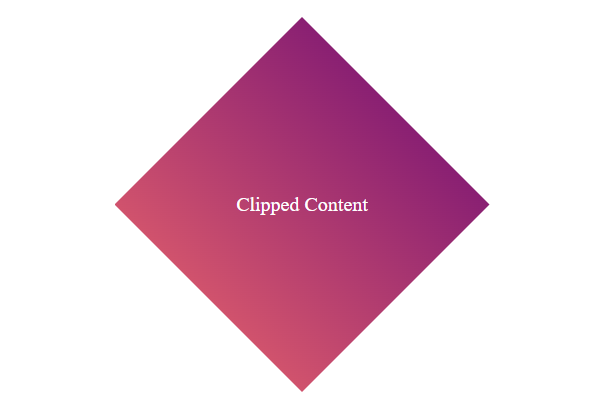
<span class="hljs-selector-class">.clip-card</span> {
<span class="hljs-attribute">width</span>: <span class="hljs-number">300px</span>;
<span class="hljs-attribute">height</span>: <span class="hljs-number">300px</span>;
<span class="hljs-attribute">background</span>: <span class="hljs-built_in">linear-gradient</span>(<span class="hljs-number">45deg</span>, <span class="hljs-number">#ff6b6b</span>, <span class="hljs-number">#6a0572</span>);
<span class="hljs-attribute">clip-path</span>: <span class="hljs-built_in">polygon</span>(<span class="hljs-number">50%</span> <span class="hljs-number">0%</span>, <span class="hljs-number">100%</span> <span class="hljs-number">50%</span>, <span class="hljs-number">50%</span> <span class="hljs-number">100%</span>, <span class="hljs-number">0%</span> <span class="hljs-number">50%</span>);
<span class="hljs-attribute">color</span>: white;
<span class="hljs-attribute">display</span>: flex;
<span class="hljs-attribute">justify-content</span>: center;
<span class="hljs-attribute">align-items</span>: center;
}
</span><span class="hljs-tag"></<span class="hljs-name">style</span>></span></pre></div><p id="d5d2">Part One :</p><div id="e942" class="link-block">
<a href="https://readmedium.com/top-7-css-tricks-to-make-your-websites-look-stunning-856dd901d336">
<div>
<div>
<h2>Top 7 CSS Tricks to Make Your Websites Look Stunning</h2>
<div><h3>Aesthetic appeal ensures user engagement</h3></div>
<div><p>medium.com</p></div>
</div>
<div>
<div style="background-image: url(https://miro.readmedium.com/v2/resize:fit:320/1*t-EiMgpCjxYwV4Tzac3euA.jpeg)"></div>
</div>
</div>
</a>
</div><div id="a1b5" class="link-block">
<a href="https://readmedium.com/top-10-free-resources-every-ui-ux-designer-should-know-about-1001fbf23481">
<div>
<div>
<h2>Top 10 Free Resources Every UI/UX Designer Should Know About</h2>
<div><h3>The latest tools, trends, and techniques</h3></div>
<div><p>medium.com</p></div>
</div>
<div>
<div style="background-image: url(https://miro.readmedium.com/v2/resize:fit:320/1*_fOoDGuX14NQy_rgYhfQcA.jpeg)"></div>
</div>
</div>
</a>
</div><div id="cdb4" class="link-block">
<a href="https://readmedium.com/5-circus-performers-who-defied-the-odds-stories-behind-the-photos-part-1-f0e50b212031">
<div>
<div>
<h2>5 Circus Performers Who Defied the Odds: Stories Behind the Photos (Part 1)</h2>
<div><h3>Historical Figures</h3></div>
<div><p>medium.com</p></div>
</div>
<div>
<div style="background-image: url(https://miro.readmedium.com/v2/resize:fit:320/1*aPSp_U2onKQlZxjWMe1tYA.png)"></div>
</div>
</div>
</a>
</div></article></body>