
Stata graphs: Sankey diagram
Note Feb 2023: This guide has been converted into a Stata package: sankey that considerably extends the routines discussed below. Regardless, the guide might still be useful in learning how Sankey’s are constructed.
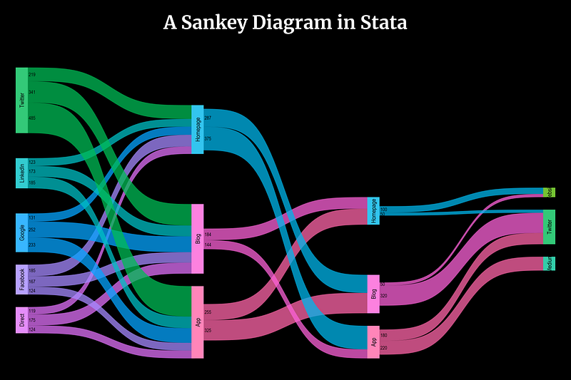
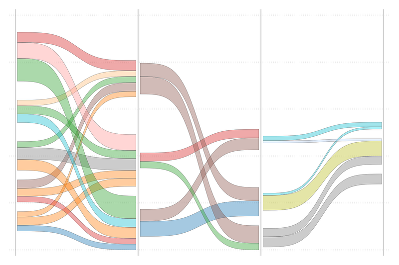
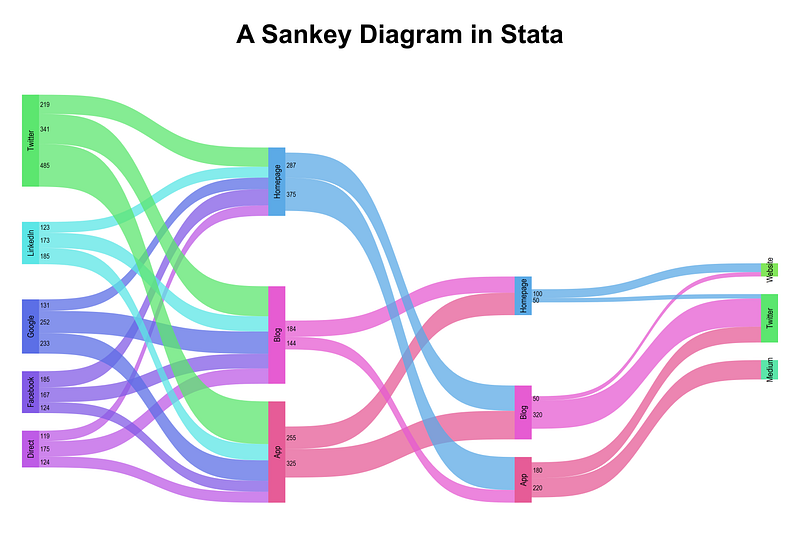
In this guide we will learn to program the following Sankey diagram in Stata:
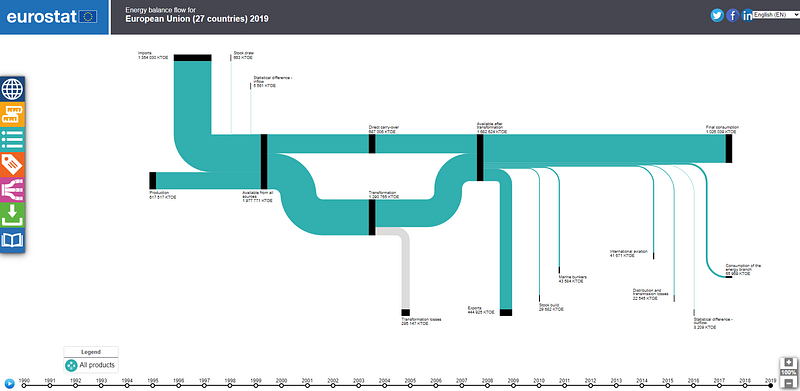
So what are Sankey diagrams? Sankeys represent the evolution of flows across different stages or categories. They are often used to show migration trends across regions, or energy and material flows. Eurostat also has an interactive Sankey tool to illustrate energy balances:
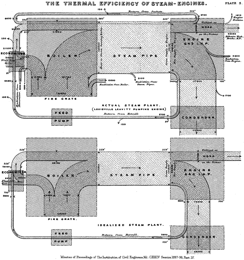
Sankeys are named after Irishman, Matthew Sankey, who first conceived of this figure to illustrate the energy efficiency of steam engines:
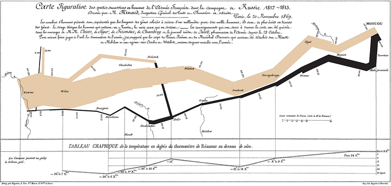
Another classic example is Charles Minard’s depiction of Napoleon’s invasion of Russia and how it unfolded as he moved towards Moscow:
Since Sankeys are great at representing complex flows, they are also a great tool for interactive visualizations. They should also not be confused with their close cousin Alluvial plots, which have a completely different underlying data structure. A guide on Alluvials will come later!
Preamble
Like other guides, a basic knowledge of Stata is assumed. This guide deals with advanced usage of locals, loops, and code structures that require some experience and familiarity with Stata programming.
In order to make the graphs exactly as they are shown here, install the schemepack suite (more info in the Scheme guide and on GitHub):
ssc install schemepack, replaceand set the scheme to White Tableau:
set scheme white_tableau- Set the default graph font to Arial Narrow (see the Font guide on customizing fonts)
graph set window fontface "Arial Narrow"Since this guide is fairly long, all possible code options are not discussed in detail. It is expected that the users can follow the logic explained and are aware of the logic of loops and locals from earlier guides.
Get the data in order
Here we will use the same dataset we used for Arc plots. While Arc charts just deal with visualizing bilateral flows, Sankeys allow us to visualize all the steps of flows.
Let’s get the dataset from GitHub:
https://github.com/asjadnaqvi/The-Stata-Guide/blob/master/data/network_data.dta?raw=trueIf it doesn’t work, you can manually download the network_data.dta or network_data.xlsx files here.
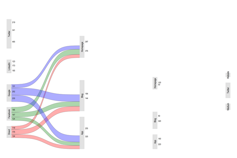
This data represents the online traffic flows from one website to another in the number of users. This type of statistics is generated by Google Analytics if tracking in enabled on websites. The data itself is fake and we are just using it for practice. A screenshot of the data is as follows:
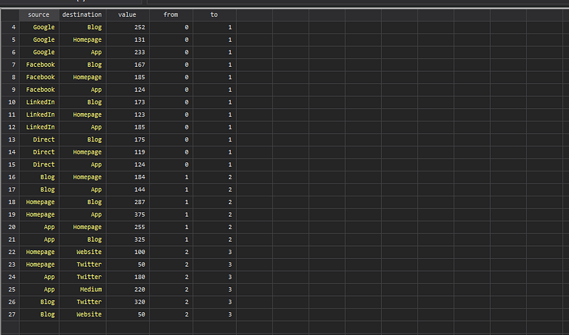
Here we can see the Source and Destination fields, and the value transferred. This is just the number of users going from one website to another. The from and to fields show the layer levels. For example, 0 to 1, is the first layer, 1 to 2 is the second layer, and 2 to 3 is the third layer.
In total these are four partitions or nodes, which are connected via three sets of flows. For the subsequent steps, I would highly recommend checking the data browser (type br) to see how the data is evolving. These under-the-hood steps that do massive data structure adjustments are not usually revealed when using packages.
Let’s start by cleaning up the names:
ren from        x1
ren source      lab1
ren to x2
ren destination lab2TIP: The more systematic the names are, the easier it is to loop over them.
We also create a duplicate of the value after also fixing its name:
ren value  val1
gen val2 = val1
This will allows us to differentiate between inflows and outflows later. Next we sort the data and generate a sequence id:
sort x1 lab1 lab2gen id = _n
order idegen grp1 = group(x1 lab1) // draw order
egen grp2 = group(x1 lab2)This step freezes the order in which the layers are drawn. The group layer is used for identifying colors and also controlling the code flow. Next by each category, we generate cumulative sums:
cap drop y1
cap drop y2
sort x1 grp1 grp2
by x1 : gen y1 = sum(val1)sort x2 grp2 grp1
by x2 : gen y2 = sum(val2)sort lab1Cumulative sums allows us to stack variables on the y-axis.
Let’s see what we have so far by drawing a few layers using the twoway pcspike:
twoway ///
 (pcspike y1 x1 y2 x2 if grp1==1) ///
 (pcspike y1 x1 y2 x2 if grp1==2) ///
 (pcspike y1 x1 y2 x2 if grp1==3) ///
 (pcspike y1 x1 y2 x2 if grp1==4) ///
 (pcspike y1 x1 y2 x2 if grp1==5) ///
 (pcspike y1 x1 y2 x2 if grp1==6) ///
  , legend(off)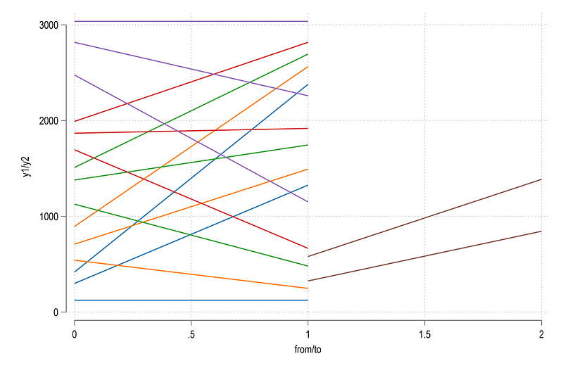
Here we can see the flows of each category in colors by relying on the grp variable. Let’s draw all the layers and show some labels as well:
local lines
levelsof grp1, local(lvls)
foreach x of local lvls {
local lines `lines' (pcspike y1 x1 y2 x2 if grp1==`x') ||
}twoway ///
`lines' ///
(scatter y1 x1, mlab(lab1) mlabs(vsmall) mc(black) mlabpos(3)) ///
(scatter y2 x2, mlab(lab2) mlabs(vsmall) mc(black) mlabpos(9)) ///
, legend(off)and we get this figure:
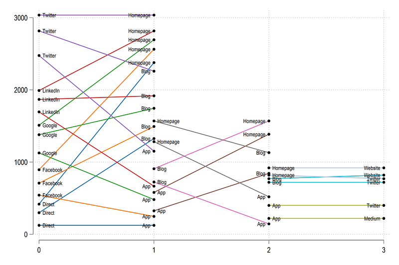
This simple variation parallel-coordinates plot figure is basically a stripped-down version of a Sankey. Next steps deal with making it look more like a Sankey.
First thing, note in the first above that the categories on the left determine the color. This is the rule for Sankeys. While some visualizations dissolve colors or use color gradients as they move from one category to other, keeping the “source” color makes it easier to interpret. Here you will also notice that similar “left” categories like Blog or App have different colors across the different partitions or layers. This is something we also need to fix at a later stage after the data structure is in order. But since data is carried forward, we can already partially solve this problem by reshaping the data to long form:
sort x1 lab1 lab2gen layer = x1 + 1
reshape long x val lab grp y , i(id layer) j(tt)drop tt // just a dummy variable we don't needorder grp id lab x
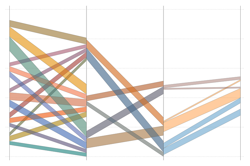
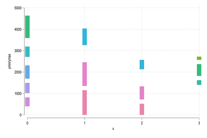
sort id x labThis allows us to use levels of the lab variable to generate the colors. Let’s draw the data again:
local lines
levelsof grp, local(lvls)
foreach x of local lvls {
local lines `lines' (scatter y x if grp==`x', mlabel(lab) mlabpos(3)) ||
}twoway ///
`lines' ///
, legend(off)which gives us:
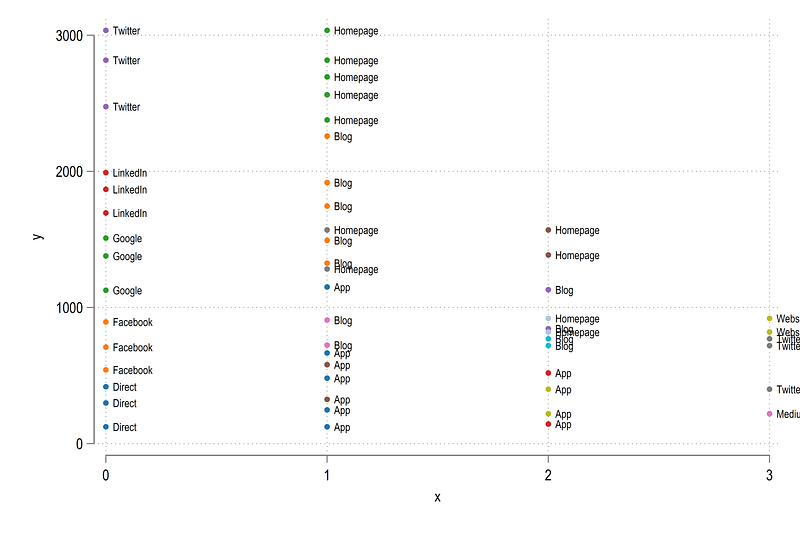
Here we have all the points that we want to link together.
Adding shapes
In order to add shapes, we first need to deal with the bottom-most layers on the y-axis. They need to have a starting point. While all the other layers can use one layer below, the first layer cannot:
cap drop y1
cap drop y2
sort layer x yby layer x: gen y1 = y[_n-1]
recode y1 (.=0)
gen y2 = y
drop yorder layer grp id lab x y1 y2 valIn the data browser, notice the y1 and y2 columns. They are now the starting and ending values on the y-axes which allow us to use Stata’s native twoway rarea option.
Let’s fill up the areas and draw the layer:
local areas

levelsof id, local(lvls)
foreach x of local lvls {
 local areas `areas' (rarea y1 y2 x if id==`x', fc(%20)) ||
}
twoway ///
`areas' ///
, ///
legend(off) ///
xline( `r(levels)', lp(solid) lw(vthin)) ///
xlabel(, nogrid) ///
xscale(off) yscale(off)from which we get this figure:
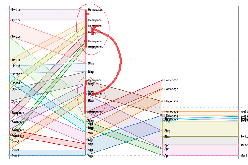
Now we have this structure in place, we need to align the layers with each other. Here we need to make sure that the next layer starts where the first one ends for that category and so on. For example, see “Homepage”. It ends at the top from the first to the second layer, but starts the bottom of the second layer. This is because these values are stacked by axes. So we need to make sure that the second starting values should actually be exactly in the middle of the ending values.
Here it becomes a bit complicated since we need to do two things. First, we need to “match” starting and ending categories. Second, we need to center the ranges (to look nice). This is done through the following routine, which is at the heart of getting the design right:
*** transform the groups to be at the mid pointssort x id y1 y2cap drop y1t
cap drop y2tgen y1t = .
gen y2t = .levelsof layer
local tlayers = `r(r)' - 1 // drop one layerforval i = 1/`tlayers' {
local left = `i'
local right = `i' + 1display "Layer: `i', Left x: `left', Right x = `right'"levelsof lab if layer==`left', local(lleft)
levelsof lab if layer==`right', local(lright) foreach y of local lleft { // left
foreach x of local lright { // rightif "`x'" == "`y'" { // check if the groups are equal display "`x'" // just for checking** next part gets the ranges of the in and out layers// "in" data layer range
summ y1 if lab=="`x'" & layer==`left' & x==`left' local y1max `r(max)'
local y1min `r(min)'summ y2 if lab=="`x'" & layer==`left' & x==`left'
local y2max `r(max)'
local y2min `r(min)'
local l1max = max(`y1max',`y2max')
local l1min = min(`y1min',`y2min')
// "out" data layer range
summ y1 if lab=="`x'" & layer==`right' & x==`left'
    local y1max `r(max)'
    local y1min `r(min)'
summ y2 if lab=="`x'" & layer==`right' & x==`left'
local y2max `r(max)'
local y2min `r(min)'
// get the bounds local l2max = max(`y1max',`y2max')
local l2min = min(`y1min',`y2min')
// calculate the displacement local displace = ((`l1max' - `l1min') - (`l2max' - `l2min')) / 2
// displace the top and bottom partsreplace y1t = y1 + `displace' + `l1min' - `l2min' if layer==`right' & lab=="`x'" & x==`left' replace y2t = y2 + `displace' + `l1min' - `l2min' if layer==`right' & lab=="`x'" & x==`left'
}
}
}
}// the bottom layers are not displacedreplace y1t = y1 if y1t==.
replace y2t = y2 if y2t==.In the code above, we make pairs of ids that match and determine which layer is going in and which one is going out. Next we find the end points and center values of each layer. Since the incoming layer is same or larger than the outgoing layer (outflows have to be less or equal to inflows), we know for sure that the incoming layer defines the bounds. Once this is sorted out, we just need to displace the second layer by making sure, its center point aligns with the incoming layer.
Let’s draw these new data points:
local areas

levelsof id, local(lvls)
foreach x of local lvls {
 local areas `areas' (rarea y1t y2t x if id==`x', fc(%20)) ||
}
levelsof x
twoway ///
`areas' ///
(scatter y1 x, mlabel(lab) mlabpos(3) mlabcolor(black) mlabsize(vsmall)) ///
(scatter y2 x, mlabel(lab) mlabpos(3) mlabcolor(black) mlabsize(vsmall)) ///
, ///
legend(off) ///
xline(`r(levels)', lp(solid) lw(vthin)) ///
xlabel(, nogrid) ///
xscale(off) yscale(off)and we get this figure:
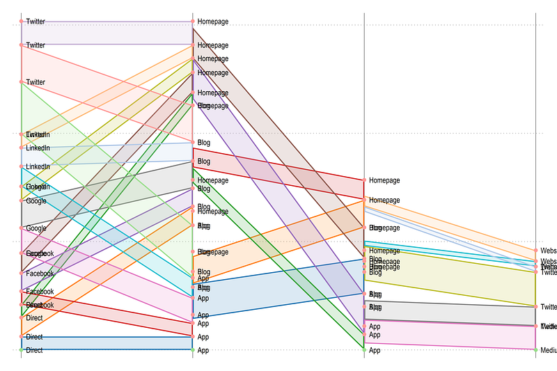
Here we can see that the layers are aligned correctly. Let’s place the original values:
drop y1 y2ren y1t y1
ren y2t y2and now let’s add gaps between the categories across the layers:
*** generate offset between categoriessort x y1cap drop tag*
encode lab, gen(order)cap drop offset
bysort x: gen offset = (order - 1) * 200 // 200 is arbitraryreplace y1 = y1 + offset
replace y2 = y2 + offset*cap drop tag
cap drop offsetHere, I just use the offset based on the order values and give a spacing of 200. This of course can be improved and automated depending on the output we want to produce. But for now, we stick to this crude transformation. Now let’s draw all the layers we have:
local areas

levelsof id, local(lvls)
foreach x of local lvls {
 local areas `areas' (rarea y1 y2 x if id==`x', fc(%20)) ||
}
levelsof x
twoway ///
`areas' ///
, ///
legend(off) ///
xline(`r(levels)', lp(solid) lw(vthin)) ///
xlabel(, nogrid) ///
xscale(off) yscale(off)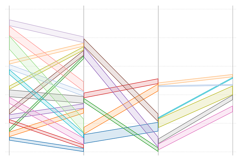
Here we see spacing between the layers, which is exactly what we want. The last layer is offset a bit too much, since it has a large order value, but for this dataset we leave it for now. We can also draw a slightly nicer graph:
local shapeslevelsof order
local groups = `r(r)'summ x
local cuts = `r(max)' - 1
display `cuts'levelsof id, local(lvls)forval y = 0/`cuts' {
foreach x of local lvls {qui summ order if id==`x' & x==`y'
if `r(N)' > 0 {
display "Cut: `y', ID: `x', Value = `r(mean)'"
local clr = `r(mean)'
colorpalette tableau, n(`groups') nographlocal shapes `shapes' (rarea y1 y2 x if id==`x', lc(gs6) lw(0.06) fi(100) fcolor("`r(p`clr')'%40")) ||
}
}
}levelsof x
twoway ///
`shapes' ///
, ///
legend(off) ///
xline(`r(levels)', lp(solid) lw(vthin)) ///
xlabel(, nogrid) ///
xscale(off) yscale(off)which gives us:
The curves
Now comes the challenging part: converting the areas into curves. For this we make use of Sigmoid functions. Sigmoids are S-shaped graphs, for example, the type seen in logistic or probit models. But, here we need a special case. A generic Sigmoid that is bound between 0 and 1 on both the x- and the y-axis. Why do we do this? We will basically take a bounded [0,1][0,1] Sigmoid and stretch it to fit the ends points we have calculated.
So how do we draw a Sigmoid? We can take any function and parameterize it to give some reasonable value. Here we use this functional form:
y = 1/ (1 + (x / (1-x))^-betaThis function has only one parameter beta, which gives the slope of the curve. We can try different values:
twoway ///
(function y = 1/ (1 + (x / (1-x))^-2), range(0 1)) ///
(function y = 1/ (1 + (x / (1-x))^-3), range(0 1)) ///
(function y = 1/ (1 + (x / (1-x))^-4), range(0 1)) ///
(function y = 1/ (1 + (x / (1-x))^-5), range(0 1)) ///
, legend(order(1 "beta=2" 2 "beta=3" 3 "beta=4" 4 "beta=5"))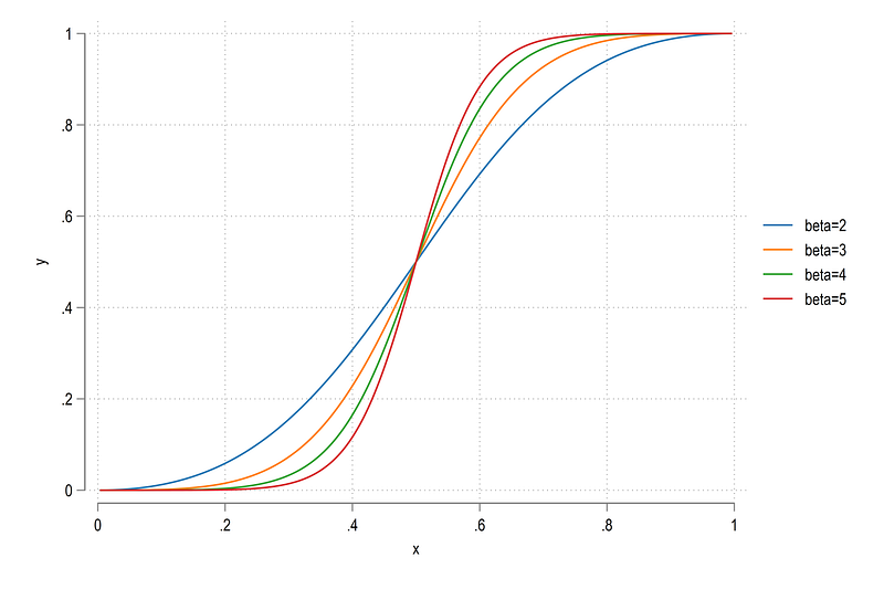
The higher the beta, the more S-shaped the function is. Here we can select beta=3 as a reasonably S-shaped Sigmoid, but feel free to experiment with other values or functions. The figure is also bound between [0,1] and [0,1] on both the axes.
We can also easily transform this function. On the x-axis, we just need to define the values. Domain rescaling can be done using the following formula:
**** function rescaling from one domain to [a,b] intervalx_norm = (b-a)(x - min / (max - min)) + aLet’s apply this to one segment id==1:
sort id xtwoway ///
(rarea y1 y2 x if id==1)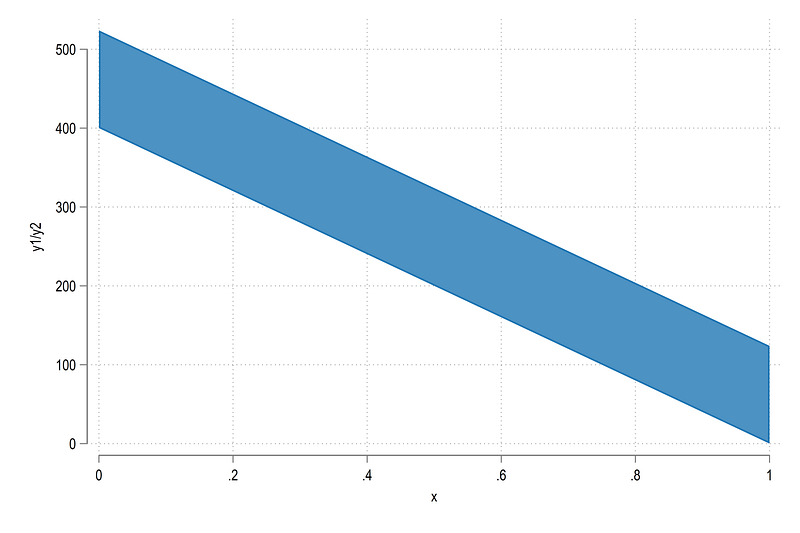
Since Stata does not allow areas to be filled between two layers, we covert the S-curves into points that we can connect. This is something we have done several times in previous guides (see for example, Arc plots, which use the same data set to generate semi-circles).
First we need to expand the observations:
local newobs = 30 // higher the value, the smoother the curve
expand `newobs'sort id xHere 30 is an arbitrary value. The higher this value is, the smoother the curve will be. But it will also take more computational time especially if you have a lot of layers.
Now we just generate a generic Sigmoid:
local newobs = 30
cap drop xtemp
bysort id: gen xtemp = (_n / (`newobs' * 2))cap drop ytemp
gen ytemp = (1 / (1 + (xtemp / (1 - xtemp))^-3))which gives us:
scatter ytemp xtemp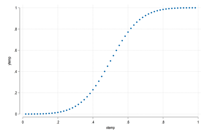
The next part, we need to transform the layers. Here we introduce another routine:
gen y1temp = .
gen y2temp = .*** run the loop here
levelsof layer, local(cuts)
display `cuts'levelsof id, local(lvls)foreach x of local lvls { // each id is looped over
foreach y of local cuts {display "ID = `x', cut = `y'"summ ytemp if id==`x' & layer==`y'
if `r(N)' > 0 {
local ymin = `r(min)'
local ymax = `r(max)'
}
else {
local ymin = 0
local ymax = 0
}sum x if layer==`y'
local x0 = `r(min)'
local x1 = `r(max)'// first partdisplay "Left side"
summ y1 if id==`x' & x==`x0' & layer==`y'
if `r(N)' > 0 {
local y1min = `r(min)'
}
else {
local y1min = 0
}
summ y1 if id==`x' & x==`x1' & layer==`y'
if `r(N)' > 0 {
local y1max = `r(max)'
}
else {
local y1max = 0
}
display "Left side values"
replace y1temp = (`y1max' - `y1min') * (ytemp - `ymin') / (`ymax' - `ymin') + `y1min' if id==`x' & layer==`y'
// second part display "Right side"
summ y2 if id==`x' & x==`x0' & layer==`y'
if `r(N)' > 0 {
local y2min = `r(min)'
}
else {
local y2min = 0
}
summ y2 if id==`x' & x==`x1' & layer==`y'
if `r(N)' > 0 {
local y2max = `r(max)'
}
else {
local y2max = 0.00001 // to avoid division by zero
}
display "Right side values"
replace y2temp = (`y2max' - `y2min') * (ytemp - `ymin') / (`ymax' - `ymin') + `y2min' if id==`x' & layer==`y'} }
replace xtemp = xtemp + layer - 1Above we do a two-part adjustment. First we deal with the left side y-axis, and then the right sight y-axis. In between are a series of checks to make sure the correct shape is drawn. Once these are finalized, the generic Sigmoid coordinates are transformed.
Let’s see what we got:
twoway ///
(rarea y1 y2 x if id==1, fc(%20)) ///
(rarea y1temp y2temp xtemp if id==1, fc(%20))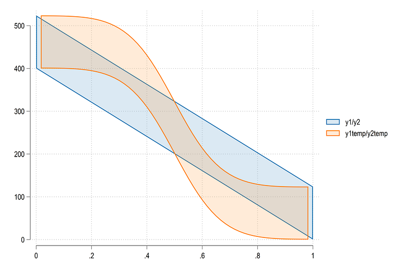
Here we can see that the curve is close to the end points but not quite. This is because we wanted to avoid division by zero. This very minor difference won’t show up in the final figure since we still need to add the wedges for categories that will fill up this space.
We can also draw a bunch of Sigmoids:
twoway ///
(rarea y1temp y2temp xtemp if id==1) ///
(rarea y1temp y2temp xtemp if id==2) ///
(rarea y1temp y2temp xtemp if id==3) ///
(rarea y1temp y2temp xtemp if id==4)which gives us:
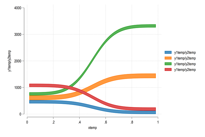
Here we can see that the transformations also take care of the direction. The blue and red curves are inverted. This is the beauty of the bounded S-shape. It can be molded to fit any two end points. Once the curves are drawn, Stata’s twoway rarea takes care of the rest.
Let’s loop over all the values and see what we have:
levelsof order
local groups = `r(r)'
local shapes
levelsof id, local(lvls)foreach x of local lvls {qui summ grp if id==`x'
if `r(N)' > 0 {
local clr = `r(mean)'
colorpalette tableau, n(`groups') nograph
local shapes `shapes' (rarea y1temp y2temp xtemp if id==`x', lc(gs6) lw(0.06) fi(100) fcolor("`r(p`clr')'%40")) ||
}
}levelsof x
twoway ///
`shapes' ///
, ///
legend(off) ///
xline(`r(levels)', lp(solid) lw(vthin)) ///
xlabel(, nogrid) ///
xscale(off) yscale(off)and we get:
Looks nice! The colors are still random but at least the curves are showing properly. Also note how the ending and the starting curves center and align with each other nicely.
Next part: the labels.
The labels
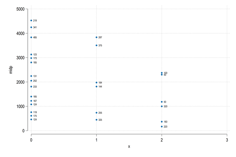
We need two labels. One for the markers or wedges and second for the values. The mid points are relatively simply. We know where each category starts and ends:
egen tag = tag(x order)
cap gen midy = .levelsof x, local(lvls)
foreach x of local lvls {levelsof order if x ==`x', local(odrs)foreach y of local odrs {
summ y1 if x==`x' & order==`y'
local min = `r(min)'
summ y2 if x==`x' & order==`y'
local max = `r(max)'
replace midy = (`min' + `max') / 2 if tag==1 & x==`x' & order==`y'
}
}Next we need the mid points for the labels. This is simply the mid point of each out-going group:
egen tagp = tag(id)cap drop midp
cap gen midp = .levelsof id, local(lvls)
foreach x of local lvls {qui summ x if id==`x'
local xval = `r(min)'
qui summ y1 if id==`x' & x==`xval'
local min = `r(min)'
qui summ y2 if id==`x' & x==`xval'
local max = `r(max)'local test = (`min' + `max') / 2
replace midp = (`min' + `max') / 2 if id==`x' & tagp==1
}Let’s check the values:
twoway ///
(scatter midp x, mlabel(val) mlabsize(1.6) mlabpos(3))and we get:
We can also plot the labels with some curves:
twoway ///
(rarea y1temp y2temp xtemp if id==1, lc(gs6) lw(0.06) fcolor(red%40)) ///
(rarea y1temp y2temp xtemp if id==2, lc(gs6) lw(0.06) fcolor(red%40)) ///
(rarea y1temp y2temp xtemp if id==3, lc(gs6) lw(0.06) fcolor(red%40)) ///
(rarea y1temp y2temp xtemp if id==4, lc(gs6) lw(0.06) fcolor(green%40)) ///
(rarea y1temp y2temp xtemp if id==5, lc(gs6) lw(0.06) fcolor(green%40)) ///
(rarea y1temp y2temp xtemp if id==6, lc(gs6) lw(0.06) fcolor(green%40)) ///
(rarea y1temp y2temp xtemp if id==7, lc(gs6) lw(0.06) fcolor(blue%40)) ///
(rarea y1temp y2temp xtemp if id==8, lc(gs6) lw(0.06) fcolor(blue%40)) ///
(rarea y1temp y2temp xtemp if id==9, lc(gs6) lw(0.06) fcolor(blue%40)) ///
(rspike y1 y2 x, lcolor(gs14%40) lwidth(3)) ///
(scatter midy x if tag==1, msymbol(none) mlabel(lab) mlabsize(1.6) mlabpos(0) mlabangle(vertical)) ///
(scatter midp x , msymbol(none) mlabel(val) mlabgap(1.4) mlabsize(1.3) mlabpos(3)) ///
, ///
legend(off) ///
xlabel(, nogrid) ylabel(, nogrid) ///
xscale(off) yscale(off)which gives us:
Looks fine! Let’s loop over all the values:
levelsof order
local groups = `r(r)'

local shapes

levelsof id, local(lvls)
foreach x of local lvls {
qui sum x if id==`x'
qui summ order if id==`x' & x == `r(min)'
if `r(N)' > 0 {
local clr = `r(mean)'
colorpalette tableau, n(`groups') nograph
local shapes `shapes' (rarea y1temp y2temp xtemp if id==`x', lc(gs6) lw(0.06) fi(100) fcolor("`r(p`clr')'%40")) ||
}
}levelsof x
twoway ///
`shapes' ///
(rspike y1 y2 x, lcolor(gs14) lwidth(3)) ///
(scatter midy x if tag==1, msymbol(none) mlabel(lab) mlabsize(1.6) mlabposition(0) mlabangle(vertical)) ///
, ///
legend(off) ///
xline(`r(levels)', lp(solid) lw(vthin)) ///
xlabel(, nogrid) ylabel(, nogrid) ///
xscale(off) yscale(off)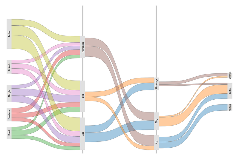
Looks even better! And we sorted out the colors. Note Blog and App categories.
And now, comes the challenging part. Coloring the category wedges.
Category colors
What makes this part challenging? Some categories are repeated. For example “App” label needs to be color twice. So we need to make sure we “match” the colors correctly. This also needs to be automated in the code to accommodate any data structure.
Let’s check the left most starting axis where x=0:
summ y1 if grp==1 & x==0local g1min = `r(min)'
local g1max = `r(max)'twoway ///
(rbar y1 y2 x if grp==1 & x==0) ///
(rbar y1 y2 x if grp==2 & x==0) ///
(rbar y1 y2 x if grp==3 & x==0) ///
(rbar y1 y2 x if grp==4 & x==0)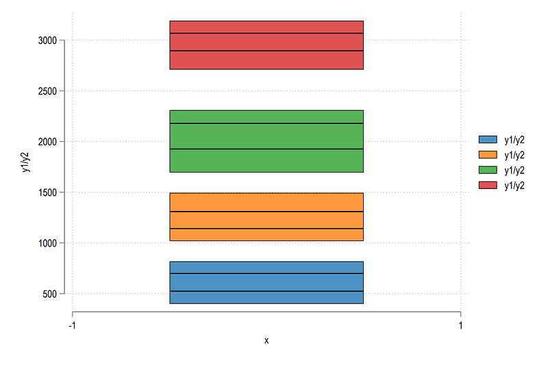
Here we can see that the min and maximum values are actually the minimum and maximum of each group. This is expected since this is what our data structure looks like.
We can also check all the categories:
twoway ///
   (rspike y1 y2 x, lcolor(gs14%20) lwidth(3)) ///
   (scatter y1 x) ///     // bottom values
   (scatter y2 x)         // top values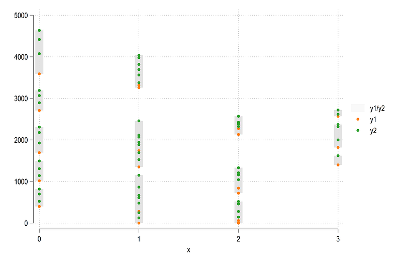
And here we see that there are a lot of dots in between the minimum and maximum values. So let’s filter this information to get the end points:
sort layer grp x y1 y2cap drop ymin ymax
*cap drop tagbysort x order: egen ymin = min(y1)
bysort x order: egen ymax = max(y2)
egen wedge = group(x order)and plot it:
twoway ///
   (rspike ymax ymin x, lcolor(gs14) lwidth(3)) ///
   (scatter ymax x) ///
   (scatter ymin x)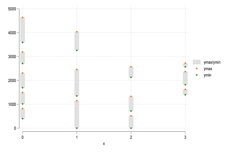
Looks reasonable. We can fill in the colors as well:
twoway ///
   (rspike ymax ymin x if wedge==1, lcolor(%20) lwidth(3)) ///
   (rspike ymax ymin x if wedge==2, lcolor(%20) lwidth(3)) ///
   (rspike ymax ymin x if wedge==3, lcolor(%20) lwidth(3)) ///
   (rspike ymax ymin x if wedge==4, lcolor(%20) lwidth(3)) ///
   (rspike ymax ymin x if wedge==5, lcolor(%20) lwidth(3)) ///
   (rspike ymax ymin x if wedge==6, lcolor(%20) lwidth(3)) ///
   (rspike ymax ymin x if wedge==7, lcolor(%20) lwidth(3)) ///
(rspike ymax ymin x if wedge==8, lcolor(%20) lwidth(3)) 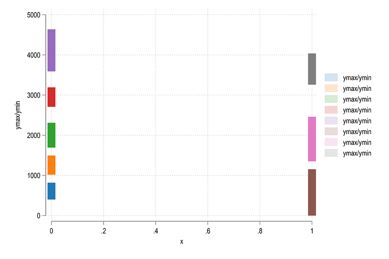
Here we can also modify the width of each line as we want.
Now we can automate the figure and add some color:
// control for the wedges
egen tagw = tag(wedge)
local boxeslevelsof wedge, local(lvls)
local items = `r(r)'foreach x of local lvls { qui summ order if wedge==`x'
local clr = `r(mean)'
colorpalette HCL dark, n(`items') intensity(0.8) reverse nograph // intensity adds white
local boxes `boxes' (rspike ymin ymax x if wedge==`x' & tagw==1, lcolor("`r(p`clr')'%100") lw(3.2)) ||
}twoway ///
`boxes' ///
, legend(off)Notice here how the order variable is being used to determine the color. If we plot this we get:
where we get the correct category colors we want.
Putting it all together
Now we have everything in place. Let’s put it all together!
sort layer x order xtemp y1temp y2temp// boxeslocal boxeslevelsof wedge, local(lvls)
local items = `r(r)'foreach x of local lvls {qui summ order if wedge==`x'
local clr = `r(mean)'
colorpalette HSV intense, n(`items') reverse nograph
local boxes `boxes' (rspike ymin ymax x if wedge==`x' & tagw==1, lcolor("`r(p`clr')'%100") lw(3.2)) ||
}// wedgeslevelsof wedge
local groups = `r(r)'
local shapeslevelsof id, local(lvls)foreach x of local lvls {
qui sum x if id==`x'
qui sum order if id==`x' & x == `r(min)'
if `r(N)' > 0 {
local clr = `r(mean)'
colorpalette HSV intense, n(`groups') reverse nograph
local shapes `shapes' (rarea y1temp y2temp xtemp if id==`x', lc(white) lw(none) fi(100) fcolor("`r(p`clr')'%75")) ||
}
}
// graph here
twoway ///
`shapes' ///
`boxes' ///
(scatter midy x if tag==1, msymbol(none) mlabel(lab) mlabsize(1.6) mlabpos(0) mlabangle(vertical) mlabcolor(black)) ///
(scatter midp x, msymbol(none) mlabel(val) mlabgap(1.2) mlabsize(1.3) mlabpos(3) mlabcolor(black)) ///
, ///
legend(off) ///
xlabel(, nogrid) ylabel(, nogrid) ///
xscale(off) yscale(off) ///
title("{fontface Arial Bold:A Sankey Diagram in Stata}")which gives us:
The colors are a bit bright. But that is because this color scheme was originally intended to be on a black background for the Stata UK 2021 presentation. And here is the code for that:
local boxeslevelsof wedge, local(lvls)
local items = `r(r)'foreach x of local lvls {qui summ order if wedge==`x'
local clr = `r(mean)'
colorpalette HCL intense, n(`items') intensity(0.8) reverse nograph
local boxes `boxes' (rspike ymin ymax x if wedge==`x' & tagw==1, lcolor("`r(p`clr')'%100") lw(3.2)) ||
}*** add the restsort layer x order xtemp y1temp y2templevelsof wedge
local groups = `r(r)'
local shapeslevelsof id, local(lvls)foreach x of local lvls {
qui sum x if id==`x'
qui summ order if id==`x' & x == `r(min)'
if `r(N)' > 0 {
local clr = `r(mean)'
colorpalette HCL intense, n(`groups') reverse nographlocal shapes `shapes' (rarea y1temp y2temp xtemp if id==`x', lc(white) lw(none) fi(100) fcolor("`r(p`clr')'%75")) ||
}
}
// final graph heretwoway ///
`shapes' ///
`boxes' ///
(scatter midy x if tag==1, msymbol(none) mlabel(lab) mlabsize(1.6) mlabpos(0) mlabangle(vertical) mlabcolor(black)) ///
(scatter midp x, msymbol(none) mlabel(val) mlabgap(1.2) mlabsize(1.3) mlabpos(3) mlabcolor(black)) ///
, ///
legend(off) ///
xlabel(, nogrid) ylabel(, nogrid) ///
xscale(off) yscale(off) ///
title("{fontface Merriweather Bold:A Sankey Diagram in Stata}", color(white)) ///
graphregion(fcolor(black) lc(black) lw(thick)) plotregion(fcolor(black)) bgcolor(black)And there we have our final figure and our very first Sankey in Stata.
That’s it for this guide! Hope you enjoyed it. If I find a nice data set for Sankey with a lot more categories, I will add it here as well. Please don’t forget to share your Sankey figures if you end up using this guide. And, as always, feel give feedback!
About the author
I am an economist by profession and I have been using Stata since 2003. I am currently based in Vienna, Austria where I work at the Vienna University of Economics and Business (WU) and at the International Institute for Applied Systems Analysis (IIASA). You can see my profile, research, and projects on GitHub or on my personal website. You can connect with me via Medium, Twitter, LinkedIn or simply via email: [email protected]. If you have questions regarding the Guide or Stata in general post them in The Code Block Discord server.
The Stata Guide, releases awesome new content regularly. Subscribe, Clap, and/or Follow the guide if you like the content!