
Stata graphs: Arc plots
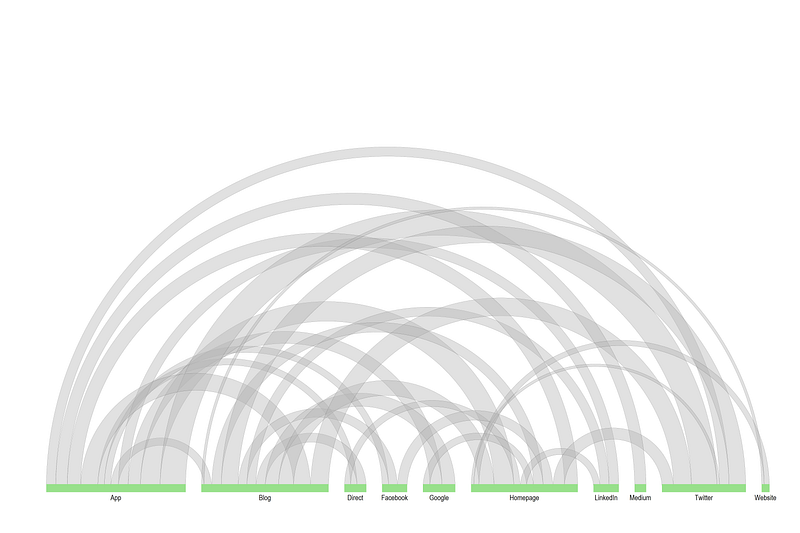
In this guide, learn to make the following arc plot in Stata:
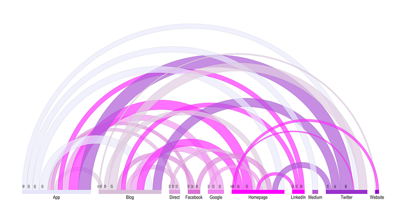
What are arc plots? Arc plots basically represent non-symmetric bilateral flows between a bunch of nodes grouped on a horizontal axis. Think of a network structure where the nodes are basically displayed on the x-axis, and the flows are the arcs. The x-axis is split into different spikes or wedges, where the size of the spike represent the total in- and outflows. The outflow arcs are assigned the same color as the horizontal spike to allow for differentiation in the direction of the flow.
Preamble
Like other guides, a basic knowledge of Stata is assumed. This guide deals with advanced usage of locals, loops, and code structures that require some experience and familiarity with Stata programming.
In order to make the graphs exactly as they are shown here, install the schemepack suite (more info in the Scheme guide and on GitHub):
ssc install schemepack, replaceand set the scheme to White Tableau:
set scheme white_tableau- Set the default graph font to Arial Narrow (see the Font guide on customizing fonts)
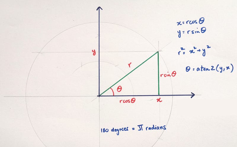
graph set window fontface "Arial Narrow"- For circles, arcs, and pies, we need to deal with angles and radians and sin, cos, and theta, so keep this figure as a reference:
Get the data in order
In order to make the arcs, I have uploaded a dummy dataset on GitHub which you can directly load in Stata as follows:
use "https://github.com/asjadnaqvi/The-Stata-Guide/blob/master/raw/network_data.dta?raw=true", clearIf it doesn’t work, you can manually download the network_data.dta or network_data.xlsx files here.
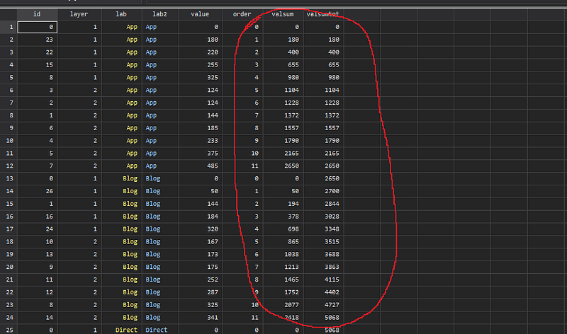
This data represents the online traffic flows from one website to another in the number of users. This type of statistics is generated by Google Analytics if tracking in enabled on websites. The data itself is fake and we are just using it for practice. A screenshot of the data is as follows:
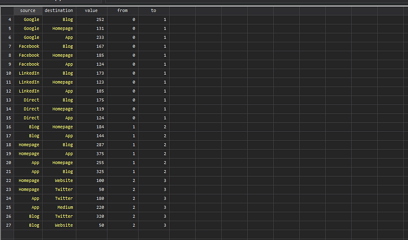
It gives us source (from) to destination (to) values. The data contains more information than we need so we get rid of it and collapse it to the level we want:
drop from toren source lab1
ren destination lab2collapse (sum) value, by(lab1 lab2)This gives us the all the pairwise source/destination combinations. Since we need to draw arcs from one point to another, the preferred data structure is long format:
gen id = _n
order id
reshape long lab, i(id) j(layer)which gives us data that looks like this:
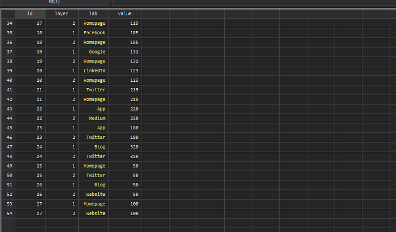
In the long form each value is duplicated. This serves two purposes. First, the long format is easier to handle in terms of data manipulation. Second, the x-axis for arc charts contain categories with a specific length which is the sum of both inflows and outflows. So each value needs to be accounted for twice.
Next step, we convert the string lab variable into a numeric and generate a draw order variable:
encode lab, gen(lab2)
order id layer lab lab2
sort lab layer value
bysort lab: gen order = _nThis gives us the draw order for each label that goes on the horizonal x-axis. We can see that the label “App” has 11 values, while the label “Website” has only two. The data is also ordered by the label variable which equals 1 for outflows and 2 for inflows. During this stage, one can define the sort order for drawing the layers.
Then, we need to start each category with a value of zero. In order to do this we need to duplicate one observation using the expand function and assign it a value of zero:
egen tag = tag(lab)expand 2 if tag==1, gen(tag2)
replace value = 0 if tag2==1 // duplicate entries are zero
replace order = 0 if tag2==1
replace id = 0 if tag2==1sort lab layer order
drop tag tag2After this step, we can check the data to see that for each category a row has been added which has value equal to 0 and order equal to 0. This essentially gives us the starting points for each lab category on the horizontal axis.
Next step, in order to define the length of each horizontal axis, we need to calculate the cumulative sum for each category:
*** generate cumulative valuescap drop valsumsort lab layer orderbysort lab: gen valsum = sum(value) // lab-wise cumulative total
gen valsumtot = sum(value) // overall cumulative totalThe valsumtot is the running total of the values.
But as we can see in the arc figure in the introduction, there are gaps between the categories. These have been inserted in the valsumtot variable.
This is achieved as follows:
*** add gaps between arcs
sort lab layer order
egen gap = group(lab)
gen valsumtotg = valsumtot + (gap * 300)  // 300 is arbitrary
where the value of 300 is the gap size. This number is arbitrary and depends on the data range and how much gap you prefer to have between the numbers. One can also automate this part to standardize the gaps but I leave this up to the user.
Generating the horizontal axis
Next step, we generate the x and y values:
cap drop x ygen y = 0sum valsumtotg
gen x = valsumtotg / `r(max)'Since we can have any type of values, the x is normalized in the [0,1] interval to help automate the next steps.
We can finally plot the data:
twoway ///
   (scatter y x if layer==1)  ///
   (scatter y x if layer==2)  ///
    , aspect(0.5) legend(off)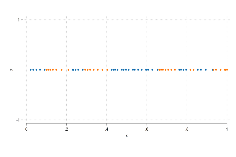
What we get here is a bunch of scatter points. Blue for outflows and orange for inflows. You can notice the gap where orange dots end and blue begins. It will become more prominent once we get rid of the axes etc.
We can covert the horizontal axis into spikes by taking advantage of the twoway pcspike option. But for this, one needs to generate variables for starting and ending points. These are achieved as follows:
*** get the spikes in order

sort id layer x
cap drop x1 y1 x2 y2

gen x1 = .
gen y1 = .
gen x2 = .
gen y2 = .egen tag = tag(lab)
levelsof lab2, local(lvls)foreach x of local lvls {
summ x if lab2==`x'
replace x1 = `r(min)' if lab2==`x' & tag==1
replace x2 = `r(max)' if lab2==`x' & tag==1summ y if lab2==`x'
replace y1 = `r(min)' if lab2==`x' & tag==1
replace y2 = `r(max)' if lab2==`x' & tag==1
}where x1 and x2 are the end points. We can also generate mid points to allow us to label the spikes:
gen xmid = (x1 + x2) / 2
gen ymid = (y1 + y2) / 2
We can add this to the plot:
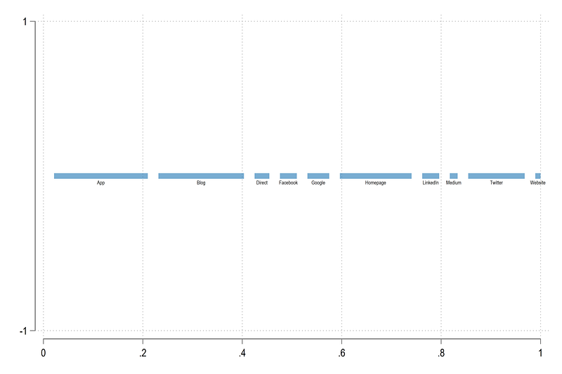
twoway ///
 (pcspike y1 x1 y2 x2, lcolor(%60) lwidth(1.5))  ///
 (scatter  ymid xmid, msize(vsmall) mcolor(none) mlabsize(tiny) mlab(lab) mlabpos(6) )  ///
  , ///
  legend(off)
where we make the spike lines thicker and label the mid points with the lab variable. From this code we get:
We can now add all the information we have including the dots (representing the arc starting and ending points) on the graph:
twoway ///
 (pcspike y1 x1 y2 x2, lcolor(gs12%60) lwidth(1.5))  ///
  (scatter y x if layer==1, msize(tiny))  ///
  (scatter y x if layer==2, msize(tiny))  ///
   (scatter ymid xmid, msize(vsmall) mcolor(none) mlabsize(tiny) mlab(lab) mlabpos(6) )  ///
  , ///
  legend(off)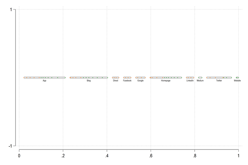
which gives the skeleton structure for the horizontal axis. Next step, the arcs!
Draw the arcs
Arcs are drawn between two pairs of points. One pair represents the outside arc and the other pair represents the inside arc. We also need to identify the correct pairs. In addition to the pairs, we also need to identify the originating arc points for the labels.
All of this is achieved in this large loop:
sort lab layer order
levelsof id if layer==1 & order!=0, local(lvls)
foreach x of local lvls {
gen boxx`x' = x if id==`x'
gen boxy`x' = y if id==`x'// layer 1: starting points
display "ID = `x' layer 1"
gen seq`x' = 1 if id==`x' & layer==1
replace seq`x' = 2 if id==`x' & layer==2
qui summ lab2 if id==`x' & layer==1
local labcat1 = `r(mean)'
// start future block. these are used much later in the last step after reshape
gen from`x' = `r(mean)' // from node
summ value if id==`x' & layer==1
gen fval`x' = `r(mean)' // from value
qui summ order if id==`x' & layer==1
local prel1 = `r(mean)' - 1
// end future block here
display "`prel1'"
replace boxx`x' = x if lab2==`labcat1' & order==`prel1'
replace boxy`x' = y if lab2==`labcat1' & order==`prel1'// one more item for the future. the mid point for labels on the from values
summ boxx`x' if layer==1
gen fmid`x' = `r(mean)'
// layer 2
display "ID = `x' layer 2"
qui summ lab2 if id==`x' & layer==2
local labcat2 = `r(mean)'
qui summ order if id==`x' & layer==2
local prel2 = `r(mean)' - 1
replace boxx`x' = x if lab2==`labcat2' & order==`prel2'
replace boxy`x' = y if lab2==`labcat2' & order==`prel2'
replace seq`x' = seq`x'[_n+1] if seq`x'[_n+1]!=.
}In this code block several things are happening, including a code chunk that will come in handy later. We leave this for now. What the rest of the loop is doing is that it is identifying the arc pairs and storing their values in boxx* and boxy* variables:
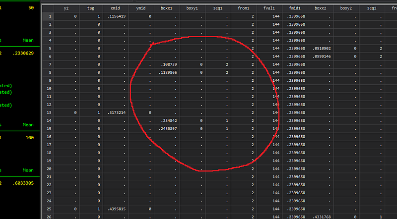
Here the seq* (sequence) variable defines the starting and ending pairs.
Now comes the tricky part, using these points to generate a curve or a semi-circle in our case. In order to draw a semi-circle, we need two elements: a mid point and a radius. Even though, we have two arcs (inside and outside arcs), the mid point stays the same, the only thing that changes is the radius. Another thing we need to consider, given that we need to shade the area between the arcs, is that the twoway function, which makes it very easy to generate arcs no longer works. Here we would need to extract arc points and shade the area between them.
This is something we have done in earlier guides as well especially in the various polar plots.
In order to generate points, we need to expand the dataset. We basically multiply the observations as follows:
expand 20 // I have used 40 for hi-res imgs for this articlewhich is 20 times the number of rows. The higher the number, the more the points we generate but slow the process.
Next step we carefully define the mid points and the radii and draw points on a semi-circle:
levelsof id if layer==1 & order!=0, local(lvls)foreach x of local lvls {
// calculate the mid point of each box based on outlayer min x of layer 0 and max x = layer 1summ boxx`x' if seq`x'==2
local xout1 = `r(min)'
local xin1 = `r(max)'
summ boxx`x' if seq`x'==1
local xout2 = `r(max)'
local xin2 = `r(min)'
local midx = (`xout1' + `xout2')/2
local midy = 0local start = atan2(0 - `midy', `xout2' - `midx')
local end = atan2(0 - `midy', `xout1' - `midx')
if `start' < `end' {
gen t`x' = runiform(`start', `end')
}
else {
gen t`x' = runiform(`end', `start')
}gen radius`x'_in = sqrt((`xin1' - `midx')^2 + (0 - `midy')^2)
gen radius`x'_out = sqrt((`xout1' - `midx')^2 + (0 - `midy')^2)gen arcx_in`x' = `midx' + radius`x'_in * cos(t`x')
gen arcy_in`x' = `midy' + radius`x'_in * sin(t`x')
gen arcx_out`x' = `midx' + radius`x'_out * cos(t`x')
gen arcy_out`x' = `midy' + radius`x'_out * sin(t`x')
}Again a lot is going on here. The mid points are relatively easy. Just take any pair of inside or outside arc x-values, and calculate the mid point. The next part is identifying the start and end points where we need to make use of the atan2 function. This function I have covered in previous arc/circle related guides as well. An important thing to note here is that a starting point of the arc might be on the right-hand side of the end point. So we need to factor this in when we are generating the points because the runiform function need to go from a low starting value to high ending value. That is what the if/else block is doing. The next part generates the radii for the inner and outer circles, and the arc commands generate the x/y polar coordinates (hence the use of sin and cos functions).
Now that we have the arc points, let’s see what they look like:
cap drop tag*
egen tag = tag(y x)
egen taglab = tag(ymid xmid)
sort lab layer ordertwoway ///
(pcspike y1 x1 y2 x2, lcolor(gs12%60) lwidth(1.5)) ///
(scatter y x if layer==1 & tag==1, msize(tiny)) ///
(scatter y x if layer==2 & tag==1, msize(tiny)) ///
(scatter arcy_in1 arcx_in1, msize(tiny)) || (scatter arcy_out1 arcx_out1, msize(tiny)) ///
, legend(off) ylabel(0(0.2)1) xlabel(0(0.2)1) aspect(1)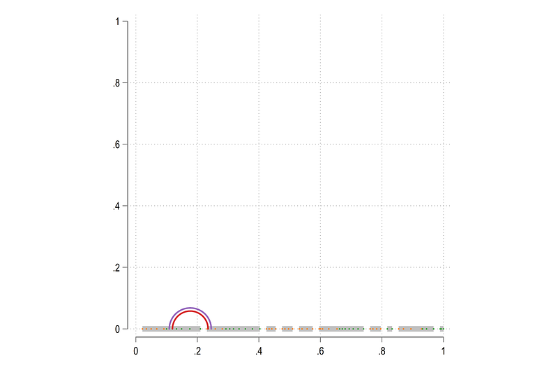
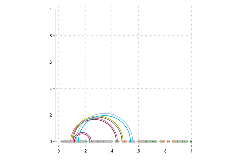
Looks good! We can also add additional arcs:
twoway ///
 (pcspike y1 x1 y2 x2, lcolor(gs12%60) lwidth(1.5))  ///
  (scatter y x if layer==1 & tag==1, msize(tiny))  ///
  (scatter y x if layer==2 & tag==1, msize(tiny))  ///
   (scatter arcy_in1 arcx_in1, msize(tiny)) || (scatter arcy_out1 arcx_out1, msize(tiny))  ///
   (scatter arcy_in2 arcx_in2, msize(tiny)) || (scatter arcy_out2 arcx_out2, msize(tiny))  ///
   (scatter arcy_in3 arcx_in3, msize(tiny)) || (scatter arcy_out3 arcx_out3, msize(tiny))  ///
   (scatter arcy_in4 arcx_in4, msize(tiny)) || (scatter arcy_out4 arcx_out4, msize(tiny))  ///
  , legend(off) ylabel(0(0.2)1) xlabel(0(0.2)1) aspect(1)
and we get:
We can also loop over all the arcs:
local arcs

levelsof id if layer==1 & order!=0, local(lvls)
foreach x of local lvls {
local arcs `arcs' (scatter arcy_in`x' arcx_in`x', msize(tiny)) || (scatter arcy_out`x' arcx_out`x', msize(tiny)) ||
}twoway ///
(pcspike y1 x1 y2 x2, lcolor(gs12%60) lwidth(1.5)) ///
(scatter y x if layer==1 & tag==1, msize(tiny)) ///
(scatter y x if layer==2 & tag==1, msize(tiny)) ///
`arcs' ///
, legend(off) ylabel(0(0.2)0.6) xlabel(0(0.2)1) aspect(0.6)which gives us the skeleton structure:
Next step is to fill in the colors. Let’s go back to just one arc pair and draw it:
sort arcx_in3twoway ///
(pcspike y1 x1 y2 x2 if tag==1, lcolor(gs12%60) lwidth(1.5)) ///
(scatter y x if layer==1 & tag==1, msize(tiny)) ///
(scatter y x if layer==2 & tag==1, msize(tiny)) ///
(line arcy_in3 arcx_in3, fc(%20) lw(vthin) lc(gs10)) ///
(line arcy_out3 arcx_out3, fc(%20) lw(vthin) lc(gs10)) ///
, legend(off) ylabel(0(0.2)0.6) xlabel(0(0.2)1) aspect(0.6)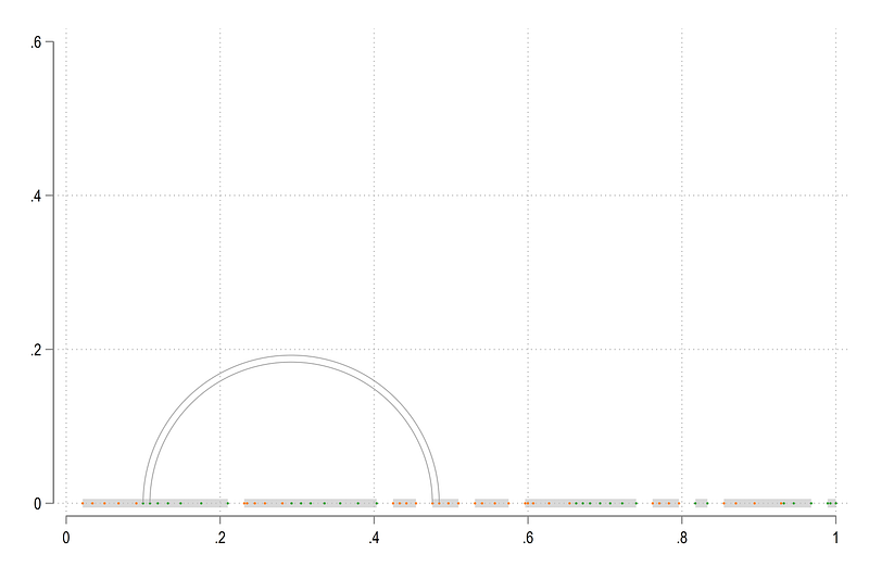
As you can see, this arc is actually starting from the orange dots and ends at the green dots which means the flow is from right to left. This is something we have programed in the code above to control the arc colors.
Next step we can fill in the colors:
twoway ///
 (pcspike y1 x1 y2 x2 if tag==1, lcolor(gs12%60) lwidth(1.5))  ///
  (scatter y x if layer==1 & tag==1, msize(tiny))  ///
  (scatter y x if layer==2 & tag==1, msize(tiny))  ///
   (scatter  ymid xmid if taglab==1, msize(vsmall) mcolor(none) mlabsize(tiny) mlab(lab) mlabpos(6) )  ///
   (area arcy_out3  arcx_out3, fc(%20) lw(vthin) lc(gs10)) ///
   (area arcy_in3   arcx_in3 , fc(%20) lw(vthin) lc(gs10)) ///
  , legend(off) ylabel(-0.2(0.2)0.6) xlabel(0(0.2)1) aspect(0.8)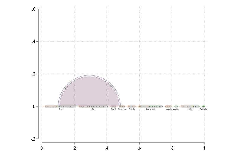
which gives us these shaded arcs. The twoway area essentially draws area under a curve till the x-axis. This is not quite what we need. We need just the area fill between the two curves. And this is the challenging part.
In order do this this, we need to generate a fake “shape” which is also correctly sequenced in order to draw the correct area. This means we need to generate and stack the points of the inside and the outside arcs and sort order them. The sorting has to be in one direction for one arc and in the other direction in the other arc, so if the points are connected, they form the shape which needs to be filled. If this sorting is not done correctly, then the shape will also not be filled in corrected.
So here we go through another major change in the data structure:
keep id y1 x1 y2 x2 ymid xmid arc* from* layer value lab2 fval* fmid*drop id
gen id = _n // dummy for reshape
reshape long arcx_in arcy_in arcx_out arcy_out from fval fmid, i(id x1 y1 x2 y2 xmid ymid layer value lab2) j(num)ren arcx_in arcx1
ren arcy_in arcy1ren arcx_out arcx2
ren arcy_out arcy2reshape long arcx arcy, i(id x1 y1 x2 y2 num lab2 layer value) j(level)This will give us the layers stacked on top of each other by the layer variable. Everything else remains the same as it is.
We can also double check the arcs:
// control variables
egen tag = tag(num)
gen y = 0 if tag==1
sort level num arcxtwoway ///
(area arcy arcx if level==1 & num==1, fc(%20) lw(vvthin) lc(gs10)) ///
(area arcy arcx if level==2 & num==1, fc(%20) lw(vvthin) lc(gs10)) ///
, legend(off) ylabel() xlabel()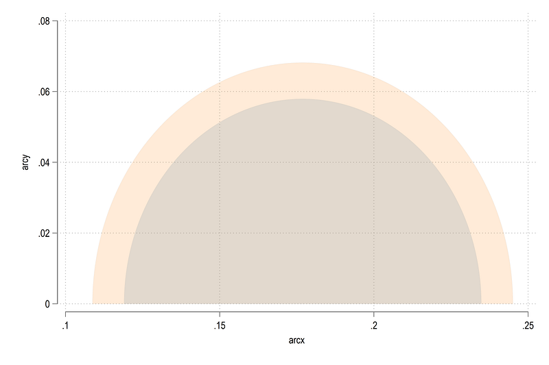
Everything is there and in correct order. Next we do the sorting:
*** order the layers

sort num level arcx
gen order = _n if level==1
gsort level -arcx
gen temp = _n if level==2replace order = temp if level==2
drop tempcap drop tag2
egen tag2 = tag(num ymid xmid) // for the mid point of spikessort num level orderHere we generate a new variable for layer 2 and reverse sort it using gsort and add it back again to the original variable. Let’s draw and see what we get:
twoway ///
 (pcspike y1 x1 y2 x2 if num==1, lcolor(%60) lwidth(1.5))  ///
 (scatter  ymid xmid if num==1 & tag2==1, msize(vsmall) mcolor(none) mlabsize(tiny) mlab(lab2) mlabpos(6) )  ///
  (area arcy arcx if num==3, fc(gs10%40) lw(vvthin) lc(gs10)) ///
  , legend(off) ylabel(0(0.2)0.6) xlabel(0(0.2)1) aspect(0.6)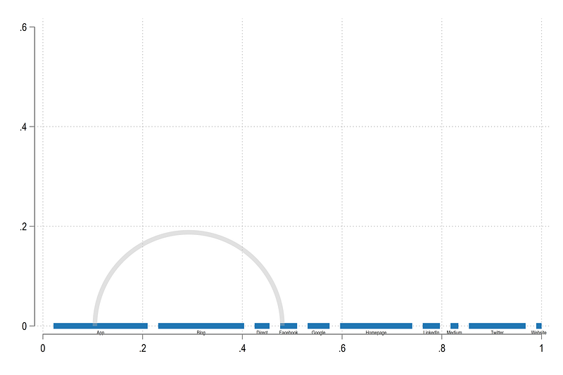
We have the arc shape in place. We can now loop over all the arcs:
local arcs

levelsof num, local(lvls)
foreach x of local lvls {

 local arcs `arcs' (area arcy arcx if num==`x', fc(gs10%40) lw(vvthin) lc(black)) ||

}
twoway ///
`arcs' ///
(pcspike y1 x1 y2 x2 if num==1, lcolor(%60) lwidth(1.5)) ///
(scatter ymid xmid if num==1 & tag2==1, msize(vsmall) mcolor(none) mlabsize(tiny) mlab(lab2) mlabpos(6) ) ///
, legend(off) ///
ylabel(0(0.2)0.6, nogrid) xlabel(0(0.2)1, nogrid) aspect(0.6) ///
xscale(off) yscale(off)and we get the core arc structure:
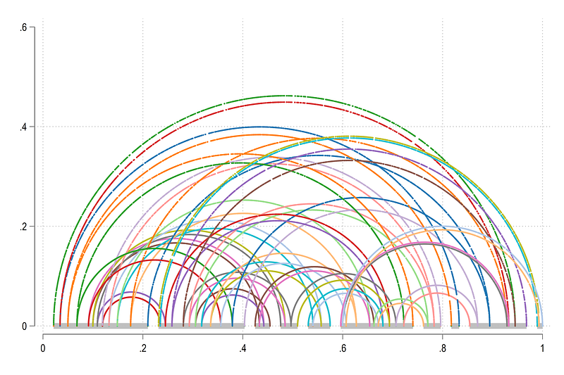
Last steps
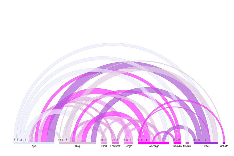
Now all we need to do is add color and add labels. Remember in the original code block, we carried forward some additional variables. They will be used here for the labeling. Here we generate the final figure using the following code:
// loop for horizontal spikeslocal spikeslevelsof lab, local(lvls)
local items = `r(r)'foreach x of local lvls {colorpalette HTML purple, n(`items') nograph
local spikes `spikes' (pcspike y1 x1 y2 x2 if num==1 & lab==`x', lc("`r(p`x')'") lwidth(1.5))
}// loop for arcs
local arcs
levelsof num, local(lvls)
foreach x of local lvls {
qui summ from if num==`x' // control the arc color here
local clr `r(mean)'
colorpalette HTML purple, n(`items') nograph
local arcs `arcs' (area arcy arcx if num==`x', fi(80) fc("`r(p`clr')'%70") lw(0.01) lc(black)) ||
}// final figuretwoway ///
`arcs' ///
`spikes' ///
(scatter ymid xmid if num==1 & tag2==1, msize(vsmall) mcolor(none) mlabsize(1.8) mlab(lab2) mlabpos(6) ) ///
(scatter y fmid, msize(vsmall) mcolor(none) mlabsize(1.0) mlab(fval) mlabpos(12) mlabangle(90) mlabgap(1.8) ) ///
, legend(off) ///
ylabel(0(0.2)0.6, nogrid) xlabel(0(0.2)1, nogrid) aspect(0.6) ///
xscale(off) yscale(off)and here we get the final figure:
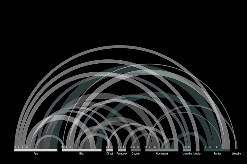
As a bonus, I am also adding the code I used for generating the figure for the Stata UK 2021 conference keynote:
local spikeslevelsof lab, local(lvls)
local items = `r(r)'foreach x of local lvls {
colorpalette HTML grey, n(`items') nograph
local spikes `spikes' (pcspike y1 x1 y2 x2 if num==1 & lab==`x', lc( "`r(p`x')'") lwidth(1.5))
}
local arcs

levelsof num, local(lvls)
foreach x of local lvls {

 qui summ from if num==`x'
 local clr `r(mean)'

 colorpalette HTML grey, n(`items') nograph

 local arcs `arcs' (area arcy arcx if num==`x', fi(80) fc( "`r(p`clr')'%50") lw(none) lc(white)) ||

}
twoway ///
`arcs' ///
`spikes' ///
(scatter ymid xmid if num==1 & tag2==1, msize(vsmall) mcolor(none) mlabsize(1.8) mlab(lab2) mlabpos(6) mlabcolor(white) ) ///
(scatter y fmid, msize(vsmall) mcolor(none) mlabsize(1.0) mlab(fval) mlabpos(12) mlabangle(90) mlabgap(1.8) mlabcolor(white) ) ///
, legend(off) ///
ylabel(0(0.2)0.6, nogrid) xlabel(0(0.2)1, nogrid) aspect(0.6) ///
xscale(off) yscale(off) ///
graphregion(fcolor(black) lc(black) lw(thick)) plotregion(fcolor(black)) bgcolor(black)which gives this nice figure on a black background:
Once you go through this guide, feel free to use other datasets with flows, for example migration data, or trade data, or any other data which has (i) source/from, (ii) destination/to, (iii) value type of fields.
Hope you enjoyed the guide! Please share your arc diagrams if you make any.
About the author
I am an economist by profession and I have been using Stata since 2003. I am currently based in Vienna, Austria where I work at the Vienna University of Economics and Business (WU) and at the International Institute for Applied Systems Analysis (IIASA). You can see my profile, research, and projects on GitHub or on my personal website. You can connect with me via Medium, Twitter, LinkedIn or simply via email: [email protected]. If you have questions regarding the Guide or Stata in general post them in The Code Block Discord server.
The Stata Guide, releases awesome new content regularly. Subscribe, Clap, and/or Follow the guide if you like the content!