
Build Your Own Blog Portfolio with Web Components: The Basics
Part 1 — Custom elements, Shadow DOM, and HTML Templates
As developers, we all know that we should reuse code as much as possible. Duplicated code is one of the main causes for software bugs, and it is essential to avoid it. Web Components help us to create reusable markup structures with encapsulated functionality.
In this series of articles, we will learn the fundamentals and advanced features of Web Components by applying them to an example. We will develop step by step a portfolio to showcase medium articles of any medium user.
- Build Your Own Blog Portfolio with Web Components: Basics
- Build Your Own Blog Portfolio with Web Components: Attributes, Props, Lifecycle Callbacks
- Build Your Own Blog Portfolio with Web Components: Webpack
- Build Your Own Blog Portfolio with Web Components: Typescript
- Build Your Own Blog Portfolio with Web Components: Lit Library
Why Web Components?
“Web Components will replace Frontend Frameworks”
Google this assumption, and you will find thousands of articles on the web discussing the future of Web Components. Whether they are or not, for sure they are an excellent way of encapsulating functionality from the rest of our code. Not only that, but we can reuse them in every web application and web page.
Web Components enable us to develop completely independently of frontend frameworks/libraries because they are based on official web standards and supported by all major browsers. This doesn’t necessarily mean that we should dump all frameworks. Rather, it means that we can outsource some parts of our application to reuse them in e.g., React, Angular, VueJS, etc… The framework/library would act more like a wrapper that passes data to its components.
Try it yourself, pass this code snippet to any web application or any website:
What you will see is the medium portfolio we will build in this article. Have a look at the live demo or CodePen.
Isn't this great? We just need to add a few lines of code to any website, and we can render a portfolio of medium articles. Additionally, we can pass different attributes like username maxArticles or showHeader to customize our application. So, if you want to, go ahead and add the snippet to your website to showcase your own medium articles. It is really that simple.
To realize what is going on, we need to understand the three main technologies of Web Components:
- Custom elements
- Shadow DOM
- HTML templates
Knowing these technologies in detail will not only help you implementing our application, but they are also essential to understand how many frontend libraries and frameworks work under their hood.
In this article, we will keep things simple by using plain HTML, CSS, and JavaScript in the beginning. Later on, we will incrementally improve our application by using more technologies like Typescript, build tools, lit, and other libraries.
Custom Elements
You probably have noticed the medium-portfolio HTML tag that “magically” renders our portfolio. We made use of Custom elements. The HTML specification defines them as follows:
“Custom elements provide a way for authors to build their own fully-featured DOM elements.”
There are basically two types of custom elements:
- Autonomous custom elements
- Customized built-in elements
Autonomous custom elements
Autonomous custom elements are more commonly used and defined as a subclass from HTMLElement. In our application, we will only make use of this kind of custom element.
You can define any name for your custom element, it just needs to be separated by at least one hyphen.
“Note that custom element names must contain a hyphen” — MDN
This is how an autonomous custom element could look like:
You can pass this element to any HTML, but nothing will happen until you define your custom element. You can define it by calling the define() method of the CustomElementRegistry interface:
The define method contains three parameters:
- name: Name for the custom element (must contain a hyphen)
- constructor: Constructor for the new custom element
- options (optional): Controls how the element is defined
Finally, let’s create our constructor by creating a class that inherits from HTMLElement. Notice that we always have to call super in the constructor first. After that, we can add any HTML to the component which will be rendered when the custom element gets added to the DOM.
Congratulations, you just created your first Web Component! You can also have a look at the CodePen:
Customized built-in elements
In comparison to autonomous custom elements, customized built-in elements are inheriting from a specific HTML element. They don’t have their own element name, but they are defined by the is attribute.
This is how a customized built-in element could look like:
To define it, we make use of the third argument options of the define() method. We specify the name of the built-in element to extend from it by setting the extends property:
Let’s create a customized button by creating a class inheriting from HTMLButton:
Here is the CodePen:
Let’s have a look at the architecture of our application. This Unified Modeling Language (UML) diagram defines the parts of our application. It contains three interfaces (blue), one super-class (orange), and seven custom element classes (green).
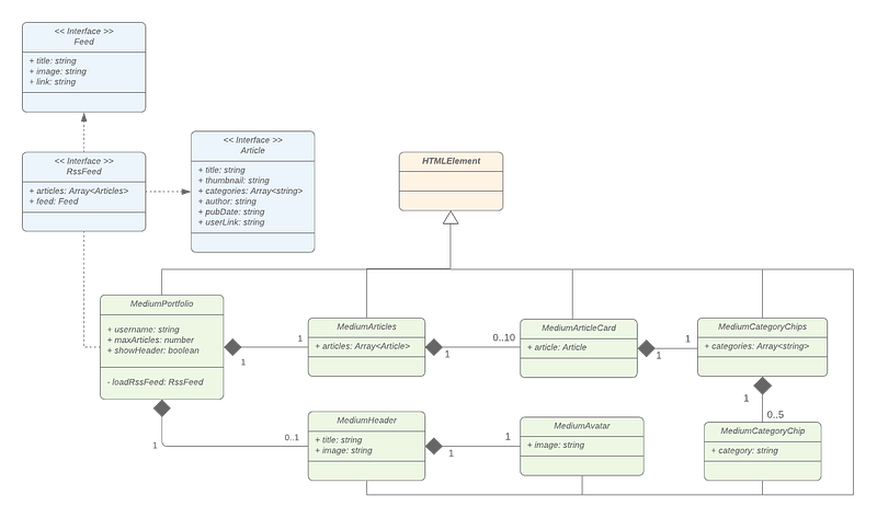
If you are familiar with UML, you will probably have realized that each of our custom elements is inheriting from the HTMLElement class. This means we make exclusively use of autonomous custom elements.
Shadow DOM
The Shadow DOM API is a key part of making the encapsulation of Web Components easy to implement.
Shadow Trees enable us to keep the markup and style of components separate from other code on the page to prevent mixing up the styling of different parts of the website.
“none of the code inside a shadow DOM can affect anything outside it” — MDN
When talking about Shadow DOM, there are some terms we should be aware of:
- Shadow Host: Node that the shadow DOM is attached to.
- Shadow Tree: DOM tree inside the shadow DOM.
- Shadow Boundary: the place where the shadow DOM ends, and the regular DOM begins.
- Shadow Root: The root node of the shadow tree.

Creating a shadow root
We can attach a shadow root to any custom element by calling attachShadow:
After that, we can manipulate the element's internal shadow DOM structure by calling this.shadowRoot. There are two modes you can define when creating a shadow root: open and closed:
mode:'open'means that you can access the element’sshadowRootfrom the outside by callingmyElement.shadowRootmode:'closed'means that you can not access the element’sshadowRootfrom the outside —myElement.shadowRootwill returnnull.
Shadow DOM’s are best demonstrated by another really simple code example. Let’s extend our MyFirstCustomElement example custom element by attaching a shadow root to it:
Q: Which color does our headline have when we added this to our HTML?
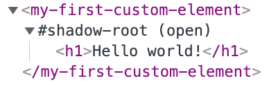
A: Our h1 element will still be shown in black font.
Adding the custom element to the HTML will create this DOM structure. Notice that our element contains an open shadow root showing our defined “Hello world!” headline, which will still be shown in black font. The shadow root prevents global styles to affect the encapsulated styling of the custom element. Furthermore, the defined style rules within the shadow root do not affect other h1 tags on the page. It is completely encapsulated.
Q: But how can we configure style rules from the outside?
A: We can make use of Shadow Parts or CSS variables.
Shadow Parts
The ::part() pseudo-element allows us to expose elements from their shadow tree to the outside. Let’s expose our header by setting the part attribute:
We can now set style rules with the help of the ::part() pseudo-element:
CSS variables
CSS variables are prefixed with --, like --font-color and can be used by using the var()function. We can now go ahead and use a CSS variable in our custom element. As a second parameter of the var() function we can also add a fallback value:
Now, we can override the color of our custom header:
Play around with the CodePen to understand CSS variables and Shadow Parts more deeply.
HTML Templates
Creating a template HTML element allows us to declare reusable fragments that hold HTML content that is not rendered immediately. These can be instantiated via Javascript to create new elements according to the template. When repeating the same markup structures repeatedly on a page, it makes sense to use a template rather than copying the same structure many times.
HTML templates are described by a DocumentFragment-node. The content is not parsed or rendered by the browser while loading the page. The parser does only ensure that the contents are valid. The main advantage of templates is that resources within the template like e.g. images are ignored until their content is added to the DOM.
Q: What will be shown on the page if we added this to some HTML?
A: Exactly, nothing!
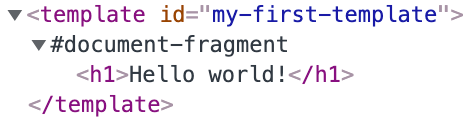
If we look in the DOM we can find our HTML fragment that holds our HTML content. It describes the structure of our HTML fragment representing our h1 headline. Nothing will be shown until we clone the content of our template and add the content via Javascript.
We queried our template element and created a clone of its content using the template as its basis. There are libraries like lit that will help us to simplify the process of creating and cloning templates. In the next articles, we will make use of this library but at first, we need to understand the fundamentals in detail.
“Templates are useful on their own, but they work even better with web components.” — MDN
For now, let’s extend our my-first-custom-element using an HTML template:
So far so good, but it seems that templates are not really helpful and they make our component more complex. Let`s make our component more flexible by using slot elements.
The slot element
With the slot element we can display different text or markup in each element in a nice declarative way.
“The slot element defines a slot. It is typically used in a shadow tree.” — https://html.spec.whatwg.org
Let’s add a slot to our template:
We can now use our custom element more flexible with our own text:
Named slots
You can also add a name attribute to get and set slot’s name when having multiple ones.
“The name content attribute may contain any string value. It represents a slot's name” — https://html.spec.whatwg.org/
Let’s add another slot to our component:
And adjust how we use our element:
Style slots
We can style our slots by using the :slotted() pseudo-element. Notice, that this only works within a shadow DOM.
We can select any element placed inside a slot with ::slotted(*) and a specific slot like this slot[name='headline']::slotted(*).
Here is the CodePen:
What’s next?
In this article, we have learned about Custom elements, Shadow DOM, and HTML Templates which are the three main technologies of Web Components. Understanding them in detail is the foundation of implementing our application in the next article. Have a look at the Github repository.
- Build Your Own Blog Portfolio with Web Components: Basics
- Build Your Own Blog Portfolio with Web Components: Attributes, Props, Lifecycle Callbacks
- Build Your Own Blog Portfolio with Web Components: Webpack
- Build Your Own Blog Portfolio with Web Components: Typescript
- Build Your Own Blog Portfolio with Web Components: Lit Library
I hope you could follow along with these steps. I am always happy to answer questions, and I am open to criticism. Feel free to contact me at any time 😊
Follow me to not miss the next articles 🙏
Here is the link for unlimited access to every content here on Medium. If you sign up by using this link, I’ll earn a small amount at no additional cost to you.
About the author
Marius Bongarts is a Software Engineering Analyst at Accenture Interactive. He also created the Web Highlights extension, which allows users to organize text highlights and bookmarks with the help of tags and directories.
Get in touch with me via LinkedIn.


