
Problems and Solutions Upgrading to Storybook 7
Sharing the nine-step migration experience with multiple Storybooks in a monorepo

Introduction
Storybook is a tool for UI development. It makes development faster and easier by isolating components. This allows us to work on one component at a time. It streamlines UI development, testing, and documentation.
Storybook 7 was released on April 3, 2023. It is the first major release in over two years and by far the largest ever. It brings a lot of features:
- First-class Vite support
- Zero-config support for NextJS and SvelteKit powered by the new frameworks API
- Component Story Format 3 (CSF3) with improved type safety
- MDX2 support and streamlined doc blocks
- UI design refresh
- Improved interaction testing and test coverage
- Ecosystem CI for better stability and smoother upgrades
The Task
We were at Storybook 6 using React and Webpack, with three Storybooks defined in a monorepo, a software development strategy in which the code for several projects is stored in the same repository.
root
├── .storybook
│   ├── main.js
│   └── preview.jsx
├── node_modules
├── package.json
├── components
│   ├── .storybook
│   │   ├── main.js
│   │   ├── preview.jsx
│   │   └── style.css
│   └── package.json
└── apps
    ├── .storybook
    │   ├── main.js
    │   └── preview.jsx
└── package.json- The repository has a
root, where the globalpackage.jsonis defined andnode_modulesare generated.componentsis a project for common components, andappsis a project for an enterprise application using common components via"@product/components": "link:../components". The packages innode_modulesare shared by bothcomponentsandapps. - We have three Storybooks in the monorepo, the root Storybook, the component Storybook, and the app Storybook. The root Storybook is the composition of the other two Storybooks.
.storybookis a folder for Storybook configuration.main.jsconfigures story file location, add-ons, as well as custom Webpack and Babel configurations.preview.jssets the global setting for decorators, parameters, and global types.style.cssis one of the six ways to define global styles.
The task is to upgrade Storybooks to version 7. With a complicated Storybook setup, our migration is not as smooth as previous versions. We share the nine-step migration experience with you, and hopefully, it might help your applications.
Here is the summary of the steps:
- Step 1: Meet the requirements
- Step 2: Choose a migration script
- Step 3: Execute the migration script
- Step 4: Fix MDX2 Issues
- Step 5: Migrate
main.js and preview.js to TypeScript - Step 6: Upgrade the component Storybook
- Step 7: Upgrade the app Storybook
- Step 8: Remove the composition Storybook
- Step 9: Write CSF3 stories
Meet the Requirements
Storybook 7 requires Node 16 or above, and it no longer supports IE11. The target browser version is chrome >= 100. It also requires Webpack 5.
Storybook 7 does not support stories that use storiesOf. However, these stories can continue to work by setting features.storyStoreV7: false in main.js, with the performance penalty.
Storybook 7 does not support MDX1. It is recommended to migrate to MDX2, but MDX1 can continue to work by setting features.legacyMdx1: true in main.js.
Writing stories directly in MDX has been deprecated in Storybook 7. It is recommended to document stories with simple .mdx, and write actual stories in CSF3, an improved version of CSF2 that requires writing stories with objects.
Choose a Migration Script
A Storybook migration script accomplishes two tasks:
- Upgrade Storybook dependencies to the latest version.
- Run a collection of automigrations, which will:
- Check for common upgrade tasks.
- Explain the necessary changes with links to more information.
- Ask for approval, and then perform the task.
There are three migration scripts provided, automigrate, upgrade, and prerelease.
Automigrate Script
Here is the command to run automigrate script:
$ npx storybook@next automigrate
It runs standard configuration checks, explains what is potentially out-of-date, and offers to fix it automatically. However, it does not upgrade Storybook packages.
Upgrade script
Here is the command to run the upgrade script:
$ npx storybook@latest upgrade
It upgrades the Storybook packages to the latest stable version, performs confidence checks of package versions, and executes automigrate to check the configuration.
Prerelease script
Here is the command to run the prerelease script:
$ npx storybook@latest upgrade --prerelease
Storybook is under constant development, and prerelease versions are published almost daily. It is best to try out new features before they are generally available.
Execute the Migration Script
The upgrade script is the most common way to upgrade Storybook, and we use it to walk through the migration process.
At root, execute the script:
$ npx storybook@latest upgrade
The script runs in a few steps.
Install Storybook 7 packages
The upgrade script checks for the latest versions of storybook packages and displays what needs to be upgraded:
info  @storybook/addon-actions     ^6.5.16  →  ^7.0.11
info  @storybook/addon-essentials  ^6.5.16  →  ^7.0.11
info  @storybook/addon-links       ^6.5.16  →  ^7.0.11
info  @storybook/addons            ^6.5.16  →  ^7.0.11
info  @storybook/react             ^6.5.16  →  ^7.0.11
info  @storybook/theming           ^6.5.16  →  ^7.0.11
info  eslint-plugin-storybook      ^0.6.11  →  ^0.6.12
info  storybook-dark-mode           ^2.1.1  →   ^3.0.0
It finds several outdated packages in yarn.lock, and prints out the warning messages:
WARN Found 5 outdated packages (relative to '@storybook/addon-actions@7.0.11')
WARN Please make sure your packages are updated to ensure a consistent experience.
WARN - @storybook/core-common@6.5.16
WARN - @storybook/core-events@6.5.16
WARN - @storybook/core@6.5.16
WARN - @storybook/node-logger@6.5.16
WARN - @storybook/telemetry@6.5.16
🔎 checking possible migrations..
The devDpendencies in package.json are upgraded to the following:
"devDependencies": {
  "@storybook/addon-actions": "^7.0.11",
  "@storybook/addon-essentials": "^7.0.11",
  "@storybook/addon-links": "^7.0.11",
  "@storybook/addons": "^7.0.11",
  "@storybook/core": "^6.5.16",
  "@storybook/react": "^7.0.11",
  "@storybook/theming": "^7.0.11",
  "eslint-plugin-storybook": "^0.6.12",
  "storybook-dark-mode": "^3.0.0"
}
Have you noticed that @storybook/core is not upgraded? We need to handle it manually.
Install storybook binary and upgrade scripts
Storybook 6 has binaries called start-storybook and build-storybook. In Storybook 7, these binaries are removed and replaced by a new CLI command, storybook. storybook dev starts a Storybook and storybook build builds a Storybook.
storybook looks for the framework field in main.js, and use it to determine how to start or build a Storybook. The benefit of this change is that it is now possible to install multiple frameworks in a project without worrying about hoisting issues.
The upgrade script first asks whether to install the storybook binary.
🔎 found a 'storybook-binary' migration:
╭ Automigration detected ────────────────────────────────────────────────────────────────────────────────────────────────────────────────────╮
│                                                                                                                                            │
│   We've detected you are using Storybook 7.0.11 without Storybook's storybook binary. Starting in Storybook 7.0, it has to be installed.   │
│                                                                                                                                            │
│                                                                                                                                            │
│   More info: https://github.com/storybookjs/storybook/blob/next/MIGRATION.md#start-storybook--build-storybook-binaries-removed             │
│                                                                                                                                            │
╰────────────────────────────────────────────────────────────────────────────────────────────────────────────────────────────────────────────╯
✔ Do you want to run the 'storybook-binary' migration on your project? (Y/n)
Type y, and it runs the storybook-binary migration.
storybook is added to devDpendencies in package.json:
"devDependencies": {
  "storybook": "^7.0.11"
}
Then, the upgrade script asks whether to fix Storybook scripts in package.json.
🔎 found a 'sb-scripts' migration:
╭ Automigration detected ───────────────────────────────────────────────────────────────────────────────────────────────────────────────────────╮
│                                                                                                                                               │
│   We've detected you are using Storybook 7.0.11 with scripts from previous versions of Storybook.                                             │
│   Starting in Storybook 7, the start-storybook and build-storybook binaries have changed to storybook dev and storybook build respectively.   │
│   In order to work with Storybook 7.0.11, your storybook scripts have to be adjusted to use the binary. We can adjust them for you:           │
│                                                                                                                                               │
│   build-storybook                                                                                                                             │
│   from:                                                                                                                                       │
│   build-storybook                                                                                                                             │
│   to:                                                                                                                                         │
│   storybook build                                                                                                                             │
│                                                                                                                                               │
│   storybook                                                                                                                                   │
│   from:                                                                                                                                       │
│   start-storybook -p 6006                                                                                                                     │
│   to:                                                                                                                                         │
│   storybook dev -p 6006                                                                                                                       │
│                                                                                                                                               │
│   In case this migration did not cover all of your scripts, or you'd like more info:                                                          │
│   https://github.com/storybookjs/storybook/blob/next/MIGRATION.md#start-storybook--build-storybook-binaries-removed                           │
│                                                                                                                                               │
╰───────────────────────────────────────────────────────────────────────────────────────────────────────────────────────────────────────────────╯
✔ Do you want to run the 'sb-scripts' migration on your project? (Y/n)
Type y, and it runs the sb-scripts migration.
scripts in package.json are updated to use the new CLI command.
"scripts": {
  "build-storybook": "storybook build",
  "storybook": "storybook dev -p 6006",
}
Configure frameworks
Storybook 7 introduces the concept of frameworks, which abstracts configuration for renderers (React, Vue, etc.), builders (Webpack, Vite, etc.), and defaults to make integrations easier.
In Storybook 7, framework combines a renderer and a builder, with the exception of a few packages that do not contain multiple builders, such as @storybook/angular, which only has Webpack 5 support.
Here is the list of frameworks:
@storybook/angular(same as Storybook 6)@storybook/ember(same as Storybook 6)@storybook/html-vite@storybook/html-webpack5@storybook/preact-vite@storybook/preact-webpack5@storybook/react-vite@storybook/react-webpack5@storybook/nextjs@storybook/server-webpack5@storybook/svelte-vite@storybook/svelte-webpack5@storybook/sveltekit@storybook/vue-vite@storybook/vue-webpack5@storybook/vue3-vite@storybook/vue3-webpack5@storybook/web-components-vite@storybook/web-components-webpack5
The upgrade script asks whether to set up frameworks:
🔎 found a 'new-frameworks' migration:
╭ Automigration detected ─────────────────────────────────────────────────────────────────────────────────────────────────────────────────────────────────────╮
│                                                                                                                                                             │
│   We've detected your project is not fully setup with Storybook's 7 new framework format.                                                                   │
│                                                                                                                                                             │
│   Storybook 7 introduced the concept of frameworks, which abstracts configuration for renderers (e.g. React, Vue), builders (e.g. Webpack, Vite) and        │
│   defaults to make integrations easier.                                                                                                                     │
│                                                                                                                                                             │
│   Your project should be updated to use Storybook's framework: @storybook/react-webpack5. We can attempt to do this for you automatically.                  │
│                                                                                                                                                             │
│   Here are the steps this migration will do to migrate your project:                                                                                        │
│   - Add the following dependencies:                                                                                                                         │
│   - * @storybook/react-webpack5                                                                                                                             │
│   - Update or specify the framework field in .storybook/main.js with the value of "@storybook/react-webpack5".                                              │
│                                                                                                                                                             │
│                                                                                                                                                             │
│   To learn more about the new framework format, see: https://github.com/storybookjs/storybook/blob/next/MIGRATION.md#new-framework-api                      │
│                                                                                                                                                             │
╰─────────────────────────────────────────────────────────────────────────────────────────────────────────────────────────────────────────────────────────────╯
? Do you want to run the 'new-frameworks' migration on your project? › (Y/n)
Type y, and it runs the new-frameworks migration.
Since this is a React application, @storybook/react-webpack5 is added to devDpendencies in package.json:
"devDependencies": {
  "@storybook/react-webpack5": "^7.0.11"
}
main.js has been updated with the framework field:
module.exports = {
  ...
  framework: {
    name: "@storybook/react-webpack5",
    options: {}
  }
};
Migrate MDX1 to MDX2
MDX allows using JSX inside markdown content. It can import components, such as interactive charts or alerts, and embed them within a markdown file. Version 2 of MDX (MDX2) was released on February 1, 2022, with better performance and improved syntax. It supports any JSX runtime, including React, Preact, Vue, Emotion, etc.
Storybook 7 uses MDX2 instead of MDX1 to write .stories.mdx files that define and document stories. The upgrade script detects that we have 84 .stories.mdx files, and asks whether to migrate them to MDX2:
🔎 found a 'mdx1to2' migration:
╭ Automigration detected ──────────────────────────────────────────────────────────────────────────────────────────╮
│                                                                                                                  │
│   We've found 84 '.stories.mdx' files in your project.                                                           │
│                                                                                                                  │
│   Storybook has upgraded to MDX2 (https://mdxjs.com/blog/v2/), which contains breaking changes from MDX1.        │
│   We can try to automatically upgrade your MDX files to MDX2 format using some common patterns.                  │
│                                                                                                                  │
│   After this install completes, and before you start Storybook, we strongly recommend reading the MDX2 section   │
│   of the 7.0 migration guide. It contains useful tools for detecting and fixing any remaining issues.            │
│                                                                                                                  │
│   https://storybook.js.org/migration-guides/7.0                                                                  │
│                                                                                                                  │
╰──────────────────────────────────────────────────────────────────────────────────────────────────────────────────╯
? Do you want to run the 'mdx1to2' migration on your project? › (Y/n)
Type y, and it runs the mdx1to2 migration.
Actually, for these 84 files, no changes have been made.
Configure autodocs option
Writing stories directly in MDX (.stories.mdx files) has been deprecated in Storybook 7. It is recommended to document stories with simple .mdx, and write stories in CSF3, an improved version of CSF2, that requires writing stories with objects.
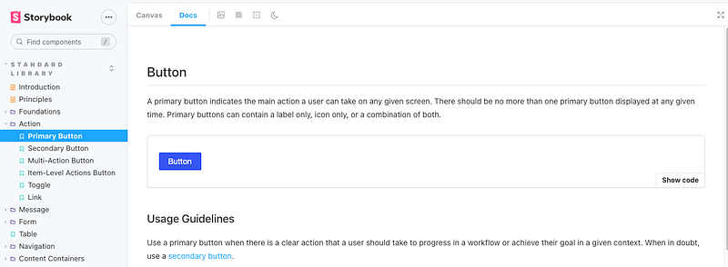
Previously, Docs is a tab next to Canvas, which renders each story in docs view mode.
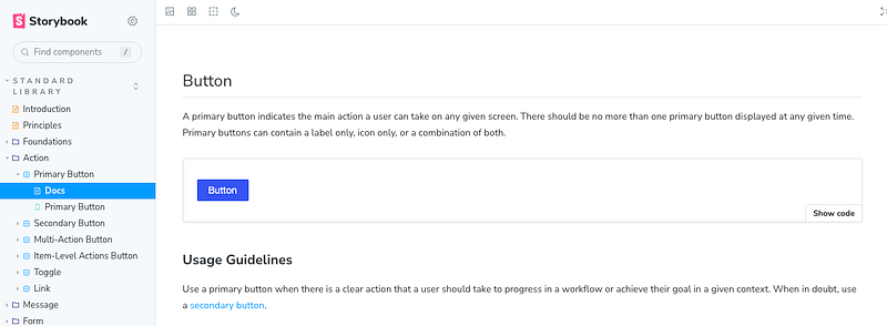
In Storybook7, autodocs adds additional sidebar entries for stories.
autodocs can be configured in main.js, and the folder name is configurable.
module.exports = {
  docs: {
    autodocs: true,
    defaultName: 'Docs'
  }
};
autodocs can take the following three values:
true: It automatically creates docs for every story file.false: It never creates docs.tag: It only creates docs for story files with theautodocstag. Here is an example:
export default {
  component: MyComponent,
  tags: ['autodocs']
}
The upgrade script asks whether to set autodocs to true:
🔎 found a 'autodocsTrue' migration:
╭ Automigration detected ────────────────────────────────────────────────────────────────────────────╮
│                                                                                                    │
│   We've changed the configuration of autodocs (previous docsPage), so now the value:               │
│     - docs.autodocs: true -- means automatically create docs for every CSF file                    │
│     - docs.autodocs: 'tag' -- means only create autodocs for CSF files with the 'autodocs' tag     │
│     - docs.autodocs: false -- means never create autodocs                                          │
│                                                                                                    │
│   Based on your prior configuration,  we can set the `docs.autodocs` to keep your old behaviour:   │
│                                                                                                    │
│   docs: { autodocs: true }                                                                         │
│                                                                                                    │
│   More info: https://github.com/storybookjs/storybook/blob/next/MIGRATION.md#autodocs-changes      │
│                                                                                                    │
╰────────────────────────────────────────────────────────────────────────────────────────────────────╯
? Do you want to run the 'autodocsTrue' migration on your project? › (Y/n)
Type y, and it runs the autodocsTrue migration.
main.js has been updated with the docs field:
module.exports = {
  ...
  framework: {
    name: "@storybook/react-webpack5",
    options: {}
  },
  docs: {
    autodocs: true
  }
};
Create root’s babel settings
Babel is a toolchain that is mainly used to convert ECMAScript 2015+ and/or TypeScript code into a backward-compatible version of JavaScript in current and older browsers or environments. Storybook 7 now uses Babel mode v7 exclusively. By default, babelModeV7 is set to true in main.js. Because it is the default value, the setting is not necessary.
module.exports = {
  features: {
    babelModeV7: true
  }
}
Storybook reads the project’s babel configuration, .babelrc.json, babel.config.js, etc.
The upgrade script asks whether to create a .babelrc.json file with some basic configuration and add any necessary packages to devDependencies.
🔎 found a 'missing-babelrc' migration:
╭ Automigration detected ─────────────────────────────────────────────────────────────────────────────────────────────────────────────────────────────────────╮
│                                                                                                                                                             │
│   We detected that your project does not have a babel configuration (.babelrc, babel.config.js, etc.).                                                      │
│                                                                                                                                                             │
│   In version 6.x, Storybook provided its own babel settings out of the box. Now, Storybook re-uses your project's babel configuration, with small,          │
│   incremental updates from Storybook addons.                                                                                                                │
│                                                                                                                                                             │
│   If your project does not have a babel configuration file, we can generate one that's equivalent to the 6.x defaults for you. Keep in mind that this can   │
│   affect your project if it uses babel, and you may need to make additional changes based on your projects needs.                                           │
│                                                                                                                                                             │
│   Note: This automatic setup doesn't work in a monorepo, see the babel documentation for how to setup babel manually:                                       │
│   https://babeljs.io/docs                                                                                                                                   │
│                                                                                                                                                             │
│   We can create a .babelrc.json file with some basic configuration and add any necessary package devDependencies.                                           │
│                                                                                                                                                             │
│   Please see the migration guide for more information:                                                                                                      │
│   https://github.com/storybookjs/storybook/blob/next/MIGRATION.md#babel-mode-v7-exclusively                                                                 │
│                                                                                                                                                             │
│                                                                                                                                                             │
╰─────────────────────────────────────────────────────────────────────────────────────────────────────────────────────────────────────────────────────────────╯
? Do you want to run the 'missing-babelrc' migration on your project? › (Y/n)
Type y, and it runs the missing-babelrc migration that asks whether to add @babel/preset-env, @babel/preset-typescript, and @babel/preset-react.
✔ Do you want to add the TypeScript preset? … yes
✔ Do you want to add the React preset? … yes
info Writing file to root/.babelrc.json
✔ Shall we install the required dependencies now? (@babel/preset-env, @babel/preset-typescript, @babel/preset-react) … yes
@babel/preset-env: It is a smart preset to use the latest JavaScript without micromanaging syntax transforms.@babel/preset-typescript: It is a recommended preset for TypeScript.@babel/preset-react: It is a recommended preset for React. Starting from Babel mode v7,@babel/preset-reactdoes not include@babel/preset-flow.
Here is the generated .babelrc.json:
{
  "sourceType": "unambiguous",
  "presets": [
    [
      "@babel/preset-env",
      {
        "targets": {
          "chrome": 100
        }
      }
    ],
    "@babel/preset-typescript",
    "@babel/preset-react"
  ],
  "plugins": []
}
Summary and followup
At the end, the upgrade script prints out a summary:
╭ Migration check ran successfully ───────────────────────────────────────────────────────────────────────────────────────────────────────────────────────────╮
│                                                                                                                                                             │
│   Successful migrations:                                                                                                                                    │
│                                                                                                                                                             │
│   storybook-binary, sb-scripts, new-frameworks, mdx1to2, autodocsTrue, missing-babelrc                                                                      │
│                                                                                                                                                             │
│   ─────────────────────────────────────────────────                                                                                                         │
│                                                                                                                                                             │
│   If you'd like to run the migrations again, you can do so by running 'npx storybook@next automigrate'                                                      │
│                                                                                                                                                             │
│   The automigrations try to migrate common patterns in your project, but might not contain everything needed to migrate to the latest version of            │
│   Storybook.                                                                                                                                                │
│                                                                                                                                                             │
│   Please check the changelog and migration guide for manual migrations and more information: https://storybook.js.org/migration-guides/7.0                  │
│   And reach out on Discord if you need help: https://discord.gg/storybook                                                                                   │
│                                                                                                                                                             │
│   ─────────────────────────────────────────────────                                                                                                         │
│                                                                                                                                                             │
│   Attention: The following dependencies are duplicated which might cause unexpected behavior:                                                               │
│                                                                                                                                                             │
│   @storybook/core-server:                                                                                                                                   │
│   7.0.11, 6.5.16                                                                                                                                            │
│                                                                                                                                                             │
│   @storybook/core-common:                                                                                                                                   │
│   7.0.11, 6.5.16                                                                                                                                            │
│                                                                                                                                                             │
│   @storybook/csf-tools:                                                                                                                                     │
│   7.0.11, 6.5.16                                                                                                                                            │
│                                                                                                                                                             │
│   @storybook/node-logger:                                                                                                                                   │
│   7.0.11, 6.5.16                                                                                                                                            │
│                                                                                                                                                             │
│   @storybook/telemetry:                                                                                                                                     │
│   7.0.11, 6.5.16                                                                                                                                            │
│                                                                                                                                                             │
│   You can find more information for a given dependency by running yarn why <package-name>                                                                   │
│                                                                                                                                                             │
╰─────────────────────────────────────────────────────────────────────────────────────────────────────────────────────────────────────────────────────────────╯
This shows the scripts executed: storybook-binary, sb-scripts, new-frameworks, mdx1to2, autodocsTrue, and missing-babelrc.
There is a warning about @storybook 6.5.16 packages, and we need to remove @storybook/core from devDpendencies in package.json.
"devDependencies": {
  "@storybook/addon-actions": "^7.0.11",
  "@storybook/addon-essentials": "^7.0.11",
  "@storybook/addon-links": "^7.0.11",
  "@storybook/addons": "^7.0.11",
  "@̶s̶t̶o̶r̶y̶b̶o̶o̶k̶/c̶o̶r̶e̶":̶ "^̶6̶.5̶.1̶6̶",
  "@storybook/react": "^7.0.11",
  "@storybook/theming": "^7.0.11"
}
Re-execute npx storybook@latest upgrade, and skip the mdx1to2 migration:
╭ Migration check ran successfully ───────────────────────────────────────────────────────────────────────────────────────────────────────────────────────────╮
│                                                                                                                                                             │
│   Skipped migrations:                                                                                                                                       │
│                                                                                                                                                             │
│   mdx1to2                                                                                                                                                   │
│                                                                                                                                                             │
│   ─────────────────────────────────────────────────                                                                                                         │
│                                                                                                                                                             │
│   If you'd like to run the migrations again, you can do so by running 'npx storybook@next automigrate'                                                      │
│                                                                                                                                                             │
│   The automigrations try to migrate common patterns in your project, but might not contain everything needed to migrate to the latest version of            │
│   Storybook.                                                                                                                                                │
│                                                                                                                                                             │
│   Please check the changelog and migration guide for manual migrations and more information: https://storybook.js.org/migration-guides/7.0                  │
│   And reach out on Discord if you need help: https://discord.gg/storybook                                                                                   │
│                                                                                                                                                             │
│   ─────────────────────────────────────────────────                                                                                                         │
│                                                                                                                                                             │
│   You can find more information for a given dependency by running yarn why <package-name>                                                                   │
│                                                                                                                                                             │
╰─────────────────────────────────────────────────────────────────────────────────────────────────────────────────────────────────────────────────────────────╯
The summary shows no more warnings.
Fix MDX2 Issues
Storybook 7 uses MDX2 by default for rendering Docs. MDX1 can be used, but it is not recommended.
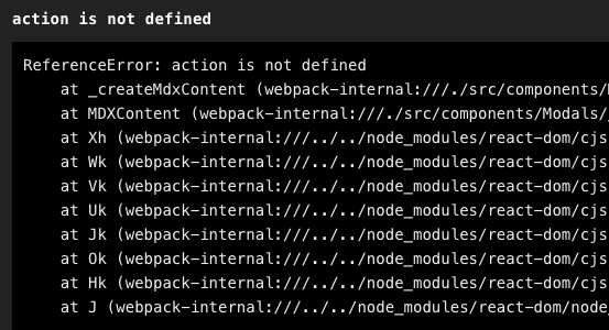
However, enabling the legacy MDX1 can be a quick fix, if you see the canvas displays Template.bind() or ReferenceError: action is not defined.
Install the package @storybook/mdx1-csf:
% yarn add @storybook/mdx1-csfSet the flag legacyMdx1 to be true in main.js:
module.exports = {
  features: {
    legacyMdx1: true
  }
}
Then, your MDX1 stories continue working.
MDX2 stories are preferred over MDX1 stories. The upgrade from MDX1 to MDX2 is not fully automated due to many changes between versions. Execute the following command to detect errors:
$ npx @hipster/mdx2-issue-checkerHere are some examples of what to fix:
"Actions for {object name}" => "Actions for \{object name\}"
The number cannot exceed 7 (<7) => The number cannot exceed 7 (`<7`)
const count = 1; => export const count = 1;
There is also this warning during migration.
info => Loading presets
WARN The "@storybook/addon-mdx-gfm" addon is meant as a migration assistant for Storybook 7.0; and will likely be removed in a future version.
WARN It's recommended you read this document:
WARN https://storybook.js.org/docs/react/writing-docs/mdx#lack-of-github-flavored-markdown-gfm
WARN
WARN Once you've made the necessary changes, you can remove the addon from your package.json and storybook config.
@storybook/addon-mdx-gfm is meant as a migration assistant for Storybook 7.0, providing Github Flavored Markdown support to Storybook docs. Once the necessary changes are made, this addon can be removed from package.json and storybook configuration. The removal needs to be done manually.
Migrate main.js and preview.js to TypeScript
Storybook 7 supports TypeScript for main and preview files. We manually migrate them to TypeScripts.
Here is root/.storybook/main.ts:
import { StorybookConfig } from '@storybook/react-webpack5';

const config: StorybookConfig = {
  stories: ['./*.story.@(js|jsx|ts|tsx)'],
  addons: ['@storybook/addon-links', '@storybook/addon-essentials', '@storybook/addon-mdx-gfm'],
  refs: {
    components: {
      title: 'components',
      url: 'http://localhost:6007'
    },
    apps: {
      title: 'apps',
      url: 'http://localhost:6008'
    }
  },
  framework: {
    name: '@storybook/react-webpack5',
    options: {fastRefresh: true}
  },
  docs: {
    autodocs: true
  }
};
Here is root/.storybook/preview.ts:
import { Preview } from '@storybook/react';

const preview: Preview = {
  parameters: {
    actions: {argTypesRegex: '^on[A-Z].*'},
    controls: {
      matchers: {
        color: /(background|color)$/i,
        date: /Date$/,
      },
    },
  }
};

export default preview;
At this point, we have finished the migration at root.
Upgrade the Component Storybook
With the monorepo, we have to make manual changes to the Storybook in root/components.
It takes a few steps to make the changes.
Rename and modify main.ts
Rename root/components/.storybook/main.js to root/components/.storybook/main.ts. Adopt the changes in root/.storybook/main.ts to root/components/.storybook/main.ts.
import { StorybookConfig } from '@storybook/react-webpack5';

// find stories
const stories = ...

const config: StorybookConfig = {
  stories,
  addons: [
    '@storybook/addon-links',
    '@storybook/addon-essentials',
    'storybook-dark-mode'
  ],
  webpackFinal: async (config) => ({
    ...config,
    devtool: 'eval-source-map'
  }),
  framework: {
    name: "@storybook/react-webpack5",
    options: { fastRefresh: true },
  },
  docs: {
    autodocs: true
  },
  features: {
    storyStoreV7: false
  }
};

export default config;
In the configuration above, storyStoreV7 is set to false, as we still have legacy stories that use storiesOf.
There are still warnings, but these stories work for the time being.
In SB7, we use the next-generation `storyStoreV7` by default, which does not support `storiesOf`.
More info, with details about how to opt-out here: https://github.com/storybookjs/storybook/blob/next/MIGRATION.md#storystorev7-enabled-by-default
Unexpected `storiesOf` usage: (line 38, col 0).
Rename and modify preview.jsx
Rename root/components/.storybook/preview.jsx to root/components/.storybook/preview.tsx. Adopt the changes in root/.storybook/preview.ts to root/components/.storybook/preview.tsx:
import * as React from 'react';
import { Preview } from '@storybook/react';
import 'antd/dist/antd.css';
import '@ant-design/compatible/assets/index.css';
import { useDarkMode } from 'storybook-dark-mode';
import ProductThemeProvider from '../src/styled/ProductThemeProvider';
import './style.css';

const preview: Preview = {
  parameters: {
    darkMode: {
      stylePreview: true,
      classTarget: 'body',
      darkClass: 'darkClass',
      lightClass: 'lightClass',
    },
    actions: {argTypesRegex: '^on[A-Z].*'},
    controls: {
      expanded: true,
      matchers: {
        color: /(background|color)$/i,
        date: /Date$/,
      },
    },
    options: {
      storySort: {
        order:
          [
            // ordered stories
          ]
      },
    },
  }
};

export default preview;

const withThemeProvider = (Story, context) => {
  const [someState, useSomeState] = React.useState();
  return (
    <ProductThemeProvider isDarkMode={useDarkMode()} isStorybook={true} someState={someState}>
      <Story {...context} useSomeState={useSomeState}/>
    </ProductThemeProvider>
  );
};
export const decorators = [withThemeProvider];
Upgrade scripts in root/components/package.json
Update scripts in root/components/package.json with the CLI command, storybook, to start and build a Storybook.
"scripts": {
  "storybook": "../../node_modules/.bin/storybook dev -p 6007",
  "build-storybook": "../../node_modules/.bin/storybook build"
}
Create .babelrc.json and fix the build
We have upgraded main, preview, and scripts.
Execute yarn storybook, and it is not able to compile TypeScript:
ModuleBuildError: Module build failed (from ../../node_modules/@storybook/builder-webpack5/node_modules/babel-loader/lib/index.js):
SyntaxError: root/components/src/components/ProductComp.tsx: Unexpected token, expected "," (12:25)

  10 |   }
  11 | `;
> 12 | const getOptions = (products: Product[]) => {
     |                          ^
.babelrc.json is the rescue. Copy root/.babelrc.json to root/components/.babelrc.json.
{
  "sourceType": "unambiguous",
  "presets": [
    [
      "@babel/preset-env",
      {
        "targets": {
          "chrome": 100
        }
      }
    ],
    "@babel/preset-typescript",
    "@babel/preset-react"
  ],
  "plugins": []
}
The Babel configuration has resolved the TypeScript compilation issue, but it shows a new error:
ModuleNotFoundError: Module not found: Error: Can't resolve 'stream' in 'root/node_modules/csv-parse/lib/es5'

BREAKING CHANGE: webpack < 5 used to include polyfills for node.js core modules by default.
This is no longer the case. Verify if you need this module and configure a polyfill for it.

If you want to include a polyfill, you need to:
        - add a fallback 'resolve.fallback: { "stream": require.resolve("stream-browserify") }'
        - install 'stream-browserify'
If you don't want to include a polyfill, you can use an empty module like this:
        resolve.fallback: { "stream": false }
It suggests installing stream-browserify. In fact, we have stream-browserify installed:
$ yarn why stream-browserify
...
=> Found "[email protected]"
info Reasons this module exists
   - "webpack#node-libs-browser" depends on it
   - Hoisted from "webpack#node-libs-browser#stream-browserify"
Let’s add stream-browserify into the fallback configuration in main.ts:
import { StorybookConfig } from '@storybook/react-webpack5';

// find stories
const stories = ...

const config: StorybookConfig = {
  stories,
  addons: [
    '@storybook/addon-links',
    '@storybook/addon-essentials',
    'storybook-dark-mode'
  ],
  webpackFinal: async (config) => {
    const fallback = config.resolve.fallback || {};
    Object.assign(fallback, {
      stream: require.resolve("stream-browserify"),
    });
    config.resolve.fallback = fallback;
    return ({
      ...config,
      devtool: 'eval-source-map'
    })
  },
  framework: {
    name: "@storybook/react-webpack5",
    options: { fastRefresh: true },
  },
  docs: {
    autodocs: true
  },
  features: {
    storyStoreV7: false
  }
};

export default config;
In addition, we add @types/webpack-env, the type definition for Webpack, to devDpendencies in package.json to resolve further type errors that come from ../../node_modules/@storybook/builder-webpack5/node_modules/babel-loader/lib/index.js.
"devDependencies": {
  "@types/webpack-env": "^1.18.0"
}
Define types in tsconfig.json to include webpack-env:
"types": ["node", "webpack-env", ...]The build is fixed. The component Storybook starts.
╭──────────────────────────────────────────────────╮
│                                                  │
│   Storybook 7.0.11 for react-webpack5 started    │
│   214 ms for manager and 48 s for preview        │
│                                                  │
│    Local:            http://localhost:6007/      │
│    On your network:  http://169.254.1.1:6007/    │
│                                                  │
╰──────────────────────────────────────────────────╯
Fix favicon and story decorators
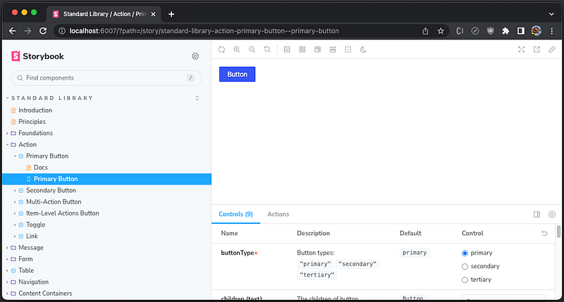
Go to http://localhost:6007, and view the component Storybook:
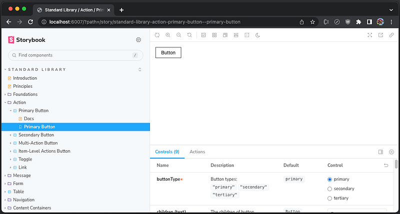
There are two issues:
- The Storybook does not have a favicon, a small icon associated with a particular website or web page.
- The
Buttoncomponent does not have associated styles.
We create the Storybook favicon at root/public/storybook.ico, and add root/components/.storybook/manager-head.html to include this icon:
<link rel="shortcut icon" href="/storybook.ico">This fixes the favicon.
We have used decorators to apply styles by decorators = [withThemeProvider]. However, the decorators syntax has been changed in Storybook 7. Instead, decorators becomes a field of root/components/.storybook/preview.tsx:
const preview: Preview = {
  ...
  decorators: [
    (Story, context) => {
      const [someState, useSomeState] = React.useState();
      return (
        <ProductThemeProvider isDarkMode={useDarkMode()} isStorybook={true} someState={someState}>
          <Story {...context} useSomeState={useSomeState}/>
        </ProductThemeProvider>
      );
    }
  ],
};
This fixes the Button component styling.
At root/components, execute yarn storybook, and it works well.
There is another issue for development. fetch-mock, a JavaScript library to mock HTTP requests, throws an error during hot reload: fetch-mock: No fallback response defined for GET to /runtime_main.b83bdb3a8714964066e2.hot-update.json.
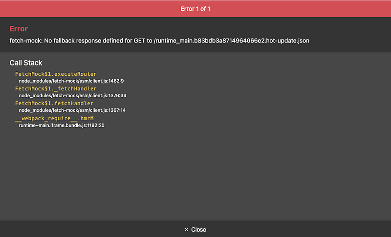
This can be fixed by setting fetchMock.config.fallbackToNetwork = true, although the setting was not needed for Storybook 6.
Because preview.tsx sets the global setting for decorators, parameters, and global types, we add the fetchMock setting in it:
import * as React from 'react';
import { Preview } from '@storybook/react';
import 'antd/dist/antd.css';
import '@ant-design/compatible/assets/index.css';
import { useDarkMode } from 'storybook-dark-mode';
import ProductThemeProvider from '../src/styled/ProductThemeProvider';
import './style.css';
import fetchMock from 'fetch-mock';
fetchMock.config.fallbackToNetwork = true;

const preview: Preview = {
  parameters: {
    darkMode: {
      stylePreview: true,
      classTarget: 'body',
      darkClass: 'darkClass',
      lightClass: 'lightClass',
    },
    actions: {argTypesRegex: '^on[A-Z].*'},
    controls: {
      expanded: true,
      matchers: {
        color: /(background|color)$/i,
        date: /Date$/,
      },
    },
    options: {
      storySort: {
        order:
          [
            // ordered stories
          ]
      },
    },
  },
  decorators: [
    (Story, context) => {
      const [someState, useSomeState] = React.useState();
      return (
        <ProductThemeProvider isDarkMode={useDarkMode()} isStorybook={true} someState={someState}>
          <Story {...context} useSomeState={useSomeState}/>
        </ProductThemeProvider>
      );
    }
  ],
};

export default preview;
Now, it works well for dev mode as well.
Upgrade the App Storybook
With the monorepo, we have to make manual changes to the Storybook in root/apps.
Similar to the component Storybook, we apply the following changes:
- Rename and modify
main.ts+ Add the fallback configuration. - Rename and modify
preview.jsx+ Fix Storydecorators+ Add thefetchMocksetting. - Upgrade scripts in
root/components/package.json. - Create
.babelrc.json. - Fix favicon.
- Fix story decorators.
Execute yarn storybook, and we are not able to compile TypeScript. .babelrc.json needs to be renamed to babel.config.json:
{
  "sourceType": "unambiguous",
  "presets": [
    [
      "@babel/preset-env",
      {
        "targets": {
          "chrome": 100
        }
      }
    ],
    "@babel/preset-typescript",
    "@babel/preset-react"
  ],
  "plugins": []
}
What are the differences between .babelrc.json and babel.config.json?
.babelrc.jsonis a configuration that only applies to a single part of the project.babel.config.jsonis a configuration for monorepo and it compilesnode_modules.
Our application is hosted by a monorepo. Since root/components acts like a single repository, .babelrc.json is still working. However, root/apps links to common components via "@product/components": "link:../components. It has multiple package.json files, and babel.config.json should be used instead, although the content is the same.
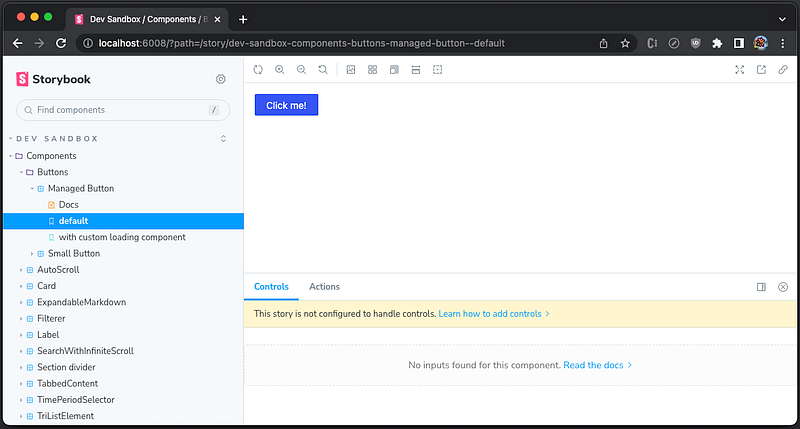
At root/apps, execute yarn storybook.
╭──────────────────────────────────────────────────╮
│                                                  │
│   Storybook 7.0.11 for react-webpack5 started    │
│   306 ms for manager and 45 s for preview        │
│                                                  │
│    Local:            http://localhost:6008/      │
│    On your network:  http://169.254.1.1:6008/    │
│                                                  │
╰──────────────────────────────────────────────────╯
The Storybook works, and here’s what it looks like:
Remove the Composition Storybook
Storybook composition allows us to browse components from any Storybook accessible via static URL or local URL.
Here is root/.storybook/main.ts that we use to reference two local Storybooks:
import { StorybookConfig } from '@storybook/react-webpack5';

const config: StorybookConfig = {
  stories: ['./*.story.@(js|jsx|ts|tsx)'],
  addons: ['@storybook/addon-links', '@storybook/addon-essentials', '@storybook/addon-mdx-gfm'],
  refs: {
    components: {
      title: 'components',
      url: 'http://localhost:6007'
    },
    apps: {
      title: 'apps',
      url: 'http://localhost:6008'
    }
  },
  framework: {
    name: '@storybook/react-webpack5',
    options: {fastRefresh: true}
  },
  docs: {
    autodocs: true
  }
};
It does not work with the upgraded component Storybook and app Storybook.
We have built the composited Storybook to put multiple Storybooks into a single pane. However, it requires all local Storybooks to run. It is inconvenient and resource intensive. We have decided to remove it instead of fixing it.
Write CSF3 stories
From Storybook 7, it is recommended to write stories in CSF3, although MDX2 and CSF2 continue to work. As time goes on, we should migrate all existing stories to CSF3.
Here is an example of CSF3 story:
export default {
  title: 'Components/MyStory', // story path
  component: MyComponent, // React component
  ArgTypes: {
    [disabledName]: { // hide specific controls
      table: {
        disable: true,
      },
    },
  },
};

export const MyStory = { // define story
  render: (args: Props) => {
    fetchMock.restore().mock(...); // configure mocks if needed
    return <MyComponent {...args}/>;
  },
  args: {
    [controlName]: {...} // configure all controls
  }
};
Conclusion
We have walked through the nine-step migration process on how to upgrade multiple Storybooks to version 7 in a monorepo. There are problems and solutions. Hopefully, our experience is helpful to your applications.
Thanks for reading.
Thanks, Sushmitha Aitha, S Sreeram, Rajasekhar Gandavarapu, Urian Chang, and Richard Tom for working with me on the Domino products.
Want to Connect?

If you are interested, check out my directory of web development articles.


