
An In-Depth Look at Storybook 6
Exploring new features since Storybook 6.0

Storybook is a tool for UI development. It makes development faster and easier by isolating components. This allows us to work on one component at a time. It streamlines UI development, testing, and documentation.
Storybook 6.3 was released in June 2021. Besides React 17, NPM 7, Yarn 2, and Webpack 5 support, the followings features have been supported since Storybook 6.0:
- Zero-configuration setup
- Dynamic component editing
- Multiple Storybook Composition
- Documentation improvement
In this article, we dive into the details of these features.
Zero-Configuration Setup
Storybook is complicated. It gets more difficult when there are more knobs to set up a complicated piece of software. Storybook 6.0 makes it simple with zero-config setup — the best practice configuration is set, TypeScript has been configured, and it is compatible with popular application frameworks.
Take Create React App as an example. The following command creates a React project:
% npx create-react-app storybook
% cd storybook
Then you just type one command, npx sb init, and Storybook is installed.
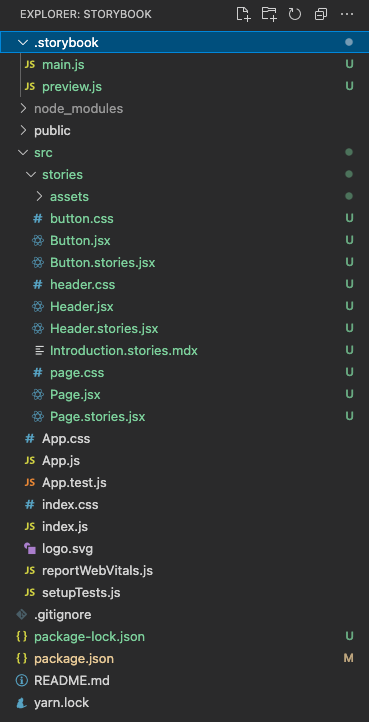
It creates the folder, .storybook, with two configuration files:
main.js: Configures story file location, add-ons, as well as custom Webpack and Babel configurations. Since it is under Create React App, the installation is smart enough to add@storybook/preset-create-react-app(line 6).
preview.js: Sets the global setting for decorators, parameters, and global types. The following parameters section configures regular expression for action handlers (line 2), uses a color picker forbackgroundorcolor(line 5), and uses a date picker forDate(line 6).
The installation includes some example components and stories under src/stories. After we get familiar with Storybook, these examples can be removed.
Execute npm run storybook, and we’re presented with a beautiful Storybook on the web.
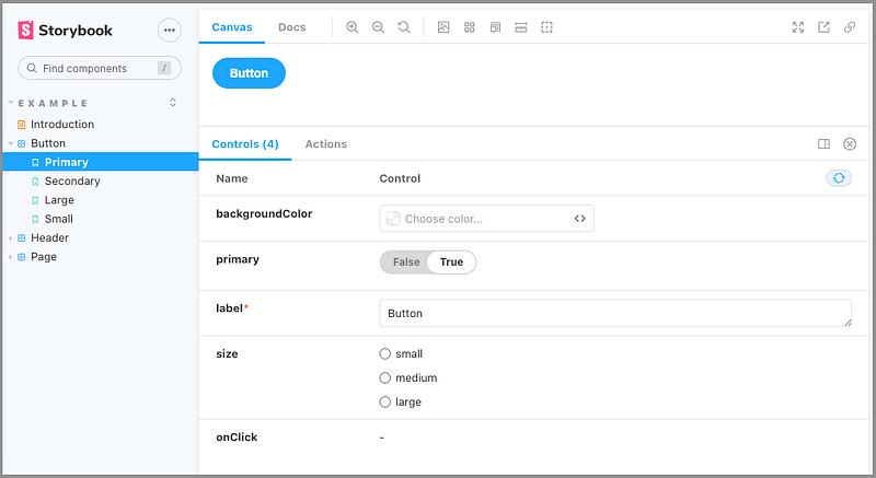
These example stories come with some add-ons.
The Controls add-on in the above screenshot allows dynamically modifying arguments.
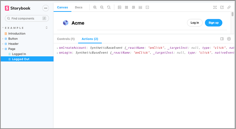
The Actions add-on in the above screenshot displays data received by event handlers. When Sign up is clicked, onCreateAccount is displayed. When Log in is clicked, onLogout is displayed.
Out of the box, each story gets a DocsPage, which aggregates the component story, text description, docgen comments, argument tables, and code examples.
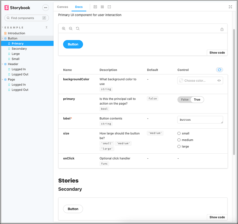
The DocsPage add-on in the above screenshot enables Show code, displays arguments, and allows modifying arguments for the currently rendered story. Be aware that only the first story shows arguments. After all, they’re the same component, and it only needs one set of arguments to be dynamically modified.
Dynamic Component Editing
We have seen the capability of dynamically modifying arguments in the Controls add-on and the DocsPage add-on.
The following is a Storybook that we built for a previous article:
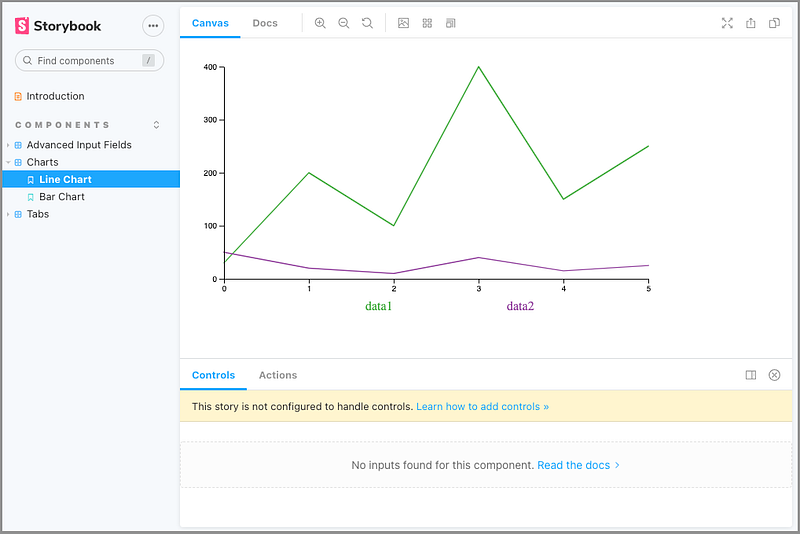
What happens to the Controls add-on?
It says that “This story is not configured to handle controls.”
The dynamic component editing is a feature of args tables. These tables list the arguments, short for args, of a component. It requires a story written in Component Story Format (CSF), which was introduced in Storybook 5.2. CSF is based on ES6 modules and decoupled from Storybook’s internal API.
The args object can be defined at the story and component level (see below). It is a JSON serializable object, composed of string keys with matching valid value types that can be passed into a component.
The following is the official Button story.
Line 14 creates Template that maps args for rendering.
Each story reuses Template at line 14, 20, 25, and 31.
Then Primary.args is defined at line 15, Secondary.args is defined at line 21, Large.args is defined at line 26, and Small.args is defined at line 31.
Are you wondering what argTypes is at line 7?
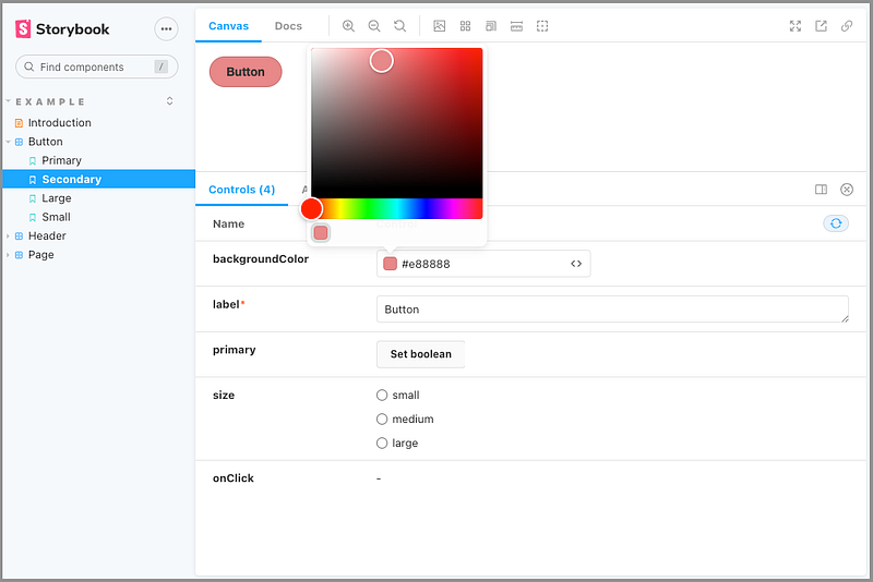
It defines backgroundColor that is controlled by the 'color' control, i.e. the color picker.
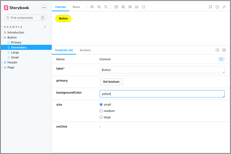
If we comment out lines 7–9, backgroundColor defaults to a color string.
Since .storybook/preview.js defines the control to use a color picker for background or color, there’s no need for argTypes if the argument is named background or color.
By the way, the red asterisk in the above screenshot indicates a required field.
Storybook 6.3 examples support CSF 2.0. CSF 3.0 makes some syntactical improvements — it’s currently available as an experimental feature.
Now let’s examine the Charts story that we built previously:
Since it does not follow CSF format, dynamic component editing is not enabled.
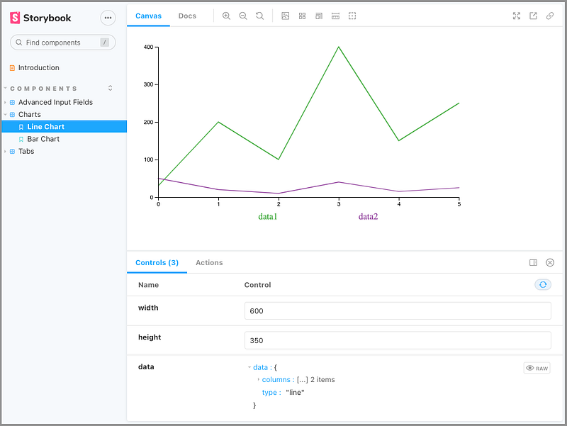
Let’s fix that:
Now we can dynamically edit the chart’s arguments.
Multiple Storybook Composition
It’s common that there are multiple Storybooks in an organization. It’s a good idea to compose them together into one Storybook. This can be achieved fairly easy with Storybook 6.0+.
Add another Storybook URL to .storybook/main.js in the Create React App repository:
Now we see the Storybook official examples along with the React component library stories.

Documentation Improvement
By default, all stories get a DocsPage, which nicely presents the component story. MDX empowers a DocsPage with more capabilities. MDX is a standard file format that combines Markdown with JSX. We can use Markdown to format a document, along with freely embedded JSX component blocks, including ArgsTable, at any point in the file.
For the same Button stories, we rename it Button.stories.mdx and implement it as follows:
At lines 4–10, the Meta tag defines information for Storybook components.
Lines 12–15 are Markdown content.
Lines 17–57 are JSX component blocks for four stories and ArgsTable.
With this MDX code, we have a beautiful document:
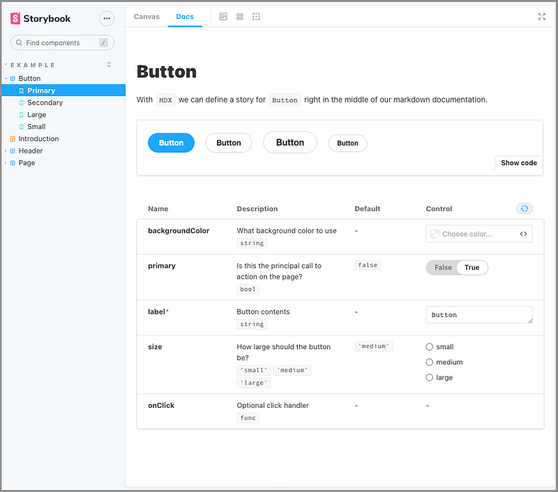
However, in the above screenshot, the titles in the sidebar are out of order due to the mixing of JSX files and MDX files.
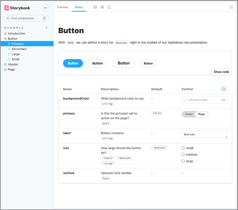
We can configure the desired sort in .storybook/preview.js:
Line 11 hardcoded the sidebar hierarchical order. 'Example' is the first level order, and ['Introduction', 'Button', 'Header', 'Page'] is the second level order.
The options section fixes the sidebar sort order.
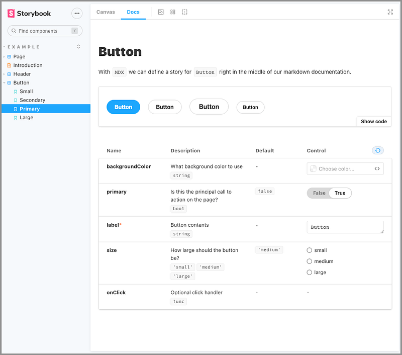
Besides an object, storySort can also take a function:
The above code results in a reverse-ordered sidebar:
Conclusion
We’ve explored new features since Storybook 6.0. It’s easier to use, with richer functionality.
Will you give it a try?
In addition, you can try Chromatic, A Cloud-Based Toolchain for Storybook.
Thanks for reading. I hope this was helpful. If you are interested, check out my other Medium articles.


