
Coronavirus and PMI
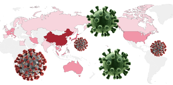
Coronavirus and the Purchasing Managers Index (PMI)
Starting from this month we ought to pay special attention to the impact of the Coronavirus to the U.S. economy. As this news article “Slowed by the Coronavirus, China Inc. Struggles to Reopen” points out, the world’s 2nd-largest economy has shut down for three weeks. The coronavirus outbreak has sickened tens of thousands of people and the epicenter of the outbreak Hubei, home to almost 11 million migrant workers, has been under a lockdown. Although China has pushed to automate its manufacturing sector, many factories remain labor-intensive. Tight cash flow and lost orders become important issues.
What do the leading economic indicators say? The S&P 500 index dropped more than 500 points in the week of February 17–21 due to the fear of the widespread of the coronavirus. Most importantly, the Purchasing Managers Index (PMI) released in this week also reflects the anticipated negative impact of Coronavirus to the global economy. See the news articles “The Dow Closes Down 228 Points. Don’t Just Blame Coronavirus, Blame the U.S. Service Economy”, and “A contrarian economist is warning of recession and deflation”, both on February 21, 2020.
In this post, I will show you what the PMI is, how to collect the PMI, how to plot the data with Plotly in Python, and how to act upon with this economic leading indicator. If you are an economist, an R language user, or a data scientist who is interested in data visualization, you may find this article useful. I have written a series of articles on data visualization. If you are interested, you can check “Create Beautiful Geomaps with Plotly”, “Powerful Plots with Plotly”, “Pandas-Bokeh to Make Stunning Interactive Plots Easy”, or “Use Seaborn to Do Beautiful Plots Easy”. You can also bookmark this learning path article “Dataman Learning Paths — Build Your Skills, Drive Your Career” for other articles.
The PMI Signals Economy Downturns
The U.S. Purchasing Managers Index (PMI) for manufacturing is “one of the most hottest economic indicators” as described by Bernard Baumohl in his best-selling book The Secrets of Economic Indicators. The PMI has demonstrated a solid track record of anticipating turning points in the business cycle and for being way ahead of the curve in detecting a buildup of inflation pressures. You will see how the PMIs correspond with recessions in the graph that we will produce.
How Are the PMI Data Collected?
The Markit Economic Group, the Institute for Supply Management (ISM) and the Singapore Institute of Purchasing and Materials Management (SIPMM) all separately compile their Purchasing Managers’ Index (PMI) surveys on a monthly basis. In our analysis, we will use the data from Markit. The firm surveys more than 16,000 companies across more than 20 countries every month to track activity in manufacturing, services, retail, and construction sectors. Monthly data for each country and region are releases here. Below I show several questions in the survey form:
- Is the level of new orders received by your company higher than, the same as, or lower than one month ago?
- Is the level of output in your company higher than, the same as, or lower than one month ago?
- Are supplier delivery times experienced by your company longer than, the same as, or lower than one month ago?
- Is the level of employment at your company higher than, the same as, or lower than one month ago?
A reading of less (or higher) than 50.0 indicates a contraction (expansion) of activity. Due to the coronavirus, it is anticipated that many managers will answer “lower” to the above surveys. We need to watch closely to its subsequent impacts.
How to Get the PMI Data and Recession Dates?
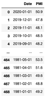
We get the Purchasing Managers Index data from Quandl.com. It is free to create an account and no credit card is required. When you sign up with the Quandl, you will receive a key with an e-mail confirmation. Once you confirm the e-mail address, you can download the data manually as a csv file (that’s what I did) or query the data programmatically.
How to Get the U.S. Recession Dates?
The National Bureau of Economic Research (NBER) publishes the business cycles and durations.
Plot the U.S. Historical Recessions and PMI with Plotly
First we use Pandas to load the PMI data:
I will plot the past four U.S. recessions since 1980:
- 1981-July — 1982-November
- 1990-July — 1991-April
- 2001-March — 2001-November
- 2007-December — 2009-June.
It is fairly easy to use Plotly to create interactive plots. Plotly offers canned functions for plotting. First, you declare a figure object by fig=go.Figure(). I will do the following three things in the plotting.
(A) the PMI series. Use fig.add_trace() and go.Scatter() to plot the time series. You only use these two functions so do not worry if there are too many syntax.
(B) the Coronavirus starting month in red, and the four recessions. I repeatedly use dict() to provide the data ranges.
(D) a dashed horizontal line at 50.0.
The outcome looks like this:
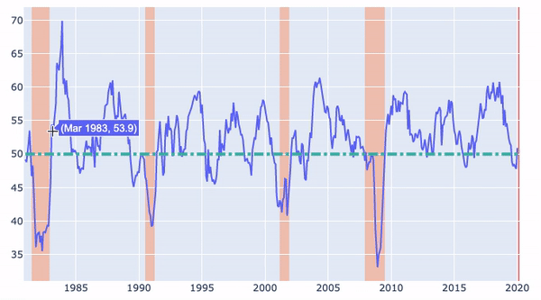
Plot Interpretations
- Low values of the PMI correspond with recessions. The PMI was noticeably low in the 2008 recession.
- There were several economic downturns when the PMIs were lower than 50.0. They were followed by quick economic recoveries.
- The Coronavirus starting month is shaded in red. It is crucial to watch in the next two months for any economic downturn.


