
Use Seaborn and Squarify to Do Beautiful Plots Easy!
Why Seaborn?
When you do data visualization or explanatory data analysis, you typically explore the distributions of all interesting variables, and their joint distributions or get the summary statistics (min, max, median, etc.) by some categorical variables. You may be comfortable with your libraries (such as Matplotlib) or packages (such as ggplot2). So why Seaborn? Indeed, there is a huge range of data visualization libraries out there. My vote for Seaborn is code efficiency and graphic attractiveness. Seaborn creates more attractive and informative statistical graphics in a few lines of code. If you use Matplotlib, you will find Seaborn uses fewer syntax and has more default themes. It is also easy to customize the aesthetics with simple commands ( sns.set_style and sns.set_palette), as I will show you in this article. By the way, all the code in this article can be downloaded via this Github link.
It is worthwhile to compare and contrast Seaborn, Bokeh, and Plotly. The biggest difference is that Bokeh and Plotly are interactive visualization libraries. I have written a series of articles on data visualization tools, including “Pandas-Bokeh to Make Stunning Interactive Plots Easy”, “Use Seaborn to Do Beautiful Plots Easy”, and “Powerful Plots with Plotly” and “Create Beautiful Geomaps with Plotly”. My goal in those articles is to assist you to produce data visualization exhibits and insights easily and proficiently. If you would like to adopt all these data visualization codes or make your work more proficient, take a look at them.
Why Squarify?
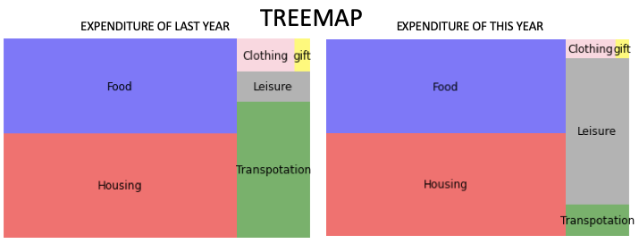
A pie chart is a typical way to represent proportions by dividing the pie into slices. Another visually appealing way is the Treemap which displays hierarchical data using nested figures in a rectangle. Below is a treemap to show the expenditure of last year and that of this year. Isn’t it visually pleasing? How do you do that? This can be easily done with the module Squarify and I will show you the code to do so.
Graphs Lead Your Audience to See through Your Eyes
A student shared with me that she knows how to code different plots, but just does not know what to plot or how to choose the best way to plot. What she means is what to focus on and what’s the story. So before you plot a graph, think of the story itself. (This will prevent you from plotting for plotting’s sake.) Telling a story in data science does not mean you need to construct a story like Alice in Wonderland. A story in data science means describing clearly the relationships between variables, and the foreseeable dynamics. For example, a story can be the distribution of X or the positive or negative relationship between X and Y. If there is a causal relationship like “the sales in Y have increased because of the marketing campaign X”, it is even better. You can start with an ordinary plot (a fancy plot does not necessarily help you hit the point). As long as a plot helps you to make the point, it is a great plot.
Typical Types of Plots in Exploratory Data Analysis
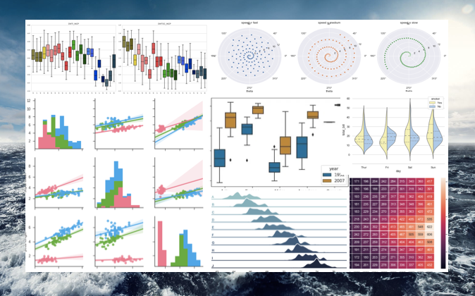
As we know “a picture is more than a thousand words”, a graph can convey the interactions of variables effectively. That’s the idea in exploratory data analysis. If we summarize the typical tasks in exploratory data analysis, the following two types of exercises are probably the most:
- Showing the distribution of X, and
- Showing the distribution of Y by another categorical variable X, and
- Showing the interactions of two or three variables.
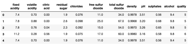
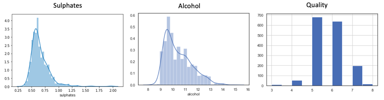
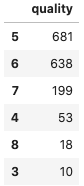
First, let me load the data. This dataset has a target variable “quality” ranging from low to high (0–10), and the following input variables: fixed acidity, volatile acidity, citric acid, residual sugar, chlorides, free sulfur dioxide, total sulfur dioxide, density, pH, sulphates and alcohol. All the variables are numeric. There are 1,599 wine samples.
I am going to make two categorical variables for our analysis. I use Pandas’ quantile-based discretization function pd.qcut() to cut each variable into two equal-sized buckets.
Type 1: Showing the Distribution of X
(1.1) Histogram
(1.2) Treemap with Squarify
To use Squarify to create a Treemap, you will first do “pip install squarify”:
I generate a list like below to plot a treemap:
It is just so easy to do:
But you will say, wait, I am not satisfied with the color, the labels, or the font size. How do I customize the treemap? This can be done easily with the code below:
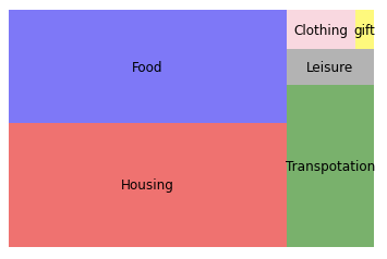
Now the treemap looks just right!
Type 2: Showing the Distribution of Y by Another Categorical Variable
(2.1) Box Plot I
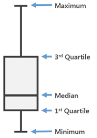
Often we need to know the summary statistics including the minimum, maximum, and median. A box plot displays the five-number summary of a set of data: the minimum, first quartile (Q1, 25%), median (Q2, 50%), third quartile (Q3, 75%), and maximum. The box covers the data from the first quartile to the third quartile.
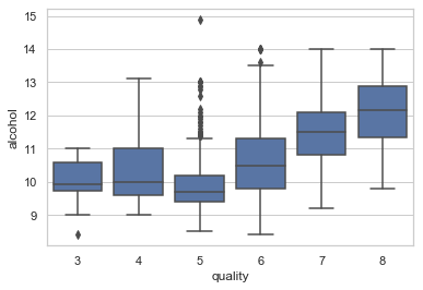
Interpretation:
- High-quality wines associate with high alcohol levels. The narrow box (Q1-Q5) of Quality-“5” indicates the alcohol level of the mid-quality wines is fairly consistent.
- The outliers of Quality-“5” shows a few wines have a noticeable high alcohol level (>11).
The typical box plot may not show enough differentiation for the outliers, such as the Quality-”5” wines in the above graph. We will resort to Box Plot Type II.
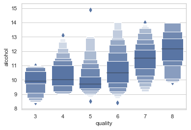
(2.2) Box Plot II
The Box Plot II, or the “letter-value-plot” named by the authors in this paper, will be a better representation of the distribution of the data when there are many outliers.
(2.3) Ridgeline Plot (sometimes called Joyplot)
A Ridgeline plot shows the distribution of a numeric value for several groups. Let’s look at the outcome graph first. I will explain the code in detail.
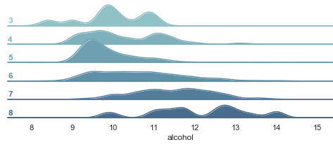
The above graph shows rich information:
- Higher quality wines (such as “7” and “8” in the vertical axis) are associated with higher levels of alcohol.
- Quality-“5” wines: The distribution of the alcohol level is narrower than others, indicating its relative consistency in the alcohol level.
The code:
- The
FacetGrid()is a very useful Seaborn way to plot the levels of multiple variables. Therow="quality"assigns each quality group to a row, and thehue="quality"assigns the colors according to the quality group. The above code declares the facetGrid and then assigns it to the objectg. - The
.map(fun,iter)is a Python function applying the given function to each item of a given iterable (list, tuple, etc). Sog.map(sns.kdeplot,"alcohol",...)applies the plotting functionsns.kdeplotto the “alcohol”. Because the objectghas the quality group as the row, each row will plot the distribution of the “alcohol”.
(2.4) Violin Plot (Use Hue for One More Variable)
A violin plot is similar to a box plot but includes the probability density of the data. We can add one more variable in a violin plot by using the color dimension hue.
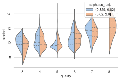
We assignhue="sulphates_rank"to add the third variable “Sulphates_rank” in addition to “alcohol” and “quality”. This graph exhibits the following:
- The violins rise higher as the quality increases, meaning the high-quality wines associate with a high level of alcohol.
- The highest quality wines (Quality-”8") are only associate with a high level of sulphates.
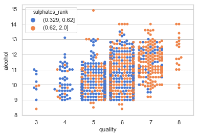
(2.5) Swarm Plot (also called a “Beeswarm Plot”)
The Swarm plot is similar to a box or violin plot and it shows the underlying distribution of the data. You also can use the color dimension to show the third variable.
Type 3: Showing the Interactions of Two Variables
(3.1) Bubble Chart
A 2-D bubble chart can display up to four dimensions of data: The X and Y locations, the size of the bubbles, and the color of the bubbles. However, it may become too busy to convey your messages. So I suggest three dimensions the most. To do so, you set color hue, and size to be the same variable, as I do below:
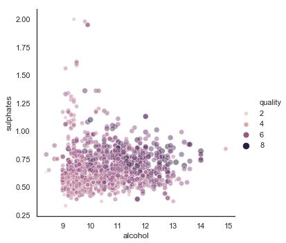
This graph conveys interesting findings:
- There is a mild positive correlation between alcohol and sulphates.
- Large bubbles scatter in the areas where the level of alcohol and sulphates are high.
(3.2) Scatter Plot: Hexbin Joint Distributions
A Hexbin plot shows the relationship between two numerical variables, with the distributions of each variable on the top and side respectively. To show the joint distributions, the plotting window is split into hexbins, and the number of points per hexbin is counted. The color denotes this number of points.
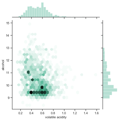
The graph conveys the following findings:
- The distribution of the volatility acidity shows symmetric and normal; in contrast, the distribution of the alcohol skews to the low levels.
- The dark hexbins indicate many wines have an alcohol level between 9 to 10 and a volatile acidity level between 0.4 to 0.7.
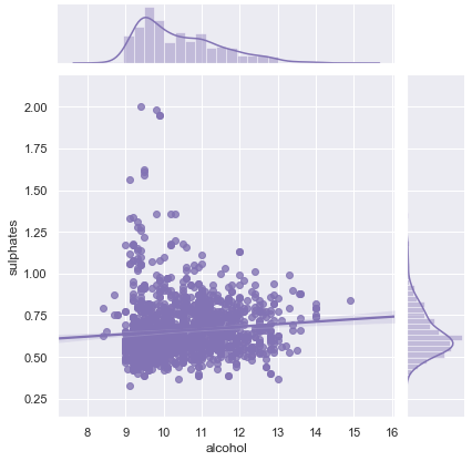
(3.3) Scatter Plot: With a Linear Regression
It will be helpful to draw a line to show whether the relationship between two numerical variables is positive or negative.
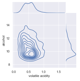
(3.4) Density Plot
If you have many observations, a scatterplot usually produces an ugly over-plotting graph. In this case, the 2D density plot is a better choice. It counts the number of observations within a particular area of the 2D space. It usually estimates a 2D kernel density estimation and represents it with contours, like the graph below.
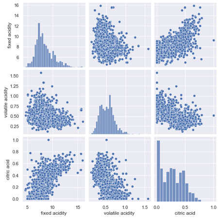
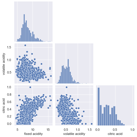
(3.5) Pairplot
A pair plot lets us show two important statistics: (a) the distribution of every single variable, and (b) the relationships between two variables.
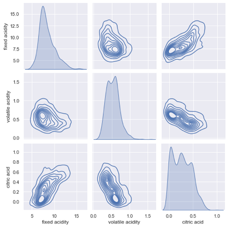
You can use kind='kde' to plot a layered kernel density estimate (KDE) like below. This will take a while because seaborn needs to calculate the KDE.
The pairplot lets you control the figure size directly by specifying height= in the parameter. Below I assign height=2.2. This is a handy function because I do not need to use matplotlib to assign the figure size (such as plt.figure(figsize(6.3))).
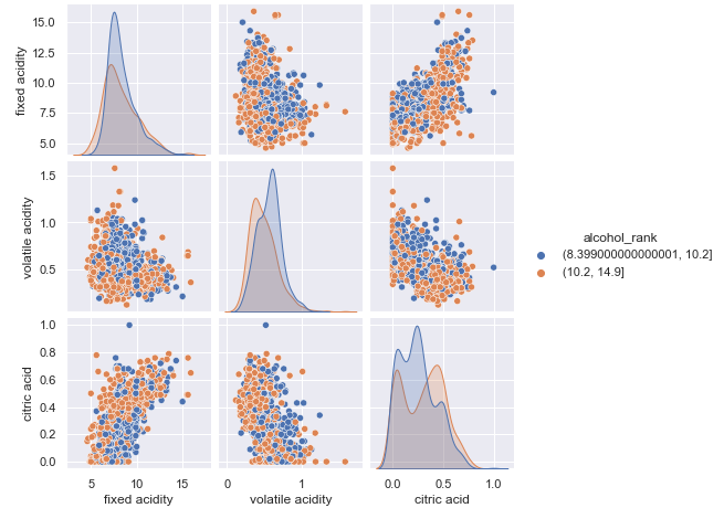
The Pairplot lets you use color as another dimension. Below I want to know the pair distributions of three variables and separate them by the “alcohol_rank” as the color dimension.
If you like to try it, you can download the notebook via this Github link.


