
Powerful Plots with Plotly
One of the finest data visualization tool
Why Do I Use Plotly?
I have written a series of articles on data visualization, including “Pandas-Bokeh to Make Stunning Interactive Plots Easy”, “Use Seaborn to Do Beautiful Plots Easy”, “Create Beautiful Geomap with Plotly” and now this one. My goal is to assist you to produce data visualization easily and proficiently. I have written articles on a variety of data science topics. For the ease of use, you can bookmark my summary post “Dataman Learning Paths — Build Your Skills, Drive Your Career” that lists the links to all articles.
So why plotly? I am thrilled to tell you that with the following summary:
- Elegant: Plotly is built on top of visualization library D3.js, HTML and CSS, which makes it one of the finest data visualization tools. D3.js is a flexible library for rendering and animating SVG in the web browser. If you have seen D3.js or are using it, you will agree it has a very powerful visualization. Plotly incorporates D3.js. It lets you create interactive visualizations without even having to know D3.js.
- Interactive: It is created using Python and the Django framework. One can choose to create interactive plots online or use the libraries that plotly offers to create these visualizations in the language/ tool of choice.
- Multiple languages: It is compatible with a number of languages or tools: R, Python, MATLAB, Perl, Julia, Arduino. If you are an R user or MATLAB coder, you will still take the full advantage of Plotly.
- Easy: The syntax for creating interactive plots is very simple.
Typical Types of Plots in Exploratory Data Analysis
As we know “a picture is more than a thousand words”, a graph can convey the interactions of variables effectively. That’s the idea in exploratory data analysis. If we summarize the typical tasks in exploratory data analysis, the following types of exercises are probably the most:
- Showing the distribution of X, and
- Showing the distribution of Y by another categorical variable X, and
- Showing the interactions of two or three variables.
So in this article I will present you the plots according to the above categories. I will walk you through different types of plots. The code notebook is available at the end of this article.
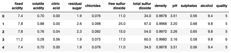
I am going to use the red wine quality data in Kaggle.com to do the analysis. use the same dataset in “Explain Your Model with the SHAP Values” and the above mentioned articles so you can compare and contrast. The target value is the quality rating from low to high (0–10). The input variables are fixed acidity, volatile acidity, citric acid, residual sugar, chlorides, free sulfur dioxide, total sulfur dioxide, density, pH, sulphates and alcohol. All the variables are numeric. There are 1,599 wine samples.
I create two categorical variables. I use Pandas’ quantile-based discretization function pd.qcut() to cut each variable into two equal-sized buckets.
Type 1: Showing the distribution of X, and
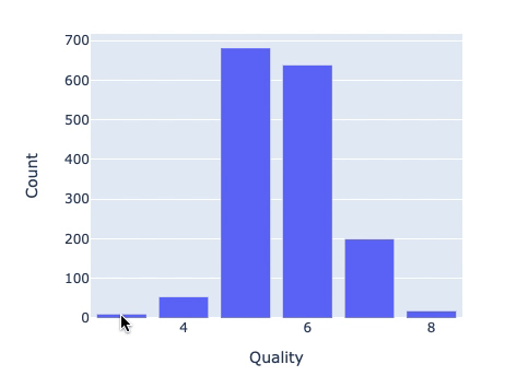
(1.1) Bar Chart
How to export your plotly figure? You can useplotly.offline.plot() and turn the auto_open=False as below:
(1.2) Pie Chart

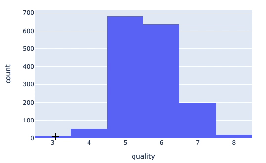
(1.3) Histogram
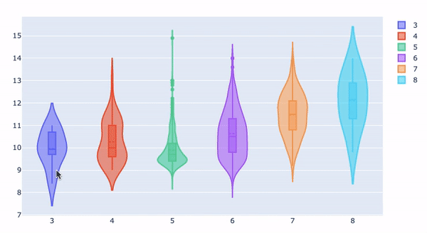
Type 2: Showing the distribution of Y by another categorical variable X
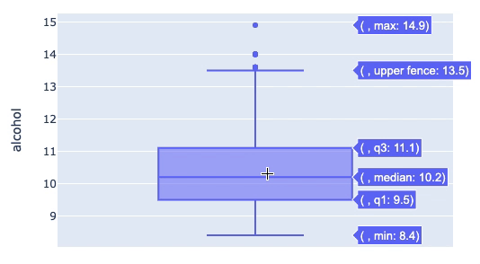
(2.1) Box Plot 0
(2.1) Box plot 1
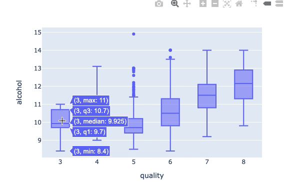
(2.1) Box Plot 2
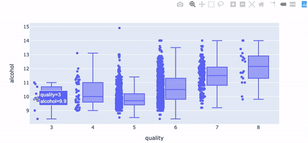
(2.1) Box Plot 3
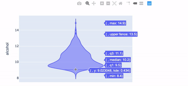
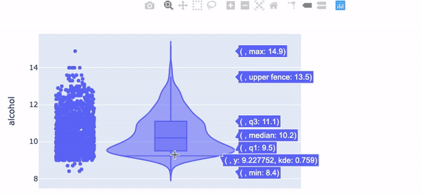
(2.2) Violin Plot 0
(2.2) Violin Plot 1
(2.2) Violin Plot 2
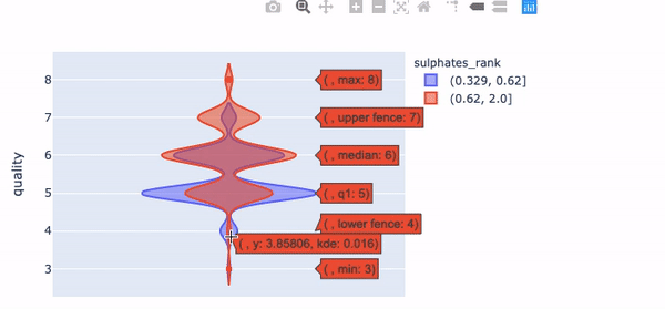
(2.2) Violin Plot 3
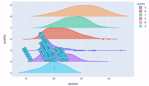
(2.3) Ridgeline Plot
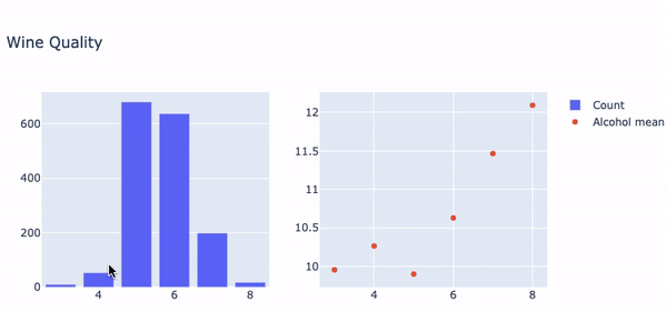
(2.4) Two Subplots
You may need to produce several subplots, one for count, one for average, and so on. Plotly lets you specify multiple subplots and craft each plot individually.
Type 3: Showing the interactions of two or three variables.
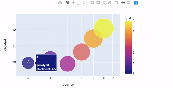
(3.1) Bubble Chart
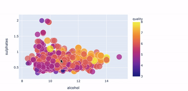
(3.1) Scatter Plot
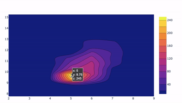
(3.2) Density Plot
The code notebook is available in this github.


