
Midjourney Explorations: #12 — Color Variations with Image and Multi-Prompts
Elevate your Midjourney images with color gradients and weighted multi-prompts. Unlock the secrets to vivid, dynamic visuals!
Welcome back to another installment of our Midjourney Explorations series! You guys loved my earlier tutorial on color techniques, so guess what? We’re diving deeper into the colorful world of Midjourney. Today I’ll show you how to infuse more color into your work via image prompts.
Here’s a sneak peek: we’ll use color gradients as a part of our prompts to get some truly eye-catching results. And if you’re not sure what an image prompt is, don’t worry — I covered that in my previous guide on blending images, so make sure to check it out!
Simple Gradients
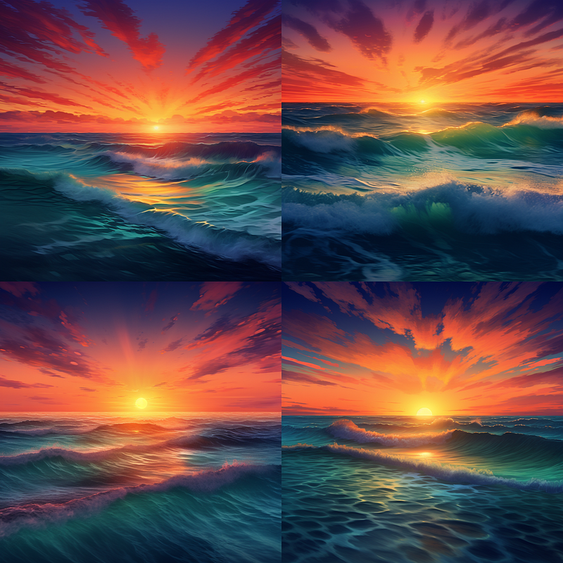
Let’s say you want to influence the basic Midjourney sunset over the ocean. You could apply a gradient in a couple of different ways to do so.
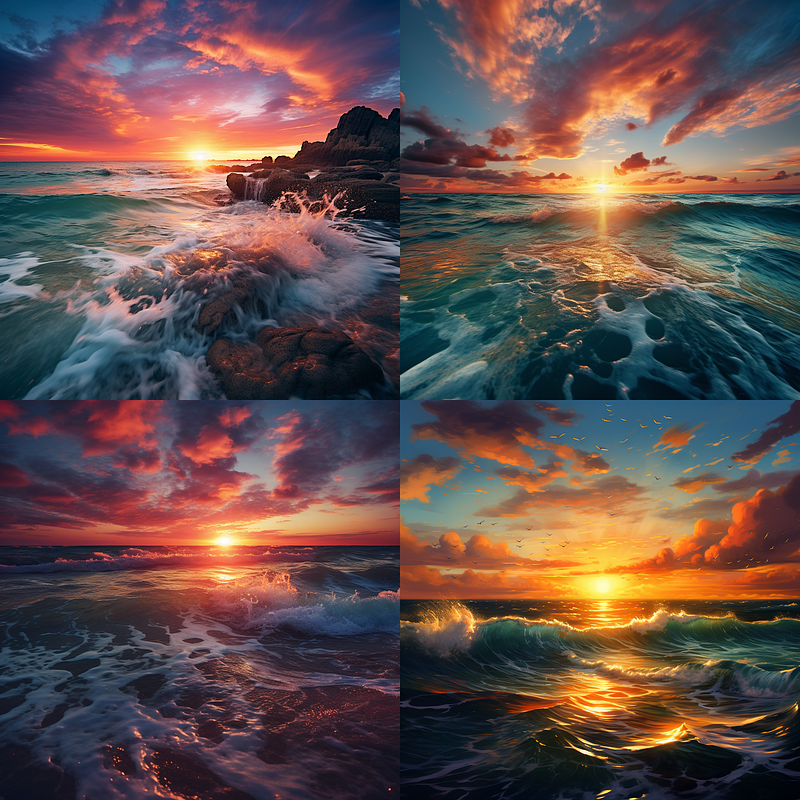
The above image is simply a control image so we know what we get if we do not specify any colors. Below I have applied the left gradient to the simple prompt to see the results. They are a bit much, and the directions of the color gradients do not lend themselves well to a horizontal horizon line, but the point here is to show the technique more than to create wall-ready art pieces.
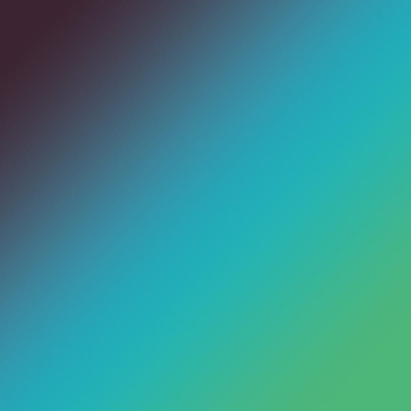
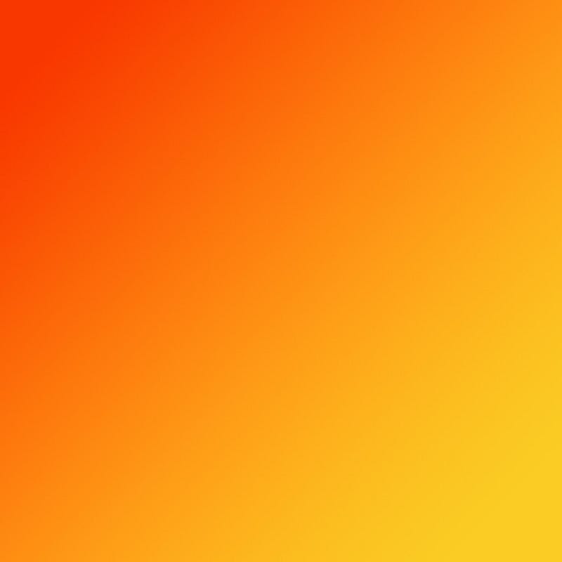
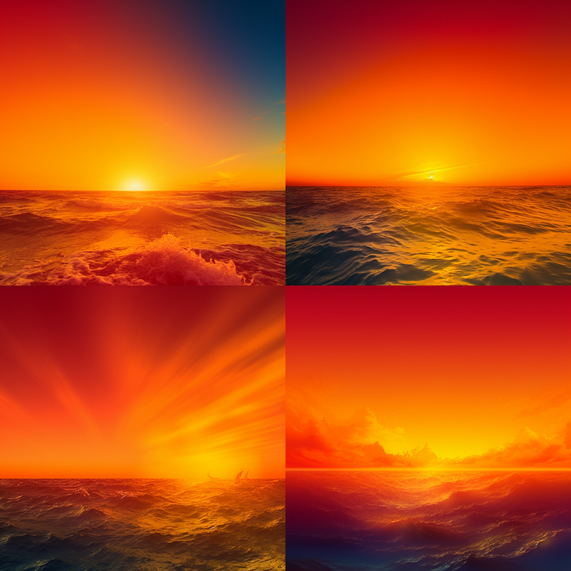
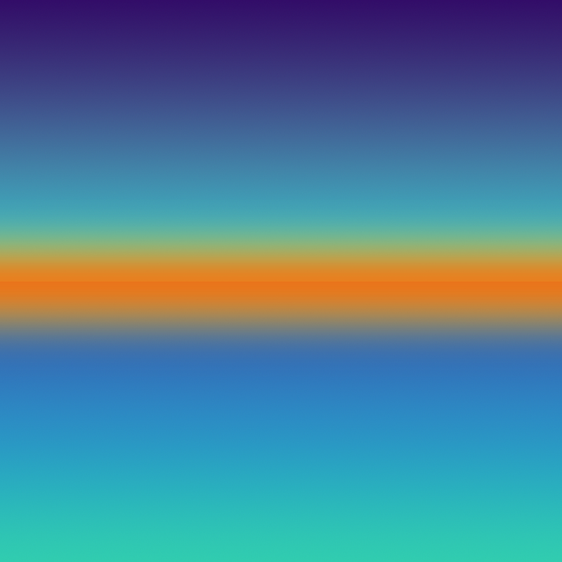
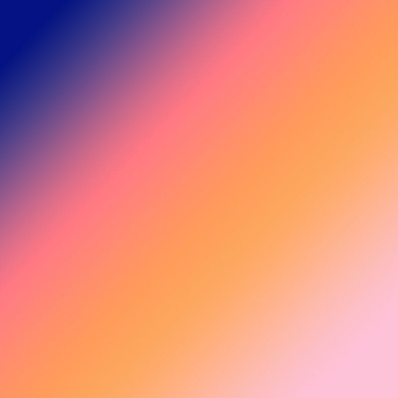
Well, that orange went way wide and is a bit painful to look at, but clearly shows the influence of our gradient. So deciding to show how this could be better leveraged I went back to Photoshop and created a more “sunsetty” gradient with more blue and just the pop or orange at the horizon.
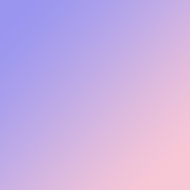
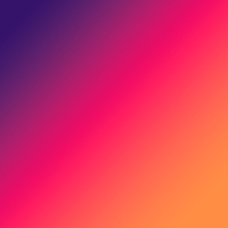
Also note that I picked fairly dayglow gradients. Subtle gradients are generally going to be better for creating final images for most subjects. I chose these to make sure it was easy to see their influence.
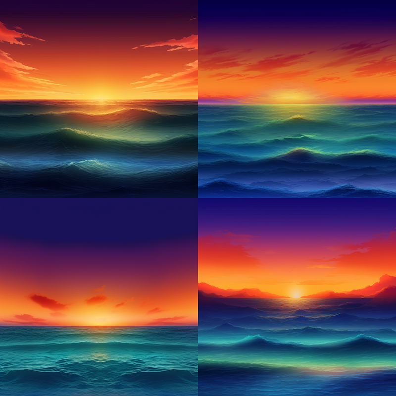
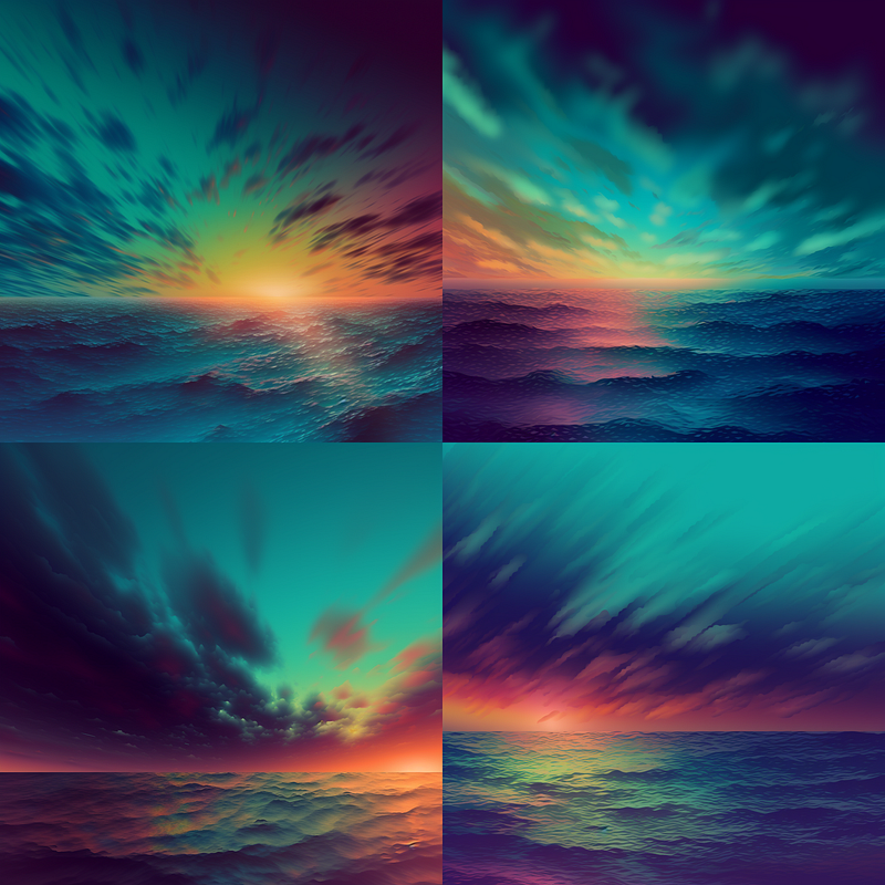
The results are still a little unfocused so instead of doing a simple prompt with the gradient image. I will mix our #1 control sunset with that gradient to see what it does.
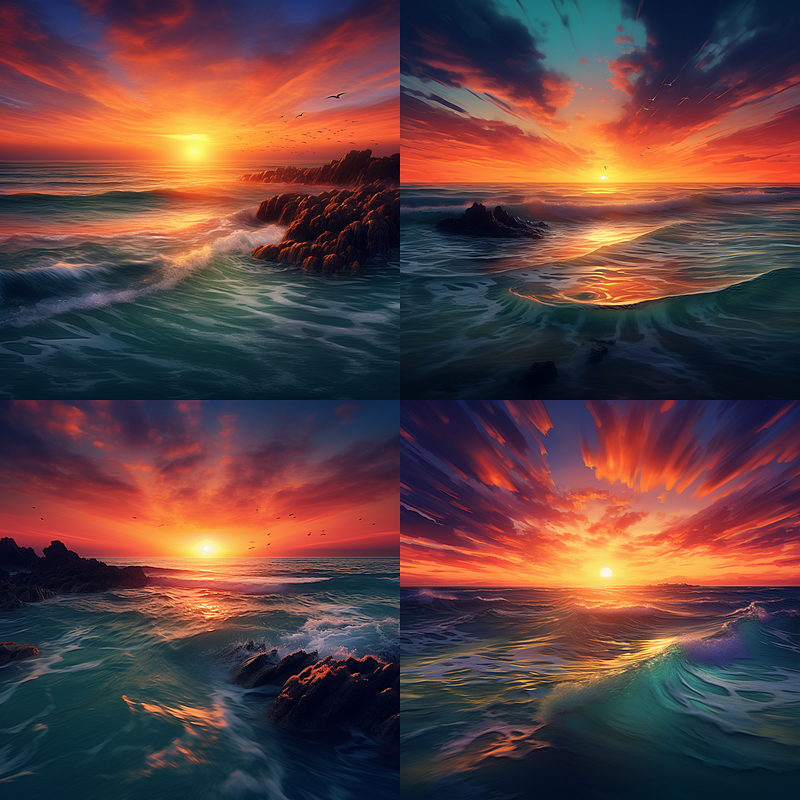
I was disappointed when the cool rocks in my sunset photo were lost. So, I told Midjourney to prioritize that photo using something called a “weighted multi-prompt.”
Not sure what that is? It’s simple. In your prompt, you can emphasize specific parts with two colons (::). For example, put a space before the colons and after whatever you’re emphasizing. No spaces between the colons or any following numbers, but do add a space after the colons before the next piece of your prompt. These colons signal to Midjourney that the preceding element is important, and you can even add a number to give it extra weight.
In my case, I gave the original sunset picture a weight of 10, the actual text prompt got a 7, and the gradient image was dialed back to a 5. This way, Midjourney knows exactly what to focus on!
https://s.mj.run/VhIsPKp6IVg ::10 a beautiful sunset over the ocean ::7 https://s.mj.run/9FPrgxo4UT4 ::5
Please note that this image weight trick does not work with all earlier versions. I am doing this tutorial using Midjourney version 5.2 .
When it comes to setting these weights, there’s no one-size-fits-all formula. It’s all about trial and error. If you think my orange gradient came on too strong, you could easily tone it down by lowering its weight from 5 to maybe 3.
If you haven’t toyed with multi-prompts yet, you’re missing out on a lot of creative potential. Stay tuned for a future tutorial where I’ll dive deeper into some more multi-prompt hacks.
And remember, gradients are just one of many tools in your creative arsenal. You can just as easily remix your initial sunset image, adding keywords like ‘oranges’ and ‘reds’ or ‘vivid colors’ to get similar effects. So go ahead, get your hands dirty, and let your creativity run wild!
Check out my tutorial: Midjourney Explorations: #10 — Adding Depth and Composition Extras for some fun gradient techniques.
Another Take on it
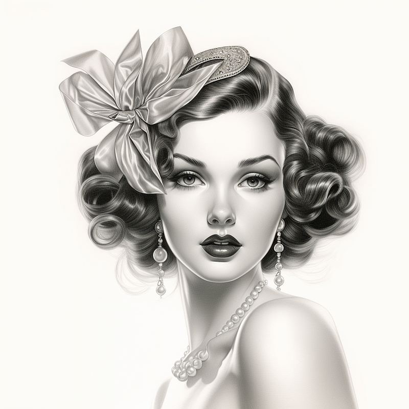
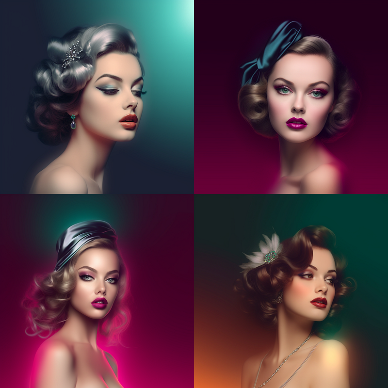
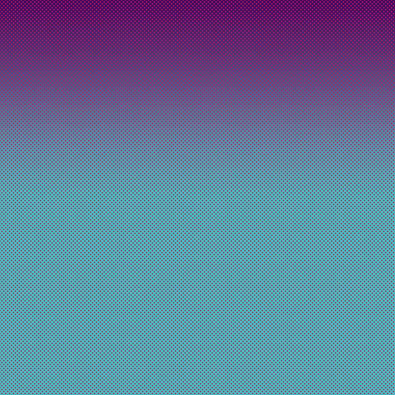
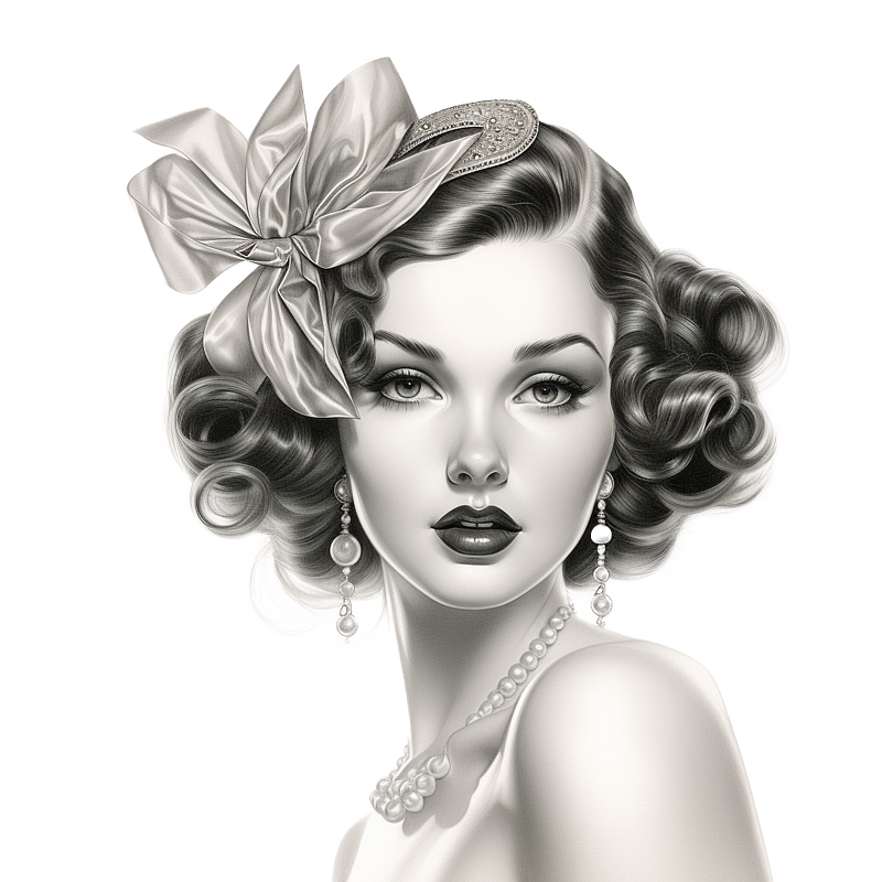
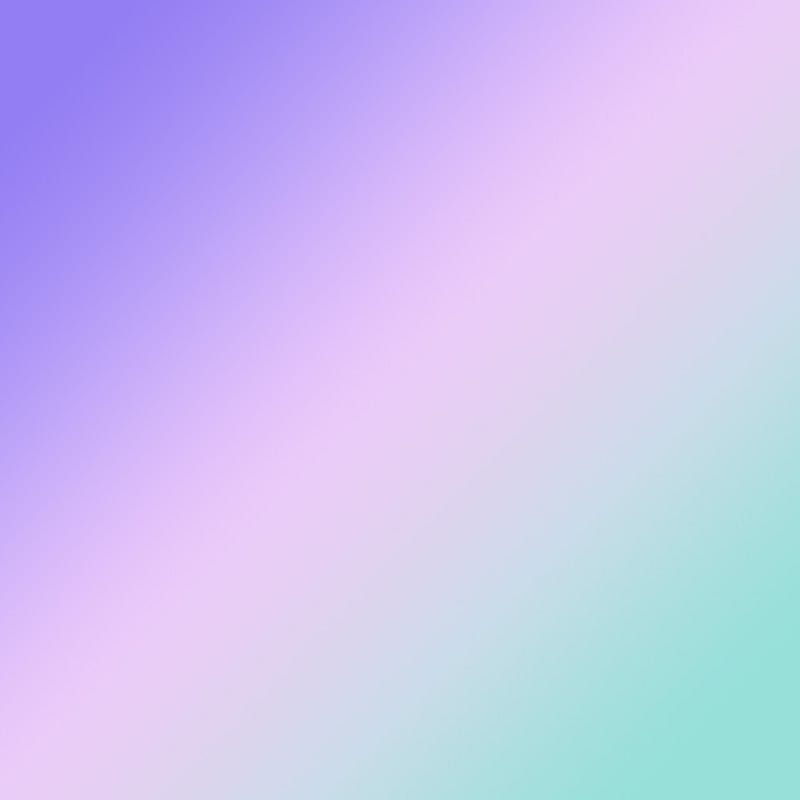
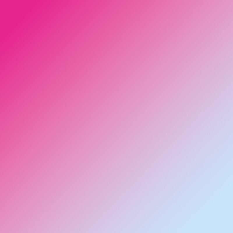
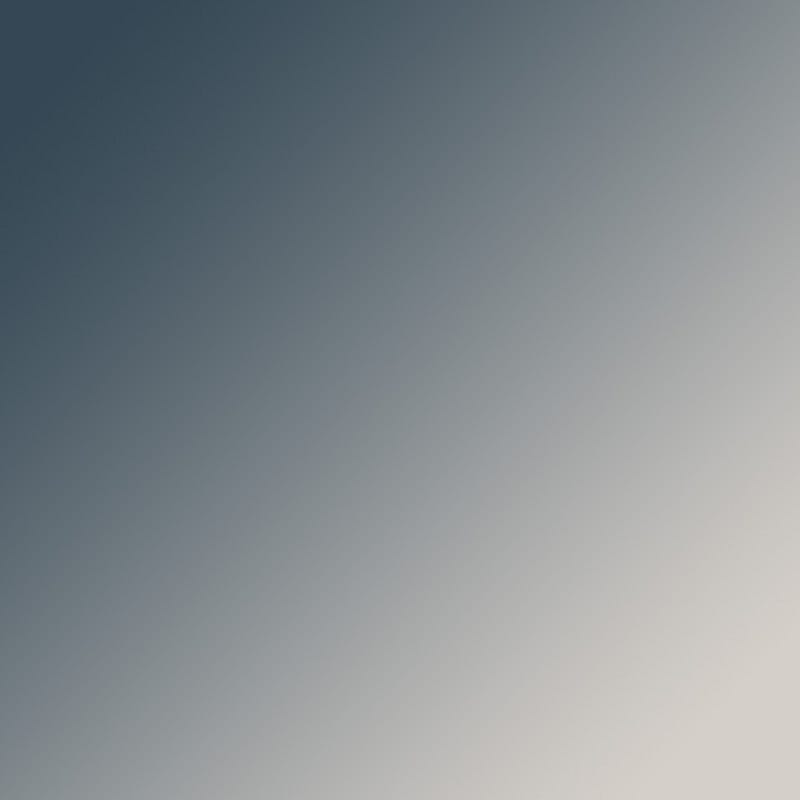
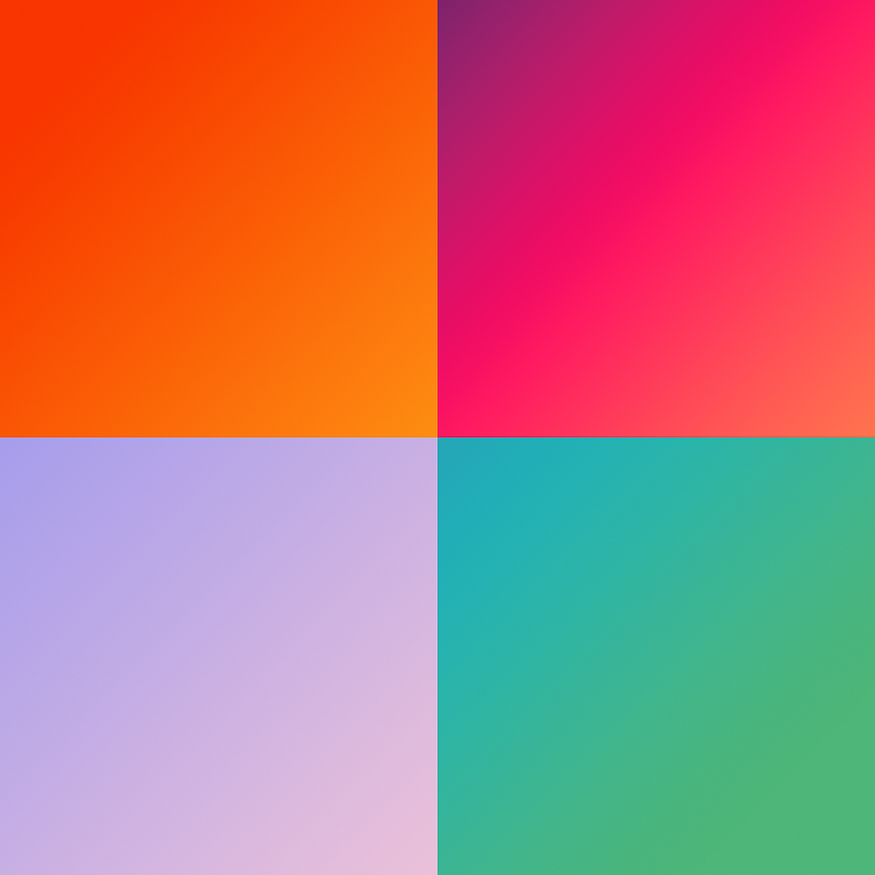
Below I have taken a grayscale image I liked with a color gradient image and a simple prompt (used to create the left image). I did several so that you can see it in action. I included a set of gradients at the end of the article to play with for your own explorations.

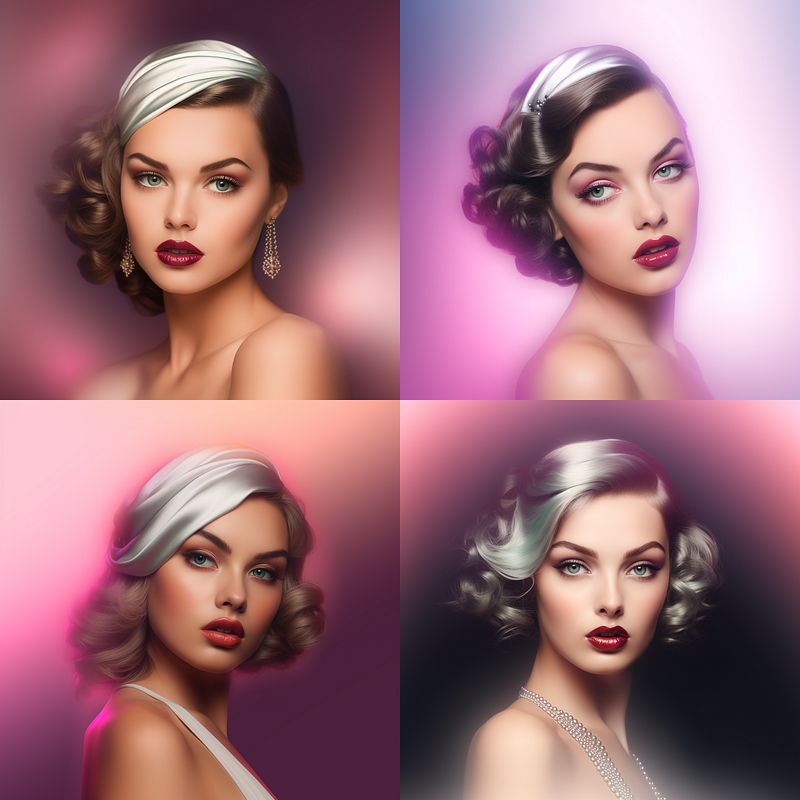
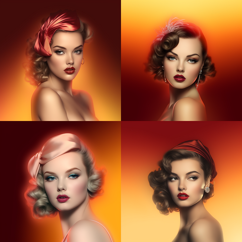
With these images above this technique simply colorizes and is the most basic thing you can do with a gradient in your image prompt.
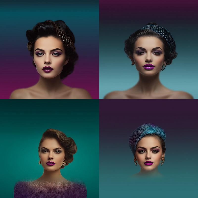
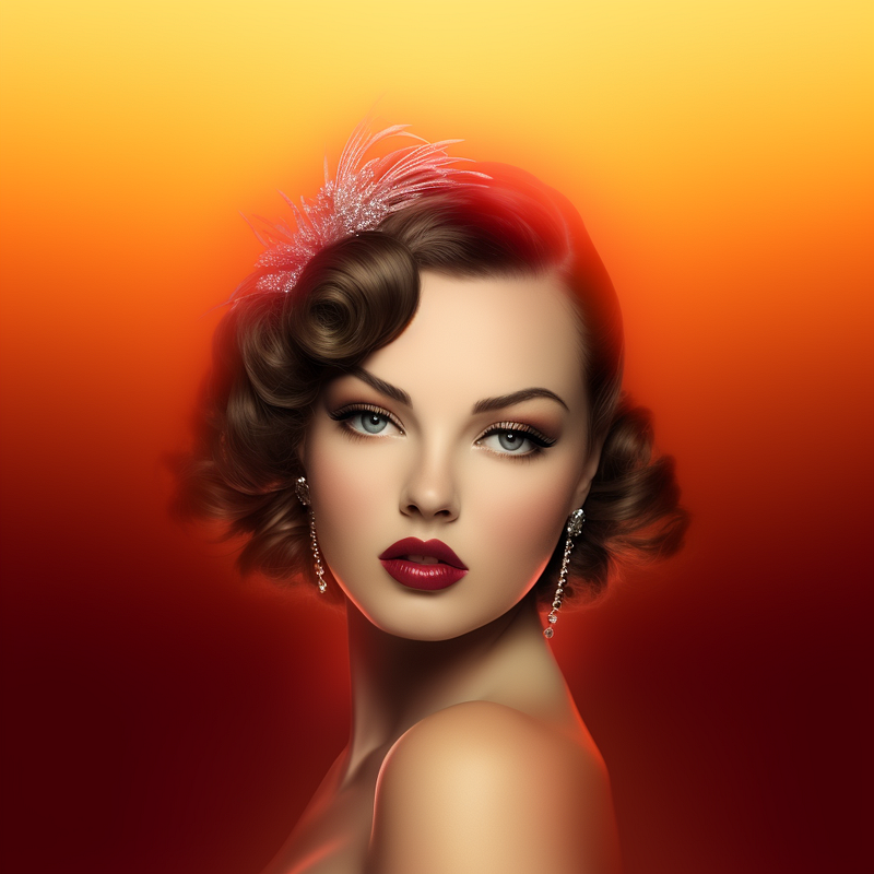
It is possible to fancy up your blend image, in this gradient I added a contrasting dot pattern, and just look at the interesting things it did to both the background colors and her headband.
In Conclusion
Thank you for joining me on this colorful journey through Midjourney’s advanced features! We’ve explored the ins and outs of color variations, image prompts, and the power of weighted multi-prompts to transform your visuals. Whether you’re a seasoned Midjourney user or just getting started, these techniques offer endless possibilities for enhancing your creative projects.
If you haven’t already, don’t hesitate to experiment with the gradients provided below. The only limit is your imagination! And if you’ve enjoyed this guide, be sure to give it lots of claps, follow me, and stay tuned for upcoming tutorials that will further elevate your Midjourney experience.
Happy coloring, and as always, let your creativity shine!
A Message from AI Mind

Thanks for being a part of our community! Before you go:
- 👏 Clap for the story and follow the author 👉
- 📰 View more content in the AI Mind Publication
- 🧠 Improve your AI prompts effortlessly and FREE
- 🧰 Discover Intuitive AI Tools