Free AI web copilot to create summaries, insights and extended knowledge, download it at here
4810
Abstract
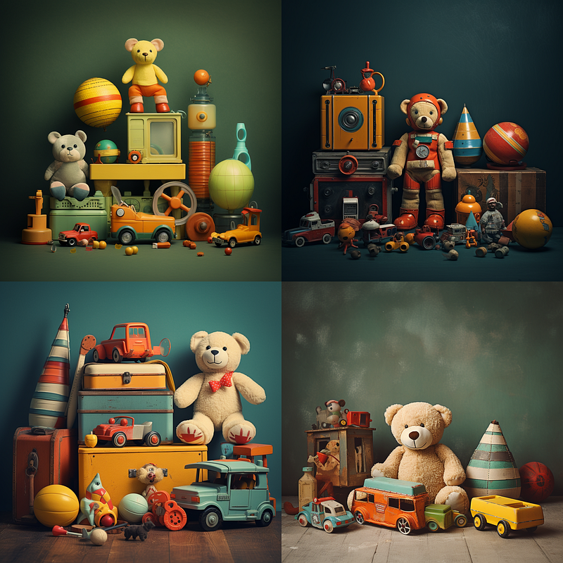
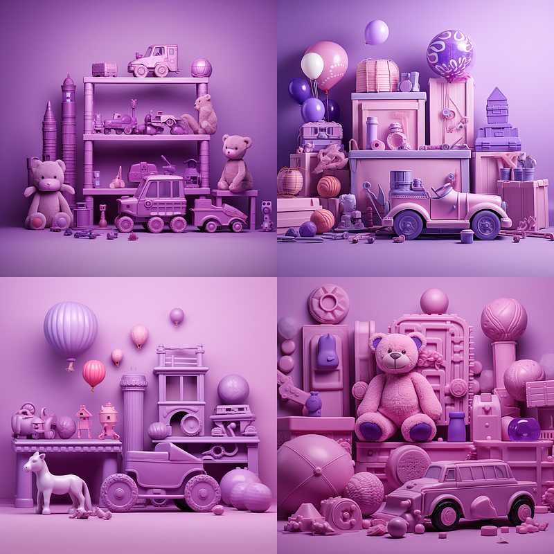
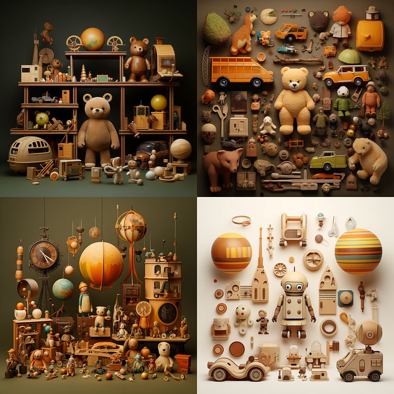
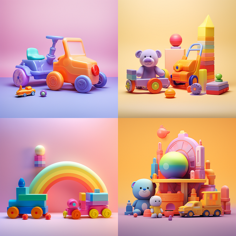
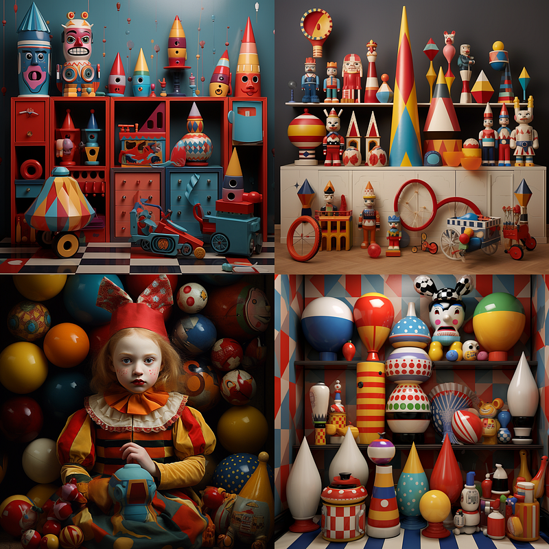
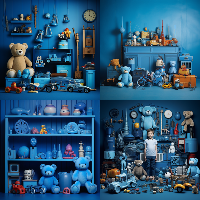
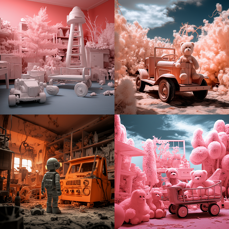
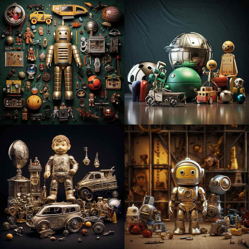
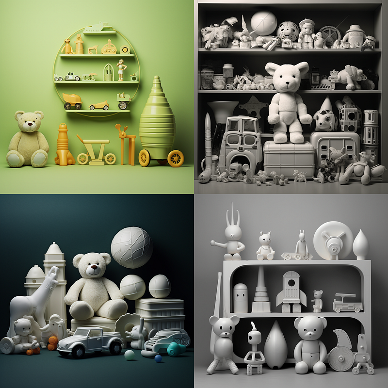
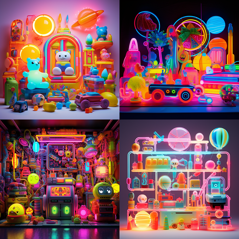
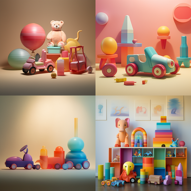
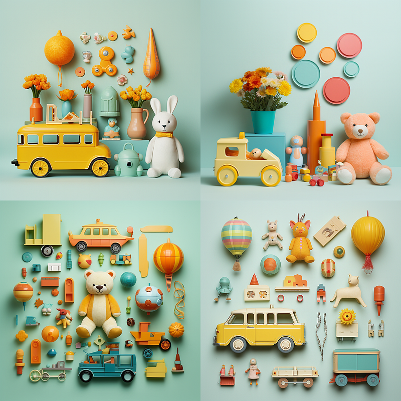
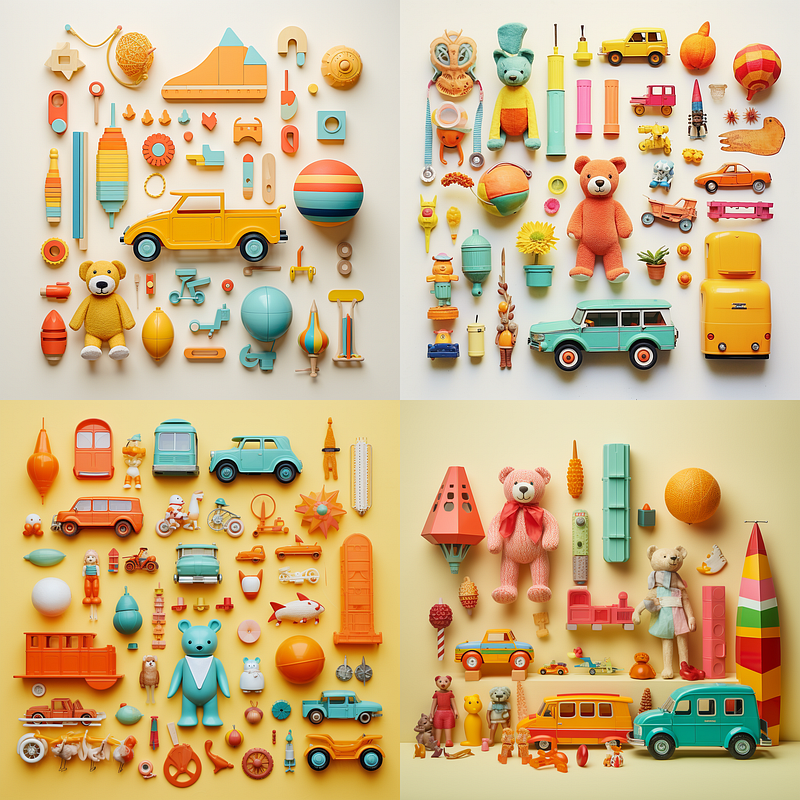
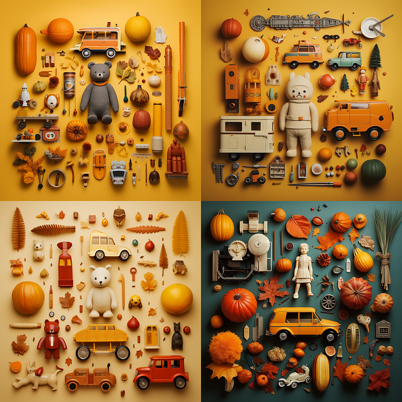
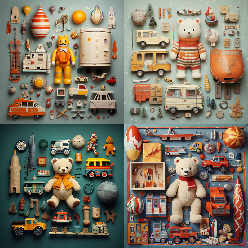
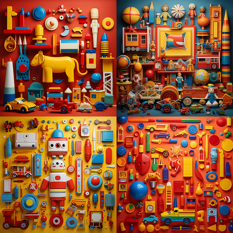
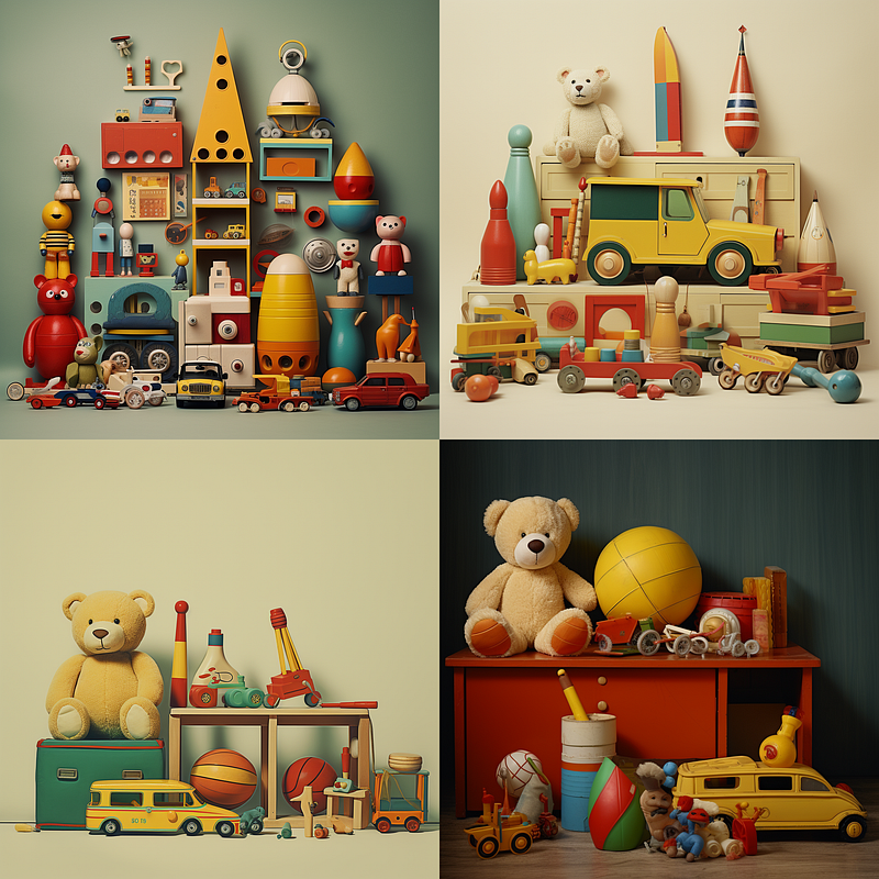
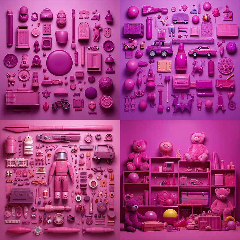
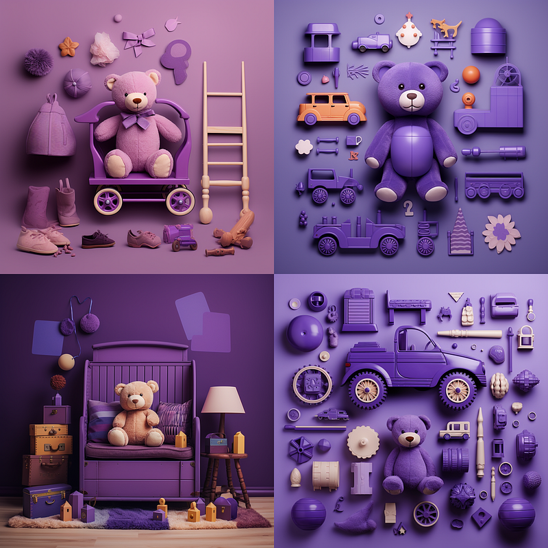
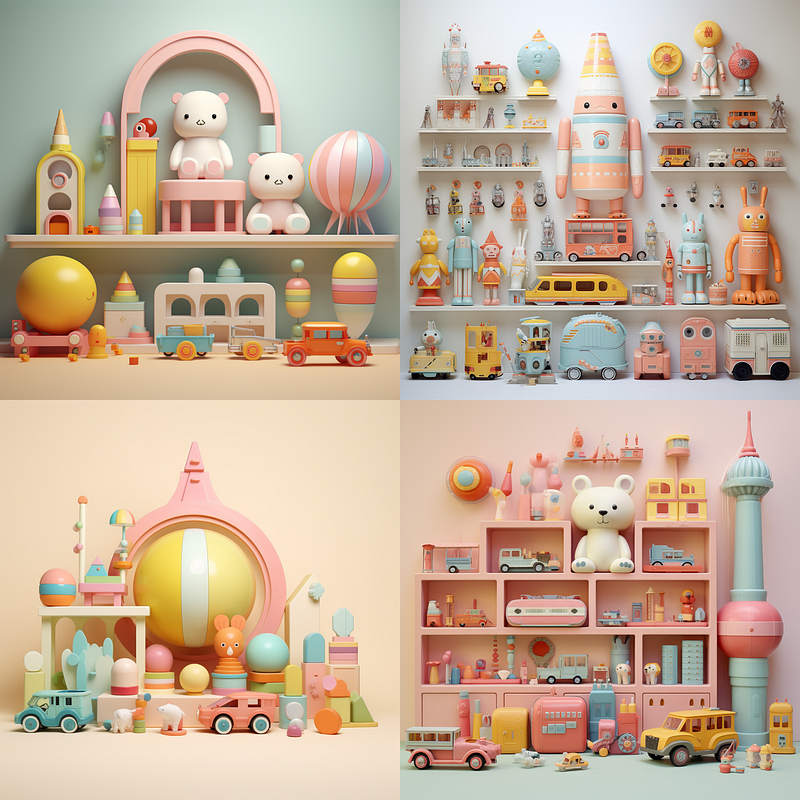
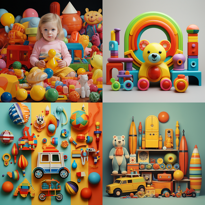
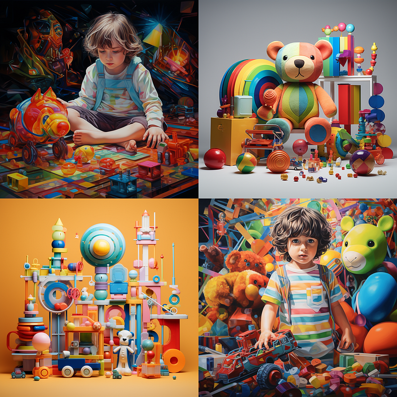
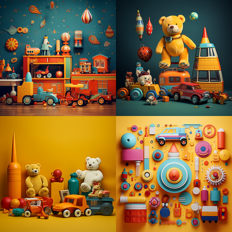
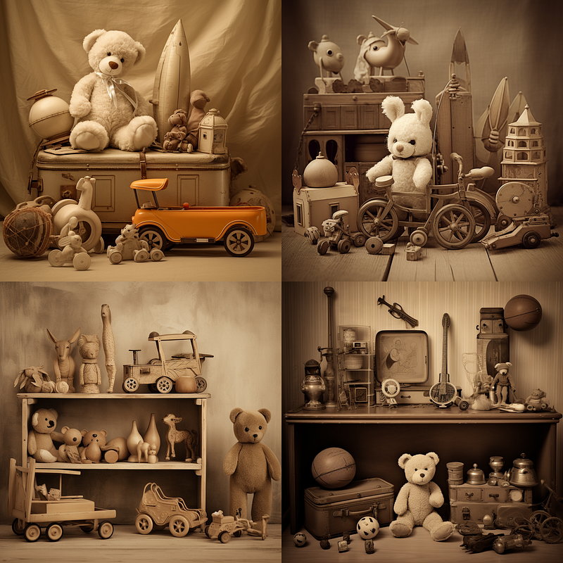
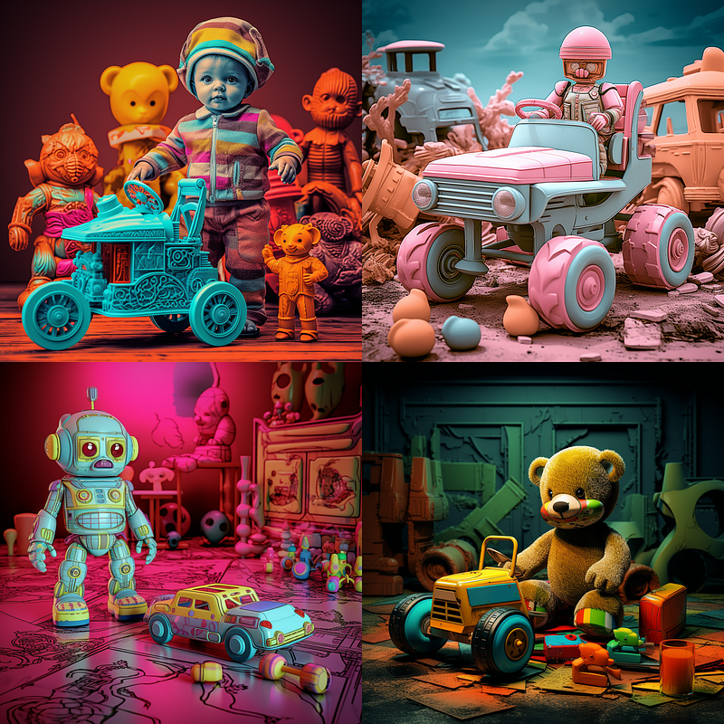
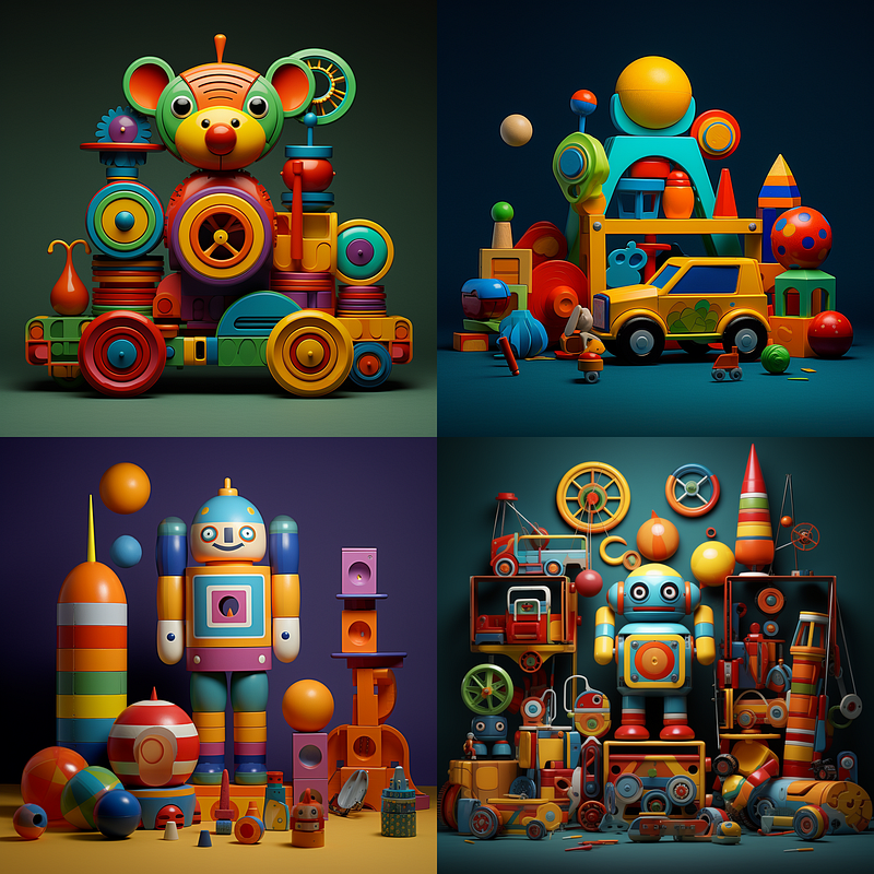
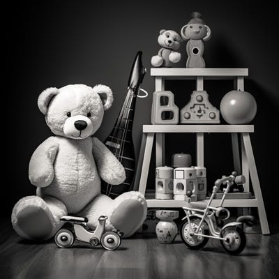
ariety or shade of a specific color.</figcaption></figure><figure id="32d8"><img src="https://cdn-images-1.readmedium.com/v2/resize:fit:800/1*VTMRPV5WLEBsjU0Z3KBexA.png"><figcaption><b>· Infrared: </b>Simulating the appearance of an infrared image with surreal, high-contrast colors.</figcaption></figure><figure id="434d"><img src="https://cdn-images-1.readmedium.com/v2/resize:fit:800/1*JA2S8iZJWN-wSnEHO8r8Vg.png"><figcaption><b>· Metallic colors: </b>Simulating the appearance of metal, with reflective and shiny qualities.</figcaption></figure><figure id="bd02"><img src="https://cdn-images-1.readmedium.com/v2/resize:fit:800/1*jMUbPaNquOOjpq1GC5ftxg.png"><figcaption><b>· Monochromatic colors:</b> Using varying shades of a single color to create a unified visual theme.</figcaption></figure><p id="b63f">Midjourney appears to have a bias towards bright toys, only black and white or grayscale seem to remove the pops of color from this prompt, although for other less stereotypical items monochromatic is likely to work just fine.</p><figure id="a59e"><img src="https://cdn-images-1.readmedium.com/v2/resize:fit:800/1*VYcLyi2ZBSmzjbLb-pKDWQ.png"><figcaption><b>· Neon colors:</b> Bright, almost fluorescent colors that evoke a high-energy, modern feel.</figcaption></figure><figure id="4280"><img src="https://cdn-images-1.readmedium.com/v2/resize:fit:800/1*-YYrAnzSnDbp2xFFylL-fA.png"><figcaption><b>· Ombre colors: </b>A gradual blend or shift from one color to another, often seen in backgrounds or textures.</figcaption></figure><figure id="894a"><img src="https://cdn-images-1.readmedium.com/v2/resize:fit:800/1*qAG9Zu4tBXCCR5CfPDHGYg.png"><figcaption></figcaption></figure><figure id="f485"><img src="https://cdn-images-1.readmedium.com/v2/resize:fit:800/1*qIl5SnLU3LNsgB8cSj6idg.png"><figcaption></figcaption></figure><figure id="d75c"><img src="https://cdn-images-1.readmedium.com/v2/resize:fit:800/1*186ctxrZ9V6Eq7l3UhvD6A.png"><figcaption></figcaption></figure><figure id="d0f1"><img src="https://cdn-images-1.readmedium.com/v2/resize:fit:800/1*9xsgIRr3I3mh7VnA7ASIQA.png"><figcaption><b>· Palette (in this case “spring palette,” “summer palette,” “autumn palette,” and “winter palette” are shown):</b> Refers to the overall range of colors used in an image.</figcaption></figure><p id="cace">There are many ways to use the word palette, these were the most obvious to me. It is possible to image prompt an image of a palette into your images, but it can be hit or miss and takes experimentation. If you are trying for a particular thing, do not be afraid to mix and match terms in this list together in a prompt.</p><figure id="1fc9"><img src="https://cdn-images-1.readmedium.com/v2/resize:fit:800/1*zd2zsnvy80Qh9akAghs9hQ.png"><figcaption></figcaption></figure><figure id="bb12"><img src="https://cdn-images-1.readmedium.com/v2/resize:fit:800/1*KtcBlycX-kezd2TiHfj87A.png"><figcaption>“a child’s toys, vivid-primary-color-palette” left and a “child’s toys, muted-primary-color-palette”</figcaption></figure><p id="9655">I tend to hyphenate these sorts of “multi-words to do a thing” parts of prompts so that Midjourney knows that all the words go together and things are not just randomly applied willy-nilly in my image. The same goes for descriptions like long-wavy-purple-hair and green-eyes, it can help from having purple eyes and green hair. It is not a requirement, but it does seem to help if descriptions are blurring into each other. It can also help to disambiguate words where the color is also a noun, as in the case of an orange versus the color orange.</p><figure id="0c64"><img src="https://cdn-images-1.readmedium.com/v2/resize:fit:800/1*bRTbKmCDsMegmQcmzQSTFw.png"><figcaption></figcaption></figure><figure id="8f4d"><img src="https://cdn-images-1.readmedium.com/v2/resize:fit:800/1*sX_xNTnUYaPxwPEOsTULBQ.png"><figcaption>“a child’s toys, analogous magenta color palette” and “a child’s toy, purple-complementary-color-palette”</figcaption></figure><figure id="ccc1"><img src="https://cdn-images-1.readmedium.com/v2/resize:fit:800/1*BaPG74hCxpySdRbaBtEKqw.png"><figcaption><b>· Pastel colors:</b> Soft, light shades of various colors.</figcaption></figure><figure id="f95d"><img src="https://cdn-images-1.readmedium.com/v2/resize:fit:800/1*rUQ985eOyHv7opX1p5xFpg.png"><figcaption><b>· Polychromatic colors:</b> Featuring multiple colors, often to create a vibrant or lively visual impression.</figcaption></figure><figure id="e5e3"><img src="https://cdn-images-1.readmedium.com/v2/resize:fit:800/1*3ZFPbLAsMhY7mDbturIU-w.png"><figcaption><b>· Prismatic colors:</b> Displaying a full spectrum of colors, often in a dynamic or radiant way.</figcaption></figure><figure id="4ef7"><img src="https://cdn-images-1.readmedium.com/v2/resize:fit:800/1*tT_Mwg8oRuS6HkWIYj1AYA.png"><
Options
figcaption><b>· Saturated colors: </b>Colors that are vibrant and rich, without any dilution or graying.</figcaption></figure><figure id="72a7"><img src="https://cdn-images-1.readmedium.com/v2/resize:fit:800/1*qA0ziecK4NkLcEawqLyWFA.png"><figcaption><b>· Sepia colors: </b>Warm brown tones that give an image a vintage or nostalgic look.</figcaption></figure><figure id="7958"><img src="https://cdn-images-1.readmedium.com/v2/resize:fit:800/1*Ra1cAPtxccyrjseMiZggYw.png"><figcaption><b>· Solarized colors: </b>A method of inverting colors to create an ethereal, surreal quality.</figcaption></figure><figure id="2a2e"><img src="https://cdn-images-1.readmedium.com/v2/resize:fit:800/1*_RKmbxKlFH9mtx0n6vtnRw.png"><figcaption><b>· Triadic colors:</b> Using three evenly spaced colors around the color wheel for a balanced look.</figcaption></figure><p id="e106">Adding a few simple color descriptors can drastically change the images generated from the base prompt “A child’s toys ______.” Knowing how these terms impact your art can help you more easily realize your vision with Midjourney prompts. While this isn’t an exhaustive list of color descriptors, it’s a solid starting point.</p><p id="2255">Remember, when staring at that empty /image line, there’s no “one right way” to approach it. The technology is constantly evolving; what worked in version 3 or 4 of Midjourney might not yield the same results in the current 5.2 version. And what’s effective in 5.2 may be obsolete when version 6 rolls around.</p><p id="e3eb">So cut yourself some slack if you don’t nail the perfect image right away. Generative AI is a journey of trial and error, remixing, and continuous learning. Keep adapting and experimenting; you’re bound to pick up new tricks along the way.</p><h1 id="fdf7">In Conclusion</h1><p id="3efa">Thank you for dedicating your time to reading this color guide. I sincerely hope it enriches your journey through the captivating universe of Midjourney. If you found this article useful, please give it a clap — it really helps! If you’re keen to delve further into these transformative generative art tools, consider following me here on Medium.com for future articles. Your support is invaluable, and I can’t wait to see what you’ll create. Happy exploring!</p><p id="1e40">If you would like to find out more ideas for color be sure to check out <a href="https://readmedium.com/midjourney-explorations-12-color-variations-with-image-and-multi-prompts-a8289a5da8b7">Midjourney Explorations: #12 — Color Variations with Image and Multi-Prompts.</a></p><figure id="fdd1"><img src="https://cdn-images-1.readmedium.com/v2/resize:fit:800/1*gA4pVUReUroKoRlvwaNfaw.jpeg"><figcaption></figcaption></figure><div id="c8d9" class="link-block">
<a href="https://pub.aimind.so/midjourney-explorations-4-art-media-lets-draw-59699594b09d">
<div>
<div>
<h2>Midjourney Explorations: #4 — Art Media, Let’s Draw</h2>
<div><h3>There are countless mediums for human art and Midjourney can do interesting things with so many of them! There are so…</h3></div>
<div><p>pub.aimind.so</p></div>
</div>
<div>
<div style="background-image: url(https://miro.readmedium.com/v2/resize:fit:320/1*8UUoYERB2Wao17B66XyJqQ.jpeg)"></div>
</div>
</div>
</a>
</div><div id="4de3" class="link-block">
<a href="https://pub.aimind.so/midjourney-explorations-5-art-media-lets-paint-b6d996464fa5">
<div>
<div>
<h2>Midjourney Explorations: #5 — Art Media, Let’s Paint</h2>
<div><h3>Dive into the world of painting media using Midjourney in this fifth installment of Midjourney Explorations! Adding…</h3></div>
<div><p>pub.aimind.so</p></div>
</div>
<div>
<div style="background-image: url(https://miro.readmedium.com/v2/resize:fit:320/1*IN2jvKa8mXPXHt6KaxmlyA.png)"></div>
</div>
</div>
</a>
</div><h2 id="417c">A Message from AI Mind</h2><figure id="ecd4"><img src="https://cdn-images-1.readmedium.com/v2/resize:fit:800/0*5Wm7sOfTpe5DEbhg.gif"><figcaption></figcaption></figure><p id="0438">Thanks for being a part of our community! Before you go:</p><ul><li>👏 Clap for the story and follow the author 👉</li><li>📰 View more content in the <a href="https://pub.aimind.so/">AI Mind Publication</a></li><li>🧠 Improve your <a href="https://www.aimind.so/prompt-generator?utm_source=pub&utm_medium=message">AI prompts effortlessly and FREE</a></li><li><b>🧰 Discover <a href="https://www.aimind.so/?utm_source=pub&utm_medium=message">Intuitive AI Tools</a></b></li></ul></article></body>