
Making a Functional and Indicative KPI in Power BI
Creating effective Key Performance Indicators (KPIs) in Power BI is crucial for any business looking to leverage data-driven insights. This article will guide you through the process of designing KPIs that are not only functional but also indicative of your business performance. Here’s what you’ll learn:
Understanding KPIs:
- Definition and importance of KPIs.
- How KPIs differ from other metrics.
- Examples of common KPIs used in various industries.
Setting Clear Objectives:
- Identifying key business goals.
- Determining what you want to measure.
- Aligning KPIs with strategic objectives.
Data Integration:
- Connecting various data sources to Power BI.
- Ensuring data accuracy and consistency.
- Handling data from multiple systems and formats.
Design Principles:
- Best practices for creating visually appealing KPIs.
- Using Power BI features to enhance KPI visualization.
- Avoiding common design pitfalls.
Customization:
- Tailoring KPIs to fit your specific business needs.
- Using custom visuals and calculations.
- Adapting KPIs for different departments and roles.
Performance Monitoring:
- Setting up dashboards for real-time monitoring.
- Analyzing KPI trends and patterns.
- Using KPIs to drive continuous improvement.
By the end of this article, you’ll have a comprehensive understanding of how to create KPIs in Power BI that truly reflect your business’s performance and drive strategic decisions. Whether you’re a seasoned data analyst or new to Power BI, these insights will help you make the most of your data and enhance your business intelligence capabilities.
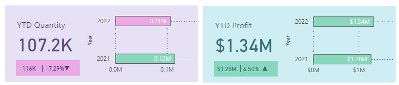
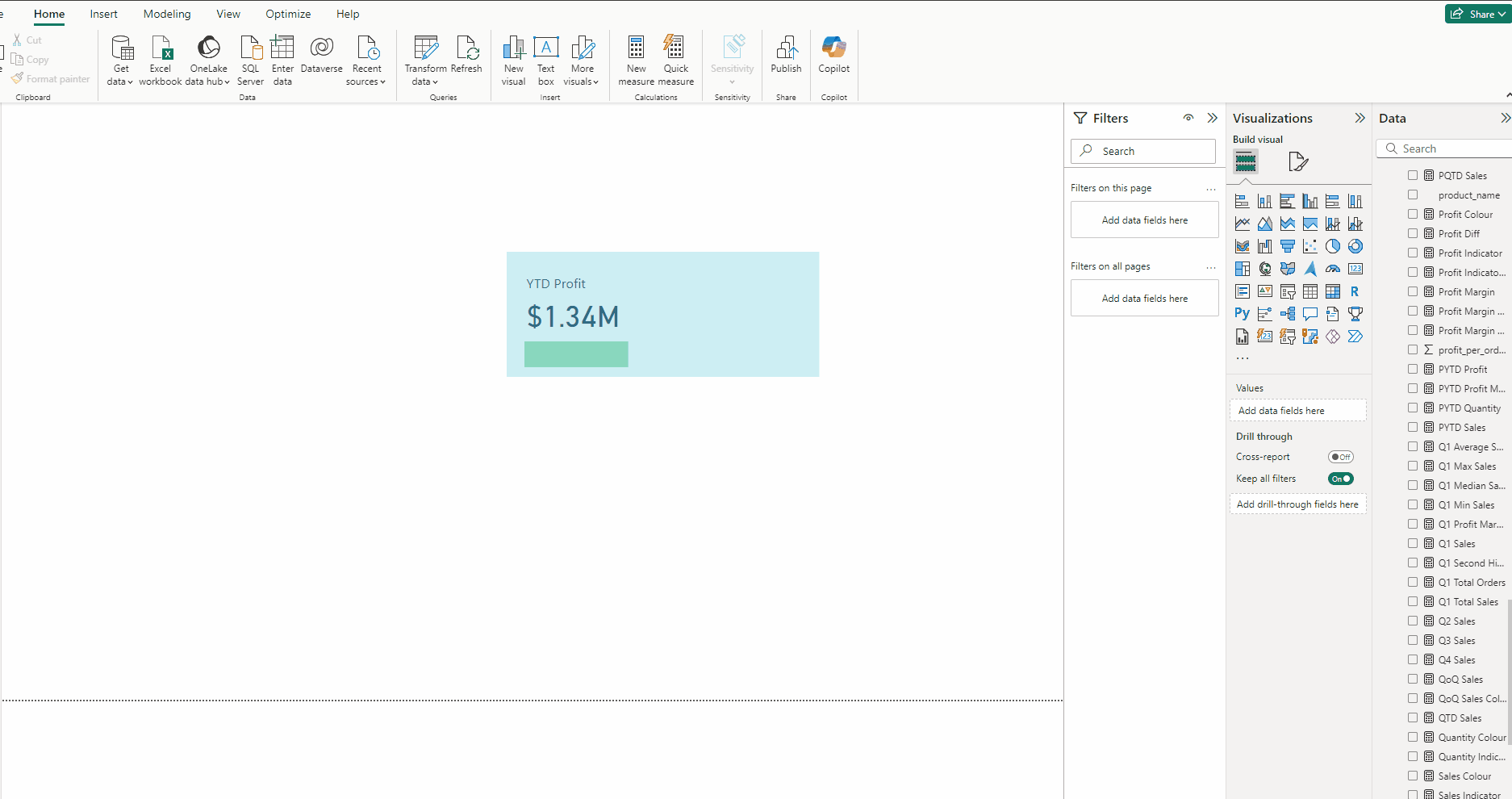
This is how our end result is going to look like:
Building the KPI
We will go through these steps:
- Creating the Calendar Table
- Creating the DAX Functions
- Creating the KPI Base
- Creating the YTD Profit Card
- Creating the Base for Subscript KPI
- Creating the PYTD and YoY KPI Cards
- Creating the Trend Indicator
- Creating the Bar Chart
Happy learning!
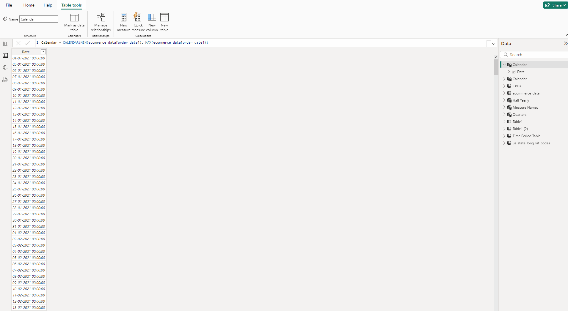
Creating the Calendar Table:
Calendar = CALENDAR(MIN(ecommerce_data[order_date]), MAX(ecommerce_data[order_date]))

The CALENDAR functions takes two arguments — StartDate and EndDate.
These two values are provided by the MIN() and MAX() functions, respectively, applied to the order_date column of the main table ecommerce_data.
- In the Table view tab, Table tools select New table.
- Type the above DAX and head back to Report view.
Year = YEAR(Calendar[Date])

- In the Table view tab, Table tools select New Column.
- Type the above DAX and head back to Report view.
- Now scroll the Main table to find order_date, then click on it and drag it to the Date column in Calendar table, vice versa will also do the task..
- This creates a Many to one(*:1) relationship between the Main table and Calendar table because Calendar table.
Below is the complete guide on connecting main table to the calendar table, do check it out, it will clear all doubts if there is any.
Creating the DAX Functions:
YTD Profit = TOTALYTD(SUM(ecommerce_data[profit_per_order]), Calender[Date])
The DAX formula calculates the Year-to-Date (YTD) profit for the e-commerce dataset. It calculates the cumulative profit from the beginning of the year to the current date based on the Calender[Date] column.
PYTD Profit = CALCULATE(SUM(ecommerce_data[profit_per_order]), SAMEPERIODLASTYEAR(Calender[Date]))
CALCULATE
The CALCULATE function evaluates an expression in a modified filter context. Essentially, it allows you to change the context in which data is evaluated.
Syntax:
CALCULATE(<expression>, <filter1>, <filter2>, ...)SAMEPERIODLASTYEAR
The SAMEPERIODLASTYEAR function is a time intelligence function that returns a table with the same period in the previous year. It’s useful for year-over-year comparisons.
Syntax:
SAMEPERIODLASTYEAR(<dates>)YoY Profit = ([YTD Profit] — [PYTD Profit])/[PYTD Profit]

Profit Colour = IF([YoY Profit]>0,”Green”,”Red”)

It assigns Profit Colour Green or Red depending on the value of YoY Profit greater or less than zero respectively.
All these are basic DAX functions which is always good to know, refer the below article to understand them, it’s under 3 min read.
Creating the KPI Base:
- Go to the Insert tab and select Rectangle from Shapes.
- In the Format visual → Style press fx in Colour.
- Keep Format Style → Rules and in field Profit Colour.
- For Green select #CEEEF3 and for Red select #E6E1F5, press OK.
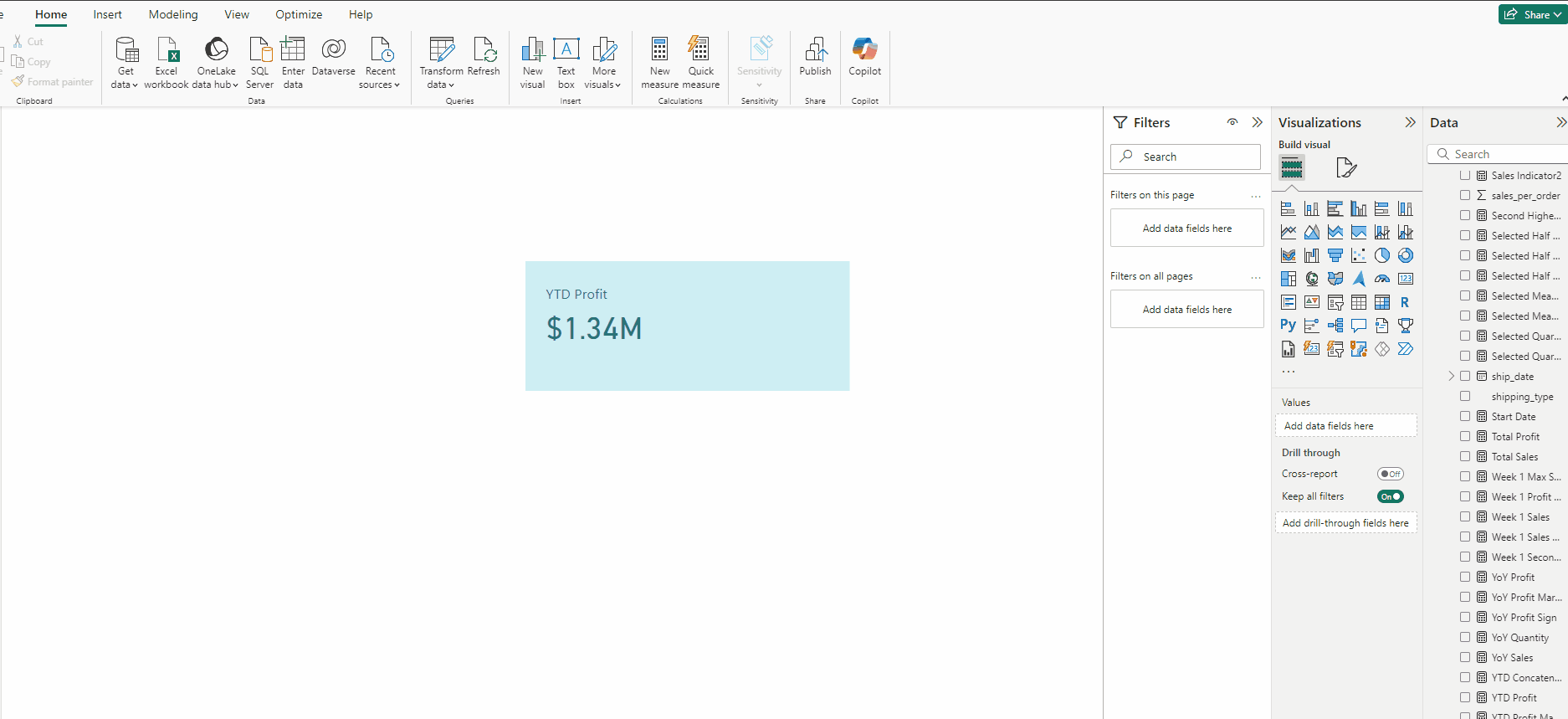
Creating the YTD Profit Card:
- Add a Card(new) and put YTD Profit to it.
- In Format visual → Callout values set size to 30 and for Color press fx.
- Keep Format Style → Rules and in field Profit Colour.
- For Green select #33707B and for Red select #5C4A7B, press OK.
- Repeat the same Format visual → Callout values → Label.
- In Cards turn off both Background and Border.
- Finally in Format visual → General → Effects turn off Background.
Creating the Base for Subscript KPI:
- Copy the KPI Base Rectangle.
- In the Format visual → Style press fx in Colour.
- For Green select #89D8BE and for Red select #EBA9E5, press OK.
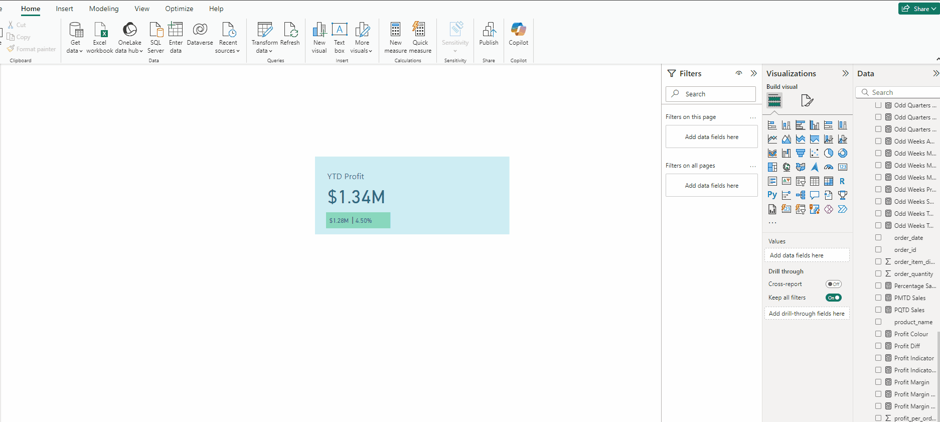
Creating the PYTD and YoY KPI Cards:
- Copy the YTD Profit KPI Card.
- Put PYTD Profit Card to it.
- In Callout values set size to 10 and turn off Label.
- Copy the PYTD Profit KPI Card.
- Put YoY Profit to it.
- In the Insert tab and select Text box.
- Type |, expand Effects and turn off Background.
Creating the Trend Indicator:
First we need this DAX:
Profit Indicator 2 = var positive_icon = “▲”
var negative_icon = “▼”
var result = IF([YoY Profit Margin]>0, positive_icon, negative_icon)
return result
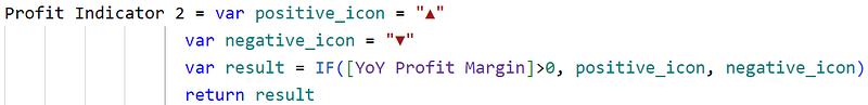
It simply outputs ▲ or ▼ depending on the value of YoY Quantity.
Check out this article to learn more about KPIs with trend indicators.
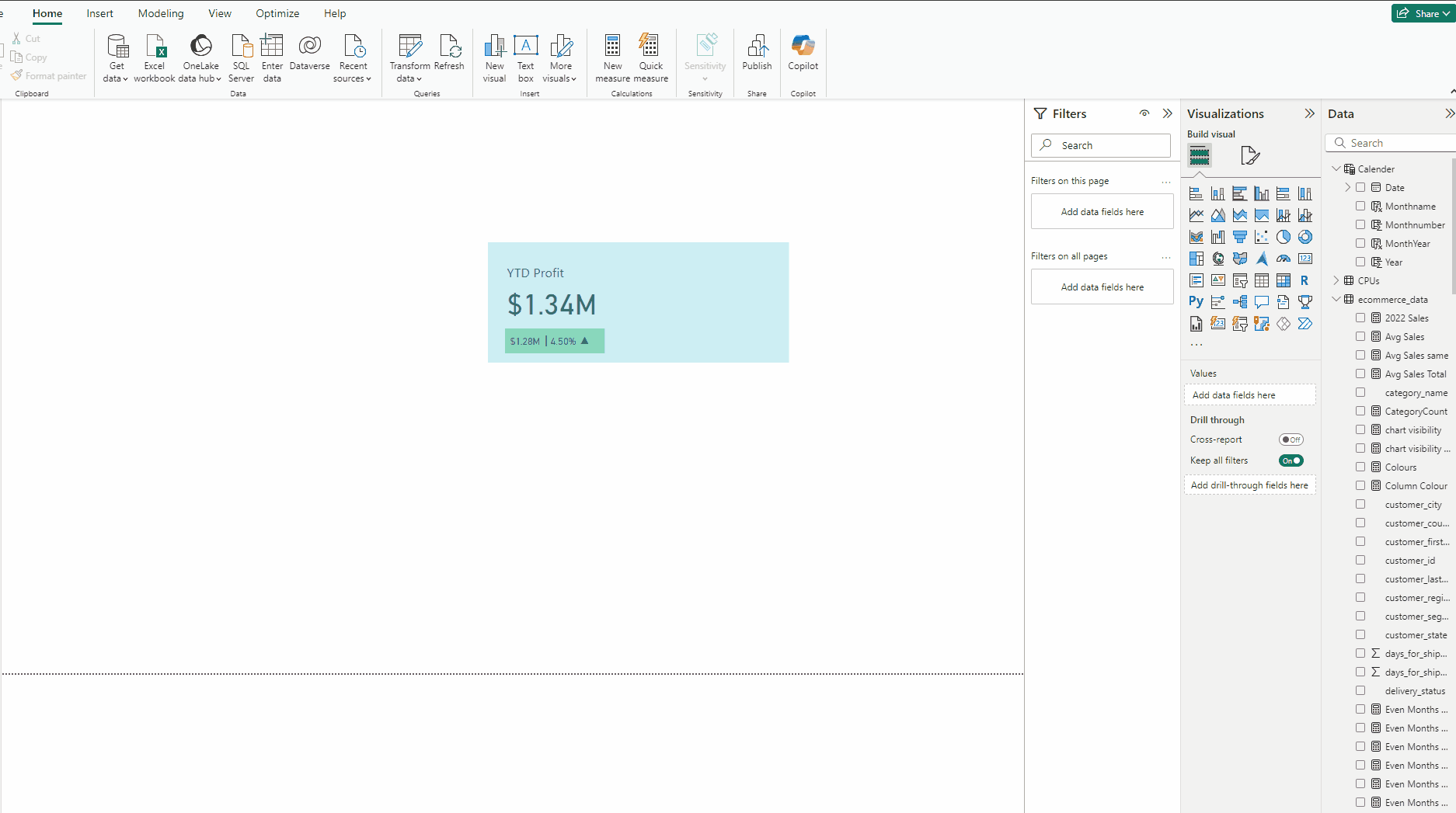
- Copy the YoY Profit KPI Card.
- Put Profit Indicator 2 Card to it.
Creating the Bar Chart:
- Add a Clustered bar chart.
- Put Year from Calendar table in Y-axis and profit_per_order in X-axis.
- In Format visual → Visual expand X-axis and turn off Title.
- Expand Bars and for Color press fx.
- For Green select #89D8BE and for Red select #EBA9E5, press OK.
- Turn on Data labels, set Position to Inside end.
- In Data labels → Value set Value decimal places to 2.
- In Format visual → General turn off Title.
- In Effects turn off Background.
- In Format visual → Visual expand Gridlines and for both Horizontal and Vertical set Color to Black.
Download the data for the Project from this link.
Download the PBIX file for the project from this link.
Thank you for your attention!
Follow me or subscribe to get all my Power BI articles!
Don’t forget to subscribe to
👉 Power BI Publication
👉 Power BI Newsletter
and join our Power BI community:


