
Let the Light Come In…
important artists using light as their dominant medium in selected key works
It can be argued that all visual artists use light. Otherwise their work wouldn’t be visible, right? Of course, the entire media of film and photography rely on light from source, through process, to finished work. Some artists, though, have explored light and its effects as the work in itself. Here, we’ll take a look at just a few key examples that represent some of the varied approaches to light as art…
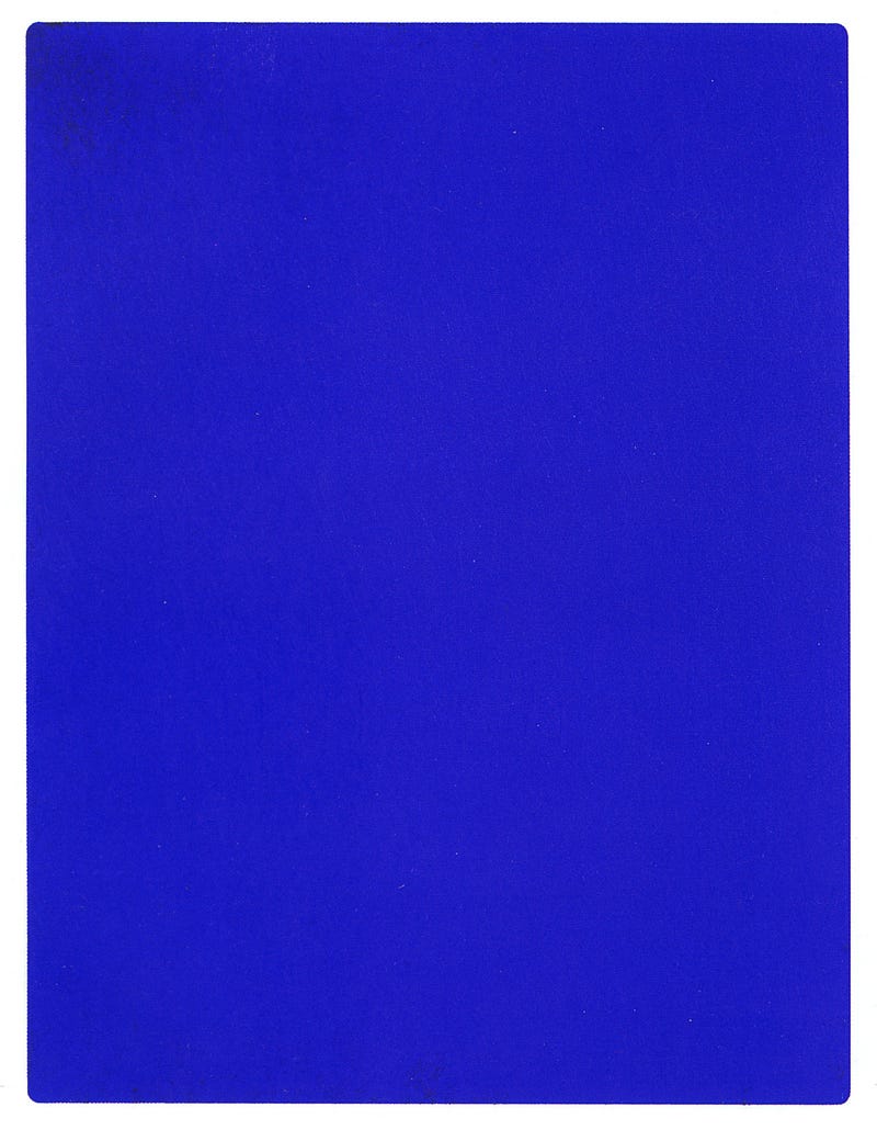
Yves Klein began producing Blue Epoch works during the 1950s, using his signature pure ultramarine pigment he called International Klein Blue, presenting the colour as the art. He attempted to capture the experience of colour without tangible substance. Inspired by the infinite blue of a clear sky, he produced large monochrome canvasses that, if viewed up close, the boundaries of the colour-field were outside the observer’s field of vision. He hoped such paintings would then be perceived as pure colour, the notion of surface would disappear, and the viewer would be within colour. He explained his concept as the viewer being inside a corridor of light reflected from the surface and extending beyond them as a continuum of blue.
During the mid-1960s, Conceptual Art became obsessed with separating the meaning from what was visible. Indeed, art could be invisible with its driving concept expressed through material, or language, or actions which did not constitute the so-called art. Art could be purely experiential or intellectual in nature.
Dutch artist Jan Dibbets reacted to this trend by using light as his starting point, so the concept grew from the visual as opposed to the literal. He enjoyed Conceptual Art that could be seen. After exploring the problems of representing three-dimensional space on a flat picture plane, first in abstract paintings and then with photography, he moved on to investigate how changing light interacted with spacial volumes. He experimented with different ways of recording such interactions over time as positions or conditions changed.
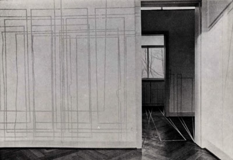
Some of these early works, produced in 1969, were simply tracking the edge of shadows within an interior space as they moved across a blank wall, using lengths of adhesive tape applied at preset intervals during the day to record its progress. Around the same time, Dibbets was also using sequential photography to record ‘time-lapse’ documents of shadows as they moved according to the time of day, cast by natural and/or artificial lighting.
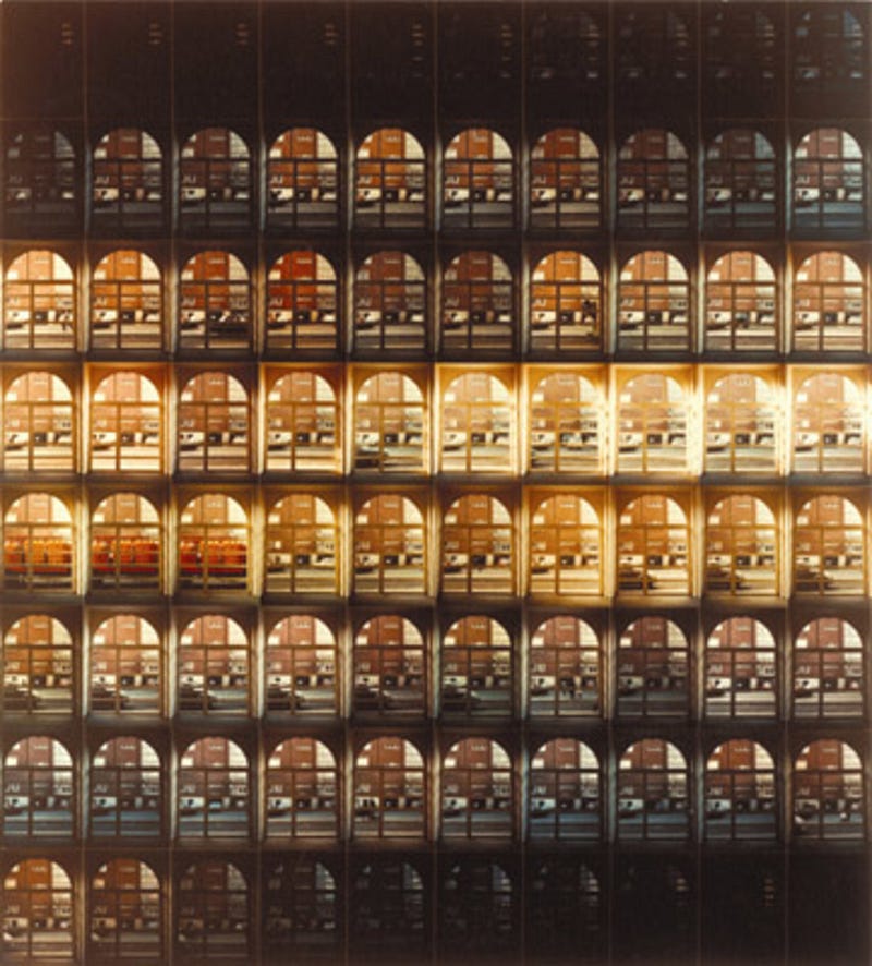
These explorations culminated in one of his best known series of works that consisted of sequential photographs of an aspect of the gallery in which the finished pieces would be displayed. The photographs were taken at set intervals over the course of a whole day and displayed in chronological sequence in a single tiled grid. Thus unifying each fragmented moment into a whole that recorded the flow of time and the changing light, integrating the viewer not only into a shared position with the artist, but giving them a reference point that combined time and space. (Time and Relative Dimensions in Space!)
These works, such as Longest Day of 1970 from Noon to Sundown Aktionsraum I, Munchen, and Shortest Day at Konrad Fisher Gallery, also 1970, reframed the idea of photography as the capturing of an instant and presented a sort of short documentary film that could be seen all at once. The works both questioned and celebrated our relationship with time — from the way we order our days to the cosmic timescale of the seasonal cycle as our world rotates on its axis and orbits our star. They also encouraged an appreciation of how light altered the aesthetics, or mood, of our surroundings… and ourselves.
Dibbets was still operating in a representational format, recording light and shadow — which is what photography does, by default — and drawing attention to the passage of time and passing of the seasons by the changing light — which is what sundials do, by default. Whereas, several of his conceptual contemporaries were experimenting with light-emitting artwork...
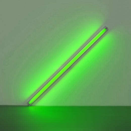
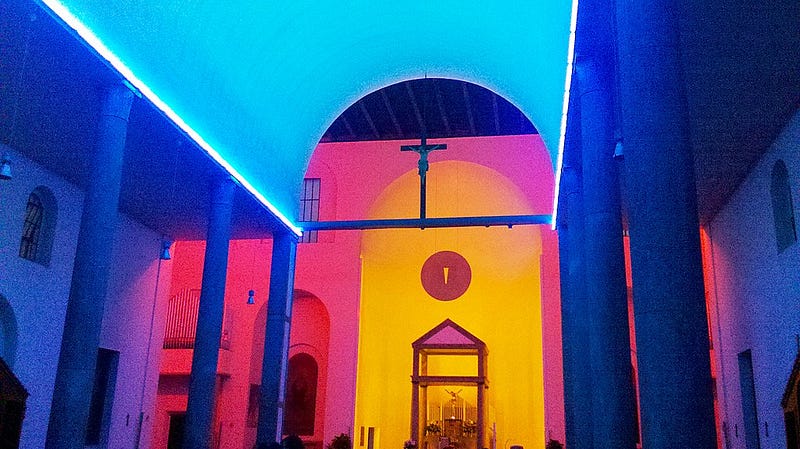
Dan Flavin gives us some great examples of art becoming light and the light being the art… Which reminds me of a visit to London’s Tate Modern where one of his ‘Diagonals’ was on show, expressing his seminal piece, Diagonal of Personal Ecstasy aka The Diagonal of May 25 1963 (To Constantin Brancusi), which is a recognised masterpiece of Minimalism. The work consists of a fluorescent lighting tube mounted at an angle of 45 degrees, low on a white wall and has been displayed in various colours.
The one I first experienced was bright green. It had attracted a small knot of gallery visitors who stood at a respectful distance. They were looking at something very familiar because such lighting tubes were once ubiquitous, particularly in kitchens of the 1970s, only this one was sheathed in a pure green transparency and presented in an exhibition. So it must be art? A few were clearly puzzling things out when my daughter, who was still a toddler back then, gleefully bounced right up to the light and turned around, raising her hands to enjoy their illuminated greenness. It was then her gaze shifted and she exclaimed, “Daddy, the art’s all over you!”
Instantly, the puzzlement left our fellow viewers and one asked her, “Are we part of the art too?” She nodded. We all were. It was interactive. The green saturated colour-field extended from its source and only became obvious when interrupted by objects, or persons. We were united by that pure intangible colour that our presence physically extended into a realm of sculptural form and figurative life-study. It was an artwork to be appreciated by not necessarily looking at it but observing its aesthetic and, in this case, social effect upon its environment. Now, that’s profound on so many levels, not least within the broader context of art history. Perhaps also, in this example, associating the colour green with environmental issues linked with energy consumption and the toxic gasses within the glowing tube.
In many ways this also refers us back to Yves Klein’s concept of the ‘corridor of light’ that emanates from the work and immerses its audience, bringing us to another notable artist who tries to capture the infinite beauty of our shared sky.
James Turrell is well-known for his monumental architectural projects built to create environments that showcase natural light. Their unchanging artificial structures counterpoint the ever-changing conditions… from season-to-season, day-to-day, hour-to-hour… minute-to-minute. Sometimes his gallery installations take a contrasting approach, secluding the viewer from natural light, immersing them instead in pure colours using artificial lighting design.
Notably, he’s an artist coming from a scientific background, qualifying first with a degree in Perceptual Psychology, in the mid-1960s, before exploring the aesthetic and emotional effects of projected lightworks presented as art. His studies included exploration of the Ganzfield effect which causes hallucinatory distortions of perception when a viewer is presented with a uniform visual stimulus such as a featureless colour-field or lack thereof, such as in a darkroom. Most of his massive sculptural works are site-specific, integrated into the land, and requiring an element of ‘pilgrimage’ to reach and experience them. It’s no accident that some resemble Modernist temples and shrines.
Perhaps his most famous project is an ambitious monumental Earthwork comprising a series of spaces excavated into the volcanic mound of Roden Crater in Arizona. It’s a work in progress, since 1979, with plans to invite public visitors in 2024. Intended as a vast ‘naked-eye observatory’, the various architectural spaces, observation portals, and platforms are designed in alignment with astronomical events and in response to seasonal shifts. In many ways it’s a logical extension of the concepts introduced by the pioneering practitioners of ‘eARTh’ — or Land Art — in the early 1970s, most notably Nancy Holt and Robert Smithson.
I have enjoyed some times of contemplation in one of Turrell’s more modest Skyspaces, an ongoing series of works that he’s been building in varied locations since their first iterations of Lunette and Skyspace I, installed at the Guggenheim Foundation in 1974. The media used are catalogued as, “structural cut to outside sky, interior filled with daylight and neon light.”
The Deer Shelter Skyspace at Yorkshire Sculpture Park was first expressed conceptually as a set of plans drawn-up by James Turrell during his extended residency there in 1993. He was responding to the partially sunken deer shelter, surviving from the estate’s days as a hunting park in the eighteenth-century which, in 2006, was finally altered into the Skyspace according to Turrell’s blueprints.
One enters through the triple arches of the original facade and passes a protective screen wall into a contrastingly modern, concrete-lined interior space featuring a continuous bench that runs uninterrupted along three of the four walls. The square room itself works as a piece of minimalist modern sculpture that presents a choice to visitors of whether to sit alongside or opposite their companions. Either way, the gaze is inevitably drawn toward the single source of illumination: a square portal cut into the ceiling, eight-metres above. It is unglazed and the chamfer of its framing edges cut to present little or no visible edge plane, affording the observer below a raw view of the sky directly overhead.
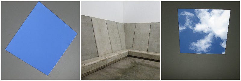
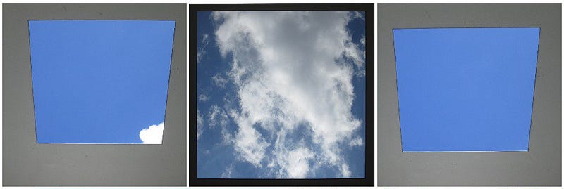
On a clear day, this eloquently expresses the same desire to capture the infinite blue depth of sky as described by Yves Klein. Most days present an ever-changing composition of clouds, continually varying their tone and textures. On a perfect day, one may enjoy a beautifully balanced interplay of both bright blue and white cloud.
The slope of the bench back accommodating a comfortable viewing angle makes for a meditative, hypnotic experience. Although there is no substance within the frame, it begins to resemble a screen showing a movie that induces an altered perception of time and space. Additionally, the square of light projects onto the walls and floor of the viewing chamber, travelling a slightly different path through each day of the year — something that Jan Dibbets may have enjoyed recording with masking tape outlines.
Another set of equally memorable installations that use light as their sole medium were installed at Gallery Oldham for its opening in 2002. The artist, Peter Freeman refers to these as “architectural light interventions” and were placed in two important, though non-gallery public areas of the building. His neon light fittings for the fire-escape stairwell create an ascending graduation from pink to blue, only visible as a whole from outside where it can be seen as a mimic of an idealised sky at sunrise and set. The other intervention, Colour Shift, involves the two main lifts, operating as a time-based experiential diptych that literally alters perception, down to the biochemical level…
The lifts, facing each other across the double height foyer are each fitted with Freeman’s neon lighting, one in a warm pure pink and one in a cool vibrant green. As the doors open and close, their light spills out across the pale tiling of the floor and reflects in the brushed steel doors of its counterpart opposite. However, that’s a minor detail of the work. The real perceptual magic occurs when one uses the lift.
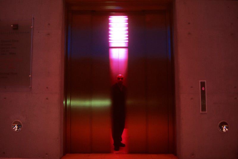
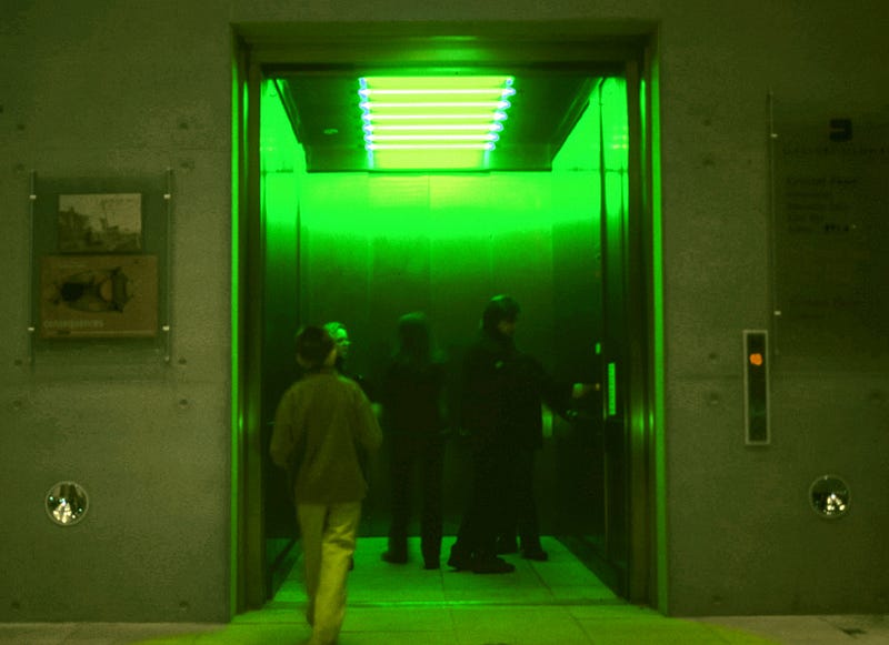
The welcoming warmth of the pink lift is quite calming but during the time it takes ascending two storeys, the saturated pure colour fatigues the receptors in the retinas of those within, depleting the neurotransmitters. Our eyes normally have four types of cells that respond to light: ‘rods’ react to dim light but not colour and three varieties of ‘cones’ reacting to red, green, or blue. When the occupants are released from the lift, their eyes have over-compensated for the red-shift and no longer register that end of the spectrum. The world around them seems overly blue-green, pale, cold and clinical, a little disconcerting perhaps. However, the return journey in the strange ‘chemist-shop’ green lift will adjust their visual perception in the other direction, instead fatiguing the cones responsible for cold colours. So, for a short time after they disembark, the world seems warm and welcoming, as if viewed through rose-tinted spectacles.
Freeman maintains that his interest lies in the weightless, poetic beauty of light itself, but it’s also easy to read quite profound ideas into the elegant simplicity of Colour Shift. It’s a clear expression of existentialism and a reminder that all our experience come through the unique filters of our own physical senses. We are immersed in the light to such an extent that it changes us on a biological level, approaching Yves Klein’s dream of being within colour.
It also links human scale environments with the vast distances of the observable universe where astronomers and astrophysicists use the red-shift of light to calculate the unimaginably cosmic scale and speeds of distant galaxies… Here, we are elevated into the realms of magic, linking the microcosm of our insular cellular being, to the infinite macrocosm of shared reality… Oh, what a lift!
Light in the work of Cerith Wyn Evans is also discussed, by Remy Dean, in Signifier.
* All images are used with license or presented here for educational purposes under fair usage policy.