
Implement Dark Mode Using JavaScript, CSS, and Third-Party Libraries
An introduction to dark mode and a number of implementation approaches
In terms of web design, a light-on-dark color scheme (also called black mode, dark mode, dark theme, or night mode) is a color scheme that uses light-colored text, icons, and UI elements on a dark background.
The opposite color scheme is called dark-on-light color scheme, light mode, or light theme.
Computer screens start with dark mode by the imitation of cathode-ray tubes used back then. When light mode was introduced in WYSIWYG (what-you-see-is-what-you-get) word processors to simulate ink on paper, the skeuomorphic approach gained popularity. And quickly, light mode became the norm.
Since the year 2015, especially for the last couple of years, dark mode has gained a lot of traction.
There are a number of reasons for users to choose dark mode:
- Energy saving: Light on the dark mode requires less energy to display.
- Eye protection: Science shows that negative polarity (dark mode) is less harmful to eyes in the long run than light mode.
- Esthetics concern: Dark mode is stylish and hip for some UI design.
Well, we are not going to throw away light mode. In fact, most electronic devices still have light mode as default. Light mode is the skeuomorphic approach, and it reads better under strong (sun) light.
Dark mode is a choice. In a sophisticated front-end UI, it becomes a must to support dark mode, for accessibility and usability.
Media Query for System Preferences
prefers-color-scheme is a CSS media feature that is used to detect if the user has requested the system to use light mode or dark mode.
no-preference: It indicates that a user has notified the system that no mode is preferred. This is the default value.light: It indicates that a user has notified the system that light mode is preferred.dark: It indicates that a user has notified the system that dark mode is preferred.
Since most systems are designed for light mode, it may not need to be in the media query.
Here is an HTML file to display Hello, World!
The page is displayed on the browser like this:

We add the media query for dark mode:
Lines 8 - 13 set the color for dark mode.
In the above code, the black background and the white text are used for simplicity.
In real applications, off white and off black are usually used. Off white is an umbrella term for a variety of shades that differ only slightly from pure white. Similarly, off black is an umbrella term for a variety of shades that differ only slightly from pure black.
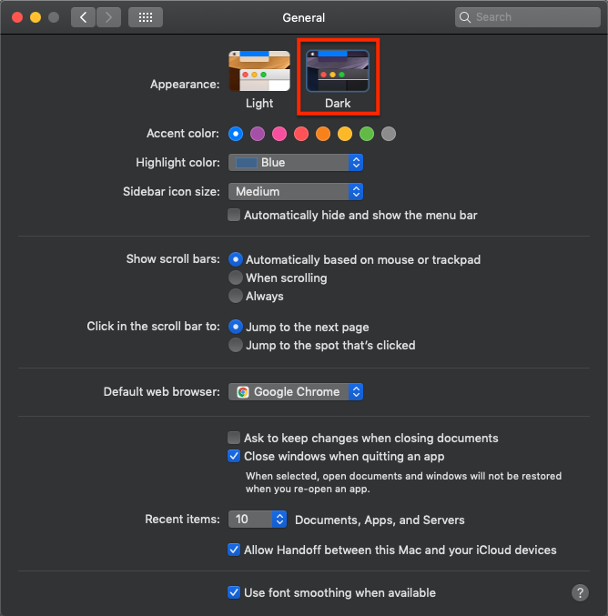
Go to Mac system preferences to change the appearance to dark mode.
The page is displayed on the browser like this:

Oops, we forgot to make the body background black. Since light mode is the default mode, dark mode needs to take care of more things to overwrite the default settings.
Here is the fix:
Lines 8 - 10 set the body background black.
Now we see the proper dark mode:

Is there anything that we can improve from the above code?
Yes. We can set dark mode CSS on body only, since div will inherit the background and color from its ascendant.
JavaScript Code Tracking System Preferences
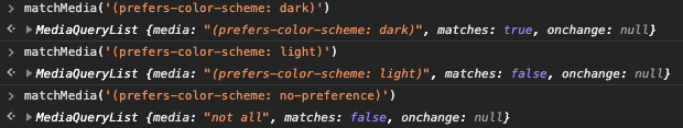
matchMedia() is a method of the Window’s interface. It returns a new MediaQueryList object that can then be used to determine if the document matches the media query string. It also listens to the media query changes.
As we have set Mac system preferences to dark mode, matchMedia() returns the following values:
Alternatively, we can use JavaScript to support both light and dark modes.
JavaScript code could be in the head or body. It is recommended to put it in the head. For this article, we leave it in the body for a change.
Line 11 checks the media query.
Lines 12 - 15 define a function to set up the color theme based on system preferences. This function is called at line 16. Whenever color mode changes, the color theme will be reset by line 17.
Well, instead of changing style directly, the recommended way is to add or remove a class regarding the dark theme.
If it is dark mode from system preferences, the dark class is added to body (line 20). Otherwise, the dark class is removed from body (line 22).
Site-Specific Preferences in Local Storage
We have gone through how to switch color modes based on system preferences. What if users want to override system preferences for a site?
In this case, a common approach is to save a user’s preference in local storage. If the preference is in local storage, a specific class will be added to the body to display the preferred color theme.
In the previous example, we get colorScheme from matchMedia:
const colorScheme = matchMedia('(prefers-color-scheme: dark)');Instead, we can get it from localStorage:
const colorScheme = localStorage.getItem("prefers-color-scheme");In addition, we can use the combination of localStorage and matchMedia:
const colorScheme = localStorage.getItem("prefers-color-scheme")
  || matchMedia('(prefers-color-scheme: dark)');
Dark mode toggle
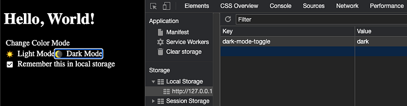
dark-mode-toggle is a third-party library, which is a custom element that enables a color toggle or switch on a website. It reads the dark-mode-toggle property from local storage and sets the mode accordingly. If the dark-mode-toggle property is not set, it follows system preferences.
The following is the user-defined light mode. You have the choice of whether to save the setting in local storage.
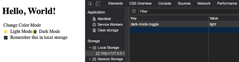
If you uncheck Remember this in local storage, the dark-mode-toggle property will be removed from local storage.
The following is the user-defined dark mode.
Here is the HTML code:
Lines 8 - 12 define the style file for light mode.
Lines 13 - 17 define the style file for dark mode.
Lines 18 - 21 import dark-mode-toggle.
Lines 25 - 32 use the dark-mode-toggle component, along with the color mode switch. If the appearance is defined to be toggle at line 28, it will only show the selected mode.
The following is the style file for light mode.
The following is the style file for dark mode.
Darkmode
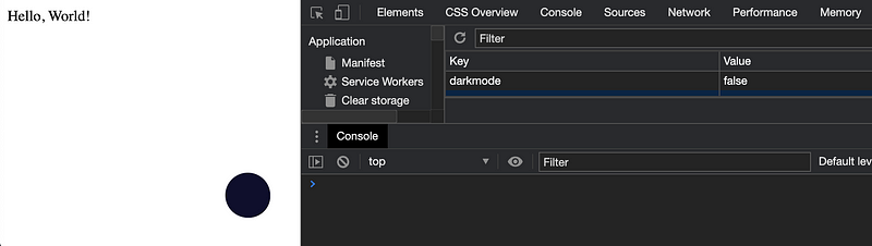
darkmode-js is a third-party library, which is a simple way to add dark mode to a website. It uses the CSS mix-blend-mode to blend an element’s content with its parent and background. It reads the darkmode property from local storage and sets the mode accordingly. If the darkmode property is not set, it follows system preferences.
The following is the user-defined light mode. You click the dot at the lower right corner, and the selection will be saved to local storage.
The following is the user-defined dark mode.
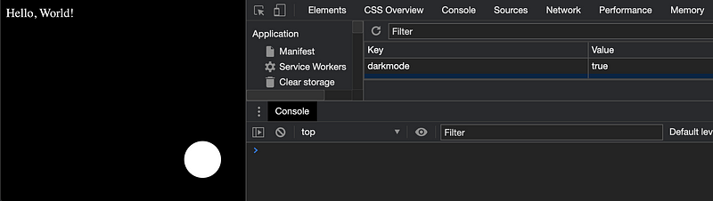
When the color mode changes, it has some sort of animation, which is captured by the following video clip.
Here is the HTML code:
Line 7 imports darkmode-js.
Line 12 shows the control widget.
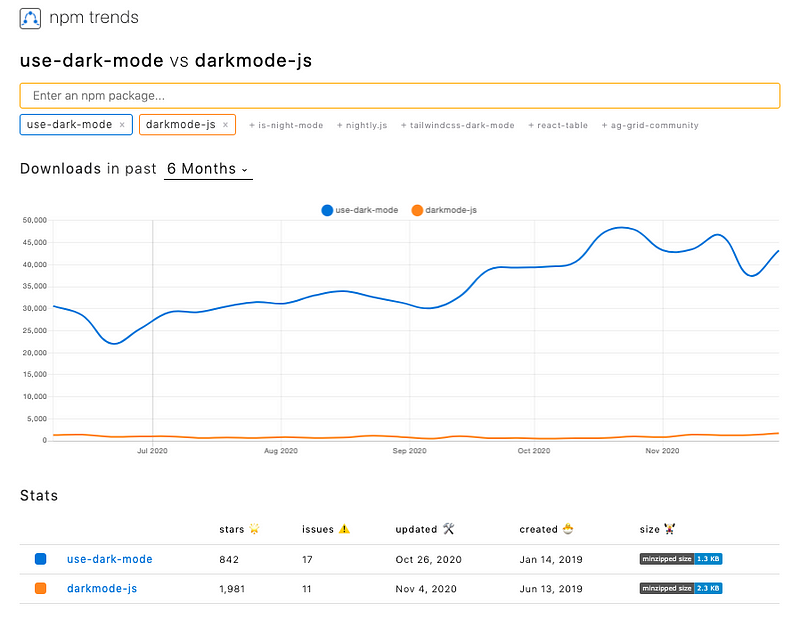
Literally, it is one line of code. No wonder darkmode-js is rated more popular by npm trends for JavaScript solutions.
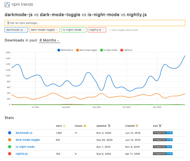
Other JavaScript libraries
- is-night-mode: This is a library to check if it’s dark mode based on the current time, the local storage property, or system preferences.
- nightly.js: This is a library to set dark mode based on system preferences. It enables user selection, but it is yet to put the user setting into the local storage.
useDarkMode Hook
There is a popular React implementation: use-dark-mode.
useDarkMode is a custom React Hook that helps to implement dark mode. The color theme is stored in local storage. The property name is configurable, and the default name is darkMode.
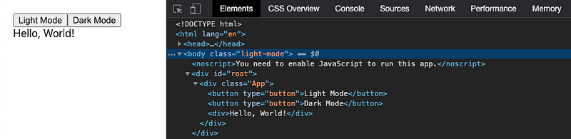
The following is the user-defined light mode, where the body is configured with the light-mode class.
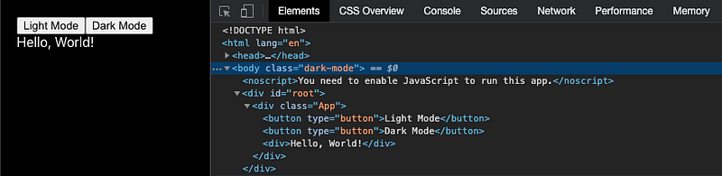
The following is the user-defined dark mode, where the body is configured with the dark-mode class.
We have embedded this example in a Create React App environment.
npx create-react-app my-appInstall use-dark-mode:
npm i use-dark-modeWe can see the new package in dependencies of package.json:
"devDependencies": {
  "use-dark-mode": "^2.3.1"
}
This is modified src/App.js:
This is modified src/App.css:
This solution does not check system preferences, but it can be implemented by matchMedia().
Conclusion
We have gone through how to implement dark mode using JavaScript, CSS, and third-party libraries.
For all the benefits and fun, would you like to try out dark mode?
There are other CSS approaches, such as styled components, Tailwind CSS, etc. They enable support for dark mode in their own ways.
Enjoy the beautiful darkness!
Thanks for reading. I hope this was helpful. You can see my other Medium publications here.


