Generate Gantt Chart in Python
A step by step tutorial on how to create a simple Gantt Chart using matplotlib in python
Introduction: What is Gantt Chart
A Gantt chart, the most common method used in project management to visualize project schedule and status. A Gantt chart is a type of bar chart showing activities (tasks or events) displayed against time. The chart is named after its inventor, Henry Gantt, who designed such a chart around the early twentieth century.
In this article I will explain how to create a Gantt chart in python using matplotlib library.
Import Libraries
First step in programing a Gantt Chart is importing the required libraries: 1. Pandas : Reading data and data analytics 2. Matplotlib : Data visualization 3. Datetime : Date manipulation
import pandas as pd
import matplotlib.pyplot as plt
import datetime as dt
Reading the data
The inputs for preparing a basic Gantt chart are the start date and the end date of each task. I have a simple schedule in the csv file simple_schedule.csv which contains details of four tasks which constitute the project. The data can be accessed by using pandas package.
df=pd.read_csv('simple_schedule.csv')
df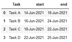
Data Pre-processing
When reading date from a data source, usually pandas considers it to be of object/string datatype. The start and end dates have to be converted into pandas datetime format.
df.start=pd.to_datetime(df.start)
df.end=pd.to_datetime(df.end)df['duration']=df.end-df.start
df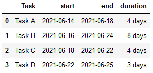
Note that the duration is in datetime.timedelta format. This has to be converted to number of days. If the start and end date of a job is the same, time delta will be zero. However, the duration of the task will be 1 day. The same is true for every task, hence the duration has to be increased by one.
Ordering the tasks in ascending order of dates is a best practice in generating a Gantt chart, it renders the chart easy to comprehend. In this example, the tasks are ordered in ascending order of start date and hence this step may be skipped. However, I am including this step so that the chart can be generalized.
#convert duration to number and add one
df.duration=df.duration.apply(lambda x: x.days+1)
#sort in ascending order of start date
df=df.sort_values(by='start', ascending=True)df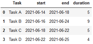
Creating Gantt Chart
Now we have all the details necessary for generating a Gantt chart. We will create the chart by plotting horizontal bar chart using barh function of pyplot. Tasks will be specified on the y-axis. Duration of the task will determine its width. The start date determine the start of the bar which in case of barh chart is left.
plt.barh(y=df.Task, left=df.start, width=df.duration)
plt.show()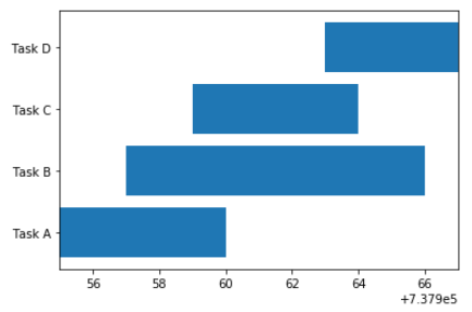
This above is the output of our previous command! We can derive information about the tasks just by looking at the chart. We can observe the following problems with the chart: 1. The y-axis need to be inverted. 2. The x-axis labels does not convey any meaning
Solving the problem 1. is simple, the axis can be inverted using invert_yaxis function.
Create Meaningful x-axis
The x axis must convey the project duration and include dates as x tick labels.
For this purpose we have to first create the project level variables for start and end dates of the project and project duration.
p_start=df.start.min()
p_end=df.end.max()
p_duration=(p_end-p_start).days+1print('project duration :', p_duration)
print('project start date :', p_start)
print('project end date :', p_end)Output:
project duration : 12
project start date : 2021-06-14 00:00:00
project end date : 2021-06-25 00:00:00The number of x-ticks should be 1 more than the project duration. The x-tick labels should be equal to the number of x-ticks, starting with the project start date. Note that the dates are in datetime format which includes the timestamp(refer the previous output). However, for labeling purpose, we require date in short format, which can be achieved by using strftime function. I have formatted the dates in ‘DD-Mon’ format using ‘%d-%b’ argument. Since this is a small 12 days project, year is omitted.
#xticks
x_ticks=[i for i in range(p_duration+1)]
#xtick labels starts with project start date |formatted
x_labels=[(p_start+dt.timedelta(days=i)).strftime('%d-%b')
for i in x_ticks]#print xticks and labels
print('x-ticks: ', x_ticks)
print('x-tick labels :', x_labels)Output:
x-ticks: [0, 1, 2, 3, 4, 5, 6, 7, 8, 9, 10, 11, 12]
x-tick labels : ['14-Jun', '15-Jun', '16-Jun', '17-Jun', '18-Jun', '19-Jun', '20-Jun', '21-Jun', '22-Jun', '23-Jun', '24-Jun', '25-Jun', '26-Jun']Add relative dates
The start date in the DataFrame is the absolute date in which the task starts. We have to convert the absolute date to relative date so that it is in alignment with the x-ticks. The project start date corresponds to 0. The relative dates can be added as a new column-rel_start by using the following code.
df['rel_start']=df.start.apply(lambda x: (x-p_start).days)
df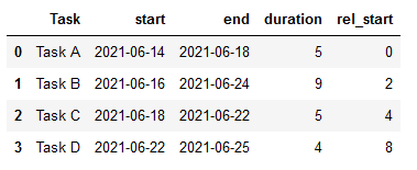
Final Gantt Chart
Putting everything together, the final Gantt chart can be created by the following code.
plt.figure(figsize=(8,4))
#plot barh chart
plt.barh(y=df.Task, left=df.rel_start, width=df.duration)
#Invert y axis
plt.gca().invert_yaxis()#customize x-ticks
plt.xticks(ticks=x_ticks, labels=x_labels)#Title
plt.title('A simple Gantt Chart')
#rotate x-ticks
plt.xticks(rotation=60)#add grid lines
plt.grid(axis='x', alpha=0.5)#save fig
plt.savefig('simple_gantt.png')plt.show()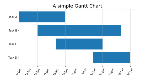
Summary
Plotting a Gantt chart can be summarized in the following 6 steps:
Step 1: Read data Step 2: Convert dates to datetime format Step 3: Add Duration Step 4: Add relative date Step 5: Create custom x-ticks and x-tick labels Step 6: Create horizontal bar-graph with y=task, left=Duration and left=relative start date; invert y-axis
Resources
Resources for the article are available in my GitHub Repo.
Become a Member
I hope you like the article, I would highly recommend signing up for Medium Membership to read more articles by me or stories by thousands of other authors on variety of topics. Your membership fee directly supports me and other writers you read. You’ll also get full access to every story on Medium.
Further Reading
The basic Gantt Chart contains bars corresponding to every task of the project. However, Gantt Charts can incorporate more details like completion status and sub-category etc. for each task. You can check out the below article where we build on the basic chart to incorporate additional details like percentage completion, department responsible for each task etc.
Other articles you may like