Stock Market Data Visualization Using Mplfinance
How to obtain stock market data and create visualizations(candlestick, OHLC, PnF etc.) in Python using mplfinance library
Mplfinance is a dedicated data visulization package from matlplotlib for visualizing financial data. Mplfinance enable visualization of financial data in the form of different types of charts- Candlestick chart, Renko Chart, OHLC chart, Point and Figure chart etc. with very few lines of code. Mplfinance also facilitates superimposing moving averages on top of charts for decision making by technical analysts.
Getting the data
Typical market data includes OHLCV(Open High Low Close Volume) data. The data can be obtained by using the sites of stock exchanges, financial publications, APIs, web-scrapping etc.
Mplfinace package can be used to plot any dataframe provided the following conditions are satisfied: i. Date is the index of the dataframe ii. Date is in pd.datetime format (‘YYYY-MM-DD’) iii. Columns are named as below: ‘Open’ : Opening price ‘High’ : Highest price for the period ‘Low’ : Lowest price for the period ‘Close’ : Closing price ‘Volume’ : Volume traded during the period
Yahoo Finance package(yfinance) can be used for obtaining market related data for free. You can check out my blogpost on Yahoo Finace if you want to know how to use yahoo finance.
Importing the required libraries
The following packages have to be imported first.
import yfinance as yf
import mplfinance as mpf
import matplotlib.pyplot as plt
import pandas as pd
Yfinance is not required if you have your own data or working with other APIs for obtaining data. Pandas is not required if your data is in the format required by mplfinance.
Obtaining data from Yahoo Finance
SKIP this section if you are using own data.
The following code gets the market data for Tesla(‘TSLA’) for last 5 years using yahoo finance.
tsla=yf.Ticker(“TSLA”).history(‘5y’)Basic plotting using mplfinace
Data obtained through yfinance is in the format required by mplfinance. Hence, we are good to go with plotting, no pre-processing is required.
The data can be plotted by using simple command mpf.plot(), providing the dataframe as argument.
mpf.plot(tsla)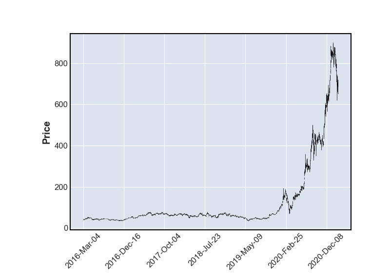
Importing data from csv file
5-year OHLCV data of Tesla is available in a csv file, tesla.csv. The data can be imported using pandas as follows
data=pd.read_csv(‘tsla.csv’)Check if the data is in the required format
Basic information about the dataframe can be obtained by using info() funcion in pandas.
data.info()Output:
RangeIndex: 1258 entries, 0 to 1257
Data columns (total 6 columns):
# Column Non-Null Count Dtype
--- ------ -------------- -----
0 Date 1258 non-null object
1 Open 1258 non-null float64
2 High 1258 non-null float64
3 Low 1258 non-null float64
4 Close 1258 non-null float64
5 Volume 1258 non-null int64 5 years of stock data have 1258 rows of data corresponding to 1258 trading days. Also note that Date is in object format and it is not the index. Hence we have to pre-process the data to convert it into format required by mplfinance mentioned earlier.
data.Date=pd.to_datetime(data.Date)  # change datetime format
data=data.set_index('Date')          # set date as index
Now that data is in the required format, we are good to go.
Basic plotting using mplfinace
The data can be plotted by using simple command mpf.plot(), providing the dataframe as argument.
mpf.plot(data)Slicing the data
If we are interested only in data for a specific period, the data can be sliced as according to the date as Date is the index.
Data for 2021 can be obtained as follows:
mpf.plot(data['2021'])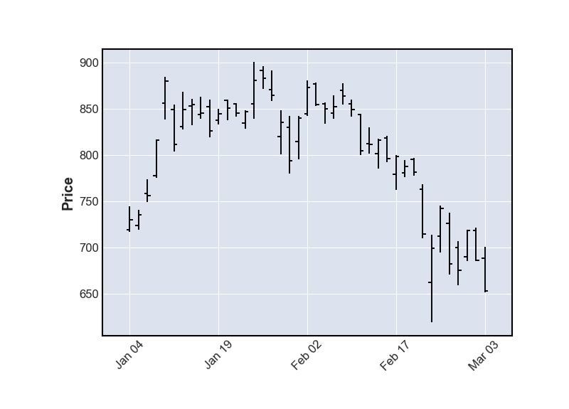
The default plot type, as you can see above, is ‘OHLC Chart’. An OHLC chart is a type of bar chart that shows open, high, low, and closing prices for each period. OHLC charts are useful since they are compact and show the four major data points over a period, with the closing price being considered the most important by many traders.
Other types of charts can be plotted by specifying the type.
Plotting a line chart
For some purpose, OHLC chart can be cluttered and difficult to comprehend, for example, for long term data. In such cases, a simple line chart can filter out the clutter by using only the closing price or weighted average of price. By setting type as line, mplfinace can plot the line chart of closing price.
mpf.plot(data['2020'], type='line')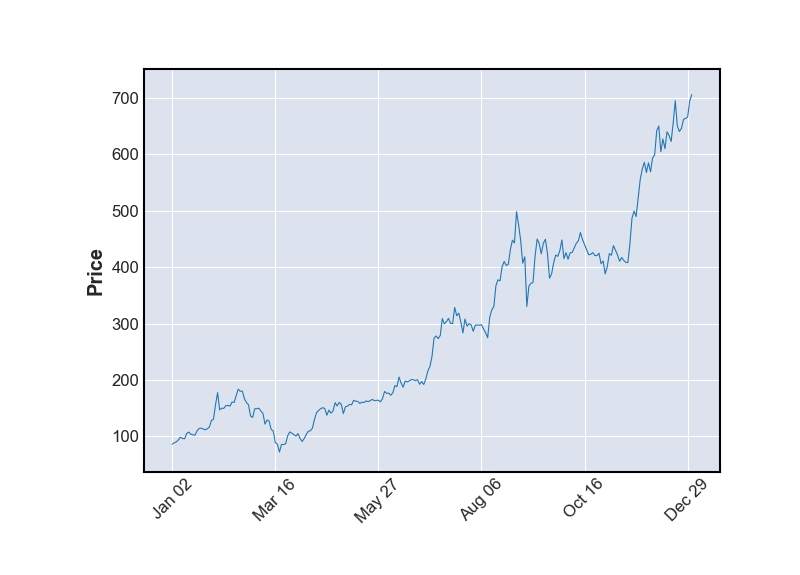
Candlestick charts, renko charts and Point-and-Figure charts are also commonly used for technical analysis. These charts can be plotted in mplfinance by setting type as ‘candle’, ‘renko’ and ‘pnf’.
Candlestick chart
A candlestick is a type of price chart used in technical analysis that displays the high, low, open, and closing prices of a security for a specific period. It originated from Japanese rice merchants and traders to track market prices and daily momentum hundreds of years before becoming popularized in the United States. The wide part of the candlestick is called the “real body” and tells investors whether the closing price was higher or lower than the opening price. An up candlestick is typically colored white or green, while a down candlestick is typically colored black or red.
mpf.plot(data[‘2021’], type=’candle’)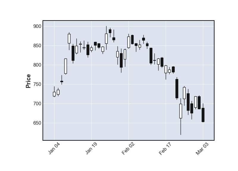
Renko chart
A Renko chart is a type of chart, developed by the Japanese, that is built using price movement rather than both price and standardized time intervals like most charts are. It is thought to be named after the Japanese word for bricks, “renga,” since the chart looks like a series of bricks. A new brick is created when the price moves a specified price amount, and each block is positioned at a 45-degree angle (up or down) to the prior brick. An up brick is typically colored white or green, while a down brick is typically colored black or red.
mpf.plot(data[‘2020’], type=’renko’)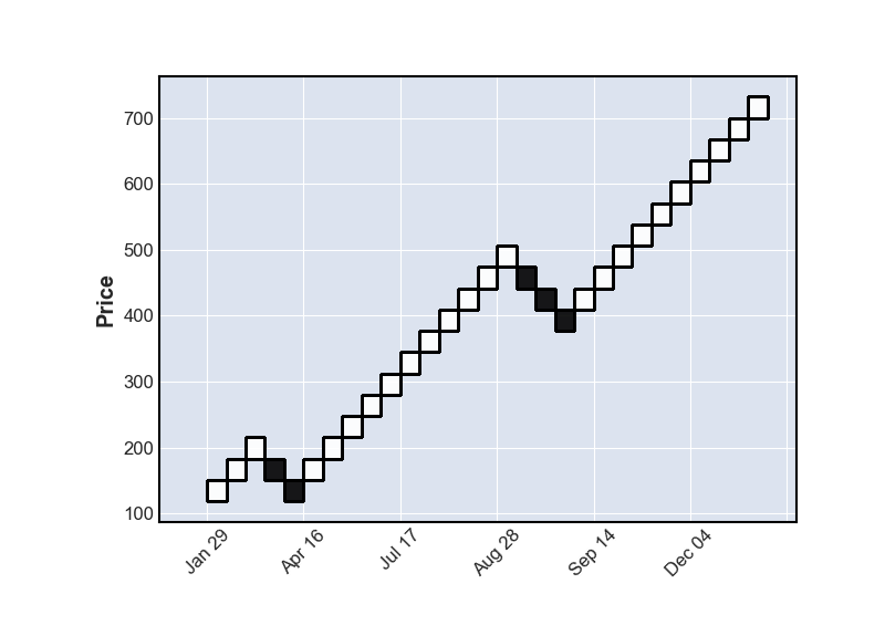
Point -and-Figure chart
A point-and-figure chart plots price movements for stocks, bonds, commodities, or futures without taking into consideration the passage of time. Technical analysts still utilize concepts such as support and resistance, as well as other patterns, when viewing P&F charts. Support and resistance levels, as well as breakouts, are more clearly defined on a P&F chart since it filters out tiny price movements and is less susceptible to false breakouts.
mpf.plot(data, type=’pnf’)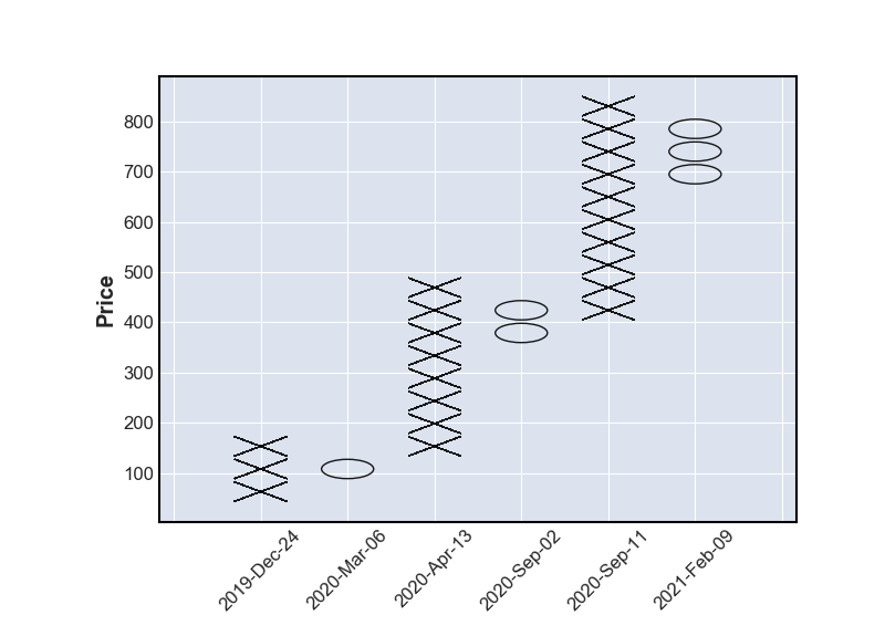
Plotting Trading Volume
Trading volume is a measure of how much of a given financial asset has traded in a period of time. Trading volume is also a very important factor in understanding the price action and making trading/investment decisions. Trading volume provides insights on buying and selling pressure on the price. Trading volume can be added to the chart by setting volume as True.
mpf.plot(data['2021'], type='candle', volume=True)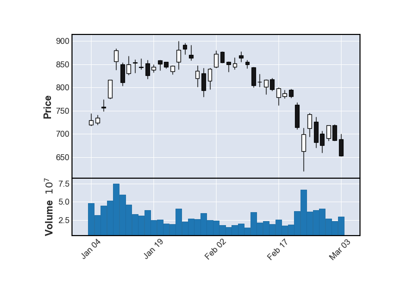
Plotting Moving Average
Moving average is a stock indicator that is commonly used in technical analysis. Moving average help smooth out the price data by creating a constantly updated average price filtering out the minor fluctuations in price.
There are numerous trading strategies based on moving averages for different periods and interaction between them and other indicators.
Mplfinance can calculate the moving average and plot it along with stock-price if the number of periods is provided as argument. Moving average of single or multiple periods can be plotted in the same chart.
mpf.plot(data['2020-07':'2020-12'], type='candle',
         volume=True, mav=(20,5))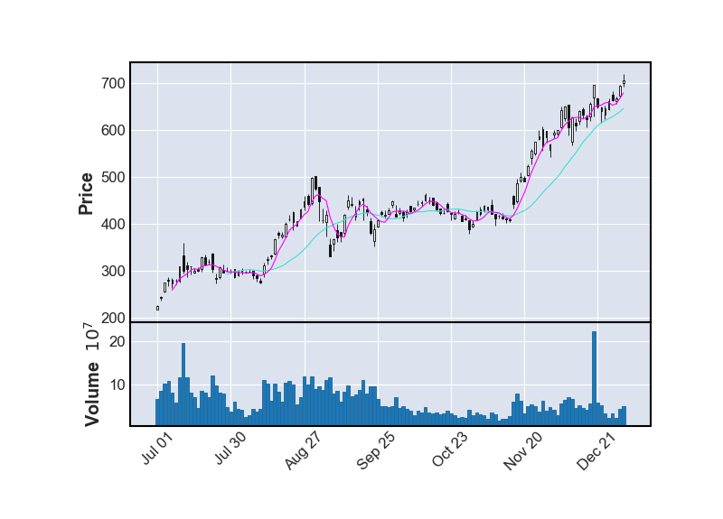
Prettifying chart
We have covered all the core functionality of chats using mplfinance. The charts can be prettified by selecting appropriate figure-size, adding title, using different standard styles(color combinations) etc. so as to improve its readablity.
Tight-layout
Note that there is a gap at the beginning and end of the chart. If the chart can expand to include the entire area by setting tight_layout=True similar to matplotlib.
Adding title
Title can be added by provindng the title after title keyword.
Figure size
figratio is the mplfinance keyword, similar to figsize in matplotlib, which is used to set the figure size.
mpf.plot(data['2020-07':'2020-12'], type='candle',
         volume=True, mav=(20,5),title = 'TSLA H2 2020',
        tight_layout=True, figratio=(10,5))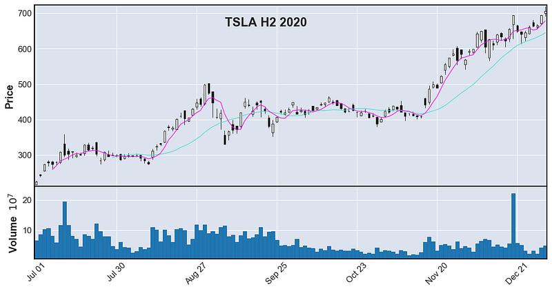
Chart styles
We are so accustomed with red candle symbolizing drop in price and green representing increase in price. These type of color schemes are popularized by financial publications, trading apps and financial news channels. This color coding lets us assimilate the information better.
Mplfinance has several built-in styles. In the following chart, chart style ‘yahoo’ is used.
mpf.plot(data['2020-07':'2020-12'], type='candle', volume=True,
         mav=(20,5), style='yahoo')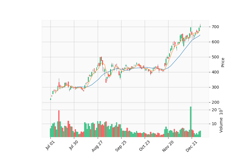
Other styes availabe in mplfinace are listed below.
mpf.available_styles()Output:
['binance', 'blueskies', 'brasil', 'charles',
'checkers', 'classic', 'default', 'ibd',
'kenan', 'mike', 'nightclouds', 'sas',
'starsandstripes', 'yahoo']I encourage you to try all of the chart-styles and select the style which best suits your purpose.
Saving the chart
The chart can be saved into your local machine by using savefig keyword. The below code will save the chart as img.png in the same folder.
mpf.plot(data['2020-07':'2020-12'], type='candle', volume=True,
         mav=(20,5), style='yahoo',
         savefig='img.png' )
Putting it all together
Intraday data at 5 minutes interval for Microsoft Inc.(‘MSFT’) is obtained by using yahoo finance. Candlestick chart with volume is plotted with 5 period, 10 period and 30 period moving averages. Figure ratio is set to 14:6, figure title which explains the figure is added and ‘mike’ style is selected for the chart. The image is saved as msft.png once the code is executed.
msft=yf.Ticker('msft').history(start='2021-03-03',end='2021-03-04', interval='5m')mpf.plot(msft, type='candle', volume=True,
title="MSFT MAR 03, 2021",
figratio=(14,6),
mav=(5,10,30), tight_layout=True,
style='mike', savefig='msft.png')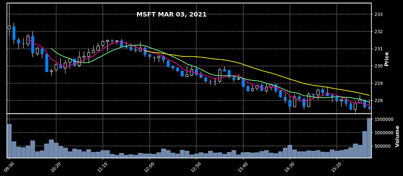
Resources
Resources for this article (Jupyter notebook and csv file) can be accessed in my GitHub Repo.
Tutorial in Video Format YouTube
References
Mplfinance github repo Investopedia
Become a Member
I hope you like the article, I would highly recommend signing up for Medium Membership to read more articles by me or stories by thousands of other authors on variety of topics. Your membership fee directly supports me and other writers you read. You’ll also get full access to every story on Medium.