
Create an Advanced Gantt Chart in Python
How to generate a Gantt Chart which contains additional details like Departments, Percentage Completion etc.
Introduction
This is the second part of visualizing Gantt Chart using python. Check this article in which steps for creating a basic Gantt Chart are explained in detail.
The basic Gantt Chart contains bars corresponding to every task of the project. In this article we will improve upon the basic Gantt Chart including details like completion status and sub-category for each task.
Recap
Preparation of a basic Gantt chart can be summed up in the following steps.
Step 1: Read data Step 2: Convert dates to datetime format Step 3: Add Duration Step 4: Add relative date Step 5: Create custom x-ticks and x-tick labels Step 6: Create horizontal bar-graph with y=task, left=Duration and left=relative start date; invert y-axis
Prepare a Basic Gantt Chart
I have a the schedule for a project in a csv file named schedule.csv which will be used for preparation of Gantt chart following the above steps. The schedule also involved additional details which are: i. Percentage completion for each task ii. Department which handles the task (Mkt, Fin, HR)
The following libraries are the requirements for generating a Gantt Chart: 1. Pandas : Reading data and data analytics 2. Matplotlib : Data visualization 3. Datetime : Date manipulation
# Import Libraries
import pandas as pd
import matplotlib.pyplot as plt
import datetime as dt
#Read Data from schedule.csv
df =pd.read_csv('schedule.csv')
df.head()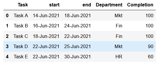
We will follow the steps enumerated in the previous article to generate the basic Gantt chart.
###### PRE-PROCESSING THE DATA ######
#Convert dates to datetime format
df.start=pd.to_datetime(df.start)
df.end=pd.to_datetime(df.end)
#Add Duration
df['duration']=df.end-df.start
df.duration=df.duration.apply(lambda x: x.days+1)
#sort in ascending order of start date
df=df.sort_values(by='start', ascending=True)#project level variables
p_start=df.start.min()
p_end=df.end.max()
p_duration=(p_end-p_start).days+1#Add relative date
df['rel_start']=df.start.apply(lambda x: (x-p_start).days)#Create custom x-ticks and x-tick labels
x_ticks=[i for i in range(p_duration+1)]
x_labels=[(p_start+dt.timedelta(days=i)).strftime('%d-%b')
for i in x_ticks]###### PLOTTING GANTT CHART ######
plt.figure(figsize=(8,4))
plt.title('Basic Gantt Chart', size=18)
plt.barh(y=df.Task, left=df.rel_start, width=df.duration)
plt.gca().invert_yaxis()
plt.xticks(ticks=x_ticks[::3], labels=x_labels[::3])
plt.grid(axis='x')
plt.show()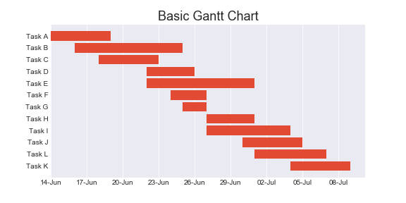
Adding Percentage Completion
Percentage completion can be conveyed by overlaying a darker bar (which indicates completed portion of the task) on top of a lighter bar (which indicated the entire task).
We have already calculated the width of the bars which is duration in days. We have to calculate the width of completed portion of the task which is named as ‘w_comp’ as below.
df['w_comp']=round(df.Completion*df.duration/100,2)
df.head()
Light and dark bar charts can be added by changing the alpha parameter.
plt.figure(figsize=(8,4))
plt.title('Gantt Chart:Completion', size=18)
#Light bar for entire task
plt.barh(y=df.Task, left=df.rel_start, width=df.duration,
alpha=0.4, color='green')
#Darker bar for completed part
plt.barh(y=df.Task, left=df.rel_start, width=df.w_comp,
alpha=1, color='green')plt.gca().invert_yaxis()
plt.xticks(ticks=x_ticks[::3], labels=x_labels[::3])
plt.grid(axis='x')
plt.show()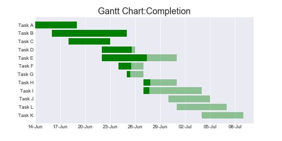
Adding Color Based on Sub-Category
The tasks can be categorized based on department. There are three departments — Marketing(Mkt), Finance(Fin) and HR. The chart will be more readable if the tasks are color coded based on the departments.
For this purpose, a dictionary is created which assign different color the each department.
c_dict={'Mkt':'red', 'Fin':'green', 'HR':'blue'}Color can be added based on department by iterating through each row of the DataFrame and selecting the color based on the Department using color dictionary created above.
plt.figure(figsize=(8,4))
plt.title('Gantt Chart:Completion | Dept.', size=18)for i in range(df.shape[0]):
color=c_dict[df.Department[i]]
plt.barh(y=df.Task[i], left=df.rel_start[i],
width=df.duration[i], alpha=0.4,
color=color)
plt.barh(y=df.Task[i], left=df.rel_start[i],
width=df.w_comp[i], alpha=1, color=color)
plt.gca().invert_yaxis()
plt.xticks(ticks=x_ticks[::3], labels=x_labels[::3])
plt.grid(axis='x')
plt.show()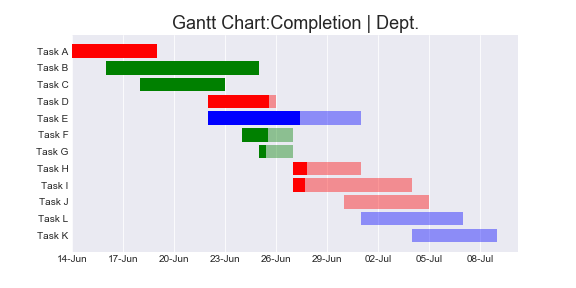
Gantt Chart Sorted by Department
Gantt chart sorted by department can be obtained by sorting the DataFrame by Department. Note to reset the index after sorting, if not the sorting will not have any effect on the plotting as it is based on the index of each row.
#Sort based on Department
df=df.sort_values(by='Department',
                  ascending=False).reset_index(drop=True)
DataFrame can be sorted by multiple sub-categories if required.
plt.figure(figsize=(8,4))
plt.title('Gantt Chart | Completion% | Sorted by Dept', size=18)
for i in range(df.shape[0]):
color=c_dict[df.Department[i]]
plt.barh(y=df.Task[i], left=df.rel_start[i],
width=df.duration[i], alpha=0.4,
color=color)
plt.barh(y=df.Task[i], left=df.rel_start[i],
width=df.w_comp[i], alpha=1, color=color)plt.gca().invert_yaxis()
plt.xticks(ticks=x_ticks[::3], labels=x_labels[::3])
plt.grid(axis='x')
plt.show()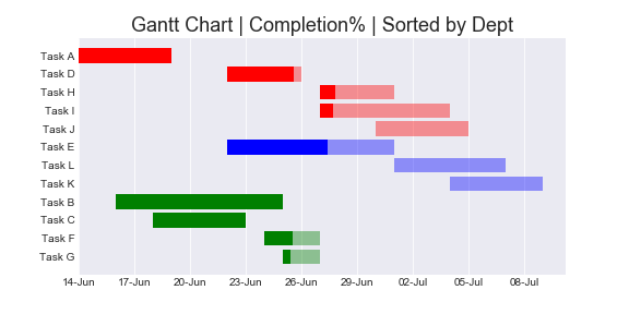
The chart can be sliced based on specific criteria by slicing the DataFrame and resetting index before plotting.
#Only HR Tasks
df=df[df.Department=='HR'].reset_index()#Only Incomplete tasks
df=df[df.Completion>100].reset_index()Adding Completion Percentage and Legends
Completion percentage can be added to the chart by using text() function in pyplot. However, this function requires x and y coordinates of the text.
Since y axis contains the Task names which is non-numeric, a list of numeric ticks has to be used instead of the Task names. New y-ticks can be generated similar to x-ticks as below.
yticks=[i for i in range(len(df.Task))]The x-coordinate for the percentage completion label would be the end of the darker bar which can be obtained by adding the width of completion to the starting position.
plt.figure(figsize=(8,4))
plt.title('Gantt Chart | Completion%', size=18)for i in range(df.shape[0]):
color=c_dict[df.Department[i]]
plt.barh(y=df.Task[i], left=df.rel_start[i],
width=df.duration[i], alpha=0.4,
color=color)
plt.barh(y=df.Task[i], left=df.rel_start[i],
width=df.w_comp[i], alpha=1, color=color)
plt.text(x=df.rel_start[i]+df.w_comp[i],
y=yticks[i],
s=f'{df.Completion[i]}%')
plt.gca().invert_yaxis()
plt.xticks(ticks=x_ticks[::3], labels=x_labels[::3])
plt.grid(axis='x')
plt.show()
To display labels in the legend, label has to be added to each bar which is the name of the Department.
plt.figure(figsize=(12,7))
plt.title('Gantt Chart:Project Mayhem', size=18)
for i in range(df.shape[0]):
color=c_dict[df.Department[i]]
plt.barh(y=yticks[i], left=df.rel_start[i],
width=df.duration[i], alpha=0.4,
color=color)
plt.barh(y=yticks[i], left=df.rel_start[i],
width=df.w_comp[i], alpha=1, color=color,
label=df.Department[i])
plt.text(x=df.rel_start[i]+df.w_comp[i],
y=yticks[i],
s=f'{df.Completion[i]}%')
plt.gca().invert_yaxis()
plt.xticks(ticks=x_ticks[::3], labels=x_labels[::3])
plt.yticks(ticks=yticks, labels=df.Task)
plt.grid(axis='x')#fix legends
handles, labels = plt.gca().get_legend_handles_labels()
handle_list, label_list = [], []
for handle, label in zip(handles, labels):
if label not in label_list:
handle_list.append(handle)
label_list.append(label)
plt.legend(handle_list, label_list, fontsize='medium',
title='Department', title_fontsize='large')plt.show()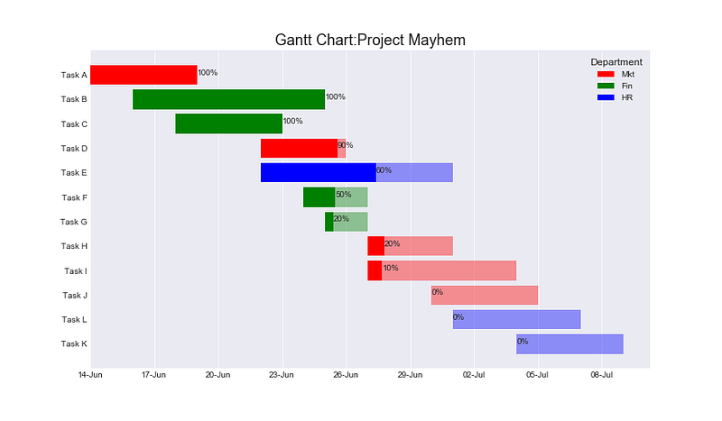
Since there are multiple bars with the same Department, the legend would display one legend for each task. This will result in duplication of labels and render the legend cluttered. Note the code snippet after #fix legends is used to handle the labels and handles.
Resources
All data and code for the article is available in my GitHub Repo.
Become a Member
I hope you like the article, I would highly recommend signing up for Medium Membership to read more articles by me or stories by thousands of other authors on variety of topics. Your membership fee directly supports me and other writers you read. You’ll also get full access to every story on Medium.


