
How to Plot a Treemap in Python
A step by step tutorial for visualizing data as treemap using squarify and matplotlib packages
Treemap is a popular visualization technique used to visualize ‘Part of a Whole’ relationship like pie chart and donut chart. However, treemaps are easy to follow and interpret. Also, treemaps perform a better job when we have to compare a large number of items.
Install package
Squarify package is used for generating treemaps. If the package is not installed, the first step is to install the package using pip.
pip install squarifyImport libraries
We have to import the following packages.
import pandas as pd             # Read data from excel
import matplotlib               # data viz
import matplotlib.pyplot as plt # data viz
import squarify                 # generate treemap
Generate a basic treemap
A basic treemap can be generated by providing an array of sizes to squarify.plot function.
sizes=[100,50,23,74]
squarify.plot(sizes)
plt.show()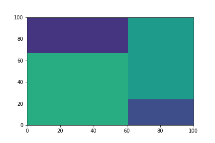
Remove axis and add padding
Note that the graph has got no gap in between the boxes. Also displaying the axis is also not required.
sizes=[100,50,23,74]
squarify.plot(sizes, pad=True)
plt.axis(‘off’)
plt.show()
Note that the colors are selected automatically.
Add labels and setting colors
Colors and labels can be set by providing array of colors and labels into squarify.plot function. Alpha keyword can be used to change the luminosity.
sizes=[100,50,23,74]
label=['A','B','C','D']
colors=['red','green','blue', 'yellow']
squarify.plot(sizes, label=label, color=colors, alpha=0.5)plt.axis('off')
plt.show()
Using data from csv file
Stats pertaining to the top 20 NASDAQ companies by market cap sourced from is imported from csv file.
df=pd.read_csv('market_cap_top20.csv')
df.head()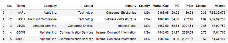
The csv file contains data including the market cap, P/E ratio and price change in the last trading session etc. The csv file is available in my GitHub Repo.
Treemap based on Market cap
Plotting a treemap with sizes proportional to the market capitalization of each company. Stock ticker is added as label.
plt.figure(figsize=(8,6))squarify.plot(df[‘Market Cap’], label=df.Ticker,alpha=0.5)plt.axis(‘off’)
plt.show()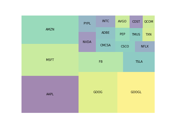
Adding color-map
We will add color-map based on the Volume traded for the company. Squarify accepts colors as an array, and does not support colormap. So we have to create a colormap using the following code. For volume traded, we can use a sequential colormap like ‘viridis’, ‘plasma’, ‘inferno’, ‘magma’, ’Greys’, ‘Purples’, ‘Blues’ etc.
cmap=matplotlib.cm.Reds #select cmap#Normalize based on Volume
norm=matplotlib.colors.Normalize(vmin=df.Volume.min(),
vmax=df.Volume.max())#Define colors array
colors=[cmap(norm(i)) for i in df.Volume]Plotting Treemap
plt.figure(figsize=(8,6))
title="Tree map Size: Market cap Color: Volume"
plt.title(title, size=18)squarify.plot(df['Market Cap'], label=df.Ticker,
text_kwargs={'color':'blue', 'size':12},
color=colors)plt.axis('off')
plt.savefig('fig.png')
plt.show()
Note that text_kwargs is used to set text properties like color and size.
Adding a color-map based on change in share price
This is the most common visualization you come across in financial news channels during news related to stock markets. Since change in price is diverging parameter, we will use RdYlGr colormap.
cmap=matplotlib.cm.RdYlGn
norm=matplotlib.colors.Normalize(vmin=df.Change.min(),
                                 vmax=df.Change.max())
colors=[cmap(norm(i)) for i in df.Change]
Plotting Treemap
plt.figure(figsize=(14,8))
title='NASDAQ Top 20, Size: Market Cap, Color: Change(%)'
plt.title(title, size=20)squarify.plot(df['Market Cap'], label=df.Ticker,alpha=0.8, color=colors, pad=True,
text_kwargs={'color':'black', 'size':12})plt.axis('off')
plt.show()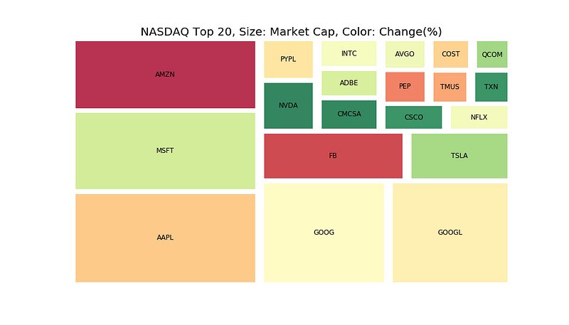
Stocks with dark green color have generated higher positive change during the day whereas the stocks in deep red color have generated low returns during the day.
Tutorial in Video Format
If you prefer the tutorial in video format, you can check out the below YouTube video.
The resources for the tutorial are available in my github repo.
Become a Member
I hope you like the article, I would highly recommend signing up for Medium Membership to read more articles by me or stories by thousands of other authors on variety of topics. Your membership fee directly supports me and other writers you read. You’ll also get full access to every story on Medium.


