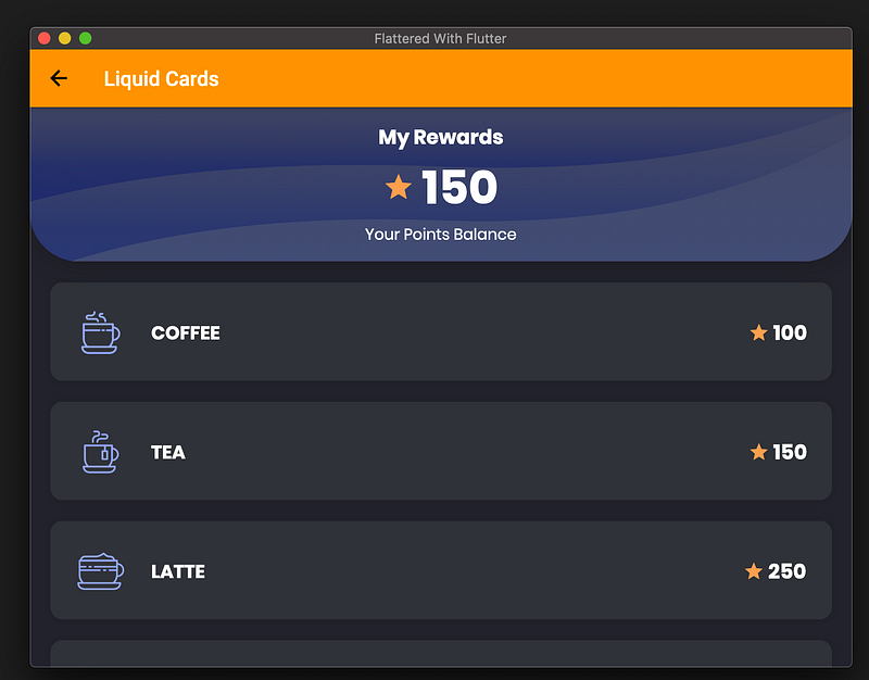
Flutter Vignette —Liquid Cards
Flutter Vignette — Liquid Cards
How to master the Liquid Cards Vignette (by gskinner team)…Hmmm
All in one Flutter resource: https://flatteredwithflutter.com/liquid-cards-vignette/
Other Vignettes :
Brief…
For Flutter Interact ’19, Google challenged gskinner to showcase the Flutter framework’s capabilities to build beautiful apps.
What are we covering today…?
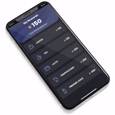
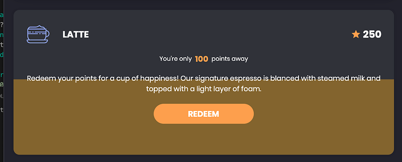
Liquid Cards: This demo aims to utilize the Flutter’s list of widgets, specially AnimtedContainer, and finally Flutter’s Canvas to simulate a liquid effect.
Begin…
This tutorial is divided into 3 steps :
- Article UI as per Vignette
- Implement card opening/closing animation
- Show the liquid effect animation
Step 1 :
Data part is static and is taken from the original source code….
We replicate the data for drinks (static data)….
Body is basically a Stack of widgets (top -> My rewards, bottom -> list of cards/drinks)
Top section (My rewards):
- Column of texts, (middle one being row)..
- Overlapped by an image (in a widget) of the same size as point 1
Bottom section (List of Cards)
- Parent widget as Stack
- Inside it’s a Column of widgets and everything is wrapped inside SingleChildScrollView..
Things to Note :
- NeverScrollableScrollPhysics : Denies user scrolling behavior..
- ButtonTheme : Used to create the Redeem button, specify default properties like minWidth etc inside it…
- MediaQuery : Use properties like aspectRatio, from the device, to take decisions..
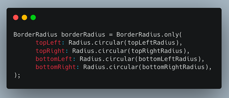
- BorderRadius : For specifying borders around the card…
- Using list reduce functionality : Returns a single value by iterating all elements of given list..
var lst = [1,2,3,4,5];
var res = lst.reduce((i, j) => i + j);
print('res is ${res}'); // res is 15Step 2 :
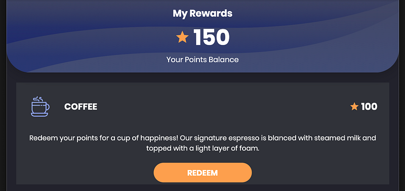
In this step, we have kept the card closed (as per vignette). On the opening or closing of each card, animation gets triggered……
Also, there is a border (rounded) for each card….
Things to Note :
Each card is wrapped inside AnimatedContainer. We detect whether the card is clicked and then animate the height of the card…
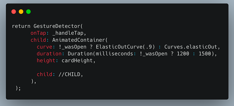
- ElasticOutCurve : Curve property of AnimatedContainer uses ElasticOutCurve(0.9), by default it’s
const ElasticOutCurve([this.period = 0.4]);Meaning we can even alter the curves :)
- RoundedShadow : Each card is given a rounded border, with the help of RoundedShadow (custom widget)..
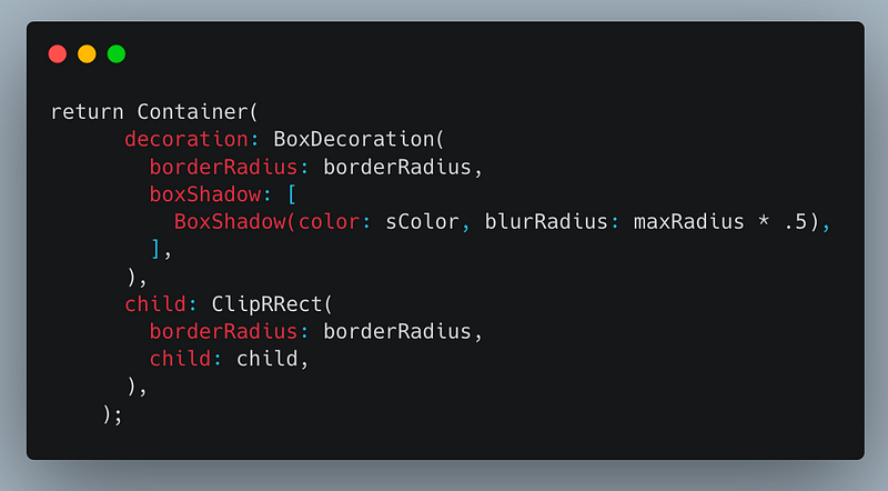
Pro-tip :
In case you want your widget to be bordered exactly,
- Set the Container’s decoration -> borderRadius
- Wrap the widget in ClipRRect with the same borderRadius
Final Step :
We integrate the liquid effect animation….
Things to Note :
- AnimatedOpacity : Wave background is wrapped inside this widget. Once a card is tapped / opened, this triggers the animation
AnimatedOpacity(
     opacity: widget.isOpen ? 1 : 0,
     duration: Duration(milliseconds: 500),
     child: _buildLiquidBackground(_maxFillLevel, fillLevel),
)- _buildLiquidBackground : This part is responsible for the liquid effect animation, lets see….
Liquid Effect Animation (LEA)
return Stack(
      fit: StackFit.expand,
      children: <Widget>[
        Transform.translate(
          offset: Offset(
            0,
            DrinkListCard.nominalHeightOpen * 1.2 -
                DrinkListCard.nominalHeightOpen *
                    _fillTween.value *
                    _maxFillLevel *
                    1.2,
          ),
          child: CustomPaint(
            painter: LiquidPainter(
              fillLevel,
              _liquidSim1,
              _liquidSim2,
              waveHeight: 100,
            ),
          ),
        ),
      ],
);
_buildLiquidBackground(code above) is made up of
- Stack with 1 child (Transform.translate widget)…
We need to start the wave from bottom to top, meaning from one offset to another..Hail, this widget…:)
- It has 2 properties : offset and child
Offset : Takes 2 params (dx, dy) ….dx = 0.0
dy -> depends on the points left (as per card) and the current animation value..
- Child -> CustomPaint and the painter property is set to a custom painter (LiquidPainter)
LiquidPainter…
We override the paint method of this painter, to include 2 waves…
  @override
  void paint(Canvas canvas, Size size) {
    _drawLiquidSim(
      simulation1,
      canvas,
      size,
      0,
      Color(0xffC48D3B).withOpacity(.4),
    );
    _drawLiquidSim(
      simulation2,
      canvas,
      size,
      5,
      Color(0xff9D7B32).withOpacity(.4),
    );
  }
// DEF. OF _drawLiquidSimvoid _drawLiquidSim(
LiquidSimulation simulation,
Canvas canvas,
Size size,
double offsetY,
Color color
)In _drawLiquidSim, we create a path from left side of the card to the right. Before rendering the path, we modify it in the form of quadraticBezierCurve
- Create a straight line path
- Divide into 4 sections
- Each section is converted into a quadraticBezierTo (property from Canvas path)
- Finally, draw the path…
For each, quadraticBezierTo, we require control points
path.quadraticBezierTo(ctrlPt.dx, ctrlPt.dy, endPt.dx, endPt.dy);Hence, we created a custom class, LiquidSimulation and outsource the control points calculation inside it….
LiquidSimulation class
In this class, we
- Calculate control points for the quadraticBezierCurve
- Create animation with non linear progression..
var animSequence = TweenSequence([
        TweenSequenceItem<double>(
          tween: Tween<double>(begin: 0, end: 0),
          weight: 10.0,
        ),
        TweenSequenceItem<double>(
          tween: Tween<double>(begin: 0, end: height).chain(
            CurveTween(curve: Curves.linear),
          ),
          weight: 10.0,
        ),
        TweenSequenceItem<double>(
          tween: Tween<double>(begin: height, end: 0).chain(
            CurveTween(curve: _ease),
          ),
          weight: 60.0,
        )
]).animate(controller)
Introducing chaining of animations….
Using TweenSequenceItem, we direct our animation’s curve to stay the same for the desired weight (begin and end)
Tween<double>(begin: 0, end: height)This, in turn, creates a nonlinear progression of animations….
Articles related to Flutter Desktop: