
Flutter Vignette — Article Dark Mode
Flutter Vignette — Article Dark Mode
How to master the Article Dark Mode Vignette (by gskinner team)…Hmmm
All in one Flutter resource: https://flatteredwithflutter.com/dark-mode-vignette/
Other Vignettes :
Brief…
For Flutter Interact ’19, Google challenged gskinner to showcase the Flutter framework’s capabilities to build beautiful apps.
What are we covering today…?
Begin…
This tutorial is divided into 4 steps :
- Article UI as per Vignette
- Implement dark/light mode
- Article FAB’s
- Masking of the transition (dark to light and vice-versa)
Step 1 :
Data part is static and is taken from the original source code….
We replicate the data for an article (static data)….
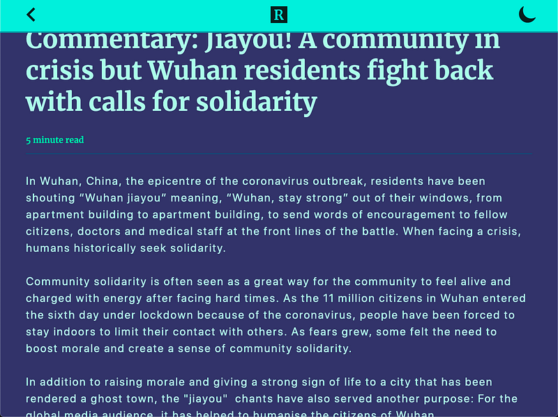
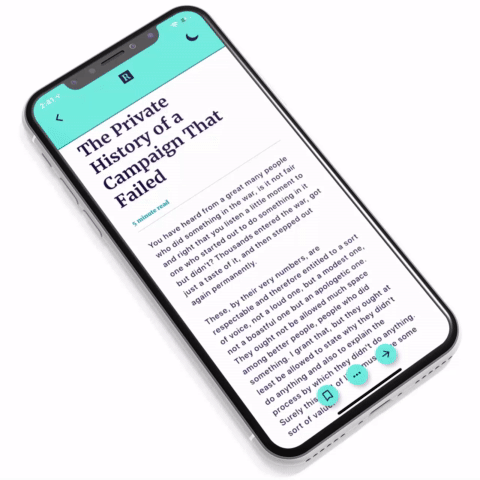
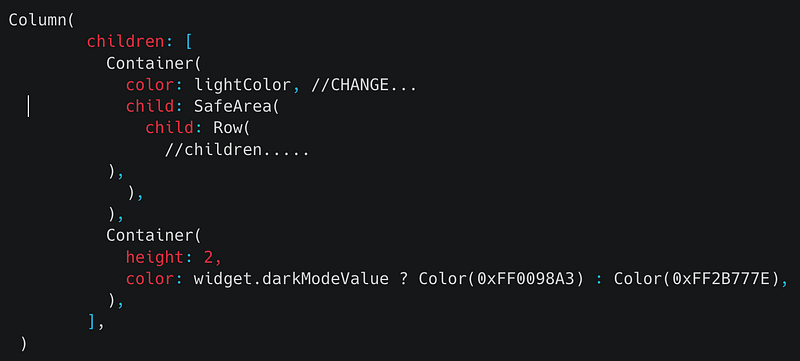
App is a stack of navigation bar and article content. Top bar is a DarkInkBar widget and is comprised of
- Column with Icons and Divider.
Icons in the nav bar are using this widget…This widget should be used, if you want to present diff. icons for light/dark mode…
- Right most icon (in the nav bar) is wrapped under Opacity.
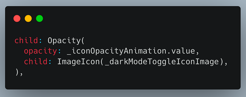
Opacity is determined by an animation, which uses TweenSequence. Basically, our animation is a set of TweenSequenceItems and each has a weight that defines its percentage of the animation’s duration.
Article Content is the DarkInkContent widget and is comprised of
- SingleChildScrollView as parent
- Inside the parent, we have a column of texts and padding…
Here, is the Source Code for Step 1
Step 2 :
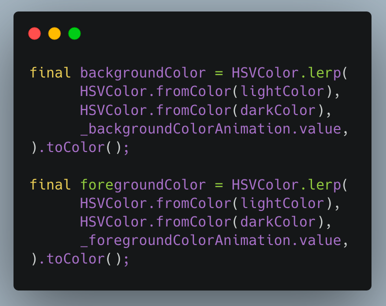
We focus on the nav bar….While transitioning from one dark to light (or otherwise), we change the background color of our nav bar…..
Introducing HSVColor..
As per doc,
An HSVColor is represented in a parameter space that’s based on human perception of color in pigments (e.g. paint and printer’s ink).
For our background and foreground color, we have something like this..
Here, is the source code for Step 2…..
Step 3:
This step focuses on the animation of article’s FABs…
Our main app stack is now comprised of :
- Navigation bar, article content and controls (aka FABs)
As we switch between themes, these FABs animate — when switching begins, the FABs move out of frame, and while its ending, the FABs show up…
This is done by Transform widget..
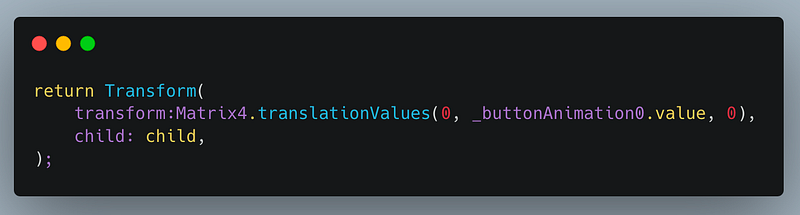
Under the transform property, we use Matrix4.translationValues. This takes in the parameters as (x, y, z)
Here, we supply animation value as y-axis parameter meaning the buttons will only shift in the y-direction….
Each FAB button is inside a separate animation and each animation is comprised of different sets of TweenSequenceItems…
Here, is the source code for Step 3…..
Step 4 :
Probably the most important step…….
Wrap the article content(DarkInkContent) inside TransitionContainer (custom widget)…
This TransitionContainer has two important widgets (custom):
- WidgetMask
- AnimatedSprite…
WidgetMask…
This widget basically extends Stack and tweaks how Stack renders its children…
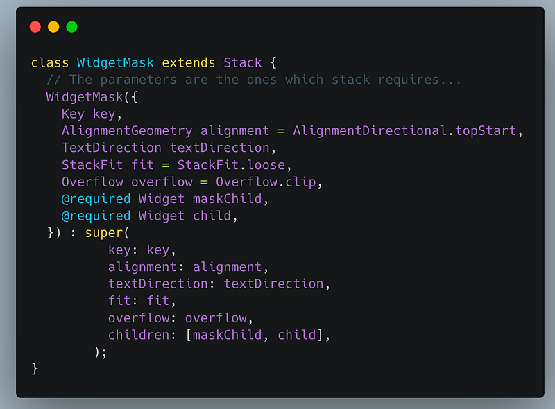
Don’t get frightened with all the parameters, as they are basically what a Stack also needs….
For rendering the widget, we now need to override two important methods — createRenderObject (which takes in a RenderStack) and updateRenderObject (void method)…
Now if we look at the Stack implementation, we see
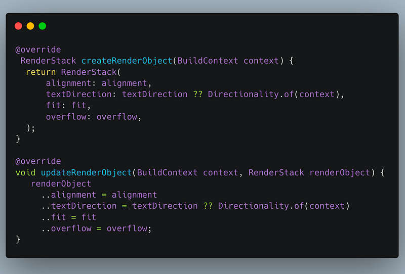
In the first method, instead of returning RenderStack, we render our custom widget RenderWidgetMask, which extends RenderStack….
RenderWidgetMask, uses a method called paintStack, wherein
- Takes all the children supplied
- Converts each child into StackParentData
- We skip painting the maskedChild,
// Skip painting the maskChild
    final paintContent = (PaintingContext context, Offset offset) {
      RenderBox child = (firstChild.parentData as StackParentData).nextSibling;
while (child != null) {
final childParentData = child.parentData as StackParentData;// Here, we used lastChild, instead of child....
context.paintChild(lastChild, offset + childParentData.offset);
child = childParentData.nextSibling;
}
};In the below line, we skip painting the first child
RenderBox child = (firstChild.parentData as StackParentData).nextSibling;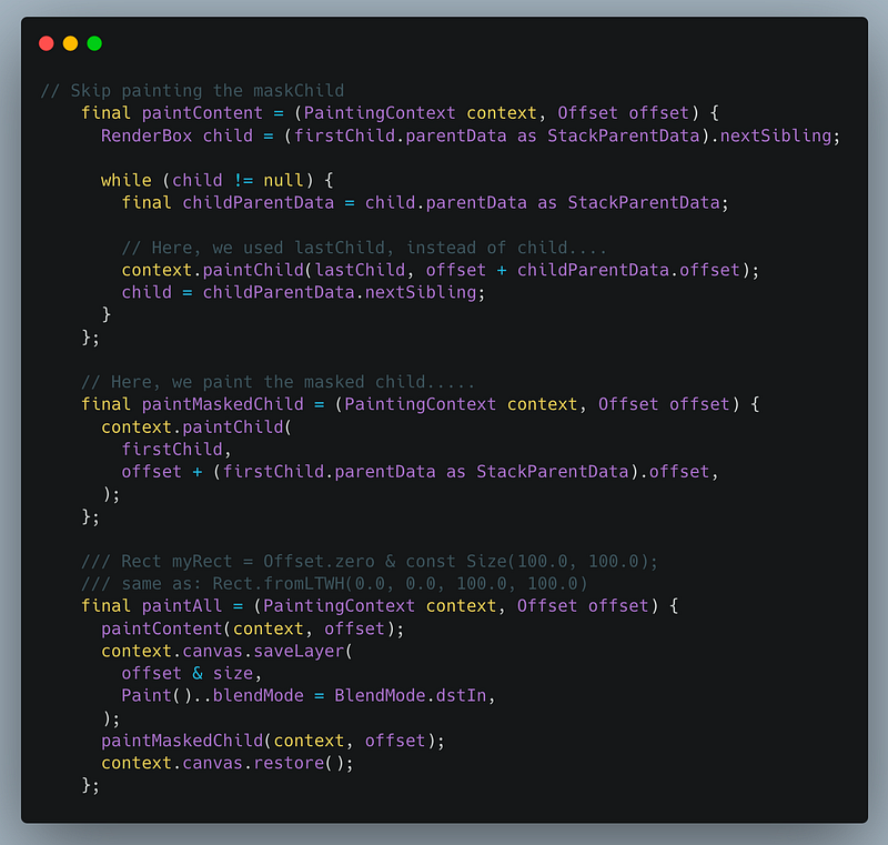
- Later, we paint this maskedChild…..using
context.pushOpacity(offset, 255, paintAll);where, 255 is the alpha argument to use when blending the painting
AnimatedSprite…
This widget extends AnimatedWidget…and needs to override the build method…
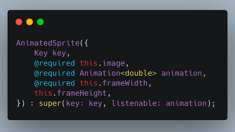
We need a parameter of type listenable (can be Animation
Inside the build method, we create a widget called Sprite (custom widget) and pass all the above parameters…
Sprite..
This widget, aims to get the size of the image dynamically frame by frame…and decides what part of image to render…
We use a widget called ImageInfo to get the size of the image…and other parameters….
ui.Image img = _imageInfo?.image;
int imgWidth = img.width;
int frameW = widget.frameWidth, frameH = widget.frameHeight;Finally, we create a rectangle which draws a portion(rectangular) of the entire image, as the animation proceeds….This is the reason, we see the theme transition as a flow………
ui.Rect rect = ui.Rect.fromLTWH(
      col * frameW * 1.0, // 0 to 9 * 360,
      row * frameH * 1.0, // 0 to 3 * 720,
      frameW * 1.0,
      frameH * 1.0,
    );
return CustomPaint(painter: _SpritePainter(img, rect));Articles related to Flutter Desktop:


