
Color Theory
Color Theory: Color space is a term used for digital file formats and devices.

Color space is a concept that’s relevant to digital designers, artists, and visual communicators. It’s a type of color theory and considered information technology, defined as a collection of colors, related to concepts like hue, color, tint, shade, and color scheme.
One example of color space that you encounter, almost every time you go online, is the RGB color space. This is a device-dependent color model that uses three channels of information (red, green, and blue) to create a visible range of colors.
RGB isn’t the only color space out there. In fact, there are dozens of different types, each with its own strengths and weaknesses. Some other examples of color spaces include CMYK (used for print design), HSL and HSV (useful for color selection tools), and LAB (a device-independent color space often used in color management).
When you’re working with colors in a digital environment, it’s important to keep color space in mind. The format of your file, the color mode you’re using, and the devices you’re viewing your work on can all impact how your colors appear.
By understanding color space, you can ensure that your colors look the way you intend them to, no matter where they’re being viewed.
In the book “Designing Brand Identity,” author Alina Wheeler writes, “Color space is the three-dimensional expanse within which all hues reside. The visible color spectrum can be thought of as a slice through this three-dimensional space, with each hue corresponding to a point on the spectrum’s edge.”
She goes on to explain, “Just as the visible spectrum is a slice of color space, so too are individual color models like RGB, CMYK, and Pantone. Each color model is a way of representing colors within a certain space.”
In other words, color space is the total range of colors that can be represented within a given color model. And each color model has its own unique color space.
When you’re working with colors digitally, it’s important to be aware of the color space you’re working in. This will ensure that your colors look the way you intend them to, no matter where they’re being viewed.
There are three main properties of color: hue, saturation, and lightness.
Hue is the “color” itself. It’s what we typically think of when we think of color names, like red, blue, or green.
Saturation is the intensity of the color. A highly saturated color is very vibrant, while a low-saturated color is more muted.
Lightness is how light or dark the color appears. A light color will appear nearer to white, while a dark color will be closer to black.
These three properties are often represented as a triangle, with each corner corresponding to one of the properties.
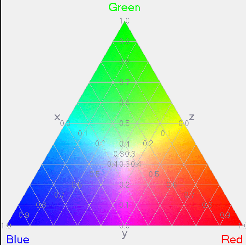
What you need to remember as a digital designer working with color is that each color has a specific value for each of these properties. And depending on the color space you’re working in, these values will be represented differently, and that matters because it changes how the color will appear onscreen.
For example, the RGB color space uses a numerical value to represent each property, with 255 being the most saturated or lightest value and 0 being the least saturated or darkest. So, color with an RGB value of (255, 0, 0) would be a very saturated red, while a color with an RGB value of (0, 255, 0) would be a very light green.
On the other hand, the CMYK color space uses a different numerical scale, with 100 being the most saturated or lightest value and 0 being the least saturated or darkest. So, a color with a CMYK value of (0, 100, 100, 0) would be a very light green, while a color with a CMYK value of (0, 0, 0, 100) would be a very saturated black.
As you can see, the same color can have different values depending on the color space it’s in. And that means that the color will look different onscreen depending on which color space it’s in.
Also, read
Color Theory: Colorimetry is the science and technology of recording color.
Color Theory: Color scheme defines the aesthetic and functional look of a design.
Color Theory: Corporate Colors are an important part of a brand’s identity.
Color Theory: Heat Maps use color temperature to convey information quickly.
Color Theory: Analogus Colors are one approach to developing color schemes.
Color Theory is a complex study related to the properties of light and human perception.
If you’ve enjoyed my writing, please consider supporting me by becoming a Medium Member, accessing unlimited Medium articles. Follow the link to subscribe for $5 a month or $50 per year. Thank you!


