
Color Theory
Color Theory: Color scheme defines the aesthetic and functional look of a design.
Color schemes are one of the defining factors in the look of a design. And because they play such an important role, you must understand the basics of color theory, along with the top five tradeoffs to gain expertise as a creative or designer.
Color theory is the study of how colors interact with each other. It includes the study of color harmony, which is basically how colors work together to create a pleasing effect.
There are many different color schemes, but the most basic and common one is the split-complementary color scheme. This color scheme consists of three colors: a base color, a color that is its complement, and a color that is midway between the two.
Color schemes can be either monochromatic, analogous, or complementary. Monochromatic color schemes use one color, analogous color schemes use colors that are next to each other on the color wheel, and complementary color schemes use colors that are opposite each other on the color wheel.
The most important thing to remember when creating a color scheme is to create harmony. Colors that work well together will create a pleasing and cohesive design. Colors that don’t work well together will create a chaotic and jarring design.
Compare these two designs and ask yourself which is jarring and which is pleasing.

Here are the top five tradeoffs to consider when creating a color scheme:
Background versus Foreground
The background color is either light on dark, or dark n light. This will create a high contrast look that is easy to read, but typically designers choose a darker background with a lighter foreground (front) because of the way people’s eyes adjust to the light, perceiving images faster.
The lightest color in the color scheme is known as the ‘key’ color, while the darkest is known as the ‘ground’ color.
Matching versus Clashing
Color harmony is an art, not a rules-based scientific process defined by a book. Great designers have a sense of tone, culture, audience, presentation, storytelling, influence, and feelings to draw from in order to create amazing color schemes.
There are some general principles, like using analogous colors or a split-complementary color scheme, but in the end, it’s up to you to create something that feels right.
Imagine you encounter red and green in a spring-themed design. Your audience might think of Christmas rather than Easter. Those types of considerations are design choices connecting color schemes to aesthetics and functionality to support a message or goal.
Chromatic versus Achromatic
Chromatic color has no hue, while an achromatic color has no chroma. The two are not the same. In design, we use both types of colors.
Chromatic colors are usually more visually interesting, while achromatic colors are usually more subdued.
One issue with using only chromatic colors is that they can be visually overwhelming, making it difficult for someone to focus on the content of your design. This is why it’s often helpful to use achromatic colors as accents.
Bright versus Dull
Color saturation references the perceived intensity of color. A color can be unsaturated (dull), moderately saturated, or highly saturated.
The level of saturation you use is usually based on the message you’re trying to communicate with your design. If you want to create a feeling of excitement or energy, you would use more highly saturated colors. If you want to create a feeling of calm or serenity, you would use more unsaturated colors.
In product design, color saturation is used to indicate operational signifiers, meaning visually informing the user how to use a product without words. This can be seen in things like the ‘on’ button being green and the ‘off’ button being red.
Warm versus Cool
Warm colors are those that are on the red, orange, and yellow side of the color wheel. Cool colors are those that are on the green, blue, and violet side of the color wheel.
Warm colors are often associated with feelings of happiness and energy, while cool colors are often associated with feelings of calm and serenity.
When creating a color scheme, you can use either warm or cool colors or a combination of both. It’s usually best to avoid using all warm or all cool colors because that can create a jarring design. The one exception to this is if you’re going for a monochromatic color scheme, which will use various shades, tints, and tones of one color.
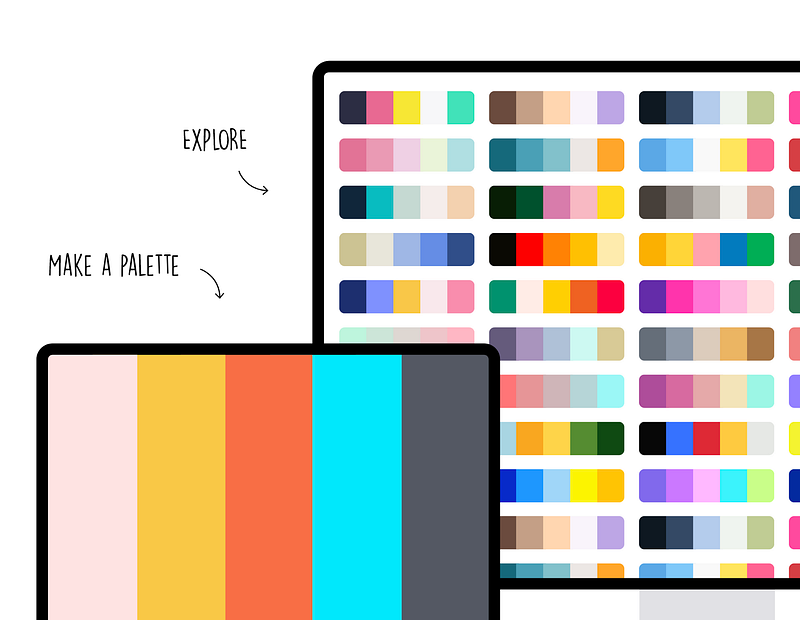
Colors.co (https://coolors.co/) is a great tool to generate color patterns and see suggested templates and palettes.
Also, read
Color Theory: Corporate Colors are an important part of a brand’s identity.
Color Theory: Heat Maps use color temperature to convey information quickly.
Color Theory: Analogus Colors are one approach to developing color schemes.
Color Theory is a complex study related to the properties of light and human perception.
If you’ve enjoyed my writing, please consider supporting me by becoming a Medium Member, accessing unlimited Medium articles. Follow the link to subscribe for $5 a month or $50 per year. Thank you!


