
Color Theory
Color Theory: Heat Maps use color temperature to convey information quickly.
A heat map is a type of color theory, very commonly used in data visualizations. It’s intuitive, cross-cultural, and carries an emotional impact. It’s closely related to color theory, color temperature, and visual design.
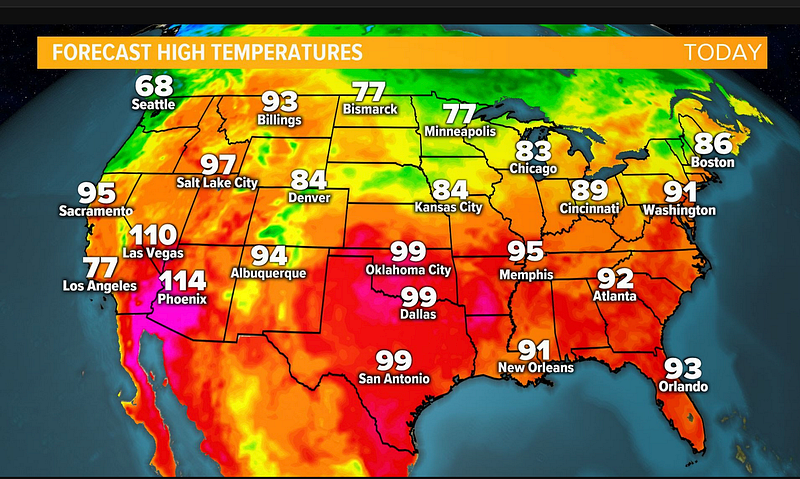
A heat map works by using a spectrum of colors to represent different values. The warmer the color, the higher the value. The cooler the color, the lower the value. This allows for quick and easy visualization of data.
Heat maps are commonly used to visualize data that has many dimensions, such as weather data. Each point on the map represents a specific location, and the colors represent different temperature values. For example, red indicates the hottest weather and blue indicates the coldest weather.
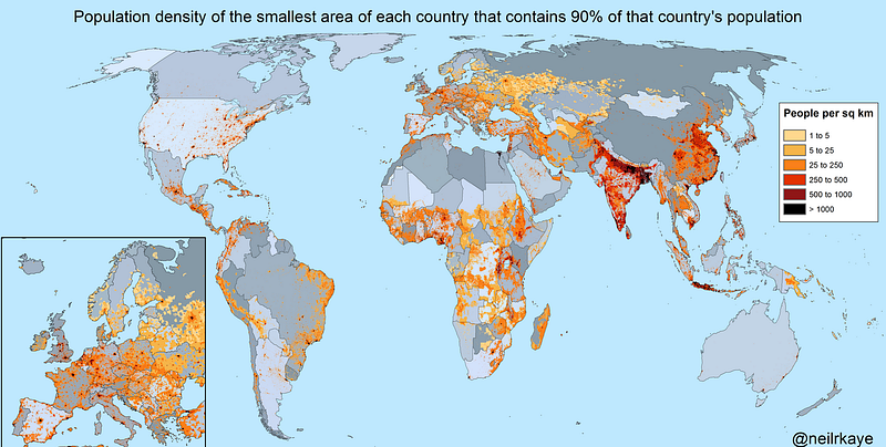
While heat maps are commonly used to visualize temperature data, they can be used to represent any type of data that has a numeric value associated with it. For example, a heat map could be used to represent population density, where the warmer colors represent areas with higher population density and the cooler colors represent areas
Heat maps are also commonly used to visualize data that changes over time, such as stock prices. The colors represent the different values at different times.
There are many other uses for heat maps as well. They can be used to show relationships between different data sets or to find patterns in data.
Color is rooted in cultural perceptions of nature.
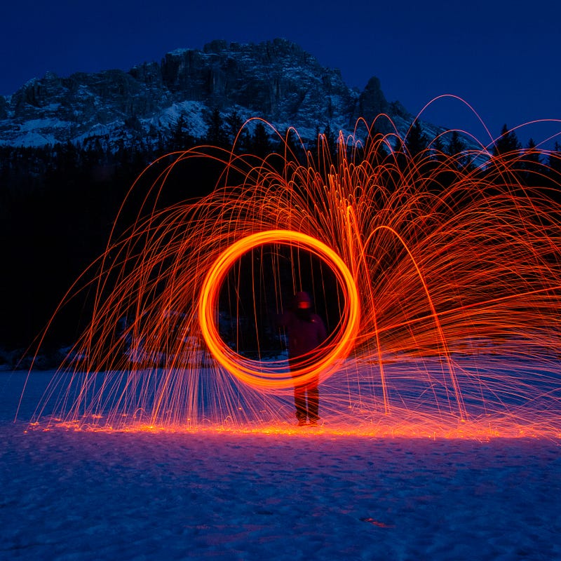
Fire, sunlight, sky, pastures, and flowers are all associated with warm colors.
Water, night, snow, ice, and shadows are all associated with cool colors.
When we see a color, we automatically associate it with a certain feeling. Warm colors often make us feel happy, while cool colors often make us feel peaceful.
This is because our brain associates warm colors with fire, which is a source of light and heat. It also associates cool colors with water, which is calming and refreshing.
In the book “The Language of Color,” author Eva Heller writes, “Color does not only have visual and practical effects, but it also represents an immediate language, a means of communication that bypasses all other channels.”
This is why colors are so important in design. They can be used to communicate a message quickly and effectively.
Heller also writes that colors can be used to create an emotional impact. Warm colors often create a feeling of excitement, while cool colors often create a feeling of relaxation.
When designing a heat map, it could be important to choose colors that will create the desired emotional effect.
The colors you choose should also be easy to distinguish from each other. This will make the data easier to interpret.
There are a few different ways to choose colors for a heat map.
One method is to use a color wheel. Start by choosing two colors that are opposite each other on the wheel, such as red and green. These two colors will be the extremes of your data.
Then, choose a few intermediate colors to represent the data in between.
Another method is to use a color scale. This is a range of colors that are all different shades of the same color. For example, you could use a blue color scale, where the darkest blue represents the highest value and the lightest blue represents the lowest value.
You can also use a gradient, which is a range of colors that gradually change from one color to another.
Once you’ve chosen your colors, it’s important to test them to make sure they’re easy to interpret. The best way to do this is to show the heat map to someone who is not familiar with the data and see if they can understand it.
If they can’t, try using different colors or a different color scale.
Heat maps and color temperatures are fundamental concepts that every designer should understand. By using color, you can quickly and effectively communicate.
Also, read
Color Theory: Analogus Colors are one approach to developing color schemes.
Color Theory is a complex study related to the properties of light and human perception.
If you’ve enjoyed my writing, please consider supporting me by becoming a Medium Member, accessing unlimited Medium articles. Follow the link to subscribe for $5 a month or $50 per year. Thank you!


